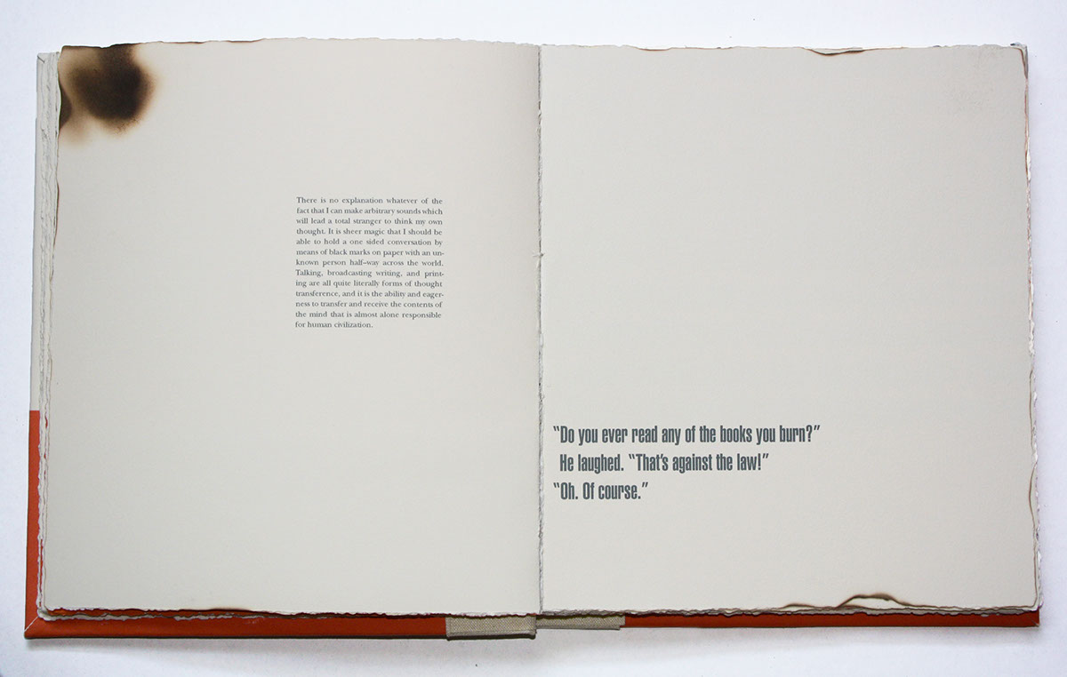
This project is a typographic book that combines the text of Beatrice Ward's essay The Crystal Goblet, or Printing Should Be Invisible and selected quotes from Ray Bradbury's novel Farenheit 451. The words from each text play off of one another to form a conversation. Both authors seemed concerned with the idea of communication and its importance to society, and it was this theme – presented in two very different ways – that formed the focal point of the typographic dialogue. Ward demonstrated this point by describing the necessity for typography to be legible and clear because its main purpose is to not only be beautiful but to provide a means of communication. Bradbury also emphasized the significance of written communication not by raising it up but by destroying it and removing it. The need for communication and text and books is highlighted through their absences.
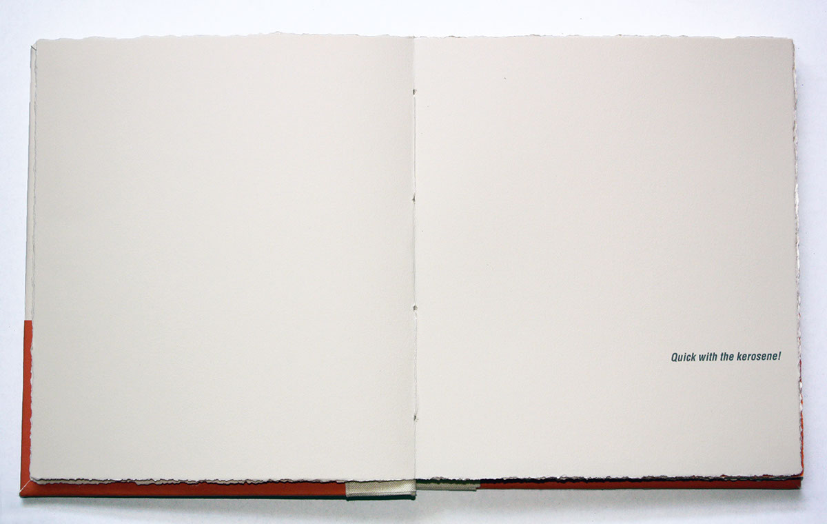
The book was hand bound and altered by hand through tearing and burning to demonstrate not only a typographic sort of fire, but a physical one as well.
Featured on the front page gallery of Typography Served for outstanding work.