
IMAGE 1 - "Make Your Mark" Exercise

Mediums: 2B pencil, colour pencil, 0.5 fine-liner pen, water-based brush pen, watercolour, acrylic paint and watercolour paper
Process: I divided the page into a 8x6 grid and filled each row with different mediums in eight different consistent patterns.
Reflection: I enjoyed working with a variety of different colour mediums, each with a distinctive properties. Each medium is used for specific purposes and are capable of rendering art styles that are expressive, abstract and photorealistic. Across all mediums, the fine liner pen was my favourite to use. It creates precise lines and is a great medium to express detailed elements in your drawing. Different pen weights can be used to add dept and mass to the drawings and highlight specific elements. I found pen one off the best medium to attract the audience's attention, establish a visual hierarchy, providing contrast, and improve the readability of a drawing. I found 2B graphite pencil and colour pencil great for sketching. Graphite pencils can produce great shadows on your drawing and are overall easily erasable (unless layered too much) compared to colour pencils which are harder to erase. Graphite pencils (when sharpened) can produce sharp lines compared to colour pencils. I noticed that water-based brush pen and watercolours are perfect mediums for rendering larger surfaces as they blend quickly. They are vibrant and translucent in nature and dry really quickly. A negative is that watercolours can leave a permanent render on paper, therefore cannot be modified one painted. I used bleed proof/water colour paper which which was very useful to allow the transparent colour to appear its most luminous. Lastly, I found acrylic paint the hardest to use due to its has stiff, buttery texture. It dries really quickly due to which it is harder to blend and use the 'wet-to-wet technique' while rendering.
IMAGE 2 - Observation Exercise 1: Line Drawings

Medium: 2B pencil, A4 paper
Process: I gathered 5 object from my desk; an artificial pot plant, soft toy rugby ball, mini table lamp and a mug. I observed and drew these object with a 2B graphite pencil from the respective angle on an A4 paper.
Reflection: This was a comparatively a straightforward, simple and fun task. All the images are not technically detailed completely but I effectively expressed the purpose of this exercise to sketch the basic form of the objects. I like the contour lines and and brief shading to add a bit if dept. An area of improvement could be the leaves in the artificial pot plant. They could be drawn more accurately.
IMAGE 3 - Observation Exercise 2: Drawing Shapes

Medium: Watercolour and watercolour paper
Process: Using the same object from the previous exercise, I used watercolour to paint the five objects.
Reflection: I found watercolour an easy medium to use as the colour blend well and dried neatly on watercolour paper. on the other hand, it was difficult to main the exact shape of the objects to what was observed and draw in the previous exercise. I tried to express the form as close to the real objects for it to be self-interpretable to the audience. The dimensions and ratio could be more accurately defined in the drawing.
IMAGE 4 - Observation Exercise 3: Combine Shapes and Lines

Medium: Watercolour, 0.5 fine liner pen, watercolour paper
Process: Using the objects and continuing on from the previous exercise in image 3, I added lines with a fine liner pen to enhance detail to the drawings.
Reflection: I was selective with outline my drawings. I outlined the main elements to enhance the key features of the objects. in the future, to improve I could of used different line weight pens to add dept and mass to these drawings.
IMAGE 5 - Observation Exercise 4: Drawing Negative Space


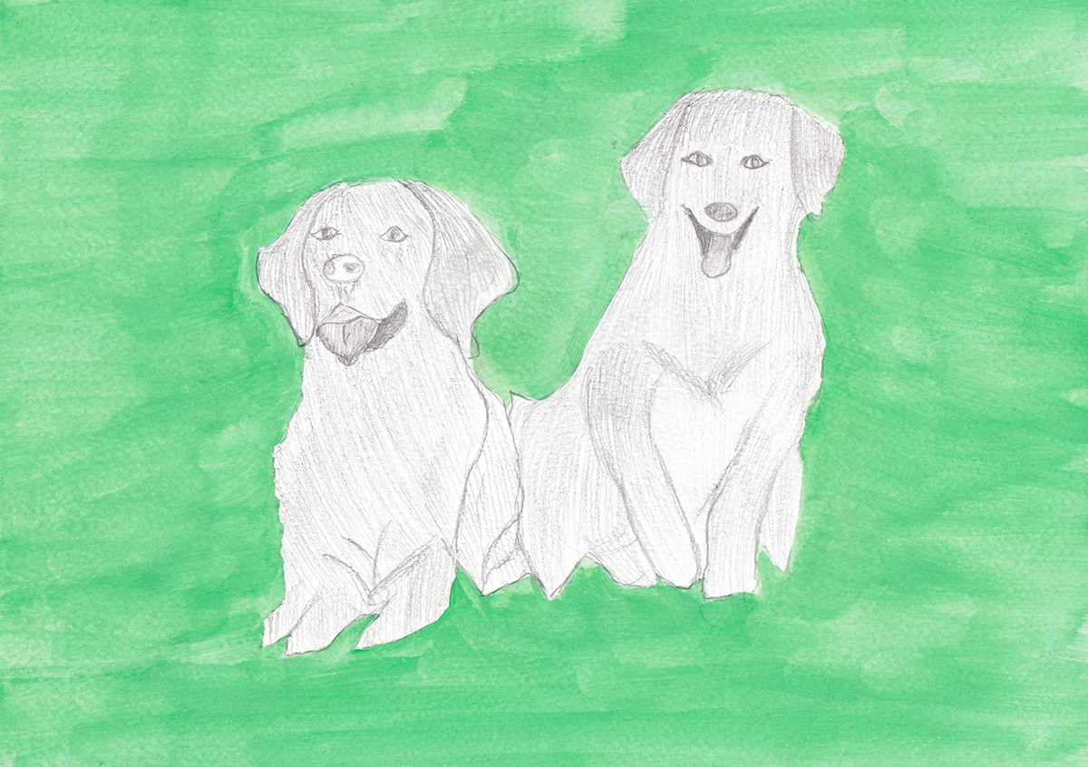
Medium: Watercolour, 2B pencil, watercolour paper
Process: From observing the reference image I chose, I firstly identified the main subject and the background (negative space) in the image. I defined the two dogs as the subject. Then, I painted using water colour to express the negative/blank space around the subject, leaving the main subject (the two dogs) empty. Lastly, I used a 2B pencil to fill in and sketch the subject.
Reflection: This exercise was extremely useful in understanding the importance of negative space and the main subject in an image. The techniques required in this exercise follows up from the previous exercises such as observing skills, balance and composition of an image and the ability to express using free hand. These skills I improved as I progressed through the activities. While using water colour in painting the negative space, expressing the outline of the dogs in accurate proximity was a bit of a challenge. I am pretty happy of how I highlighted the negative space. I tried to use the brush strokes in one direction for the neatness finish of the background. I realised the spacing of the dogs could be increased slightly. The shading of the dogs could also be further enhanced and detailed. Overall, this was my favourite exercise to perform this week and I really enjoyed it.

