
Zoox App Concept
Zoox is an autonomous robotaxi company owned by Amazon, headquartered in the Bay Area. These taxis are purpose-built for people-moving, which sets them apart from others developing self-driving technology for individual consumers. It's a step away from car dependency and a step towards a sustainable future for densely populated areas. An exciting prospect!
While Zoox does not yet offer its services to the general public and therefore does not have an app (at least not one that we have the privilege of seeing just yet), I wanted to envision what one might look like.
Visual Language
While crafting these screens, I wanted to ensure that these redesigns maintained the iconic look and feel that Zoox has already established. The company primarily utilizes a dark UI with gradients of greens, purples, and pinks on its website, a compelling, unique visual design that is consistent across its digital presence.


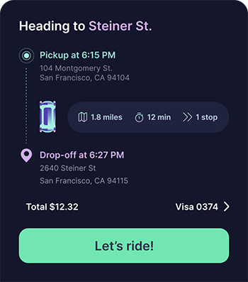
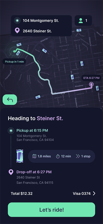
Green appears to be used for important calls to action or to denote important information. In the concept, I used the same green to denote starting point (i.e., location pin on the map) as well as other important details to be fleshed out before the ride, such as the number of riders, specific start address, and the final call to action, "Let's Ride!"

To complement green as our origin color, purple indicates all things destination. Destination address, ETA timestamp, etc., all receive this splash of color to distinguish between the two. Where information traverses the start and end points, such as details around distance, estimated time, stops, etc., I used a gradient between green and purple to reflect the shared nature of these details.
Finally, the Zoox vehicle must be represented onscreen. It needed to be simple enough to work as a small UI element while staying recognizable to the user. I referenced a video that shows the robotaxi at all angles and images published online to get a sense of its layout and silhouette.


I quickly iterated upon the Zoox taxi icon. My first attempt came from an aerial image that was affected by forced perspective. That version was not recognizable as one of the taxi's key features is its symmetry. On my next attempt, I found an image as close to an orthographic view as possible. Using this reference, I created a fully symmetrical version that I was happy with! As the cherry on top, I added a reflection to whichever side of the vehicle faces the glowing start pin on the map in the UI. A small detail, but one that intends to give the user a better sense of orientation. I also added a drop shadow to create more contrast between the taxi and the dark background.

Progression of initial attempt (left) to the final design (right)
Information Hierarchy & Progressive Disclosure
While these are only a few conceptual screens of an app I have never used, I was able to draw inspiration from existing rideshare apps as a starting point. At its core, moving people from point A to point B is not a new concept and has a well-established, familiar foundation.
For an app like this, physical and geographical orientation is everything. A map is the core component of any service that needs to locate a person, pick them up, and get them where they need to go. From the landing page, a user can see where they are on the map, their proximity to nearby taxis, and take steps towards requesting a ride. Here, the user can specify exactly where they are, where they want to go (by defining an address or selecting from a list of favorites), and who will be riding with them.

Important details about the ride should be prominent once a destination is selected. I've chosen to display the estimated distance, duration, and number of stops (this is a multi-passenger taxi, after all), along with confirmation of the most vital pieces:
When and where do I meet my taxi?
When and where will my taxi drop me off?
How much will it cost and how do I pay?
Final Thoughts
Zoox's excellent branding and visual design language, paired with its compelling technology, made for a fun evening of concept design. Zoox has pioneered a very complex product with multiple touchpoints, a synthesis of human interaction, digital interfaces, a physical product, and AI. I'm looking forward to exploring the product myself when it finally comes to market!

