Japanese Frozen Noodles|Packaging Design
Creation year / 2023
Publication year / 2023
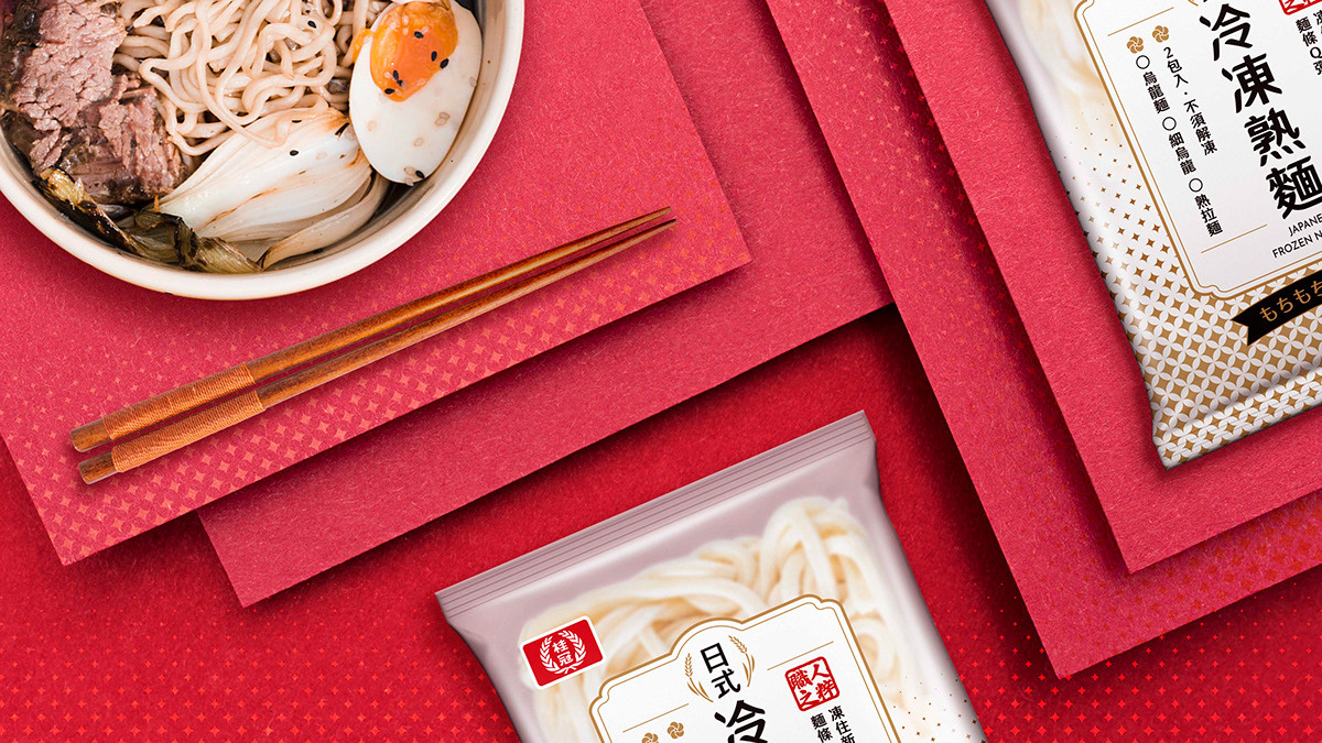
The packaging design for Japanese Frozen Ready-to-Eat Noodles is centered around a minimalist and refreshing style. The gradient design on the packaging allows consumers to instantly see the contents, emphasizing honesty and transparency. Gold stars adorn the packaging in a graceful and elegant manner, symbolizing the high quality of ingredients and unique taste, while imparting a sense of simplicity and deliciousness to the overall design.
The overall design avoids excessive decoration and colors to highlight the product's inherent quality. The product name, "Japanese Frozen Ready-to-Eat Noodles," is presented clearly and legibly on the packaging. Simultaneously, the product description on the packaging employs concise and compelling language to pique consumer curiosity.
Considering that this packaging will be used for three different products, including ready-to-eat Udon, ready-to-eat Fine Udon, and ready-to-eat Ramen, the design maintains consistency with unified font styles and layouts to ensure harmony across the entire packaging series. The goal is to capture consumer attention, highlight the uniqueness of the products, and instill confidence in their quality.
桂冠實業股份有限公司 版權所有 2023 Laurel Inc. All Rights Reserved.
This work is for display purposes only and does not represent the company's official position or involve any profit-making activities or use.
桂冠實業股份有限公司 版權所有 2023 Laurel Inc. All Rights Reserved.
This work is for display purposes only and does not represent the company's official position or involve any profit-making activities or use.