
Altimus
Altimus, a real estate agency aiming to assist people in selling or purchasing high-end properties, with security, tranquility, and assertiveness. Catering to a select and demanding clientele who value quality and exclusivity.
The challenge faced was to develop a brand that would resonate with Altimus’s exclusive and demanding target audience, conveying sophistication, elegance, and exclusivity. Altimus needed to establish a solid position in the luxury market, differentiating itself from competitors.
The primary objective was to create a brand that reflected success, exclusivity, and competence, perceived as an object of desire, and capable of awakening the desire to do business. Altimus had to highlight its exclusivity without conveying commonness, simplicity, vulgarity, insecurity, or arrogance.
Based on these challenges and objectives, Altimus emerged as a unique connection between people and high-end properties. Focusing on security, tranquility, and assertiveness, the brand reflects the sophistication and exclusivity that its clients demand.
The Name: Altimus – Superior Real Estate
Altimus is a sophisticated blend of words that reflects the brand’s aspiration. The word ‘High’, from the Latin ‘altus’, means lofty, grandiose, while ‘maximum’ (from Latin ‘maximus’) suggests the highest degree or limit, indicating success, exclusivity, and power. This name also incorporates the initials ‘ALT’, ‘IM’ (real estate) and ‘US’ (us), highlighting Altimus’s commitment to provide high-end properties and emphasizing the importance it places on the relationship with its clients.
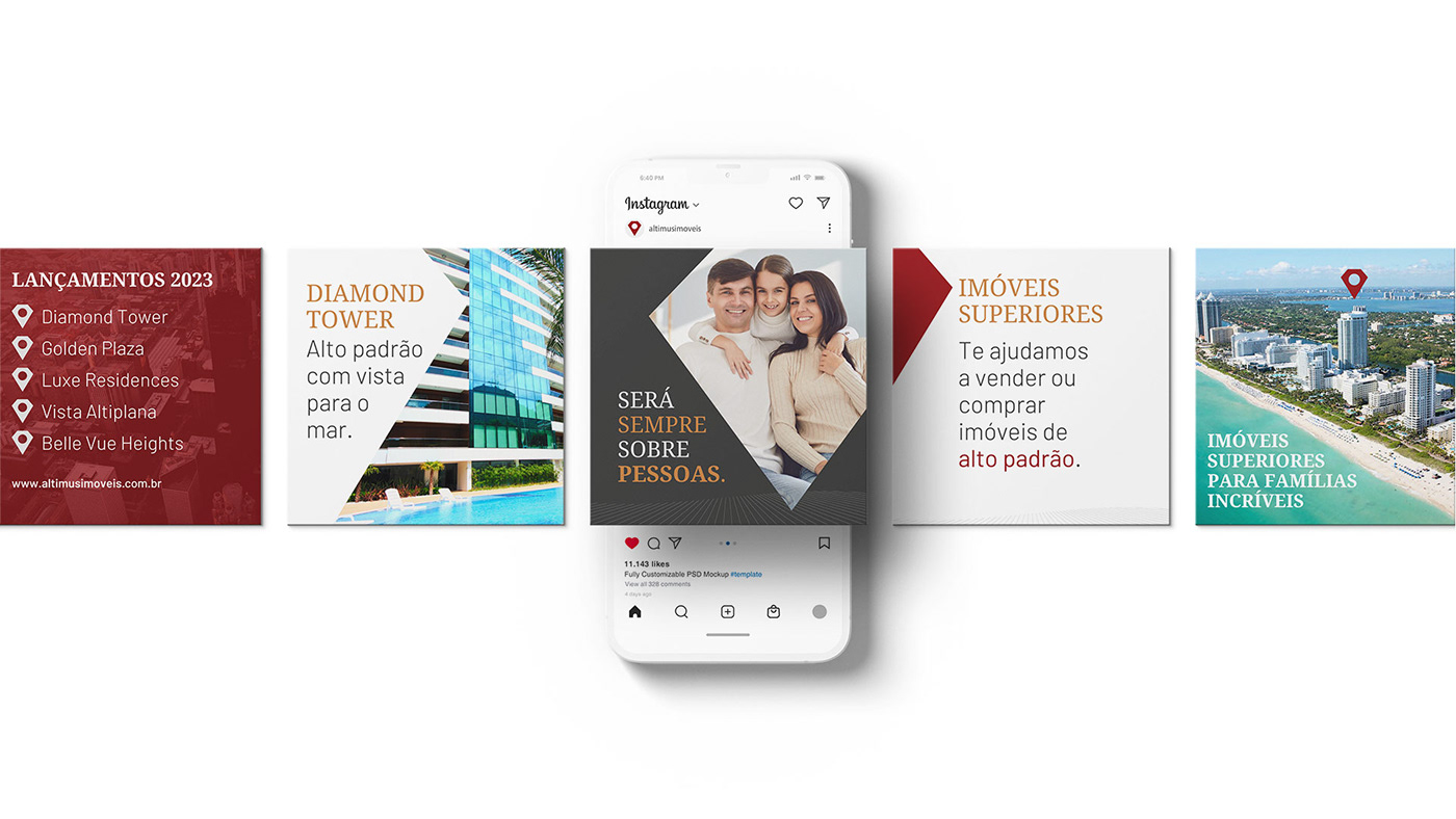
The tagline “Superior Real Estate” serves as a visual and textual reinforcement for the brand’s message, underlining Altimus’s promise to provide properties that exceed expectations and set new standards in the high-end real estate market.

The Design: Sophistication, Luxury, and Exclusivity
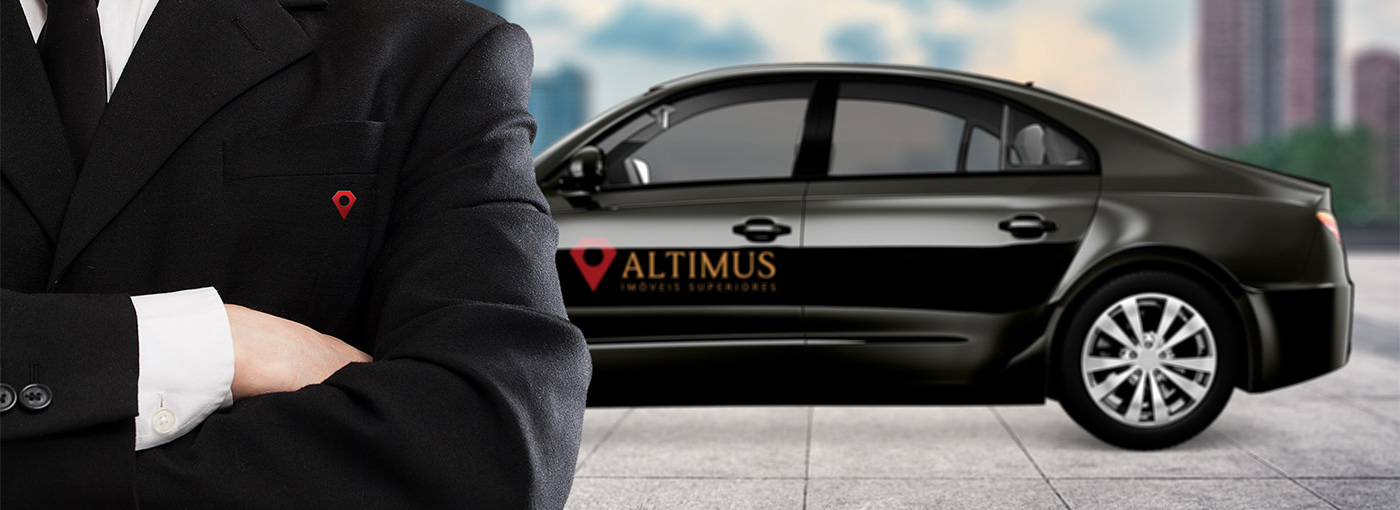
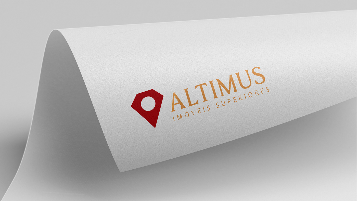
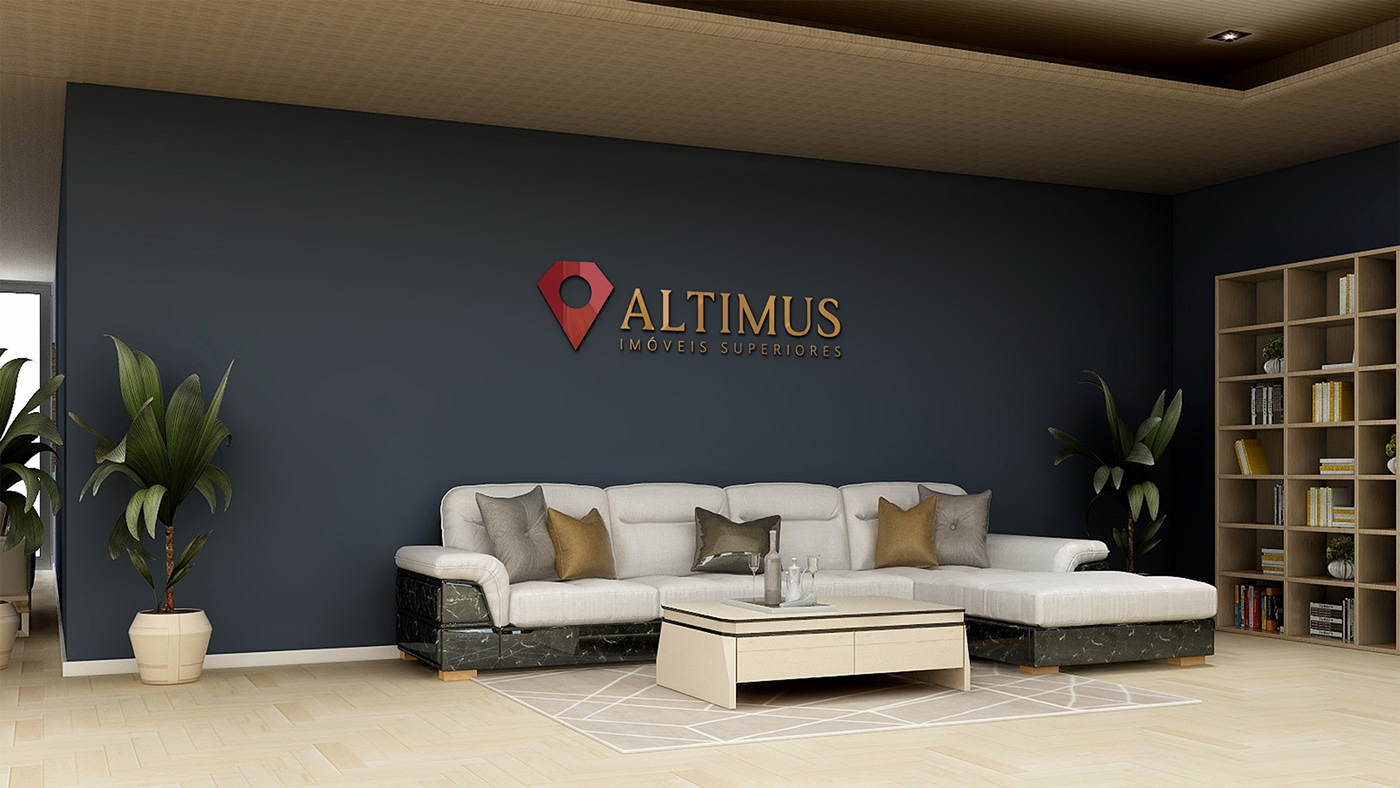
The Altimus symbol, inspired by the valuable faceted red diamond, represents excellence and attention to detail. The presence of the location pin directly connects with the essence of the brand. Together, they symbolize valuable, rare, and exclusive locations – true gems in the real estate market.
The elegant typography and the burgundy and gold colors complement Altimus’s visual identity, conveying trust and refinement to their clients. The distinctive texture, inspired by the panoramic view from the top and the facets of a diamond, reinforces the sophistication of the brand.


The Outcome: A Strong and Impactful Brand
With a carefully crafted strategy and design, Altimus has become a strong and impactful brand in the high-end real estate market. An example of how strategy and design can effectively complement each other, generating surprising results and attracting the right audience to the business.
Client Words
"Jaider exceeded expectations, capturing the essence of the brand and its partners, generating an exclusive and memorable result in the high-end and luxury real estate market. Altimus emerges with the mission of humanizing and making the real estate sector collaborative, joining forces to find the perfect development for customers. This vision is reflected from the naming to the visual identity. We thank Jaider for turning this dream into reality.”
Fernanda Ventura - Executive Director

2023 © Jaider Morais
Client: Altimus, Brazil (ES)
Client: Altimus, Brazil (ES)
Project: Naming and Brand Visual Identity


