To start this project the organisers of my course invited Vincent Pericard into my class tell us about his career/how he got to where he is today. Watch the video embled above, for those who don't know- Vincent runs an organisation that keeps the mental health of professional footballers stable, as when he was a footballer he suffered greatly from the issues his organisation has set out to solve.

We were encouraged to think back of an experience in our lives where we were put in a compremised position, where we felt helpless or belittled. I for one thought back to when I worked in the camera retailer "Jessops" Where a customer tried belittling me over a mistake that wasn't my fault.
Stemming off this I decided to base my project off of Rage. How people will take their anger out on people that don't deserve it.
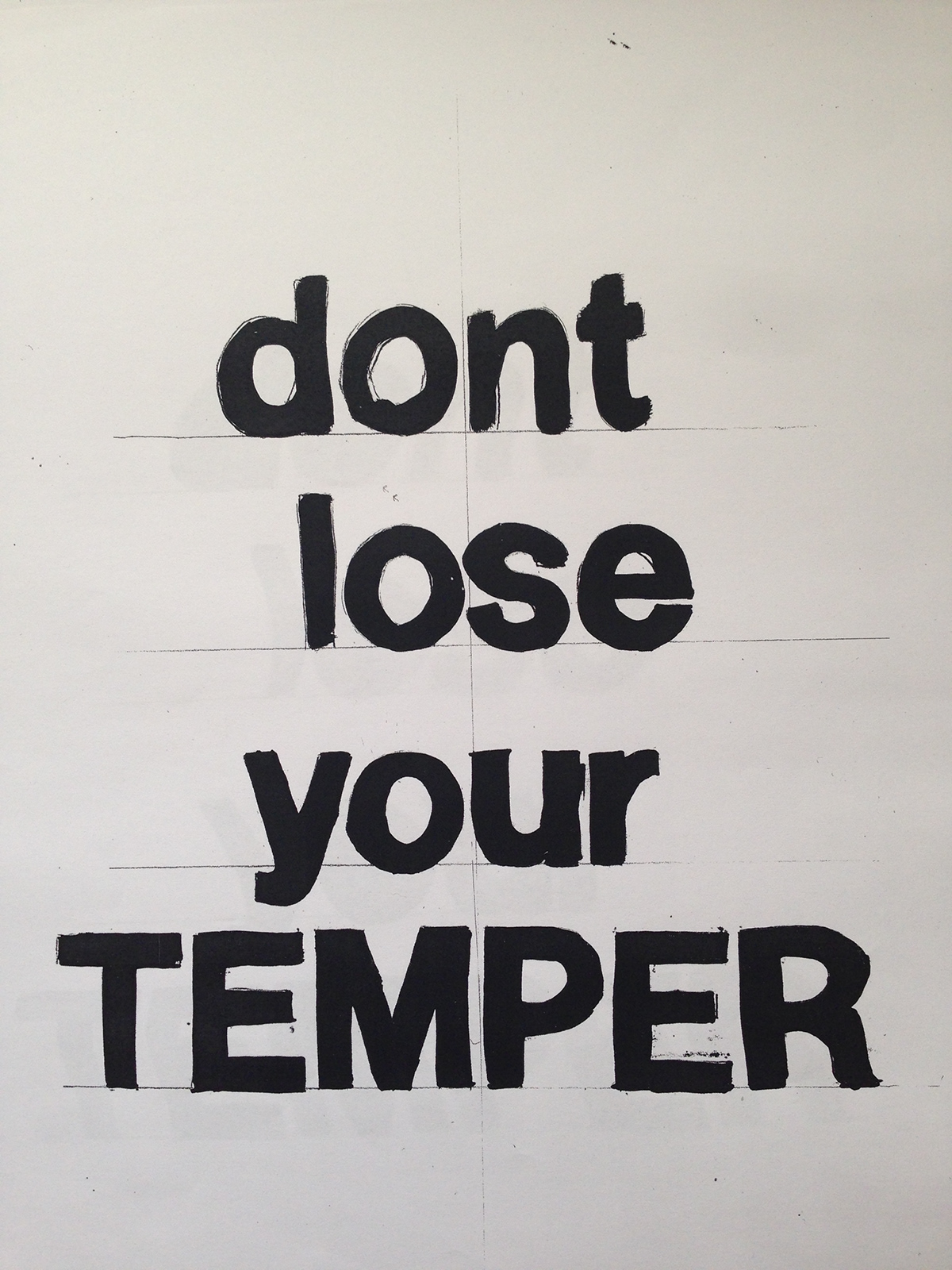
In a one hour workshop we had to create a poster concept that clearly communicates what our campaign is about. "dont lose your TEMPER" was a good place to start my project, although I didn't carry this on further it gave me a good idea on how to move on.

When using public transport I witnessed someone getting angry at the fact they was late due to an accident down the line and shouting at a member of staff. This got me thinking of a way to direct my project- Create a campaign discouraging people from taking their anger out at members of staff that aren't to blame.

Above is a poster that I found a week later, trying to raise awareness of the consequences of taking their anger out on members of staff. The layout helped me greatly to produce the posters for my campaign.
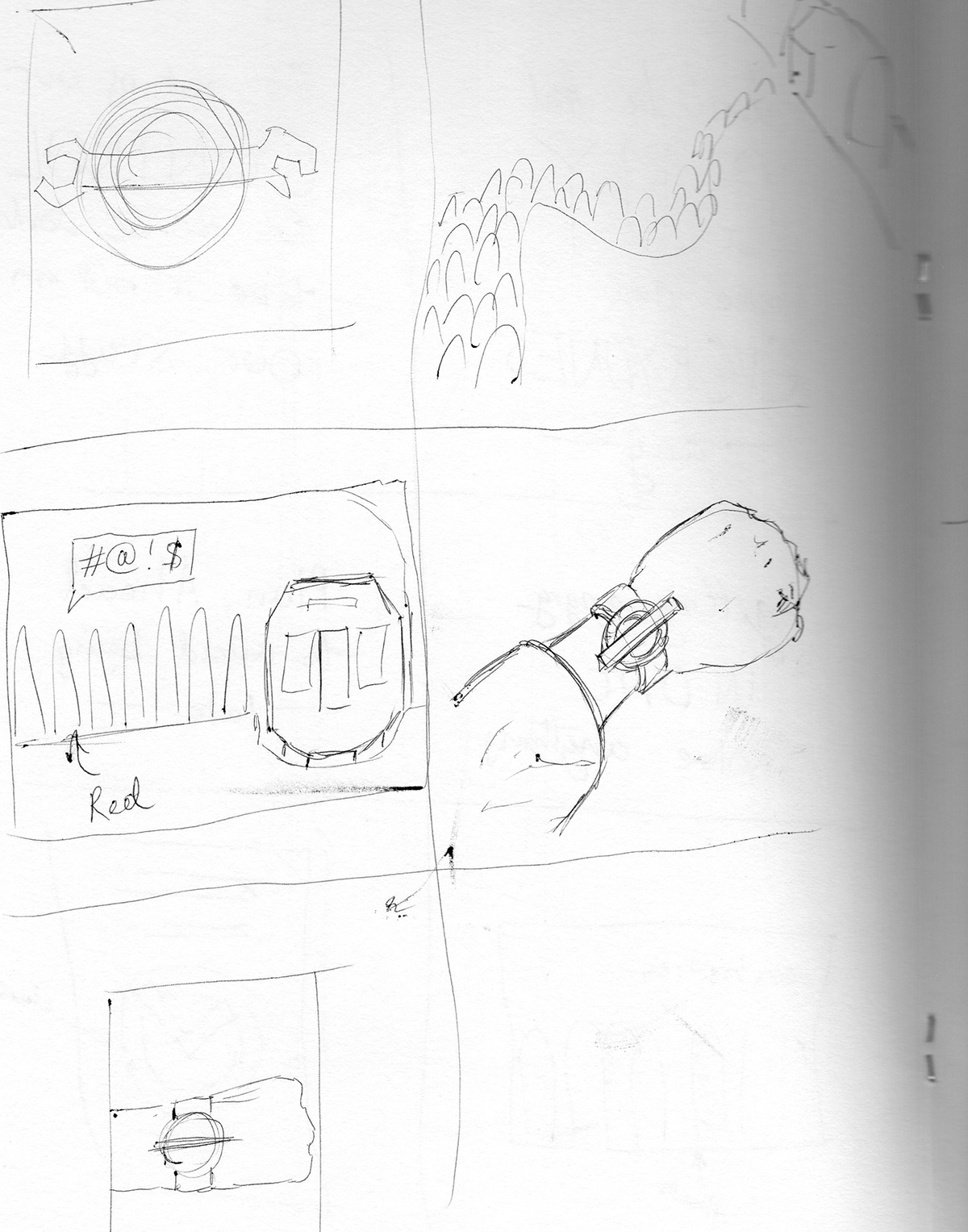
I began to draw up sketches, focusing around the concept of being late or stuck in a queue. When it came around to making my concepts in illustrator I discovered apon a set of silhoute vectors that aided me greatly in the production of these posters.
Without these silhouttes the designs wouldn't be anywhere near what they are.

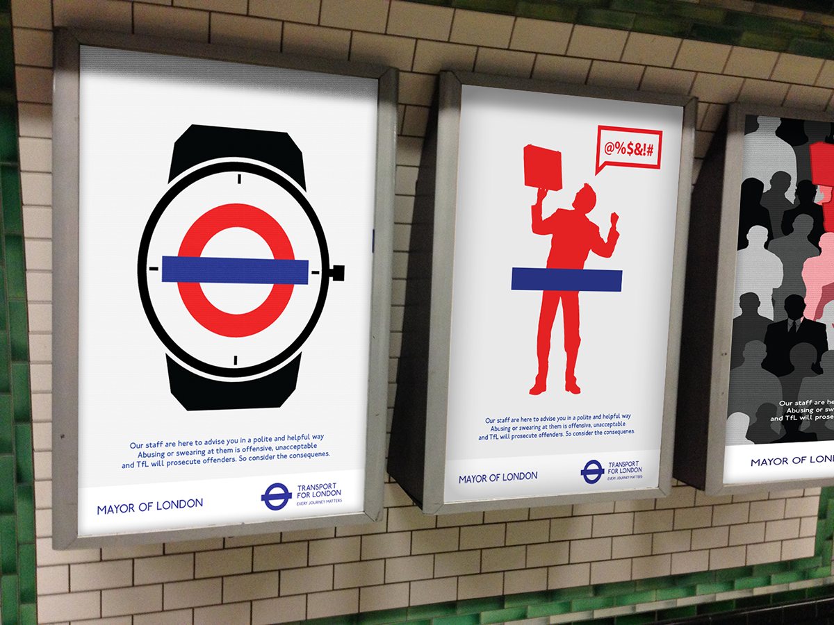
In this poster I have used colour as a key factor, the red symbolises the man being angry, accompanied by the speech bubble filled with symbols.

Application to area in the underground.

I think this design is quite unique and simple, but at the same time quite fitting to the style of posters seen in the underground to current date.

This poster is my favourite, I have swapped the red ring from the Underground logo with a silhoutte of an angry businessman, it is my favourite because although the logo has been changed you can still piece together that it is from the Underground logo.

This concept is sliightly different from the others, being more representative to the fact that one person with a bad mood can be contagious- and it can affect the mood of others around him or her.
Here I have applied my posters to a photograph I took in Elephant and Castle station so that I may test my designs.

Moving on from posters I decided to design a horizontal advert for inside the tubes & the underground walls ( Opposite the plateform)

Here is an application of the design above.

For the final peice I handed in the above poster, both horizontal and vertical- I feel that visually they are the strongest whilst being simple and communicating the manifesto well.

