
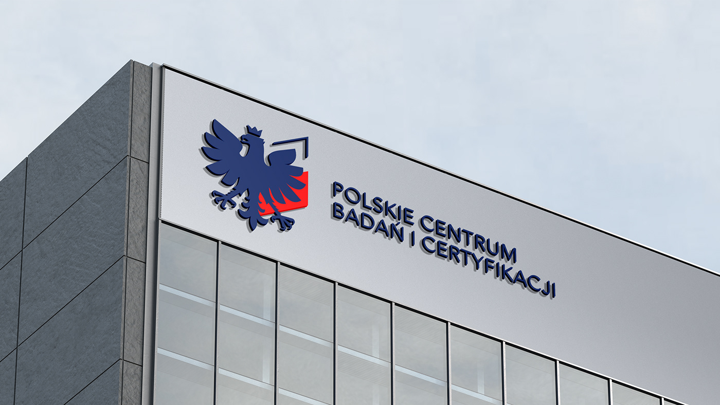
During our work, we put a lot of thought into the shape and personality of the
eagle. We aimed to introduce something fresh while still staying close to the
recognizable image of the Polish eagle.
eagle. We aimed to introduce something fresh while still staying close to the
recognizable image of the Polish eagle.

Ultimately, we decided to maintain the eagle's familiar form and
proportions, but simplified it significantly, along with the surroundings, to
move away from the heraldic aesthetic and eliminate unnecessary visual
distractions.
proportions, but simplified it significantly, along with the surroundings, to
move away from the heraldic aesthetic and eliminate unnecessary visual
distractions.


Our company has implemented a sign system that encompasses all of the
areas we are involved in, including certification, research, testing and
education. We have unequivocally decided to use the rhombus shape as it is
already present in our logo and corporate identity as a pattern and
background element. This distinguished and unpretentious shape can be
effortlessly recognized using a variety of colors.


Take a look at how the corporate identity is effortlessly adjusted to different
media. Due to the nature of the PCBC business, the corporate identity must
be able to promptly adapt to non-traditional media of various shapes. In this
instance, a straightforward geometric approach proved to be more beneficial
than intricate designs or one-of-a-kind artistic interpretations.
media. Due to the nature of the PCBC business, the corporate identity must
be able to promptly adapt to non-traditional media of various shapes. In this
instance, a straightforward geometric approach proved to be more beneficial
than intricate designs or one-of-a-kind artistic interpretations.


Like our projects?
Let's make the next big thing for you!
Let's make the next big thing for you!
+48 602 386 424
