A freelance 3D logo design reveal created for a company named J B Bali, which deals with leather goods and accessories.
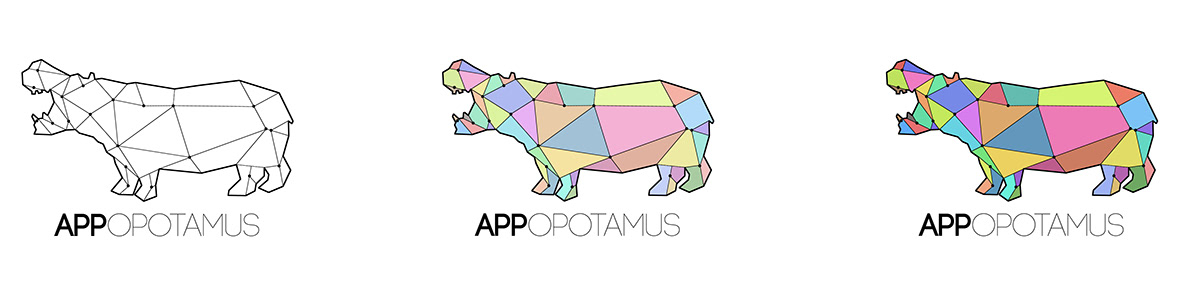
Three versions of logo design for a new app design and developement company. The logo encompasses connectivity and vitality through colours (the two conditions the company had asked me to keep in mind which sketching out the logo). The hippopotamus's silhoutte is used to suggest the evident name used by the company as its identity.
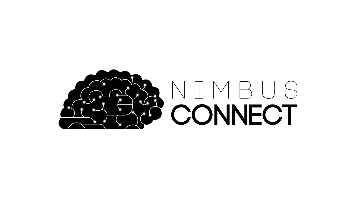
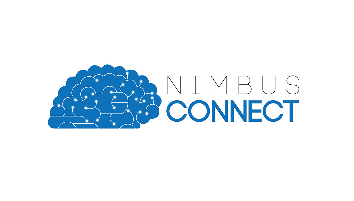
Logo design for a company which deals with cloud computing as its primary avenue of expertise. The blue version of the logo correlates with the Nimbus part of the company's name - presenting the connectivity (shown through illuminated bulb ends) within a blue coloured brain - indicating the slender similarity between a cloud and a brain's shape.
The black-and-white version of the logo is produced for cost-effective purposes - to be used by the company for trivial paper and digital documentation.
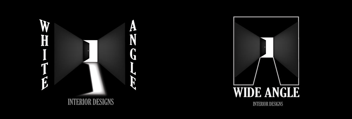
A college assignment - a logo design for a simulated interior designing company. The logo on the left is clearly indicative of the name, the company wants to commerce. The logo on the right is a compact version of the same logo designed on the left - defined by a white border, in order to bleakly denote the abbreviations of the company's name - "W" and "A" conglomerated into one another through the outlines.


