Wayne Hopkins contacted me to create a custom illustration for another book cover: At the Dead of Night, a psychological horror novel.
Some design and illustration process insight ahead:

Lettering
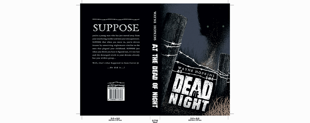
I started with lettering decisions. Among the inspiration sources there were: slasher horrors from 70-90' and their posters in particular - utilizing mostly bold, heavy sans serif display fonts, often hand-drawn or decorated. Consequently, as a direct reference for this title I opted for Lugosi, modified in height and spacing - paired with a more structured form of EB Garamond with adjusted kerning, as I needed something legible in smaller formats and this font was already utilized in this author's publications. Eventually typography was to be inked by hand.
Lettering got packed into a concise square shape, utilizing negative space and an addition of an embellishment - in a form of a piece of a barbed wire, which later became a reoccurring theme in this print edition.
Contents
The author wanted me to include the following elements:
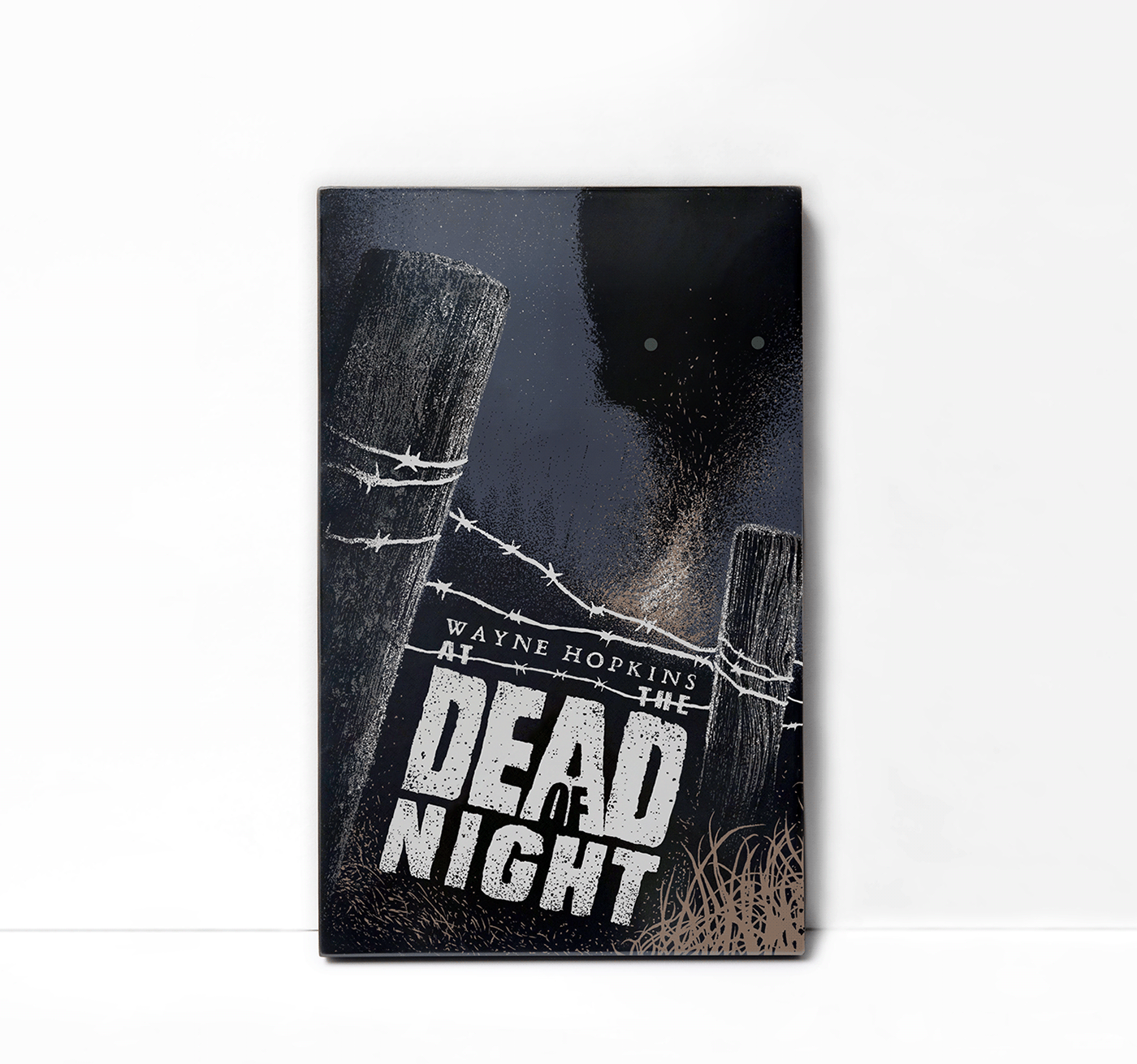
- some sort of a fence
- a meadow with a bonfire
- a treeline in the background
- a starry sky
- a face with green eyes floating in the sky
The last mentioned part (floating face/eyes) caused the most trouble as I wanted to avoid B-rated movie tackiness - even if it's present in the reference materials from the slasher era, I wanted the illustration to have much more modern and mature aesthetic.

Thumbnail sketches
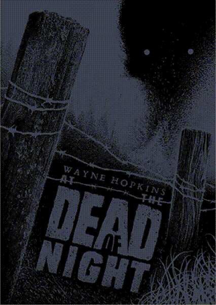
Full scale inking
Upon acceptance, I started working on the illustration in a full scale:

After scanning the piece I colored it digitally with custom-made brushes sampled from my own traditional inks for more visual consistency. The addition of a green hue on the eyes at the time, however, seemed a bit unjustified among other colors in the chosen palette - so in order to make the choice feel more deliberate I added some moss to the fence post as well. Later on the illustration got separated into color layers and vectorized for the future.
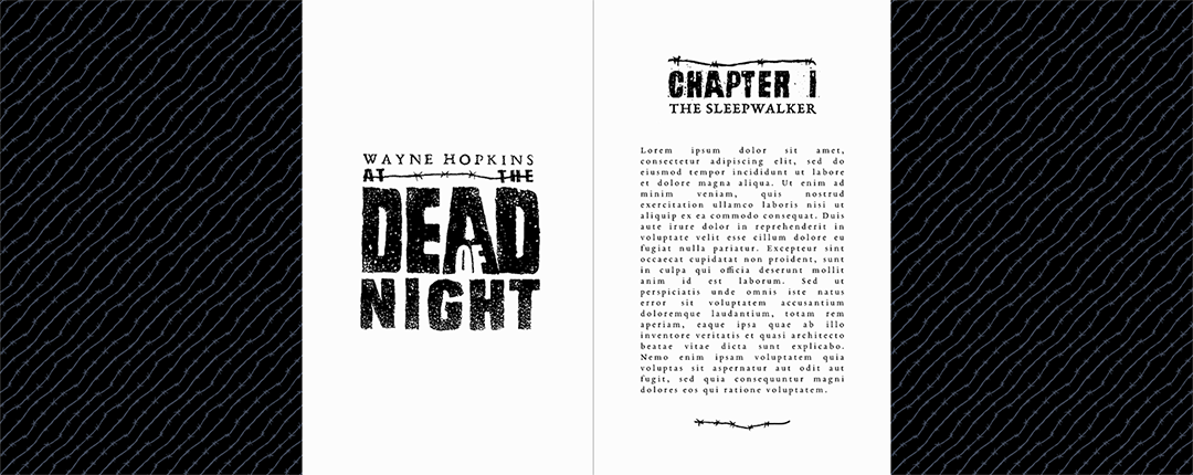
Extras
Additionally, the project got accompanied with endpapers consisting of a seamless pattern derived from the wire on the cover, a title page, chapter headers and embellishments for the books' body.
Print preparation
Since this edition was paperback rather than hardcover - the endpapers got located on the inner side of the cover via duplex printing. Color management has been done in Scribus.