
We were asked to create a series of sketches which would eventually become our own personal logo for future branding, business cards, etc.
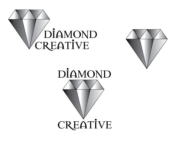
Finalized logo designs

Original sketches
Designing a personal logo wasn’t something that I had taken very seriously before and until I really started to do a lot more with my photography, I hadn’t considered coming up with something. This assignment was a little bit difficult for me, to be honest. I always have so many versions of things floating around in my head that it’s sometimes hard to narrow things down.
When I first did my original sketches they were all over the place. I had graphic based ones and typography based ones, ones that said “design” in them and ones that said “photography”. It was hard for me to figure out if I should have separate ones for my design work versus my photography. I wanted to be able to use some version of my finalized logo as a copyright mark for my photos as well as use on my personal branding. A great suggestion that I got after the first round of designs was to use the word “creative” instead of “design”. “Creative” would encompass all of my work, both design-wise and photography-wise. Once I had that I was able to move forward.
I knew that I wanted to include a diamond in my logo design as a reference to the diamond tattoos that I have. It would make a great graphic on it’s own but it would also work with type as well. I came up with a series of just seven sketches after that since I had a pretty good idea of where I was going to go with this design, it was just a matter of tweaking it just right. I hand sketched out the original logos and the seven reworked versions, once I had those I knew I had to get them into Illustrator so I could better see where things would be going. My sketches are often not close to how I envision them and I can usually get a lot closer in Illustrator. Even after I did several versions of the logo in Illustrator I was still torn, I really wasn’t sure what was going to look right or best. Eventually I chose a design that I think works well on it’s own graphically and also with the added type. I muddled through 30 or so typefaces before settling on one I think complements the design and also adds a little something to it as well.
In the end, I couldn’t decide where I liked the type set to complement the graphic so I did two versions for that. I’m sure I will need to stare at them much more in order to make a decision but in all honesty, I would be happy with either version. I think the lone graphic can stand on it’s own and I could also do a much simpler version of this, without the gradient, for a copyright mark on my photos. Overall, I’m extremely happy with the way this turned out and I’m looking forward to using it going forward.


