

Fruto de la Vid is a church network composed of different churches in different locations. A member church contacted us to make a new logo for themselves. One that contained the main elements of the network but still spoke their specific location. For this, we took inspiration from the original logo at the bottom. We replaced the world map because we weren't speaking about the whole network anymore but about the location in Georgia. So instead we used the map of Georgia given they are the only member church in the state. The original logo had three different typefaces. We reduced it to one. Also, we reduced the amount of colors for printing purposes. The typeface used is Trajan Pro 3 and it was one othe typefaces used in the orignal. The illustration of the grapes is derived from the original but with more depth and slight color change.
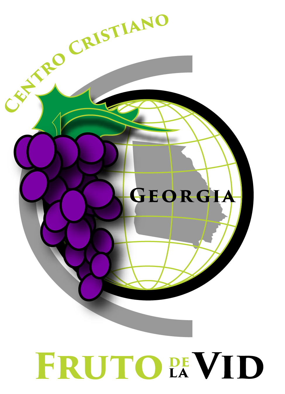
Fruto de la Vid is a church network composed of different churches in different locations. A member church contacted us to make a new logo for themselves. One that contained the main elements of the network but still spoke their specific location. For this, we took inspiration from the original logo at the bottom. We replaced the world map because we weren't speaking about the whole network anymore but about the location in Georgia. So instead we used the map of Georgia given they are the only member church in the state. The original logo had three different typefaces. We reduced it to one. Also, we reduced the amount of colors for printing purposes. The typeface used is Trajan Pro 3 and it was one othe typefaces used in the orignal. The illustration of the grapes is derived from the original but with more depth and slight color change. In this version I'm showing the possibility of color change depending of the context or theme used in.

This is an old image provided to us of the orginal logo of the church.