In a better world everybody lives off his own passion being able to add something beautiful to the world and your life.
Gusto Robusto’s contribution to this mission is producing digital artworks printed in limited edition.
“An artist is not paid for his labour but for his vision”
James Whistler
Gusto Robusto’s staff selects the best artists offering them the possibility to express themselves during the creation of exclusive digital artworks printed in limited edition. Artworks that we promote in exhibitions, museums, publication and in a new art market with www.gustorobusto.com as reference. What do you think? If your reply is good, well, you have Gusto Robusto too!
First Series
This is the first selection of Gusto Robusto®

The illustrations linked to Gusto Robusto's e-commerce if you want to buy
the free series A4 format.
Description of the illustrations
limited edition series (50 copies total)
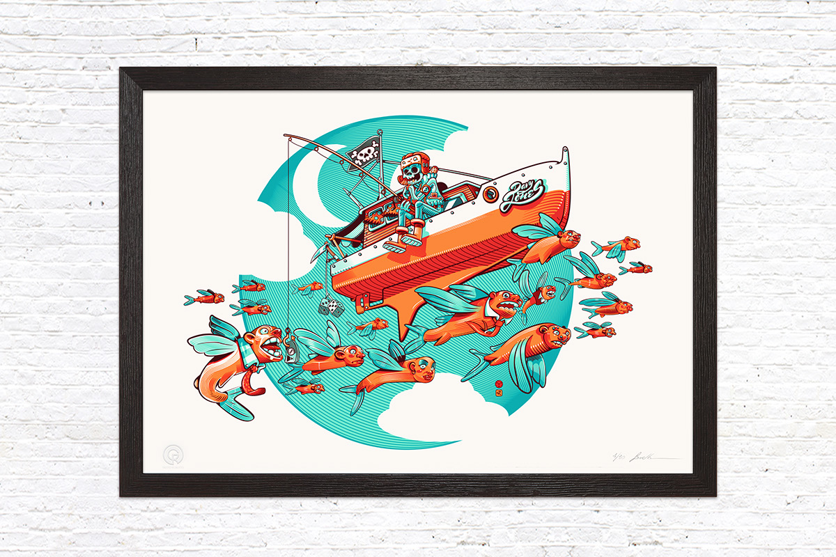
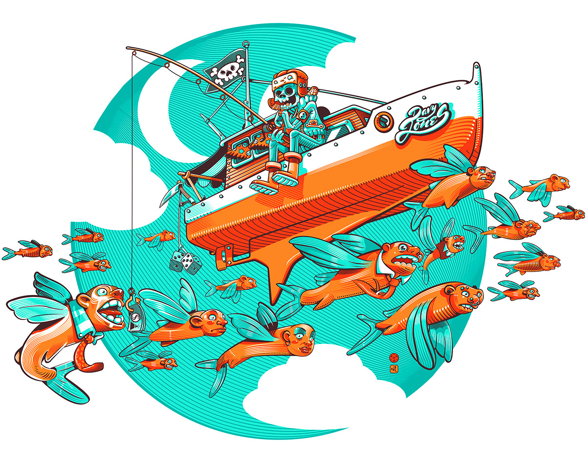
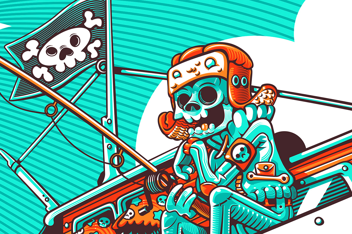
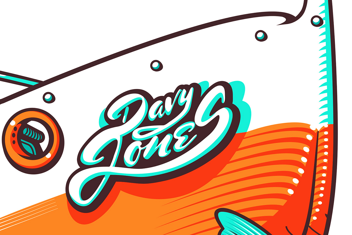
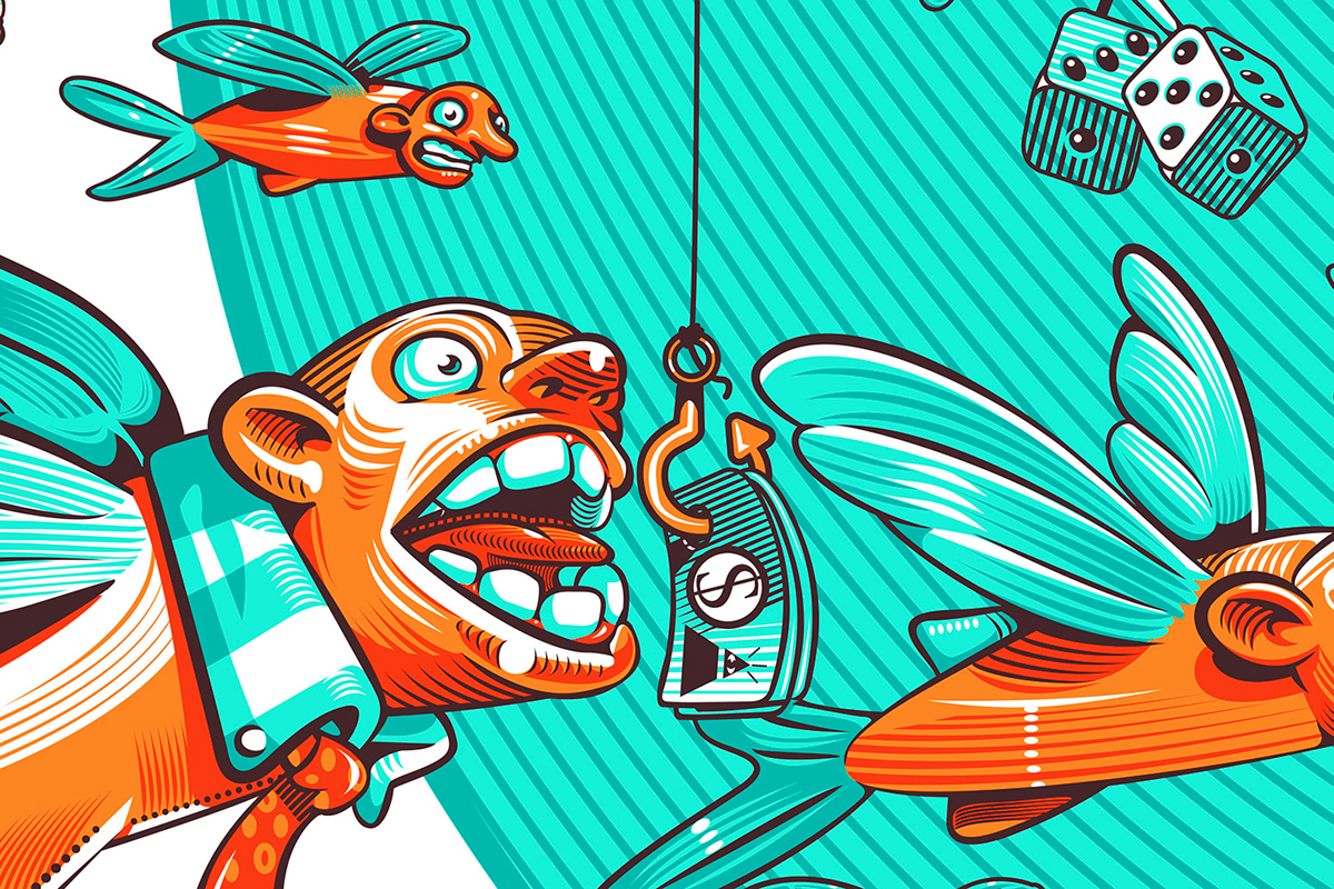
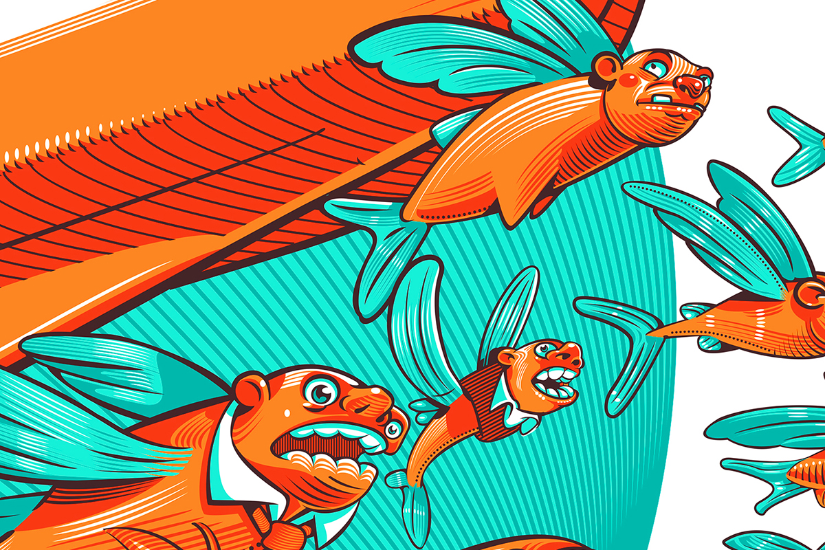
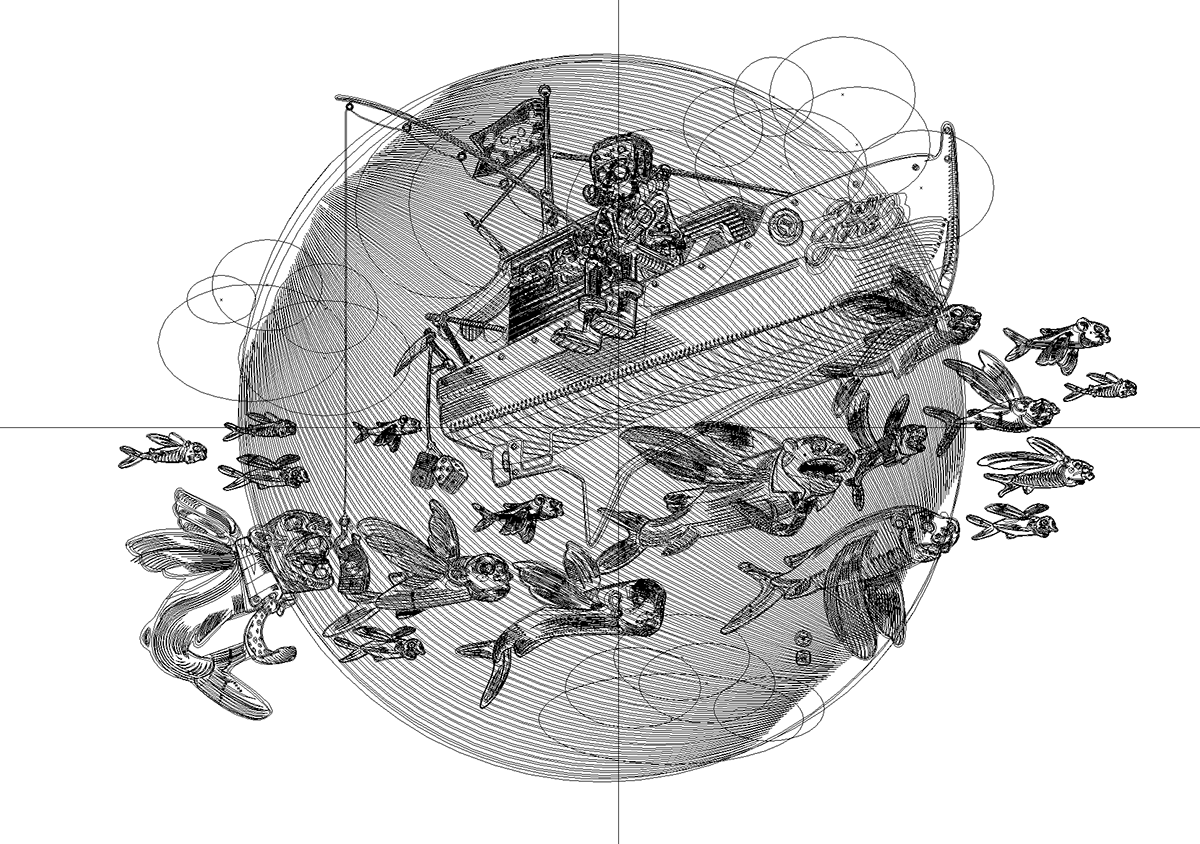
Davy Jones
68 x48 cm - 28”x18”
Limited Edition of: 50 prints
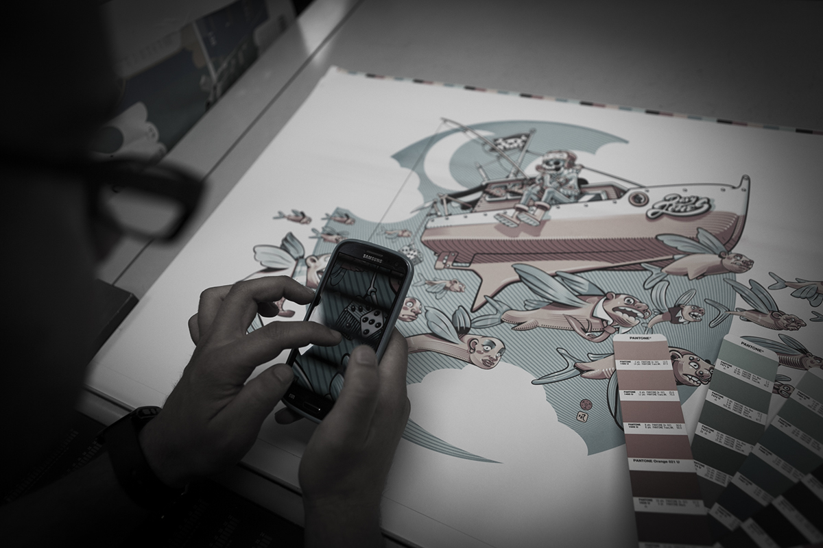
This illustration came off the question “What does Death do during his spare time?”. He goes fishing! Since that he can’t stop to be the one he used to be, then he fishes souls. What’s the best bait out of money? The meaning, far to be moralistic, is focused on the fact that the fisherman (the death) and the bait (money) are both part of an illusive world. At the end we can say that they don’t exist. The artwork is full of small meanings and hidden quotes. There are also references to tarots and legends. For example the boat is called Davy Jones: the demon who catches the souls of men dead in the sea.
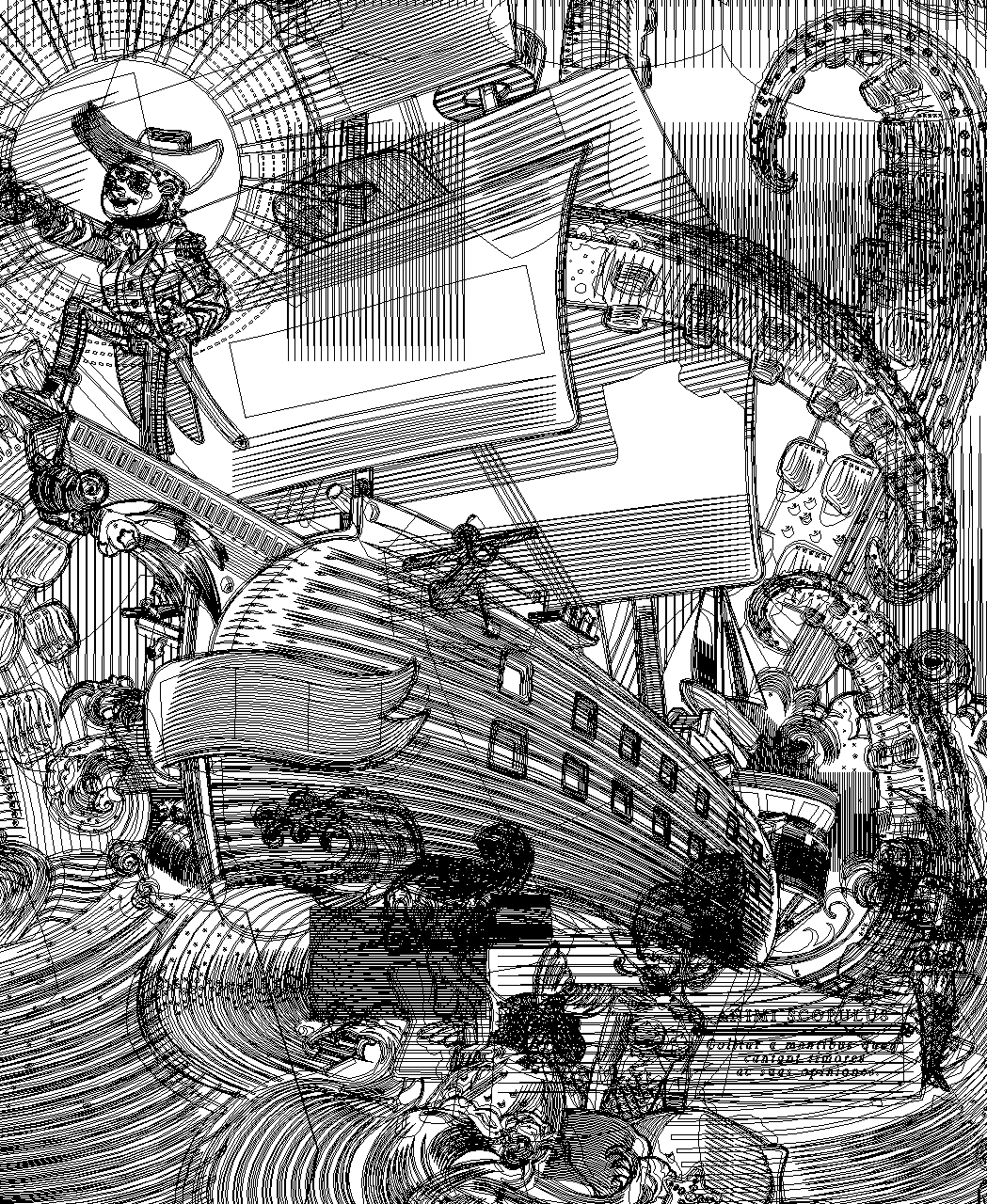
Some details of the illustration
Vector Structure
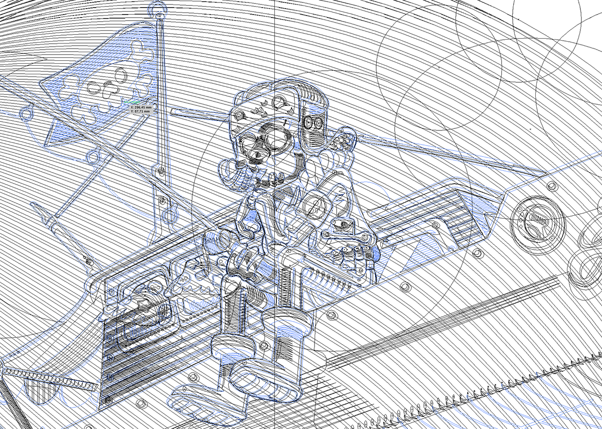
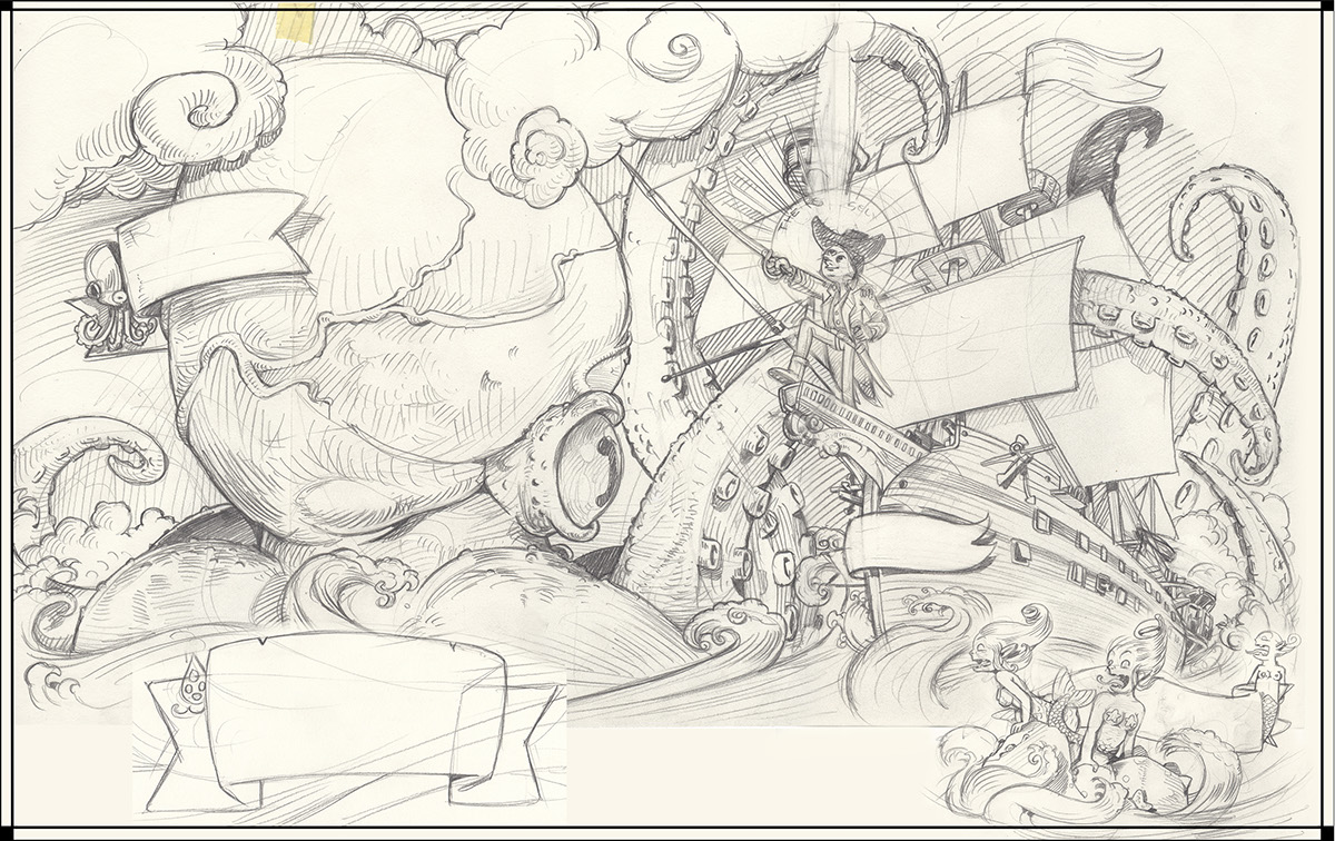
Pencil Rough

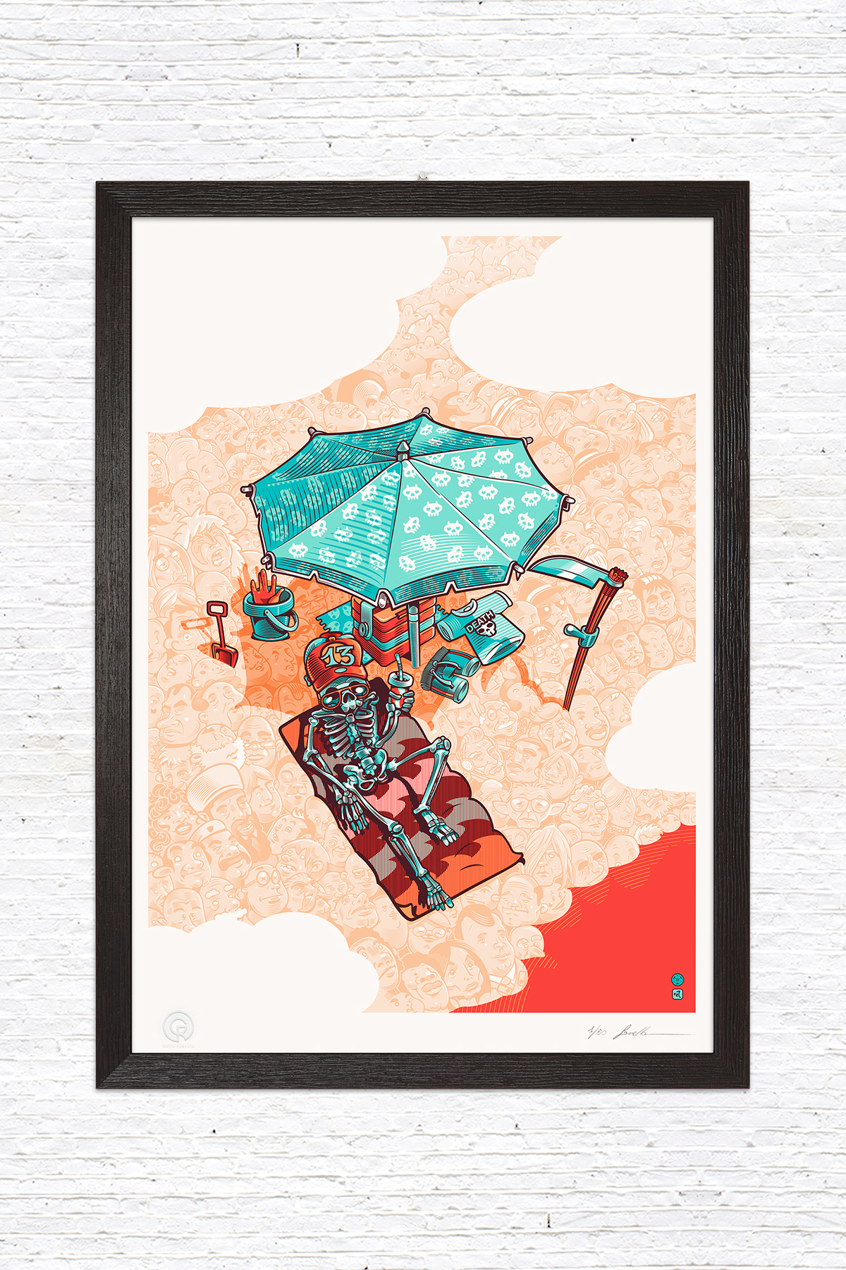
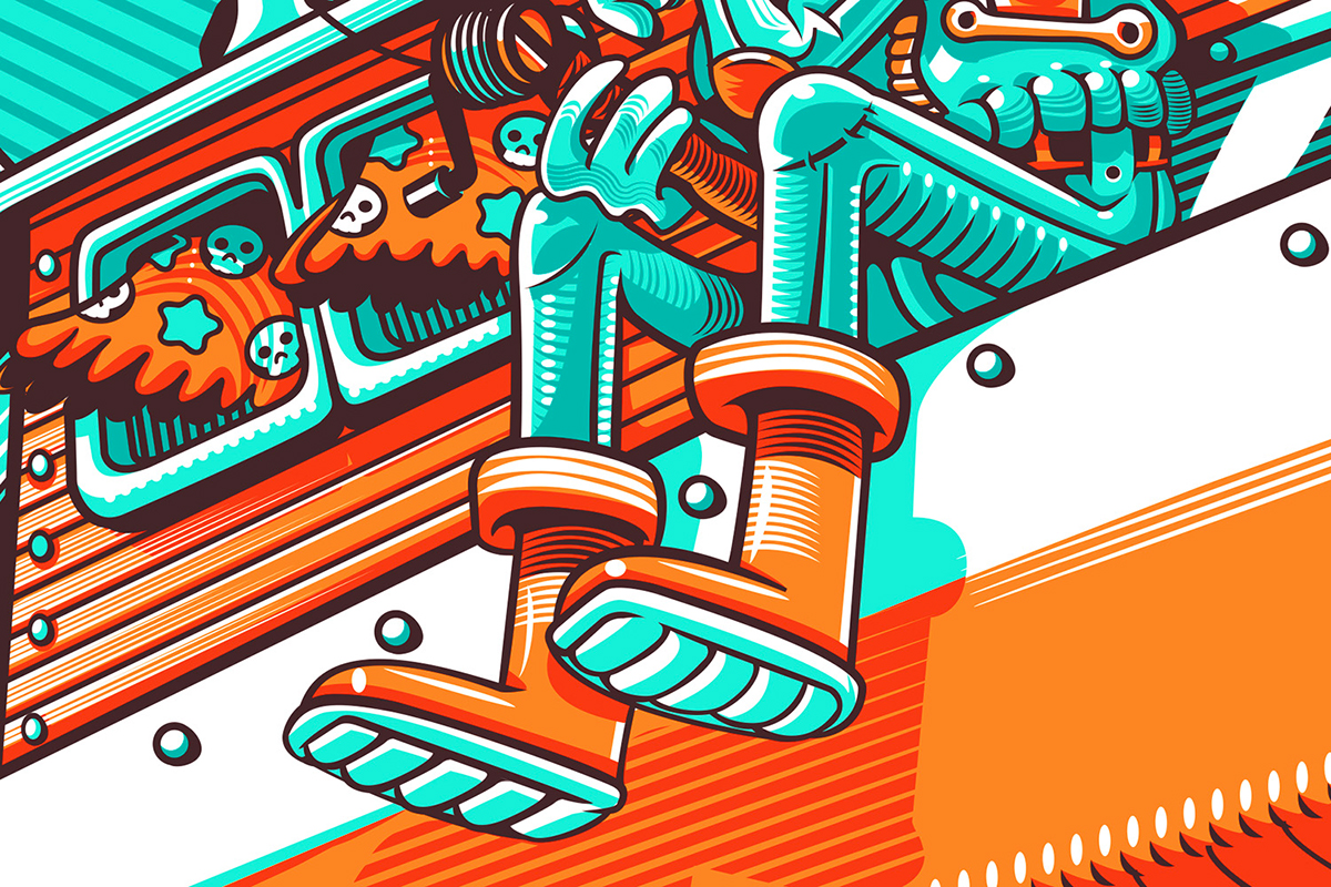
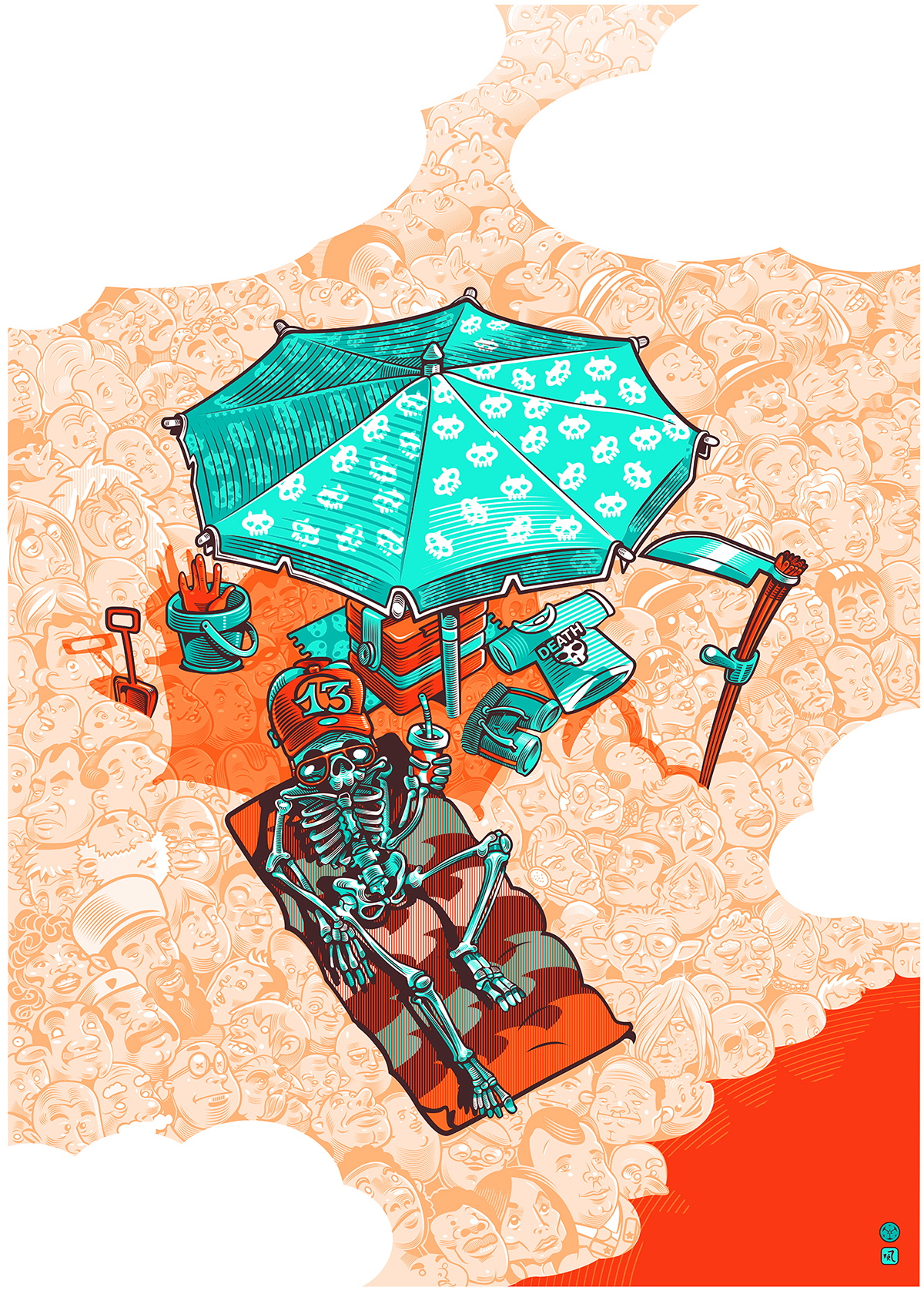
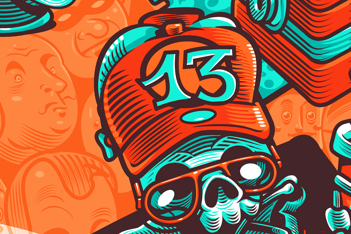
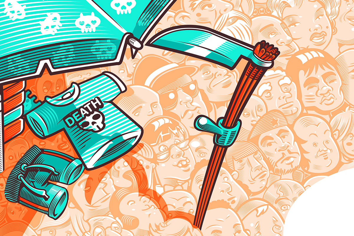
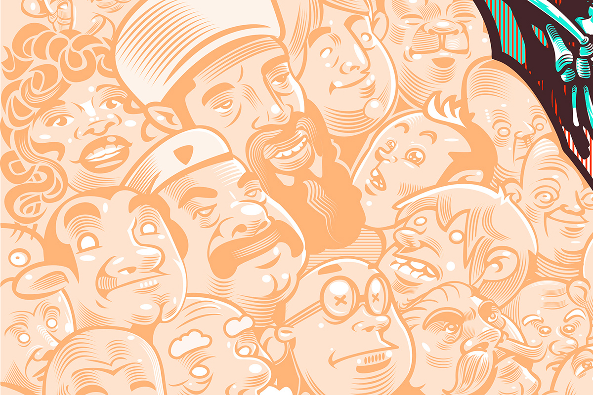
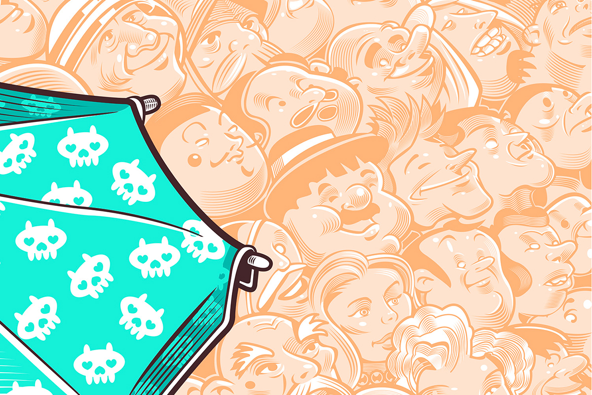
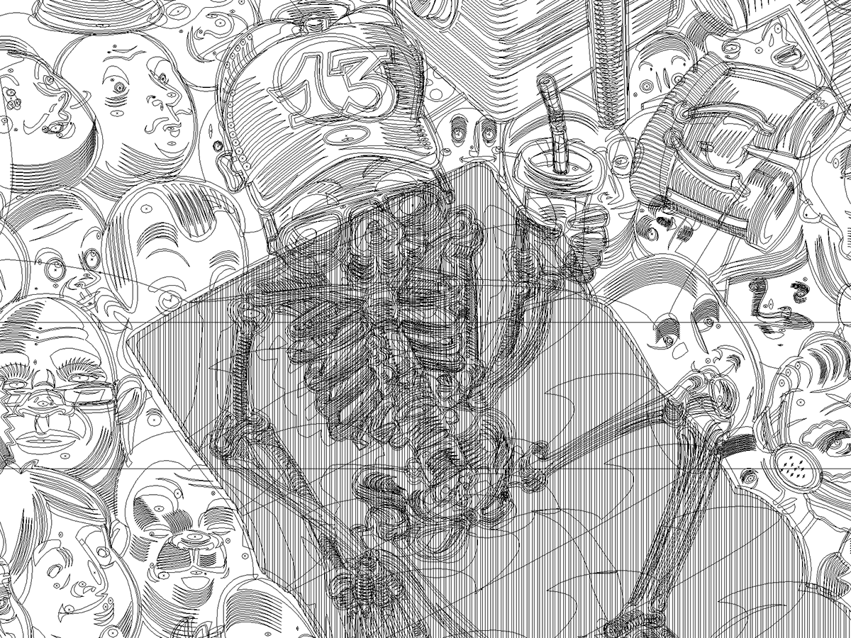
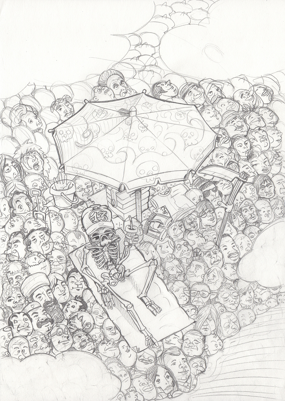
Death on the Beach
68 x48 cm - 28”x18”
Limited Edition of: 50 prints
Limited Edition of: 50 prints
The main character of this artwork is Death. In this artwork he is represented on the beach during his holidays. The illustration, full of symbolism, can be interpreted in many different ways. The subject seems to be the inevitable destiny of human beings rather their genre, fame, religion, origins … The illustration expresses its illusive nature by the paradox for which there are a lot of characters but only Death is alive. The subject is really serious, almost lugubrious, but it is designed by the artist in contrast with chosen of colors and the figurative technique. The result is a sharp irony and a positive suggestion to fight taboo, exorcise death and finally to live.
Some details of the illustration

Vector Structure

Pencil Rough
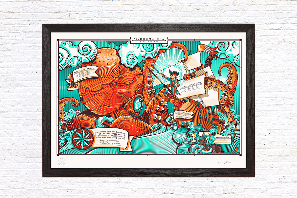
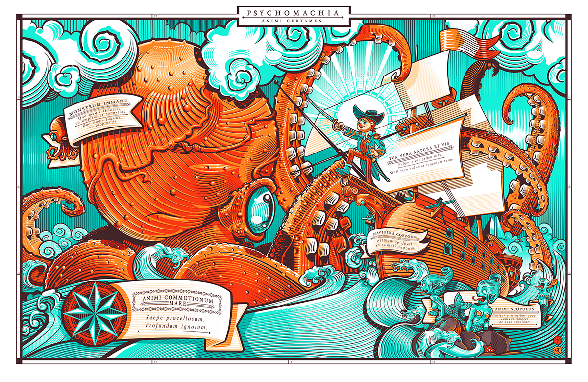
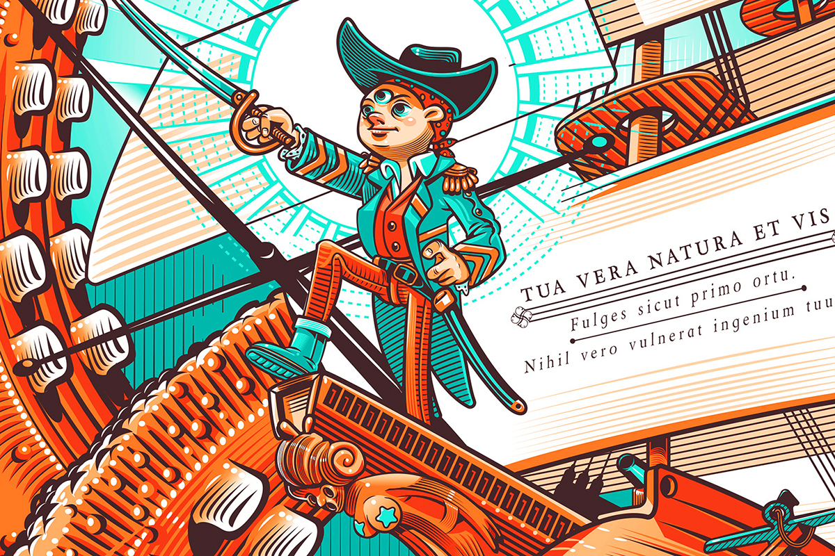
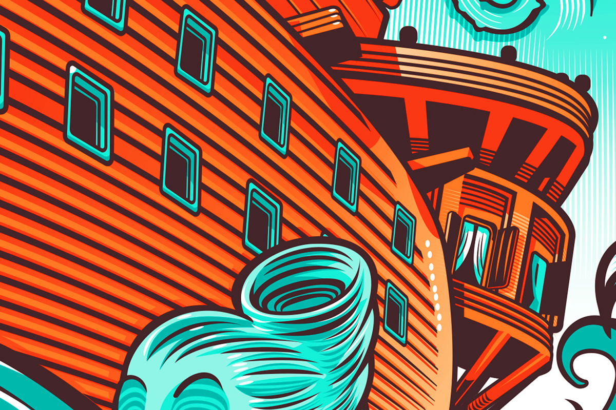
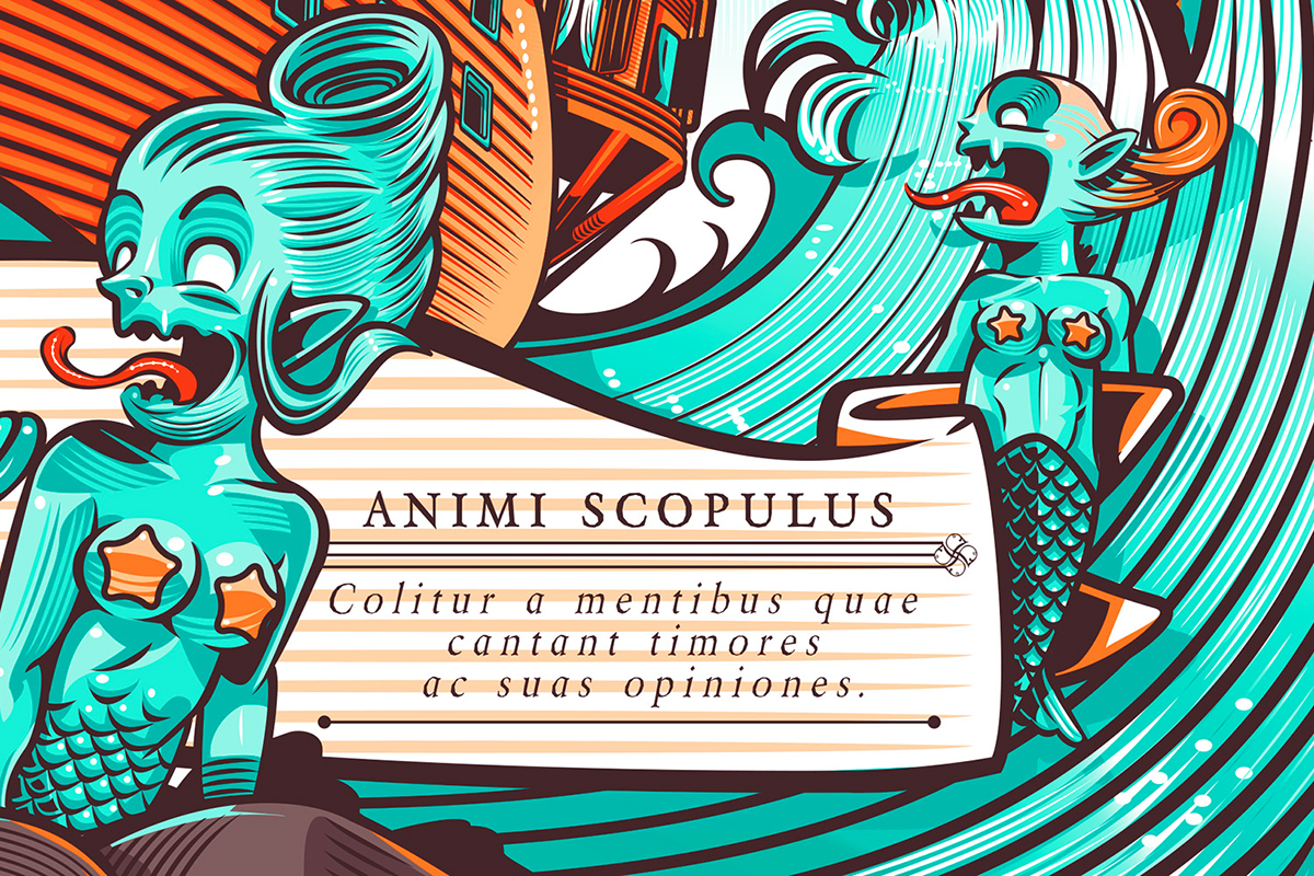
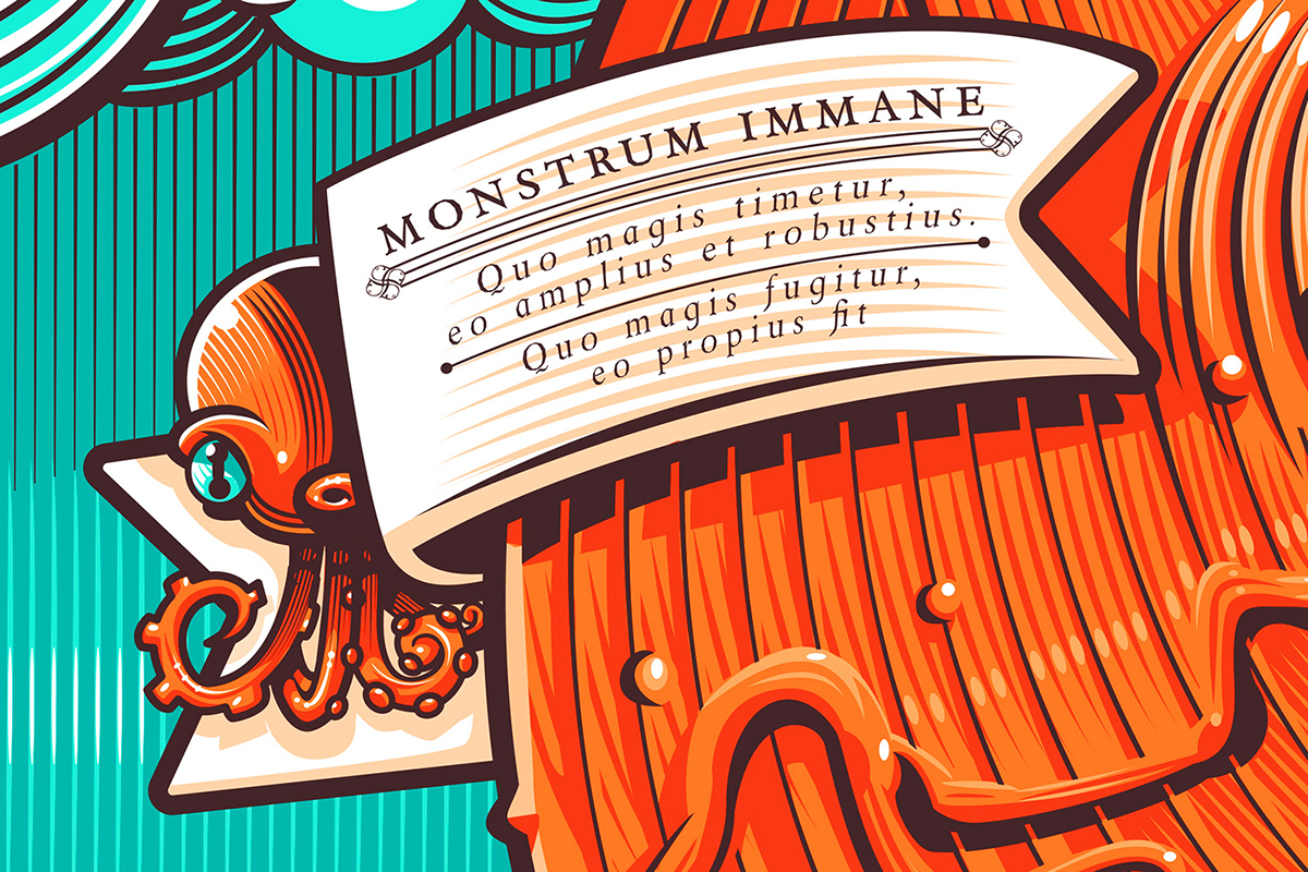
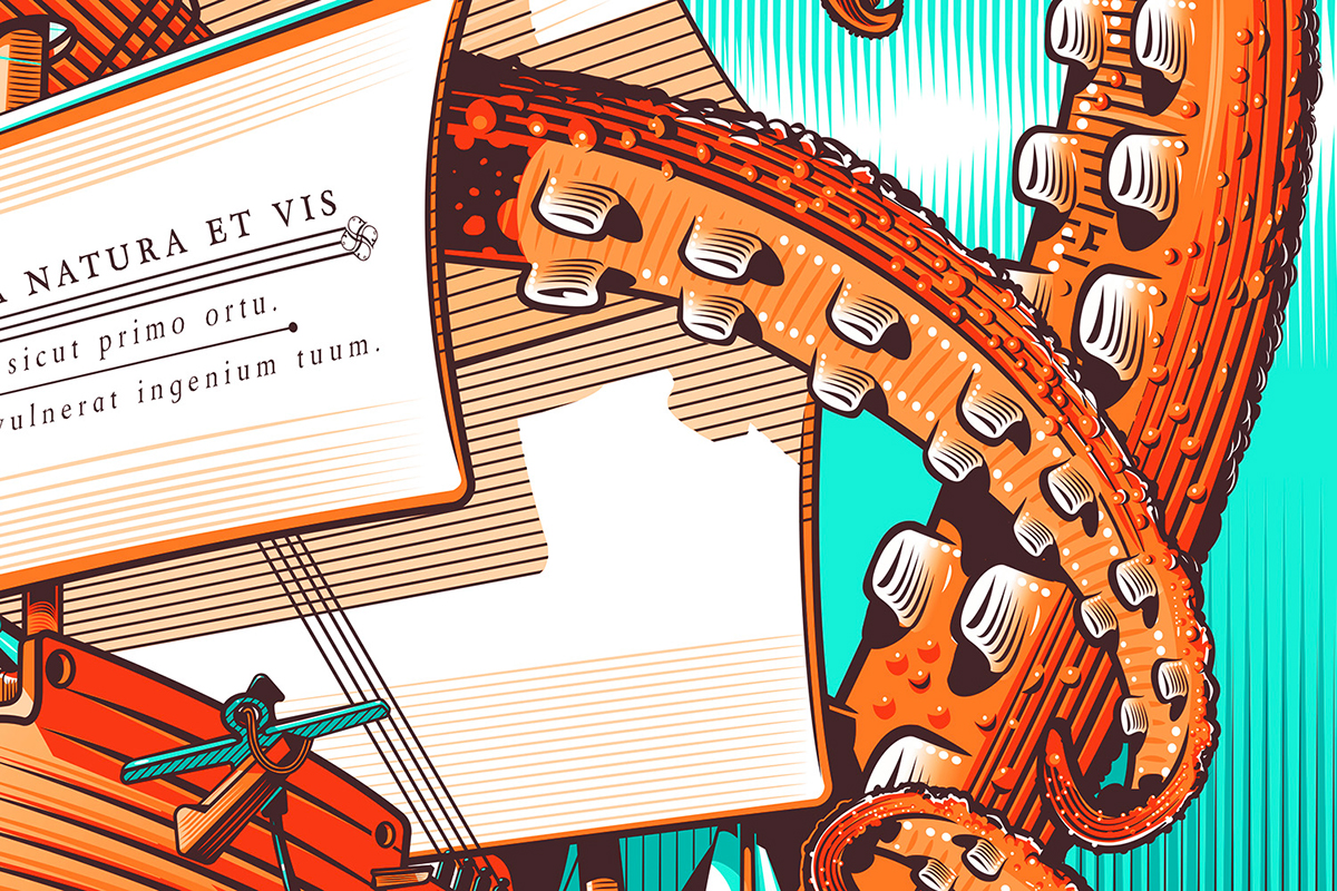
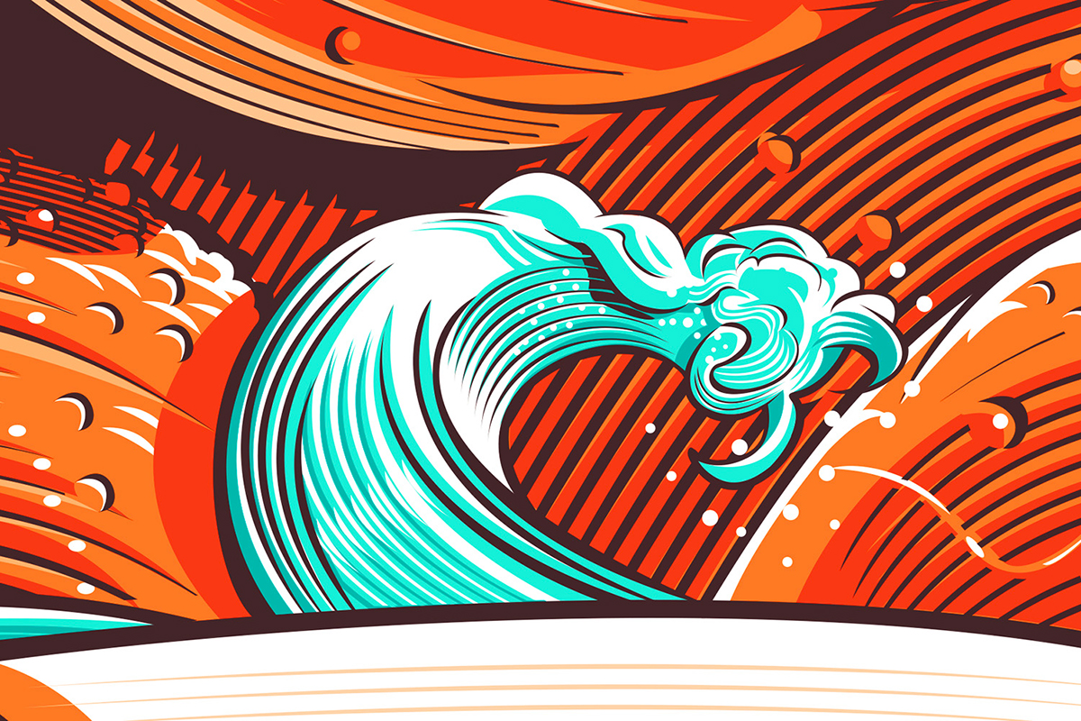
Psychomachia
68 x48 cm - 28”x18”
Limited Edition of: 50 prints
Limited Edition of: 50 prints
The artwork represents the inner battle that we use to fight. A Latin cartouche is placed side by side to every single significant element to suggest its symbolic meaning. The sea of Emotions Its surface is often moved by a storm. We have no feeling about the presence of the sea bed. The huge creature It grows unchecked as long as we have fear in our hearts. It becomes bigger and more powerful. It emerges closer as long as we try to escape it. Capitan. The real me You are the effulgent, shine in form which you were created. Anything not genuine undermines your nature. The corporeal vessel The vessel is faithful. It drives you to the realm of shape. The psychic reef Mermaids bask in all their beauty on the rocks, never stopping to sing their fears.
Some details of the illustration

Vector Structure
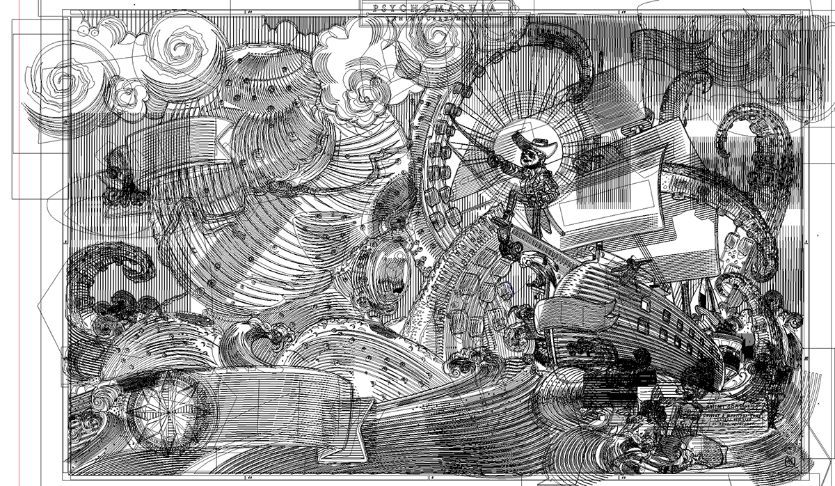
Pencil Rough
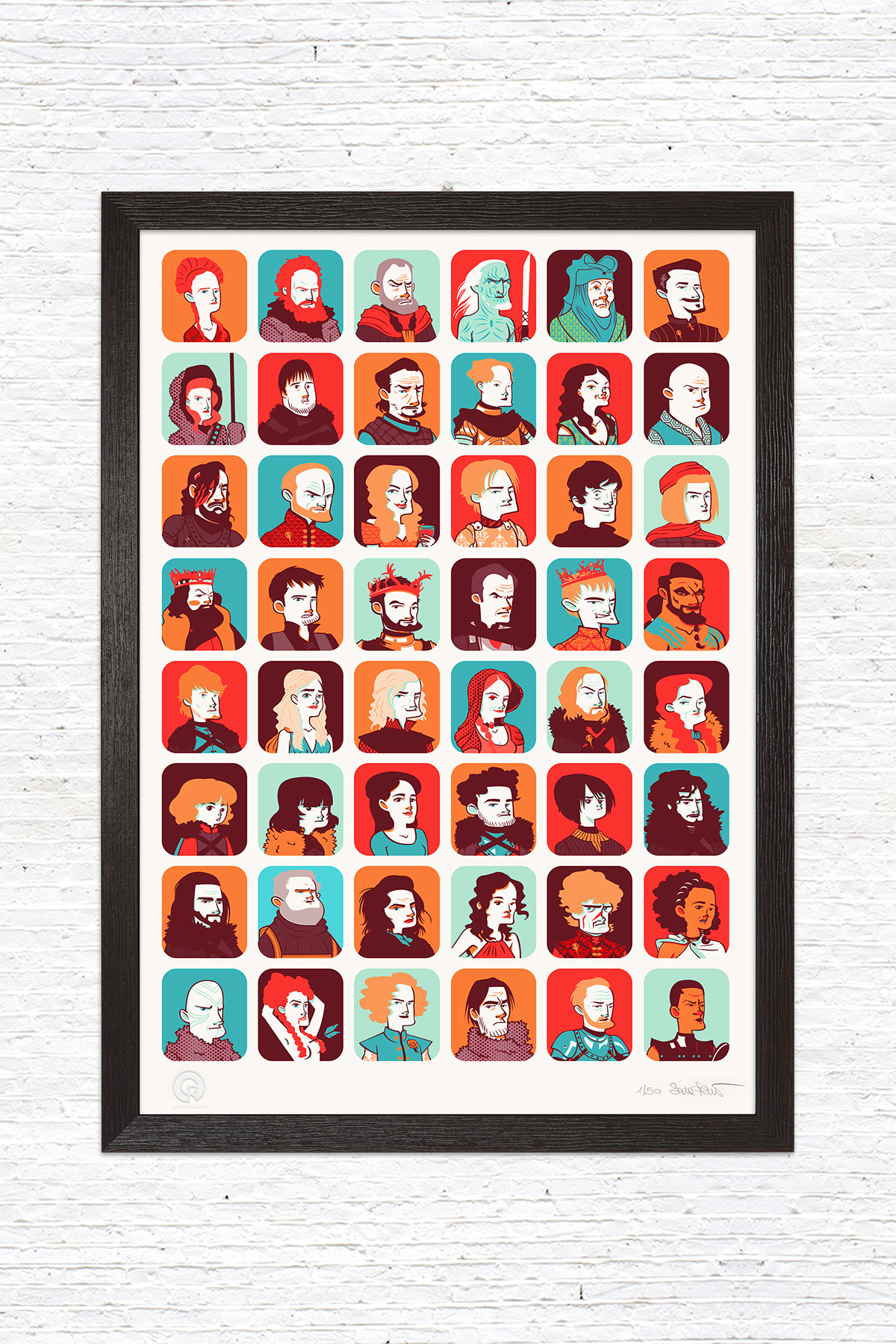
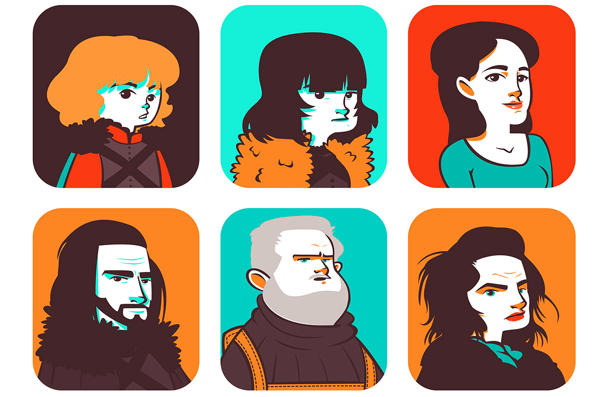
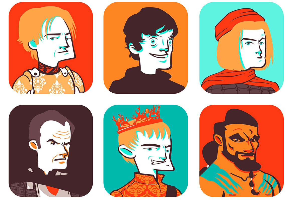
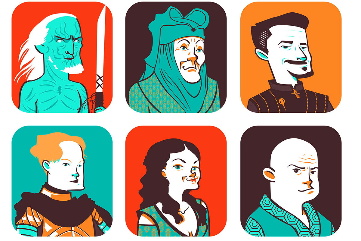
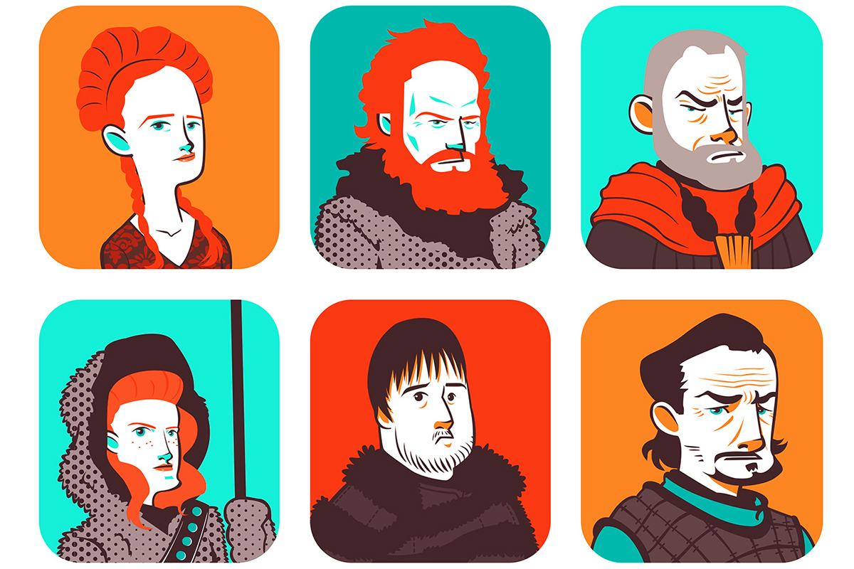
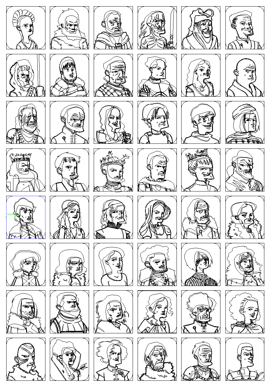
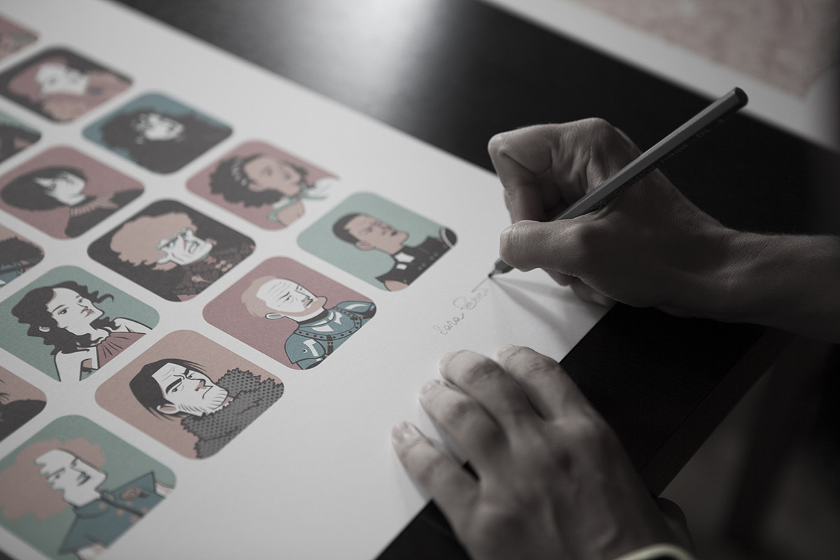
Game of Thrones Tribute
68 x48 cm - 28”x18”
Limited Edition of: 50 prints
Limited Edition of: 50 prints
With this tribute to Game of Thrones, Sara Penco expresses her skill as a portraitist, able to reproduce even 48 characters in a very small space and only with 5 colors. Their pose is the same, in particular is the one they should had in front of a medieval painter. Moreover their expression and some details tell something more about their personality. Fans will be happy to know that this artwork is relative of the first three series but there are more George Raymond Richard Martin’s adventures.
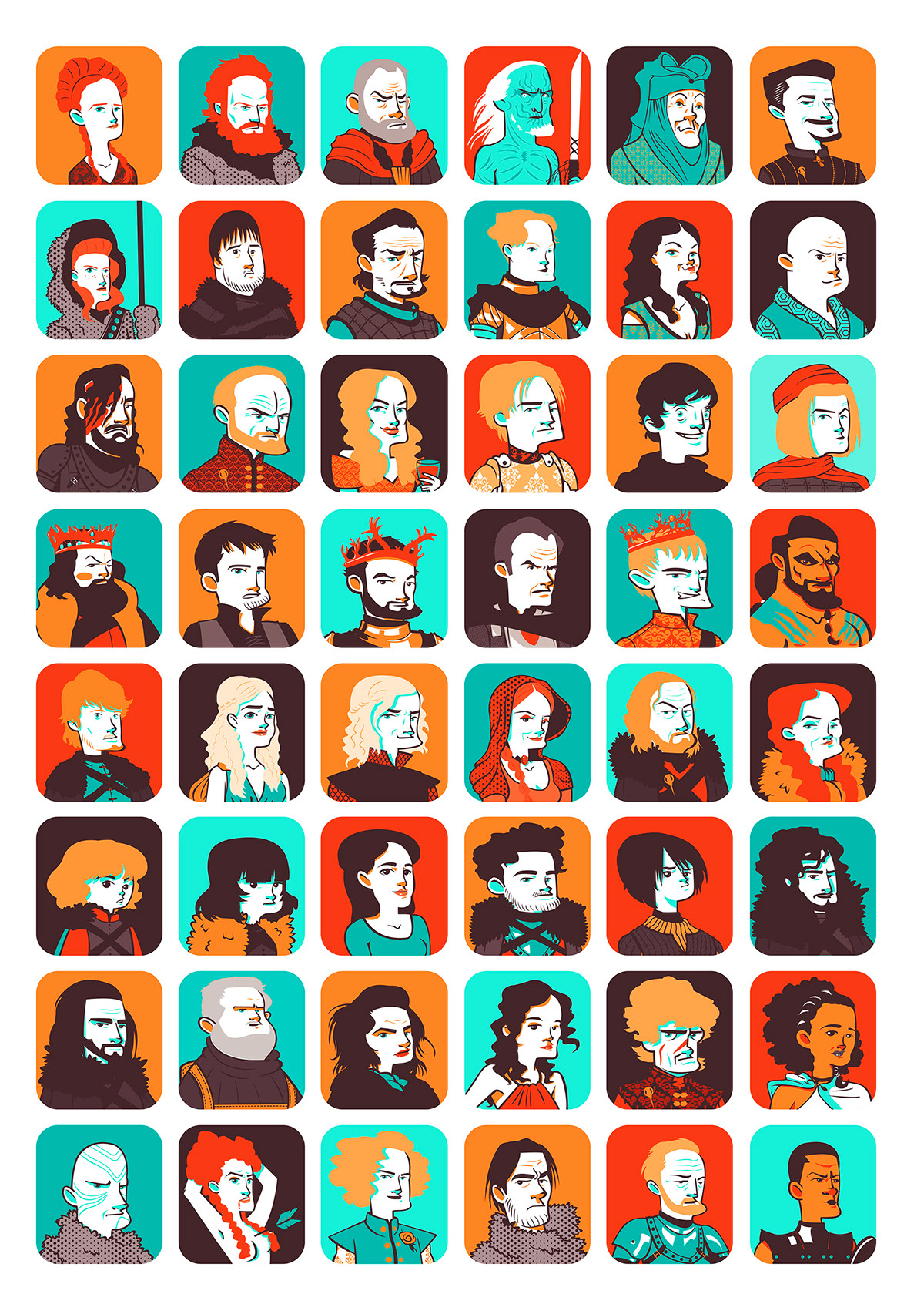
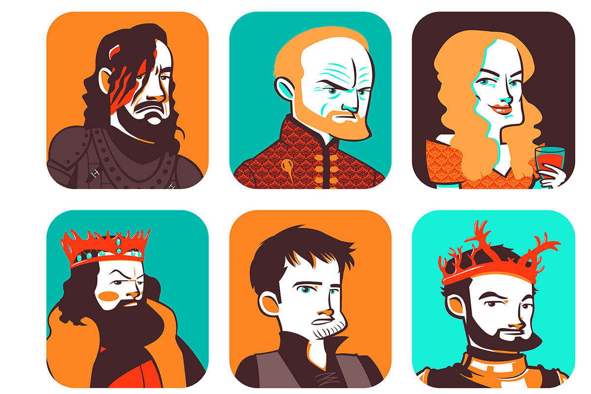
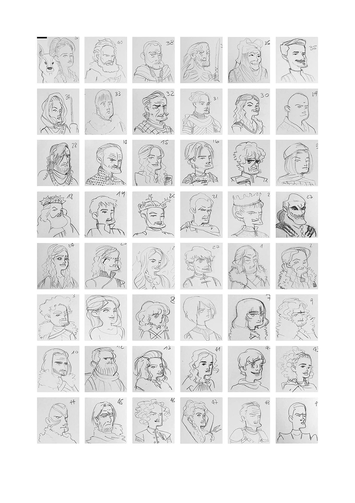
Some details of the illustration

Vector Structure
Pencil Rough
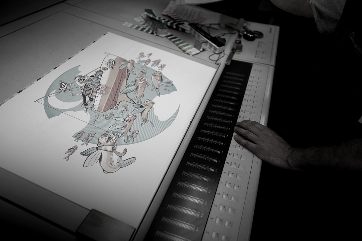
Speed Paint Process
Here below a Speed Paint video that shows the realization process
Print Process
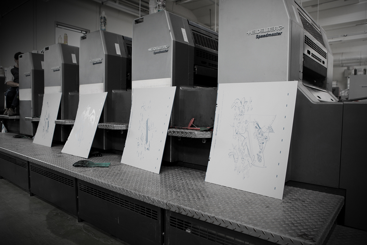
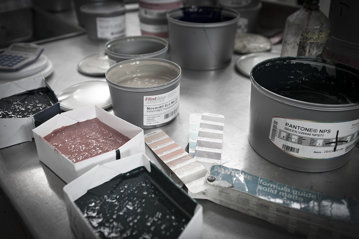
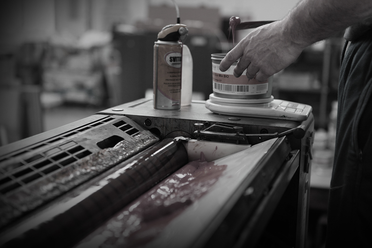
The project is designed in every aspect to obtain the best quality of line and color work.
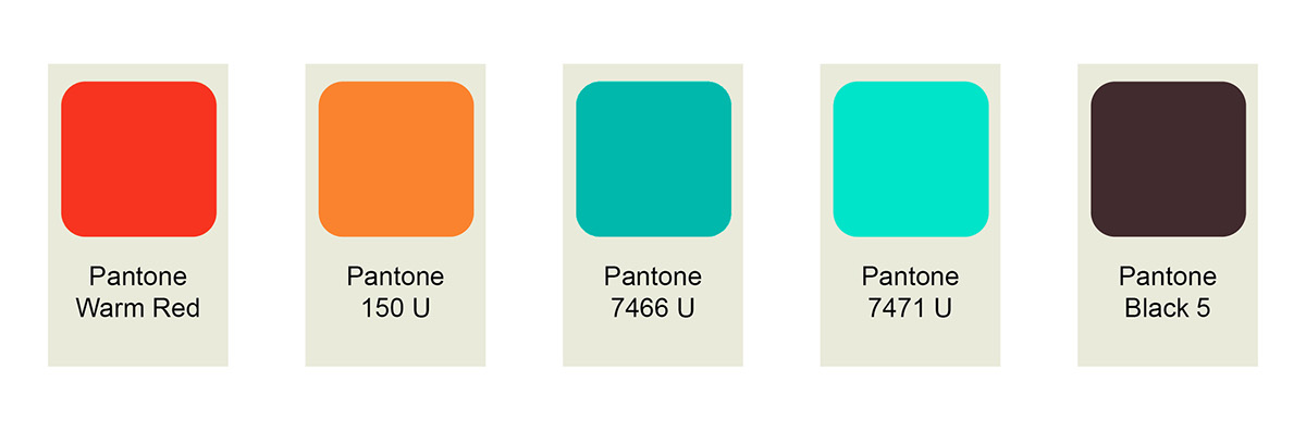
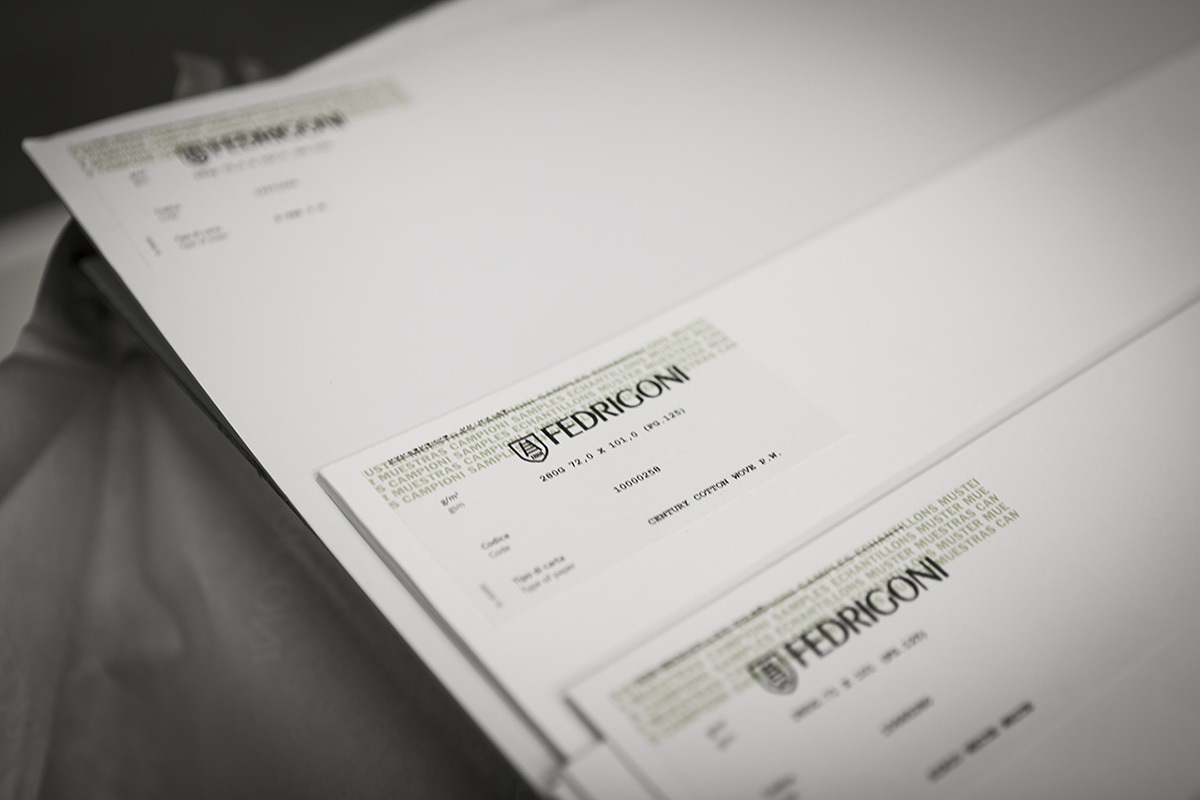
Gusto Robusto chose typographic printing (offset) with Pantone colors on Fedrigoni paper (48x68cm - 18"x28"). The colors used since the concept are predetermined and limited in order to correspond to the actual inks used in printing for the highest quality and yield.
These Pantone colors characterized the first Gusto Robusto’s edition.
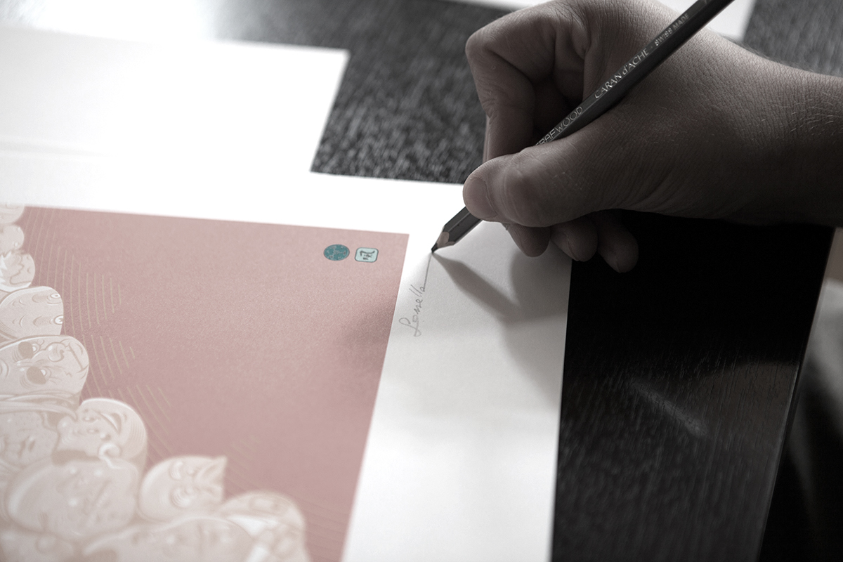
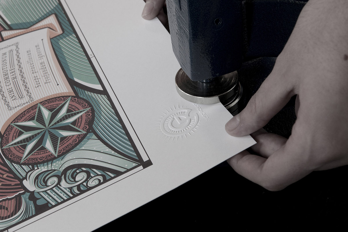
Signed, Embossed and Guaranteed
The artworks are printed in limited edition.
Each artwork is numbered, embossed with a punch (Gusto Robusto logo), originally signed and supplied with authenticity certificate signed by the artist too. Sheets used to print the artwork are kept in a safe place at Gusto Robusto to be sure that they will never be used again without authorization. A new generation of collectors will be interested in a limited edition artwork because it’s affordable but its value is destined to increase.
The more consolidated market of photography shows that a sold out print is revalued by 150% to nearly 900%.

All prints are available for sale on
you can also follow us on