

Logotype and visual identity development for Superbean, a soy milk coffee shop based in Hanoi, Vietnam

BRAND OVERVIEW
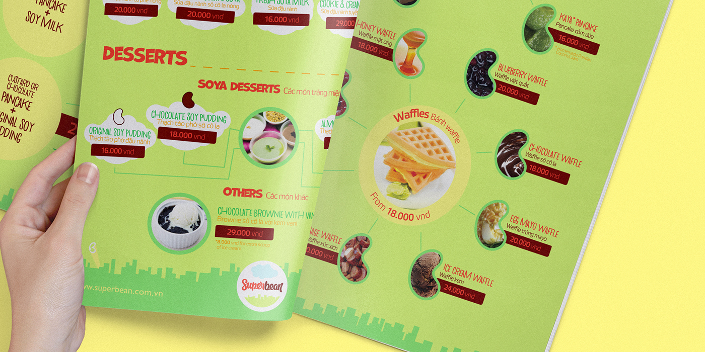
SuperBean is a new cafe franchise based in Hanoi, Vietnam. They serve all kind and tasty soy milk in different ways like Hot Coffee Soya, Hot Chocolate Soya or Ice Blended Cookie and Cream Soya; and their main food are waffles and pancakes with milk, blueberries, chocolate, kaya and more.
THE BRIEF
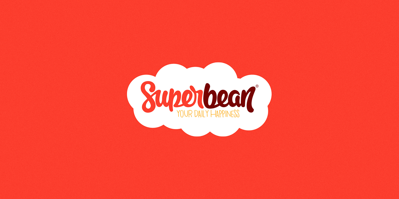
1. Revamp their old logotype with a fresh and renewed style.
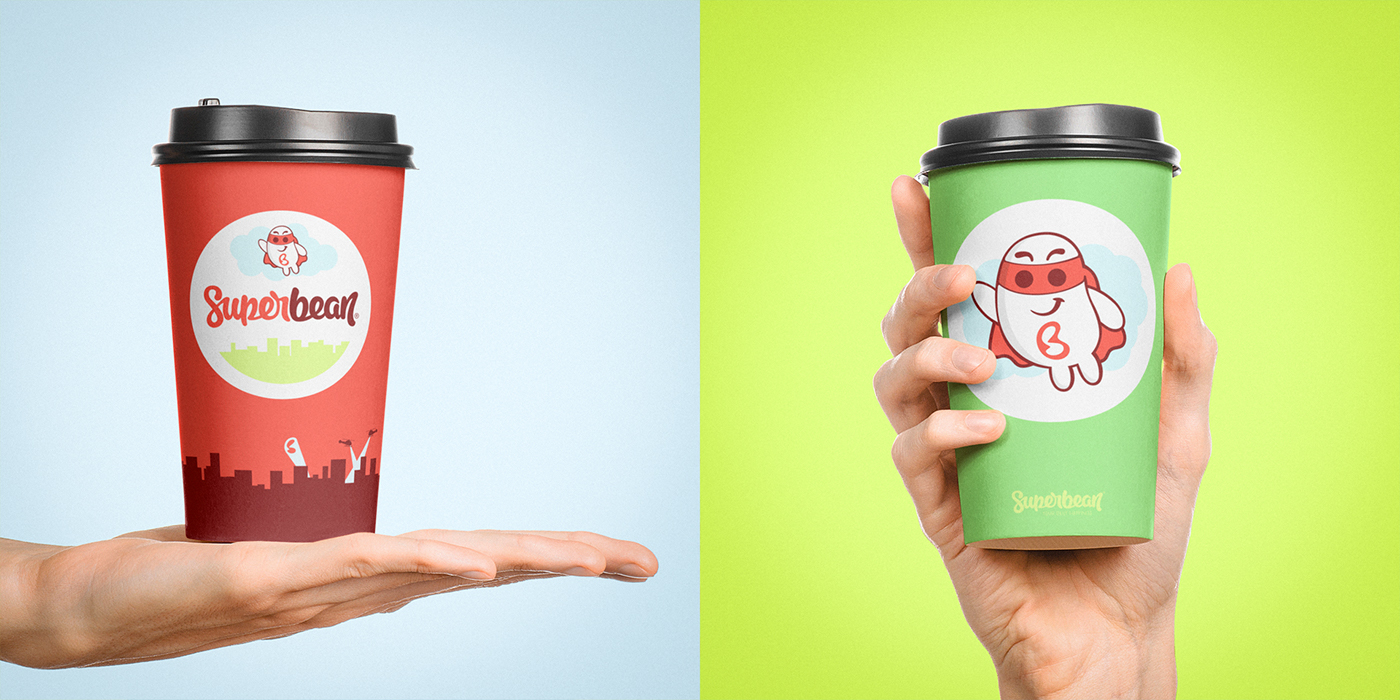
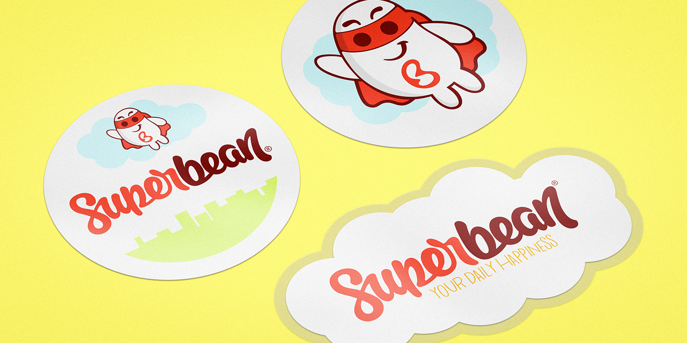
2. Rethink and redesign a new mascot, based in the bean shape.
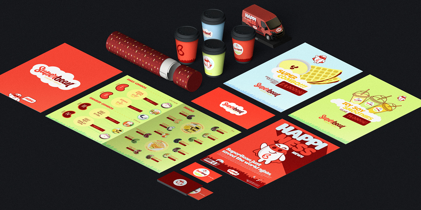
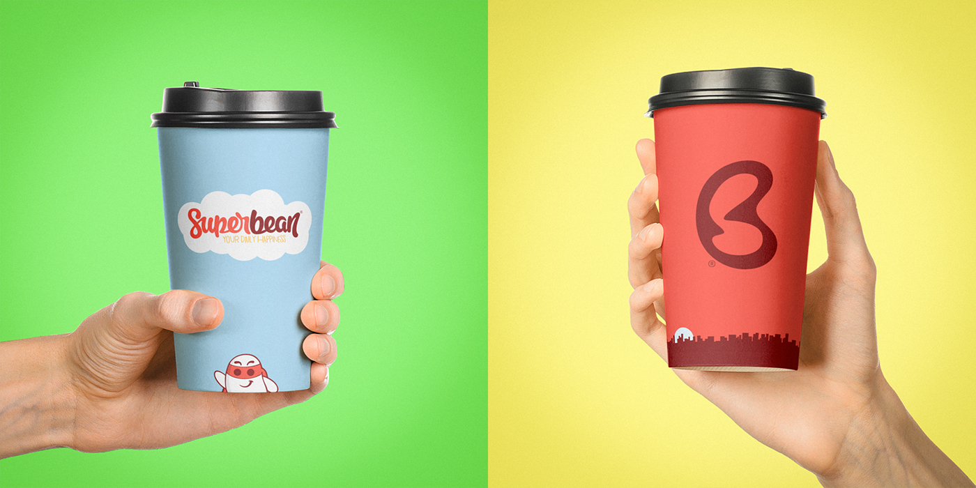
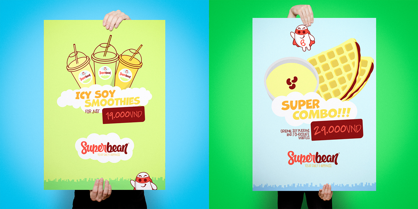
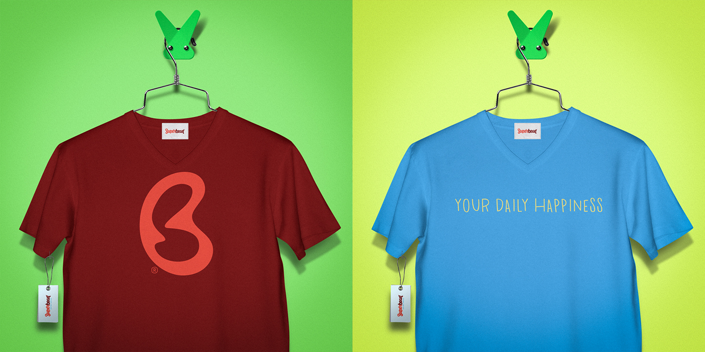
3. Create a visual identity system to be used in different kind of in-store items like boards, cups, menus and communication elements.
INSPIRATION & CONCEPT
Super Bean philosophy is based in bring something more than soy based-food and drink to the customers, it's about bringing a nice experience to the people, where optimism and happiness are all around the store.
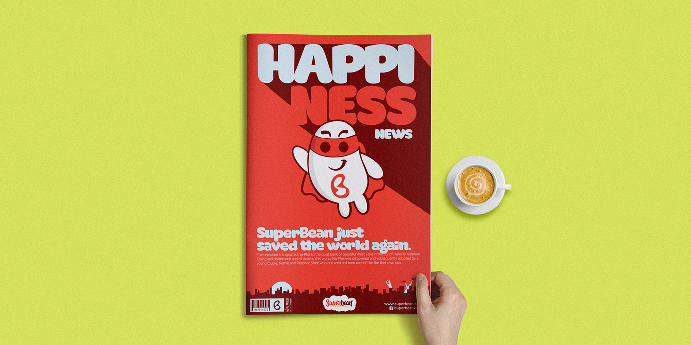
At the beginning, the company created a superhero mascot based on the shape of the main food and beverage ingredient of their products, the soybean. This super soybean character will be the one who bring (visually) happiness and optimism to the store customers.
MASCOT
The client asked to recreate their bean-shaped mascot, but in this new branding phase, the idea was to create a visually high-ended character with a group of concept inside: charisma, friendship and happiness. This special superhero is not about a rough and powerful hero but a sweet and friendly one.


