
This portfolio is a case study of my improvements to the BC Ale Trail app as a UIUX designer.

PROBLEM STATEMENT
Prioritizing user needs
The top 10 search keywords for the existing website were all related to "beer". Although the monthly unique users were around 12,000, the bounce rate was as high as 61%. This means that many users who searched for "beer" and landed on the site quickly left because they couldn't find the information they were looking for.
Improving readability and usability
The existing app has low readability and visibility. For example, placing text on top of images or using text colors that are similar to the background. Additionally, there is low functional consistency. For example, buttons are placed in unexpected locations.
Redesigning UI/UX
The existing website has a long duration of stay until the beer factory shop page, but the most important beer factory shop page has a short duration of stay. This indicates that it is difficult for users to navigate to the shop and that the desired information is lacking on the shop page.
PROJECT GOAL
Making it easy to find beer factories and improving the understanding of beer factory information.
DESIGN PROCESS

1. DISCOVER PHASE
QUALITATIVE ANALYSIS
To conduct a qualitative analysis, I personally used the app and performed actions to accumulate points. During this process, I took notes on the areas I found challenging. I also checked the reviews on the Apple Store.

QUANTITATIVE ANALYSIS
Next, I conducted a quantitative analysis based on the web version of the same service. This included utilizing SimilarWeb for competitor research as well. Particularly interesting was the fact that a significant portion of the traffic to the BC Ale Trail was seeking information related to "beer." Furthermore, the number of new visitors was quite high compared to other competitors in terms of sessions and unique users. However, I noticed that the bounce rate and page views were low, which seemed like a missed opportunity.

DEFINE
USER PERSONAS
I created personas for BC Ale Trail using ChatGPT. I utilized ChatGPT to explain the service, the results of preliminary qualitative and quantitative analysis, and to create specific personas for BC Ale Trail.

IDEATE
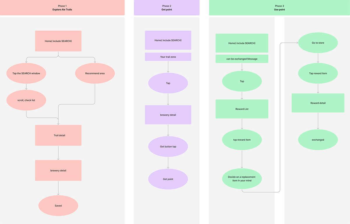
USER FLOW
I focused on creating user flows for the main tasks: "Exploring Beer Factory Trails", "Finding Beer Factories", "Collecting Points", and "Exchanging Points for Items".
DESIGN
WIREFRAME
Since improving UI/UX and prioritizing information display were crucial for this project, I created prototypes at the wireframe stage and continuously checked and refined them. I also hand-drew multiple iterations to carefully consider the order of displaying contents, and finally determined the optimal structure.


USABILITY TEST CASE DESIGN
I have created a list of cases and tasks for conducting actual usability tests, as well as developed a base for test cases. Additionally, I have prepared scenarios to facilitate smooth question-and-answer sessions during the tests.


SURVEY TEMPLATE
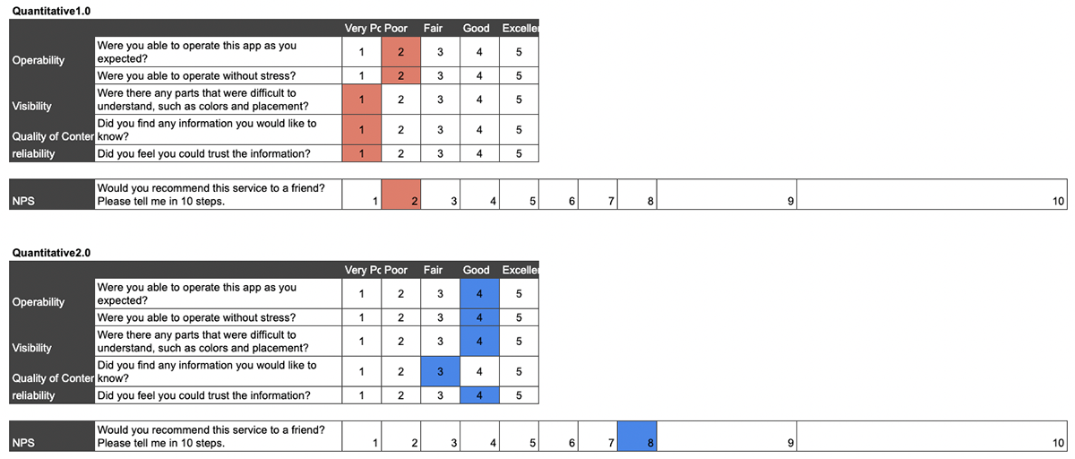
I have also created a questionnaire template to ask several questions after the tests. The template includes qualitative questions, quantitative questions (asking for scores), and a three-stage NPS (Net Promoter Score) assessment. The questionnaire covers both the existing app (version 1.0) and the new app (version 2.0).

I have also made efforts to facilitate observation by recording videos. By capturing videos, we can identify user actions and perceptions that were not anticipated and couldn't be captured through the questionnaire. Additionally, it allows us to measure specific interaction times accurately.

I conducted tests with 15 participants and was able to finalize the version with the third prototype, incorporating minor adjustments. Although the overall design may appear similar in the images, there were significant changes, such as the layout of the beer factory details page. Moreover, improvements were made to enhance usability, such as increasing the button size from 51x51 to 56x56 when buttons were prone to accidental tapping.


DESIGN
I am very satisfied with the final design. I believe that we were able to achieve significant UI/UX improvements without changing the colors, typography, imagery, and Illustrator used in the existing service. I have shared the actual prototype that I created at the bottom. Please feel free to try it out.

PROTOTYPE "Find" and "Get point" and USE POIINT


