


CLEANING ROCKS
Brand Identity & Packaging
Driven by the need to make something concrete for the environment and natural landscape, Stoked Studio and IKU Agency launched Cleaning Rocks. The project aims to gather people sharing the will to take care of nature with the common purpose of cleaning natural surroundings, such as mountains and beaches, from the waste left by man. Simple actions and many hands can turn negative footprints into positive ones.
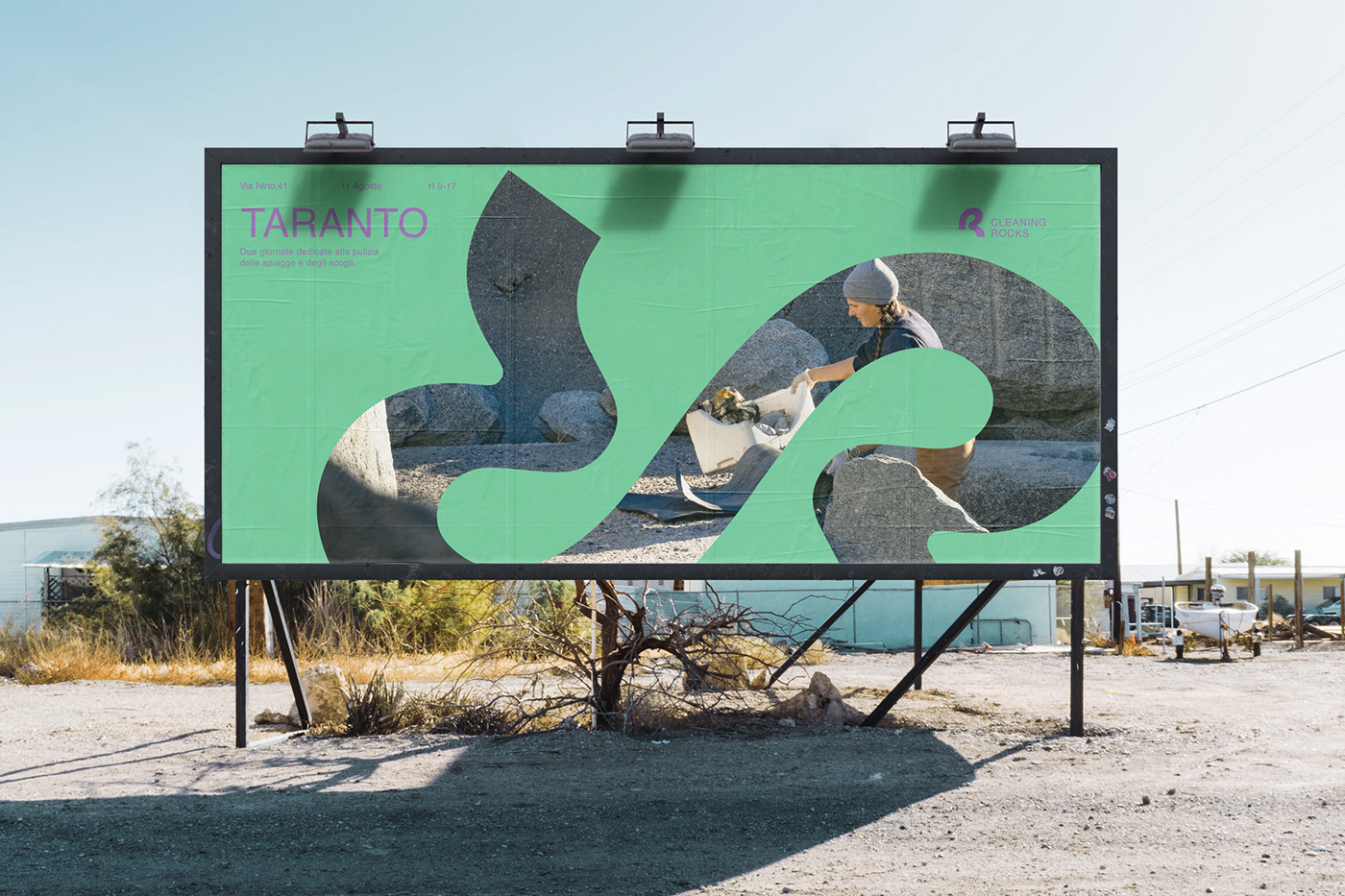
For Cleaning Rocks’ visual identity Drogheria Studio was prompted by the concept of trace as a physical gesture, and designed a sinuous and distinctive graphic mark recalling the act of cleaning which in turn reminds the letter R. In order to enhance the simplicity and immediacy of this sign, the typeface identified to complete the logo is assertive, essential, and neat.
For Cleaning Rocks’ visual identity Drogheria Studio was prompted by the concept of trace as a physical gesture, and designed a sinuous and distinctive graphic mark recalling the act of cleaning which in turn reminds the letter R. In order to enhance the simplicity and immediacy of this sign, the typeface identified to complete the logo is assertive, essential, and neat.
Cleaning Rocks’ visual campaign serves as a tool to encourage movement, engagement, and participation. For this purpose, it features a minimal and yet vibrant graphic layout that focuses the attention on the place and the city where the collective action will occur. By juxtaposing the color field with the photographic image across the shape of the logo’s graphic mark, the visual identity can be conveyed through various means and materials, such as posters, merchandising, and social media.


Thanks for watching!
follow us on instagram @drogheria_studio


