


GEONAV
With over 15 years of experience in the market, Geonav has established a strong reputation in the B2B sector, offering technological solutions that simplify people's lives. With a comprehensive portfolio, the company provides everything from cables and chargers to home automation products. Over the years, Geonav has stood out for delivering innovative products and services that make people's daily lives easier and foster a better relationship with technology.

CHALLENGE
Geonav aims to expand its operations and establish a direct relationship with the end consumer (B2C). To achieve this goal, it is crucial to deepen the understanding of the peripherals segment, comprehending the functional and emotional benefits of the products and services offered. Operating in a highly competitive and constantly evolving market, it was necessary to reposition itself by redesigning its identity and incorporating distinctive elements that generate differentiation and prominence.
The name was originally defined due to its connection with georeferencing and GPS navigation, referencing the company's initial product offerings. However, this association may create a perception that is distant from what Geonav currently strives for: to be recognized as a brand of innovative and future-oriented technological products. Considering the imminent shift in positioning and visual identity, changing the name would bring a significant branding challenge, potentially impacting the established relationships with partners and investors.
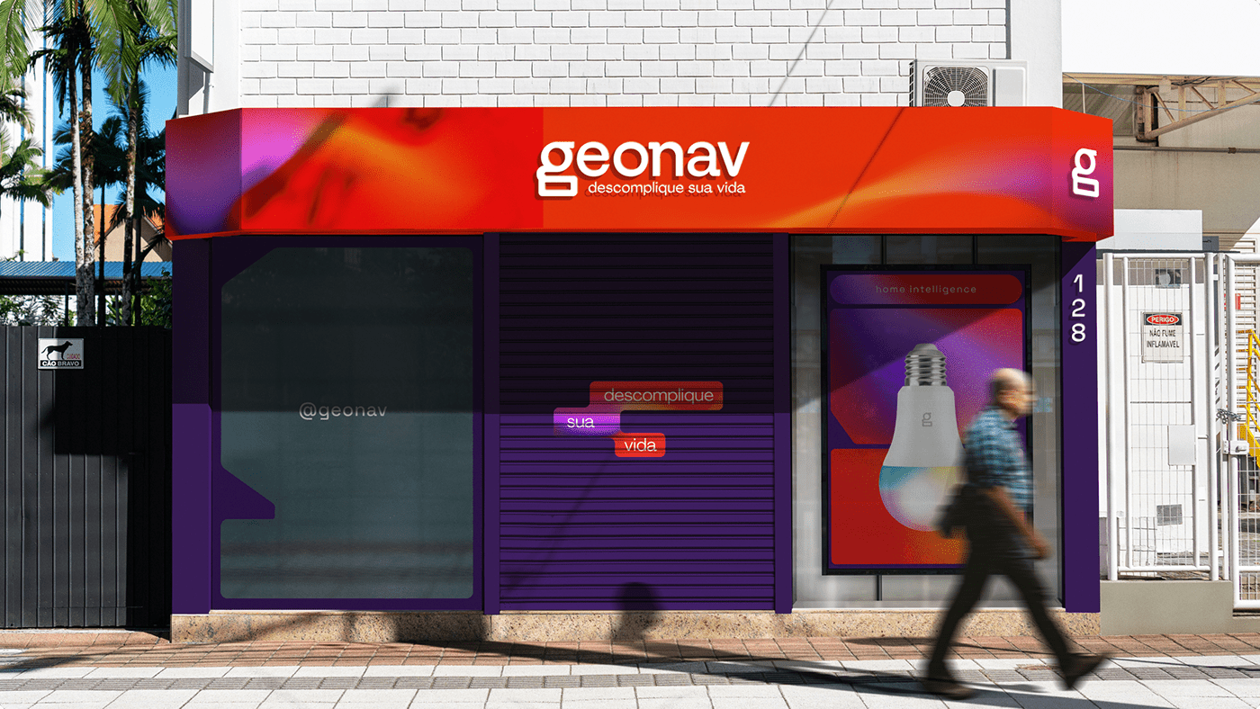
OUTCOME
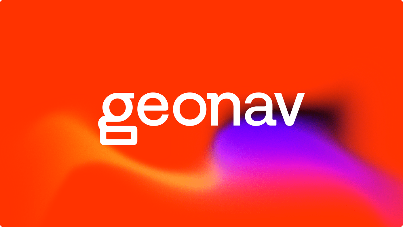
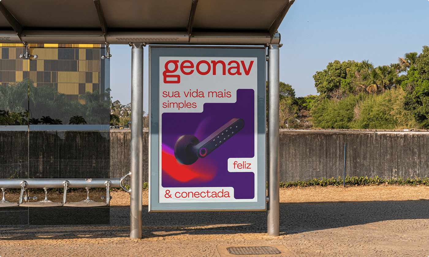
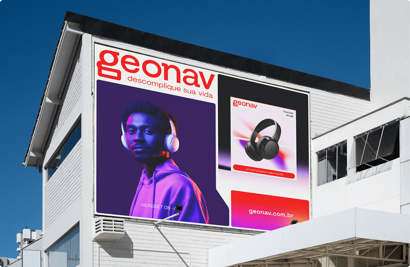
With the care to preserve the history of a brand with over 15 years, Geonav's new visual identity reinforces and revitalizes the anchor of its identity, the color orange. We have increased its intensity, making it brighter and more vibrant. Additionally, new colors have been added to the palette, including shades of purple, which, combined with other colors, create organic and nebulous shapes, highlighting the brand's magical and fun DNA, bringing authenticity to the new visual identity.
The logo, present in all products, requires careful redesign. Seeking to incorporate key visual elements from the technology universe, we drew inspiration from the characteristic serifs of monospaced typography, bringing a tech personality to the logo - particularly noticeable in the "n" and "a" characters. In the scaled-down version of the brand, the "g" takes on a prominent role, representing technology at its core and, in an abstract manner, establishing a connection with Geonav's main asset: people.
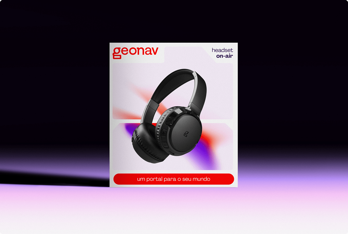
The various shapes of connectors and integrated circuits served as inspiration for the creation of modules that contribute to the visual composition of the brand, facilitating the expansion of the identity beyond the logo. Additionally, the layout system was designed taking into account the packaging design, as Geonav has a portfolio of over 200 products in different sizes. Ensuring consistency in the main touchpoint of the brand, which is the packaging, is essential.


Credits
Agency:
Brand Strategy: Edgard Vidal, Daniel Brandão, Matheus Silva
Brand Design & Motion: Felipe Souza
Geonav
Rafael Assa, Salvador Assa, Juliana Vasques, Kim Hellbrugge, Beatriz Costa, Pedro Nogueira, Camily Maia, Renata Zavitsanos, Angelo Cesar, Rafaell Miranda
-


