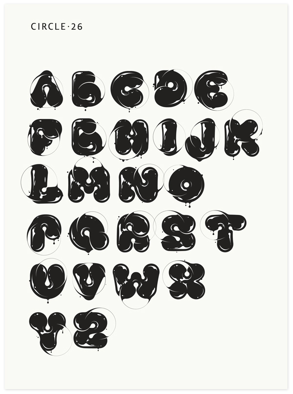
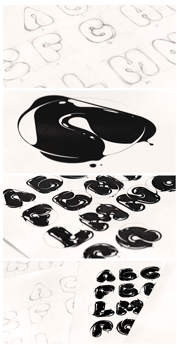
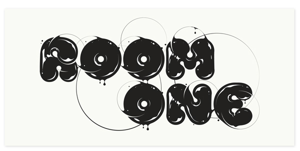
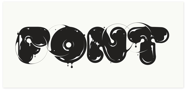
CIRCLE.26
My latest font has this contrast between the curvy shapes of the letters and the thinness
of the line that cuts them. This has also the purpose of balancing the font's glassy texture,
completing its semblance.
of the line that cuts them. This has also the purpose of balancing the font's glassy texture,
completing its semblance.