As I did several drawings over the Summer, I wanted to step up my game and try shading. Most of my own colored images looked flat with minor highlights here and there and wanted to make an improvement. As I looked through images in an old sketch book, I felt compelled to redraw an image and practice with different colors and brushes to better improve my skills.

This sketch of Strider Hiryu was made back in 2010. I made several sketches of the character during this time. Character design features that caught my attention were his wild hairstyle and focused yet serious eyes.


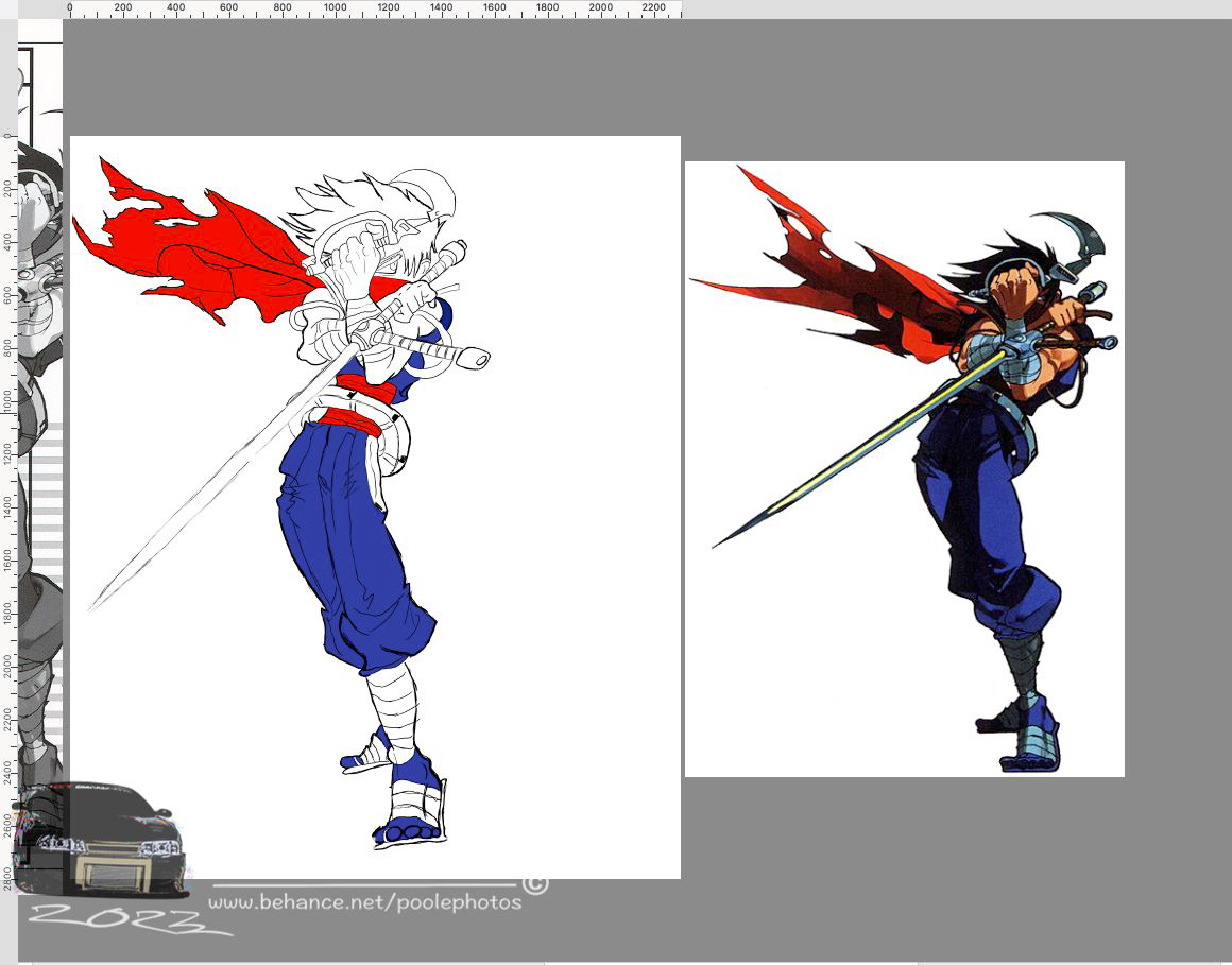
Original illustration by Harumaru. Strider Hiryu ©CAPCOM ©MOTO KIKAKU
This illustration in particular is my most favorite of Strider Hiryu. His stance and shielding his face with his weapons looks lethal and imposing.
The original illustration was done by Harumaru a former illustrator of Capcom. She worked on most of the key and promotional illustrations for Strider Hiryu 2 and did illustrations for many other Capcom games.

With reference images in place, I drew a rough sketch with simple shapes to further define some areas.

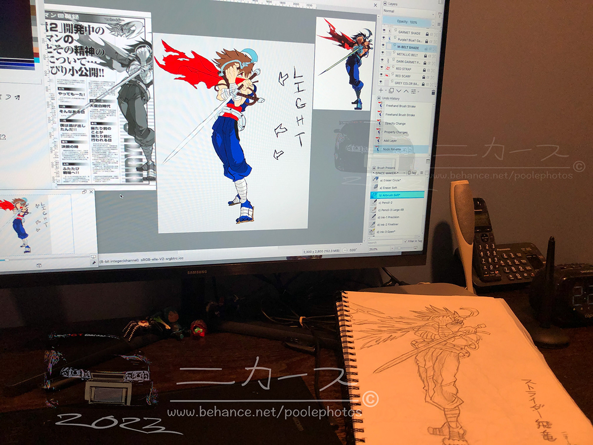
Once I was satisfied with the preliminary col-erase sketch, I drew the outline with the G-Pen brush. I erased extra lines while still retaining the rough sketch aesthetic I like.

The new sketch appears to be an overall improvement of the original so far.
I'll be dead honest.
I am terrible when it comes to choosing or picking colors. Using color charts and wheels helps a bit until I change my mind and pick something else.
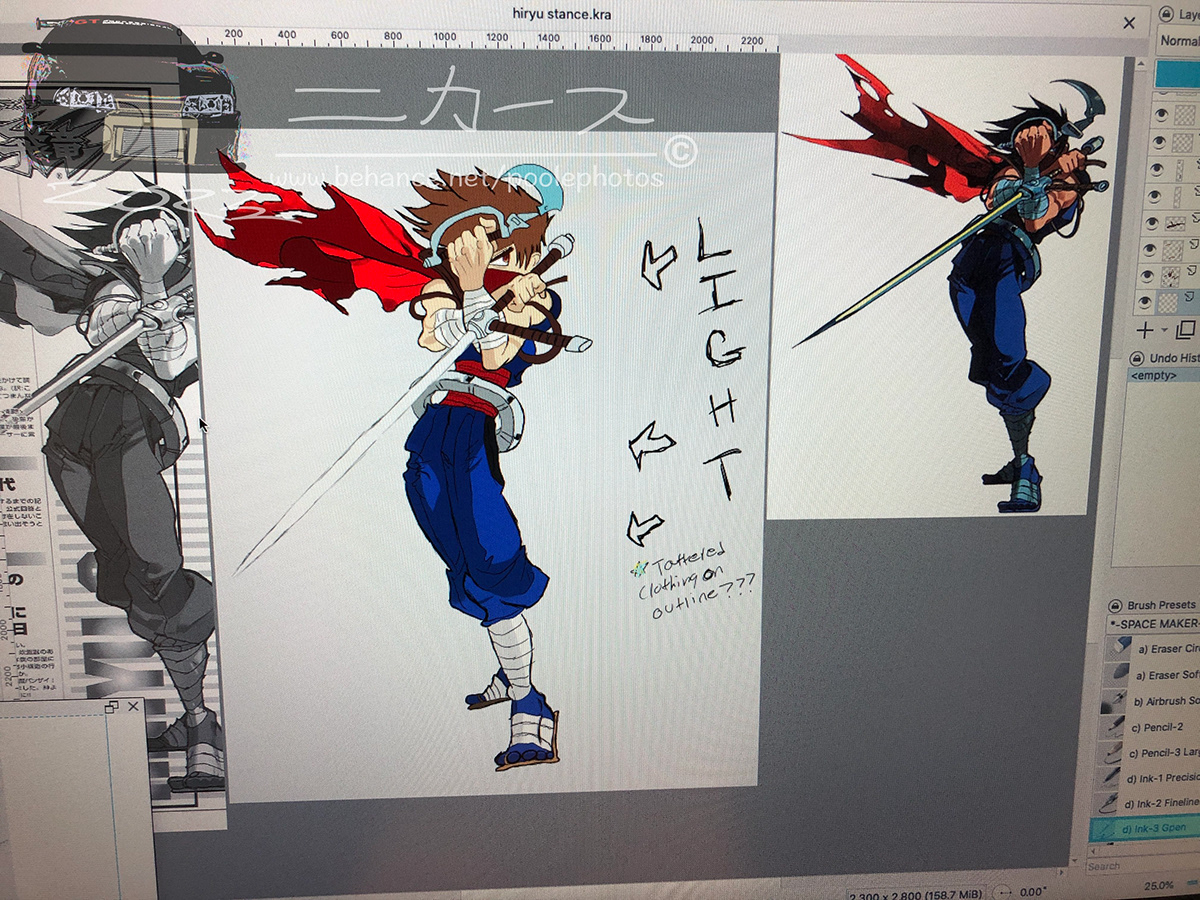
Using the color sample tool, I went with colors based off of the original illustration. Some adjustments to the hue and value of the color were made in some areas to either closely match the original or update it a bit to my liking.
After the flat base colors were in place, I then focused on my biggest challenge: shading.
Using the black and white image as a reference, I tried my best to copy the flow of the lines for shading. The Airbrush tool was used at first but later went back over with the G-Pen tool to make the lines appear sharp and consistent. Switching tools made a more satisfying result. Darker colors were made using the base color then lighted by lowering the opacity to make the shaded area.


Airbrush was still used gingerly in some areas like the flowing tattered scarf and eye coloration.


I mostly did highlights on Hiryu's weapons. His Climb Sickle being a prominent example.
Additional details were added or left from the outline as an intentional artistic choice. Examples include:

Sketchy lines from the outline give off a rough yet aggressive style for Hiryu's imposing appearance.

Another artistic detail I wanted to try was glitter or pretty sparkles. This was placed on Hiryu's weapon of choice the Cypher (or Falchion in other sources). This was done by using the WaterC Special Splats brush in varying shades of red. This is coupled with the Sparkles brush to top off that glittery touch.
With Hiryu fully colored, it was time to move on to the background art.
I'll be honest with you again.
I've never been all too good at drawing backgrounds. They are usually lines filled with color and little detail. For this approach, I used the Gradient tool to make a sky or space like backdrop. Added a small light blue gradient as some sort of floor line or horizon.

After looking through images of deep space nebula, I felt compelled to do a starscape backdrop. I used the Starfield brush to fill the backdrop with dozens of tiny little stars. I even went as far as adding different colors of blue and pink to widen the color spectrum of stars.

The WaterC Special Splats brush was used to develop a star cluster. The overall design was inspired by the V shaped saddle patches of orca whales. Added additional colors of purple and blue to highlight with color. Small amount of Cloud stamps and Sparkles finished things off.
After all that, I didn't feel satisfied at all. Felt that the background was too dark and didn't highlight Hiryu's line and color features. So I started a new layer and went back to the thing I dread: picking colors.
While looking through a song list to play while color picking, I stumbled upon a youtube thumbnail link with a striking color scheme that I had to replicate. The result is this:

Using the Gradient tool, I flip flopped between different shades of blue and red to get a good spectrum of three colors. Orientating the gradient line diagonally looked more dynamic and refreshing than a horizontal layout.

Went back to my tool assets and rebuilt the ever dazzling starfield. Went with the usual white color scheme for the stars so they could stand out. Also added back the clouds as a floor line. Slightly giving off more of a dreamscape no?

Used the Texture Splats brush to make smaller star clusters. Made the orca saddle patch star cluster a bit bigger with Sparkles scattered around to seal the deal. Applied opacity to some starfields to make some distance between other clusters.

I was much more satisfied with this new backdrop. Not only it was more colorful, it would also better show the outline and shading for the main subject Strider Hiryu.
According to Krita, 14 hours was calculated in the editing of the illustration. Here is the final result:

Hiryu stands out much better with the vibrant star filled backdrop. The heavy sketchy lines and color detail can been seen. The sparkling details of his Cypher can also be seen. My favorite touch of the overall image is the shading of his tattered scarf.
What did I take from 14 hours of steady work with constant edits of my outline, color selection and reviewing both official and fan made images?
Using my favorite video game image to study and learn how shading works on skin, fabric and metal objects. I feel that the methods I used satisfied the overall objective.
But an artist is never satisfied as improvements can always be made.
Improvements for my methods for the next image would be to use different shades of color without the use of opacity. Try vector lines to bolden my outlines while retaining some sketchy features. Study more backdrops to make an overall theme for the final image.
In comparison with my previous sketch, I see this as a great improvement of my current drawing skills.


What does your critical artistic eye see? Do you see things that could be improved or adjusted in future illustrations? I am welcome to constructive criticism to better improve my art in future projects.
Thank you for visiting!


