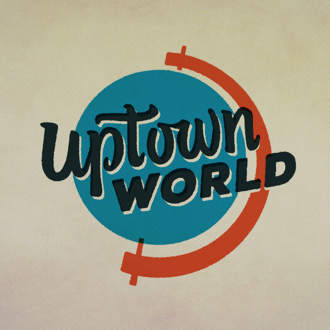
This hand lettered 1950s signage inspired logo for an architectural tour in Uptown Phoenix draws inspiration from iconic neon signs in the area. If it looks vaguely famliar, it should!
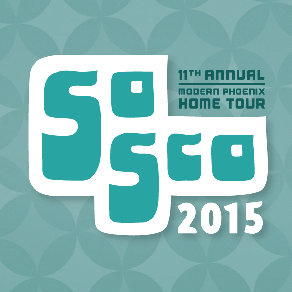
Hand lettered treatment for a 1960s themed home tour in South Scottsdale aka SoSco.
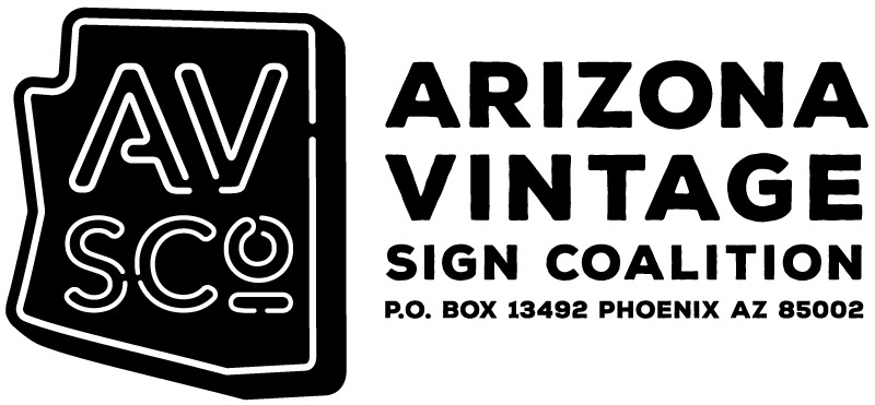
The Arizona VIntage Sign Coalition brand was shortened to the more pronounceable AVSCo, winking at the famous neon sign company in town called Yesco. The tubular lettering is based on Avenir and the supplemental type is Nexa Rust, chosen for its geometrically precise forms yet gently weathered edges.
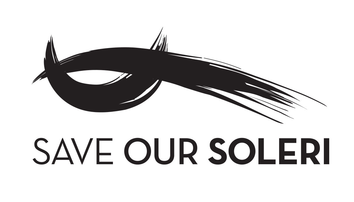
Designed for a website and campaign to save the Paolo Soleri Amphitheater in Albuquerque from demolition. The intersecting arches are taken directly from the architecture of the apse-shaped performance space. It doubles as a hawk's head, with a watchful eye on the school that threatened development. The typography gets progessively bolder, representing voices raising stronger as a chant. The campaign was effective; the building still stands.

We wanted this logo to hearken back to the WPA era and resemble a government seal. The hero image, Quebedeax Chevrolet on Grand Avenue, pops out of the conservative frame and zooms forward into the future. The deco-style typography with its unusual capital N and rounded W is similar to that used at Executive Towers.
Bowling Alley culture was the inspiration behind this breezy retro logo.
They Synergy Committee at the Art Institute of Phoenix is responsible for facilitating interaction among students, faculty and staff, both in the school and in the greater community. Rockwell font was softened to create a more humanist appearance that matches the intersecting symbols of mind, body, and spirit.

Inspired by the typography used in the old Western Savings brand, this logo uses the font OUTAGE that has been modified with semi-slab serifs which alternately weave through the tops and bottoms of some letters. The mis-registration and dark cyan ink is in keeping with the 1962 newspaper theme.
Logo for a neighborhood association in Uptown Phoenix. The monumental Courtesy Chevrolet sign on Camelback Road, which is the gateway to the Canal North neighborhood, was appropriated to create a giant blue arrow pointing north, across a canal.
What's funkier than avocado green? Though typically associated with the 1970s, it actually burst on the scene in appliances and decor in the late 60s. The Avant Garde font evokes the early 70s as the new geometric sans on the scene. The white block is the ubiquitous square-in-square screen block by Superlite. Many have asked me of the shape's origin, and it is definitely a far eastern motif that was borrowed by westerners at midcentury. In Brazil, they call it Quadrata! No matter what you call it, it's fun to find the shape everywhere in Phoenix's environment. They symbol has become associated with the midcentury modern preservation movement in Arizona.


