

The Story
Atlant Creations is an ambitious group that comes up with the fire of a new venture idea to establish their burning desire. It is a complete solution for an event/wedding.
Atlant strives to provide comprehensive solutions for all wedding and corporate event needs ranging from photography, stage decoration, food and catering, tour package and travel solutions.
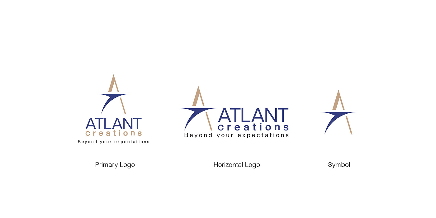
Taking a closer look at the brand identity, their association with the brand name is similar to the word Atlantic Ocean. This is no coincidence, it was created from the idea of demonstrating the spirit of a great service provider. The blue colour of the logo conveys the meaning of trust and loyalty, while the gold colour signifies success, prosperity and luxury. The logo icon was created to represent the first letter of the brand name, and it has an arrow symbol towards the centre, which is a representation of the compass, meaning that the brand acts as a navigator for clients in its respective industry.
Here I am showing the complete workflow for your reference.
I hope you are enjoying it.
Primary Logo
The primary logo is the original version of the brand identity. It will be used everywhere instead of the brand name. That means the primary logo is the face of the brand.

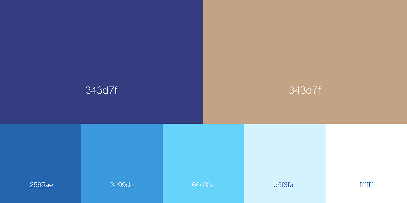
Substitute Logo Colours
The substitute logo colors used in the context of the original logo colors may not work on a specific color background.


Logo Concept
Every logo has a concept that will always be whispering the mission and vision of the brand.
In this logo, I was trying to create to represent the first letter of the brand name, and it has an arrow symbol towards the centre, which is a representation of the compass, meaning that the brand acts as a navigator for clients in its respective industry.


I hope you enjoyed it and got something from it.
FEEL FREE TO CONNECT
Instagram: https://www.instagram.com/riyasnazeer01/


