PT-BR
O Instituto Nacional de Telecomunicações - Inatel - é um centro de excelência em Ensino, Pesquisa, Desenvolvimento e Inovação de tecnologias globais. Foi a primeira instituição de ensino do país a oferecer um curso superior de Engenharia tendo as telecomunicações como foco.
O Instituto Nacional de Telecomunicações - Inatel - é um centro de excelência em Ensino, Pesquisa, Desenvolvimento e Inovação de tecnologias globais. Foi a primeira instituição de ensino do país a oferecer um curso superior de Engenharia tendo as telecomunicações como foco.
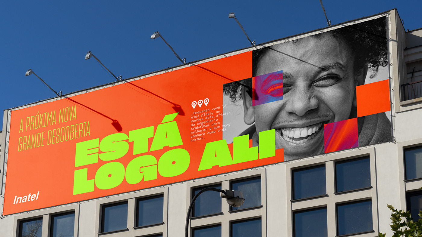
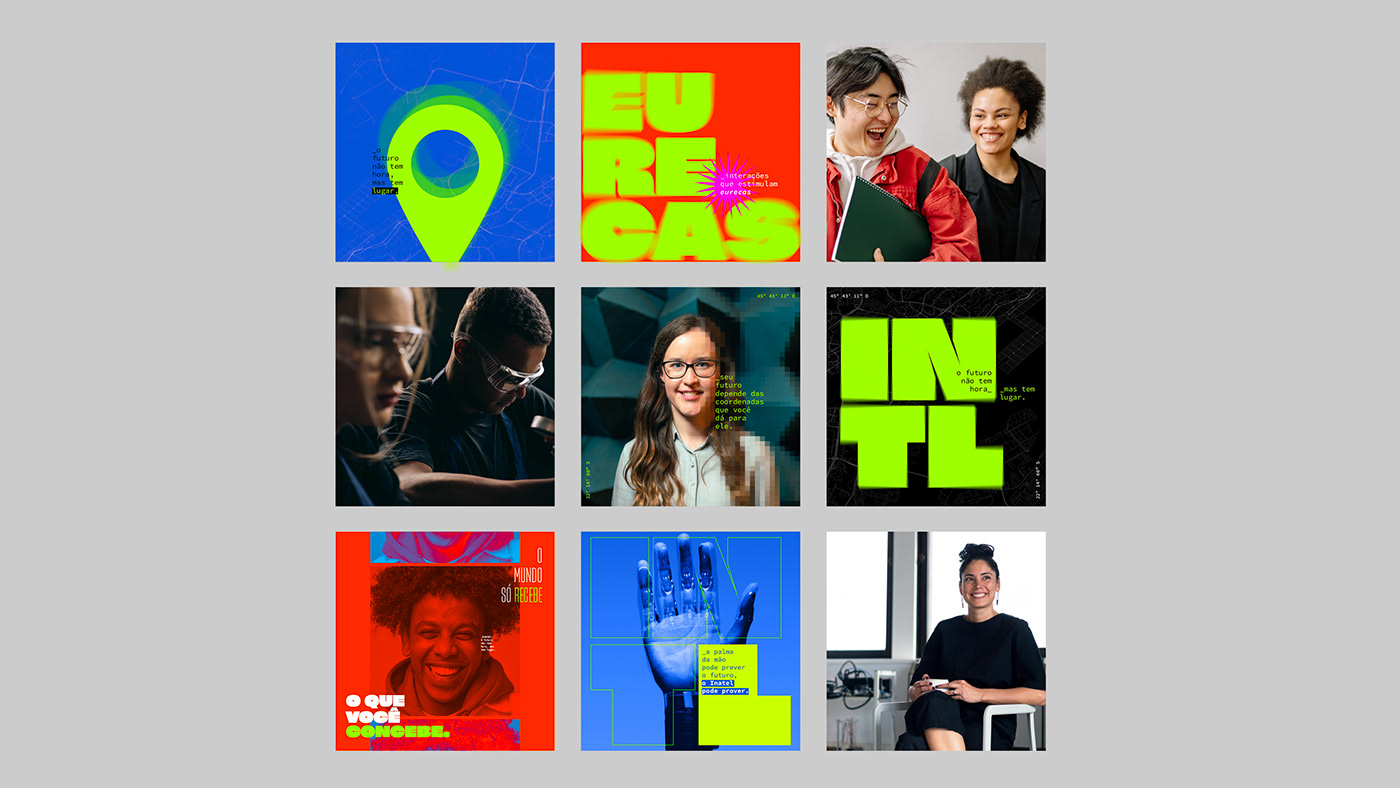
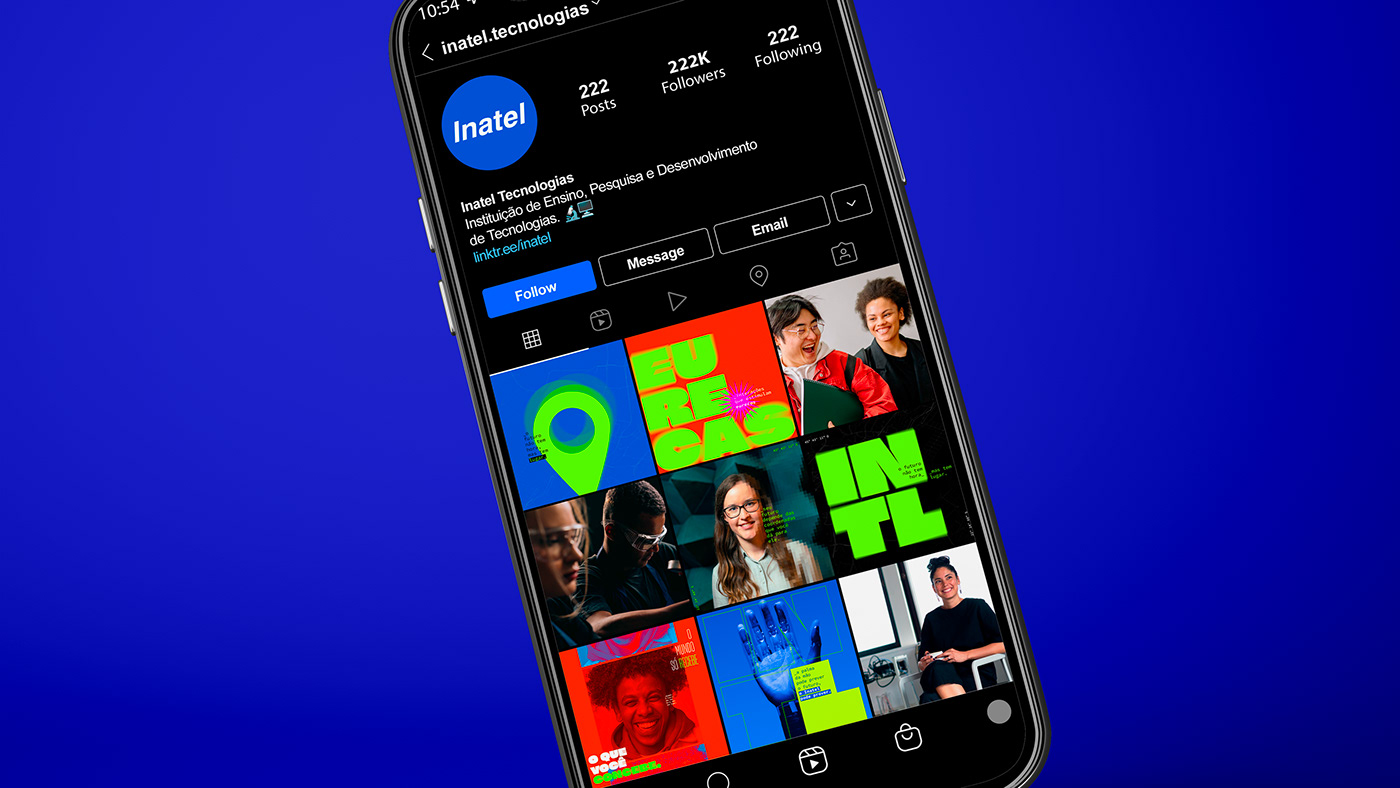
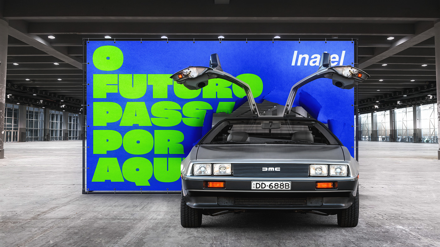
Com uma marca consolidada desde 1965, nosso desafio era renovar a identidade visual sem alterar o logo, seguindo a premissa estratégica de reposicionamento da marca que busca fazer a Engenharia ser mais desejada e vista como uma profissão que vai além das exatas. Ela é, acima de tudo, criativa e revolucionária.
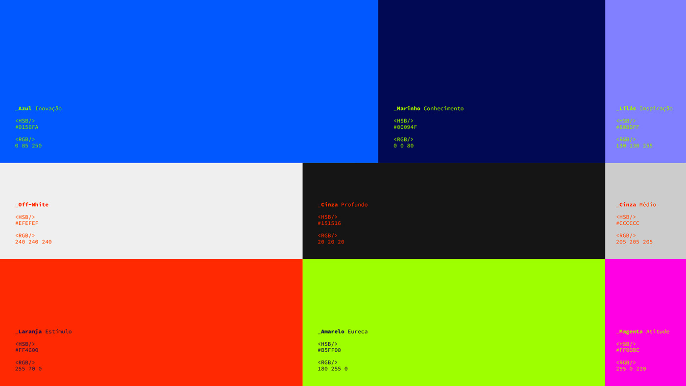
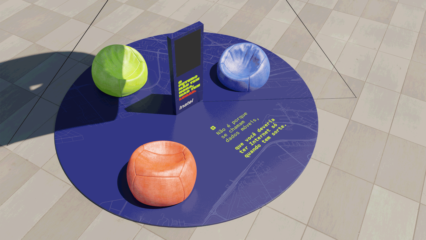
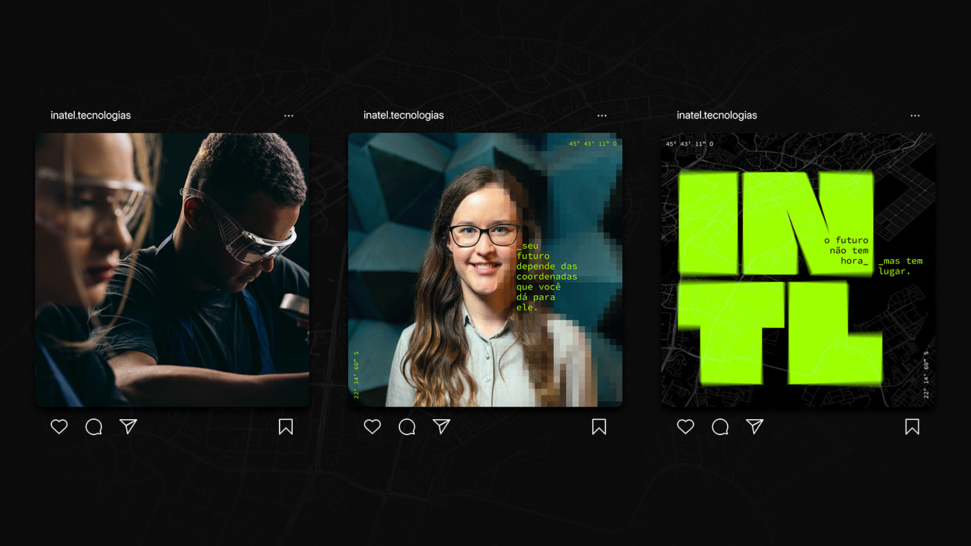
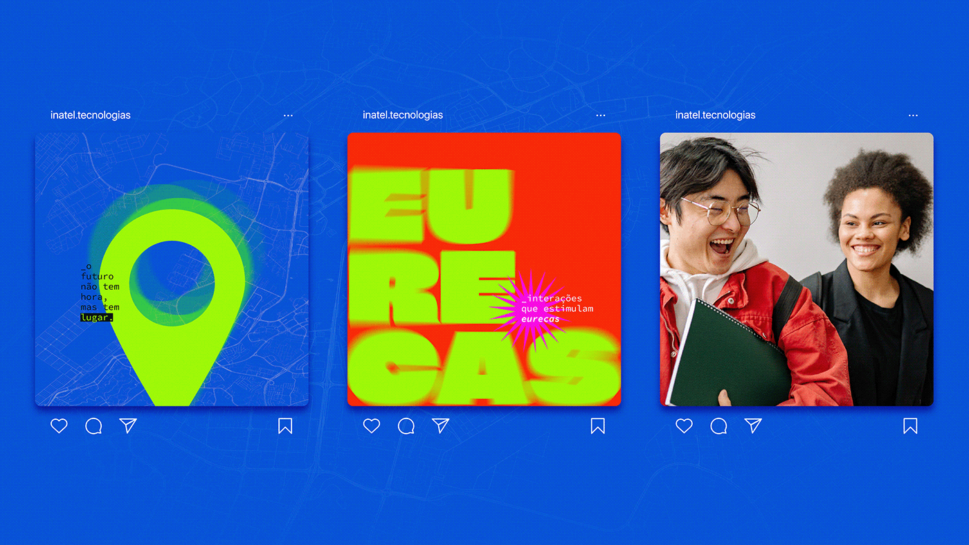
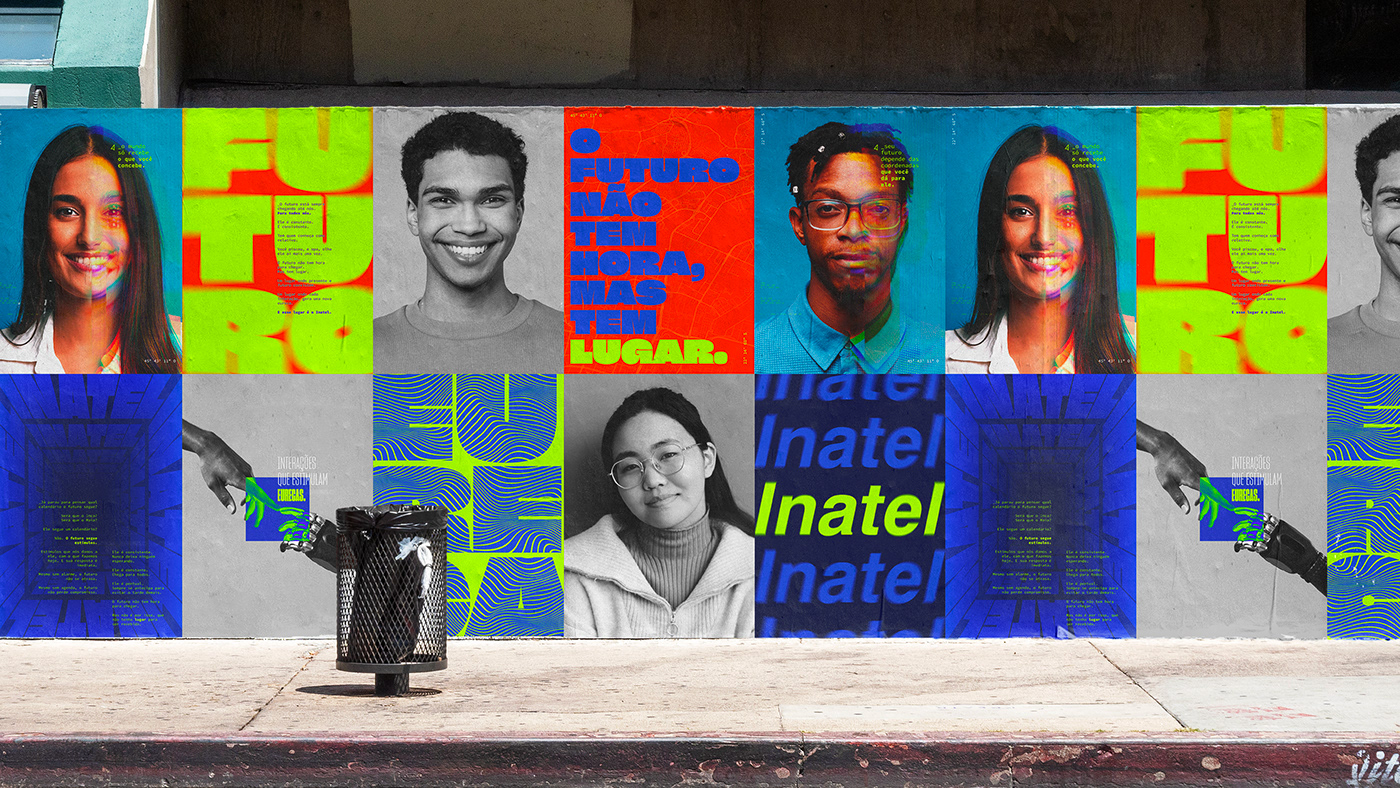
Para trazer uma solução visual tão revolucionária quanto o novo posicionamento do Inatel, mantivemos o logotipo original e repensamos a paleta da identidade trazendo, não só mais saturação nos tons de azul que a marca já possuía, mas também mais variedade de matizes, o que representa bem a efervescência do Instituto que é causada pela diversidade e união de mentes e ideias.
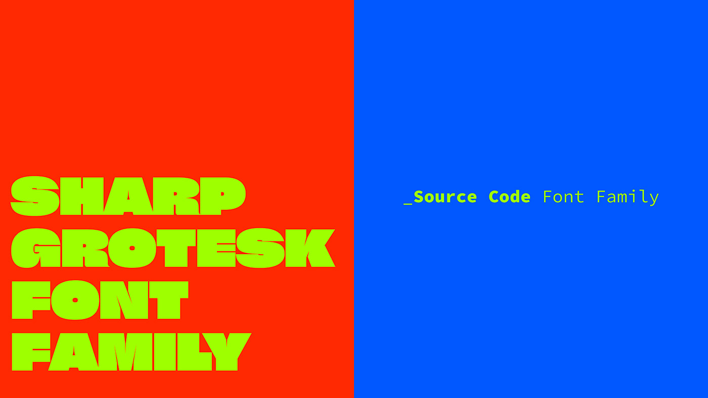
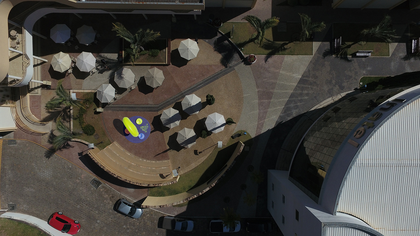
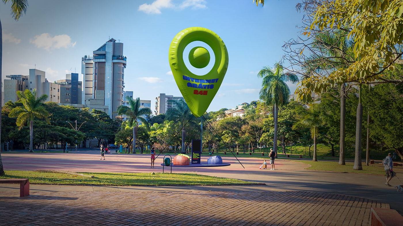
Trabalhamos também num mood mais inspirado no brutalismo e maximalismo que são movimentos conhecidos pela irreverência, o que tem tudo a ver com a essência inovadora das mentes criativas da Engenharia.
Agência: Make ID • Direção de Arte: Karen Klinger • Redação: Breno Horácio • Modelagem 3D: Daniel Debski • Direção Criativa: Graziela Mônaco
2023
EN:
The National Institute of Telecommunications - Inatel - is a center of excellence in education, research, development, and innovation of global technologies in Brazil. It was the first educational institution in the country to offer a higher education program in Engineering with a focus on telecommunications.
With a well-established brand since 1965, our challenge was to recreate the visual identity without altering the logo, with the strategic premise of making Engineering more desirable and perceived as a profession that goes beyond exact sciences. It is a creative and revolutionary career after all.
To provide a visual solution as revolutionary as Inatel's new positioning, we kept the original logo and reimagined the color palette of the identity, bringing not only increased saturation to the existing blue tones but also a wider range of hues, representing the vibrant atmosphere of the Institute, fueled by the diversity and unity of minds and ideas.
We worked on an identity inspired by brutalism and maximalism, which are movements known for their irreverence, aligning well with the innovative essence of the creative minds in Engineering.
Agency: Make ID • Art Direction: Karen Klinger • Copywriter: Breno Horácio • 3D Modeling: Daniel Debski • Creative Direction: Graziela Mônaco
2023