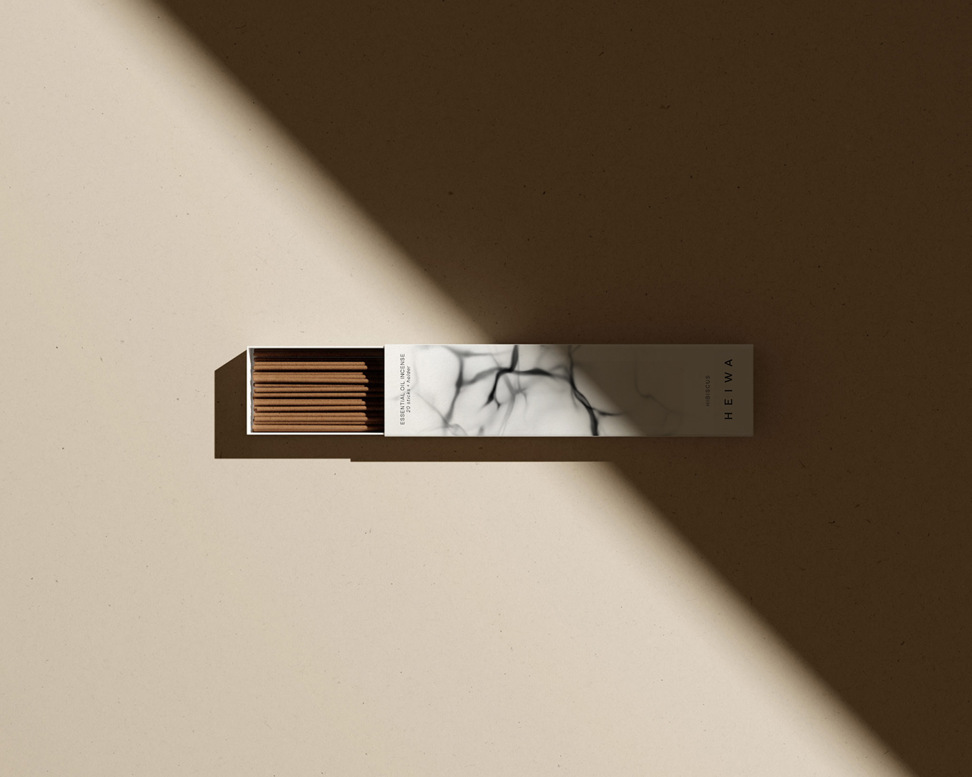
The branding project for Heiwa aims to establish a captivating and holistic brand identity that embodies the essence of tranquility. Heiwa, meaning "peace" in Japanese, represents the company's commitment to crafting high-quality, natural incense sticks that foster a sense of harmony, balance, and serenity in everyday life. The project will encompass various elements, including visual identity and packaging design.
Heiwa's brand essence revolves around the concept of tranquility. It encapsulates the idea of finding inner peace, creating a sanctuary amidst the chaos of daily life, and embracing the serene beauty of Japanese culture. The brand seeks to elevate the act of burning incense into a mindful ritual, encouraging individuals to pause, breathe, and immerse themselves in a moment of calm and self-reflection.
Client: Heiwa
Category: Fragrance
Designer: Vasudha Bakshi
Photography: Cup of Couple
Year: 2023
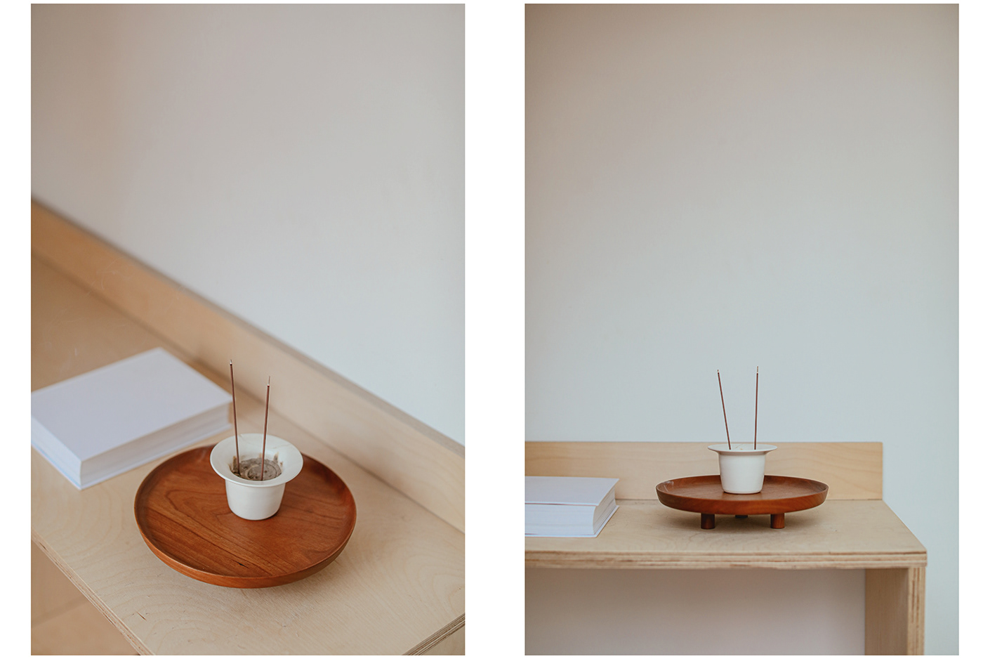

The visual identity of Heiwa is inspired by the tranquility and simplicity found in Japanese aesthetics. The logo features a clean and elegant typography, the packaging incorporates elements like a wisp of smoke to represent the brand's core offering. The color palette consists of soft, natural tones, evoking a sense of calmness and harmony. Delicate patterns, inspired by traditional Japanese art forms, will be used sparingly to create visual interest and reflect the brand's heritage.