
-=-Music Brief-=-
This includes some of my work from my music brief during my time at Sixth form.
I was required to come up with a band and create promotional material for it.

The Logo.
The fonts were from Dafont (at least the one on the top was, I am not sure about the second one).
Since the main theme for the Brief was Music, and my chosen sub-theme was Urban/City I used a Thesaurus to come up with different words.
The 'Symphony' bit is on it's own layer, so the color can be changed by adjusting the hue. I used GIMP to create a glow effect around the word.
Unfortunately, since I kept exporting and re-importing the files in Photoshop and GIMP and I lost my backup files, the text was converted to an image, therefore giving me some difficulty to edit it. If you look closely, you can see a bit of grey between the letters. Fortunately this is not too much of an issue as my other work did not use much bright colors and the logo was small.
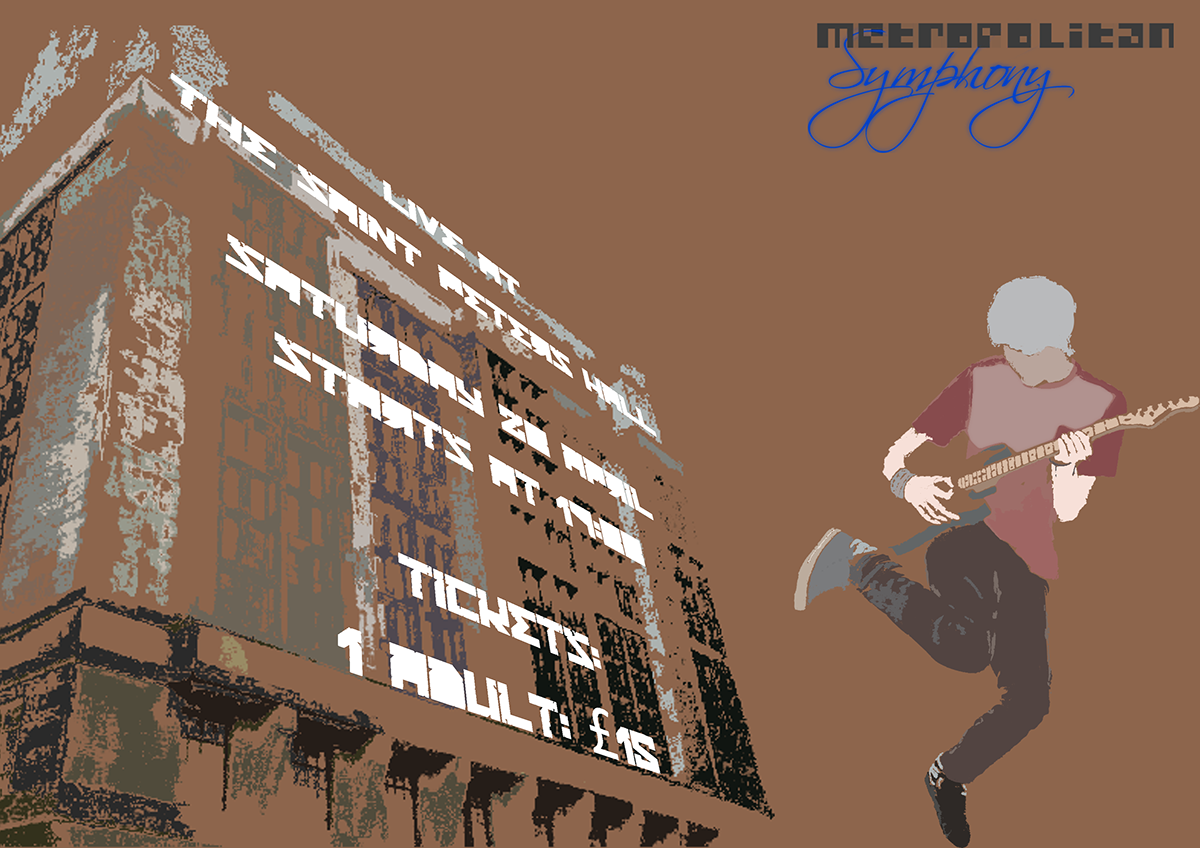
'Poster 1'
-Inspired by Jonathan Tran
-Most of this was created with the help of the fuzzy select tool/magic wand tool
-Inspired by Jonathan Tran
-Most of this was created with the help of the fuzzy select tool/magic wand tool
-Text was done using the Perspective tool.

'Poster 2'
-Again, this was inspired by Jonathan Tran
-Just like before, the fuzzy select tool/magic wand tool was used.
-Again, this was inspired by Jonathan Tran
-Just like before, the fuzzy select tool/magic wand tool was used.
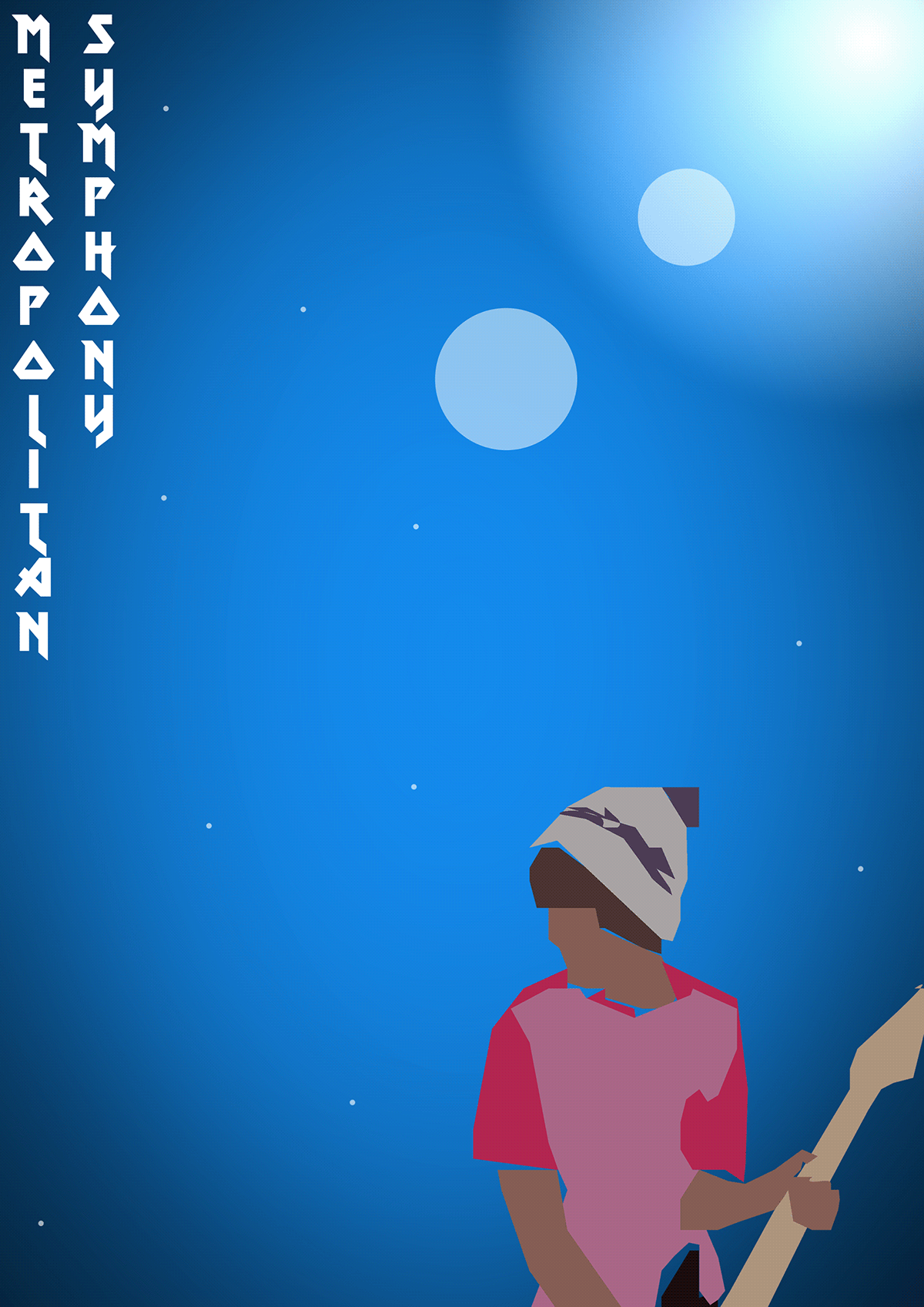
'Poster 3'
I was playing around with some of GIMP's features and found out how to create the background with the sun-like light.
The idea with the person in sharp shapes just came to me, however I ended up not developing this poster further as the design was not consistent with the rest of my work.

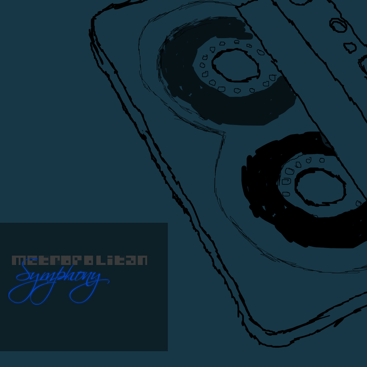
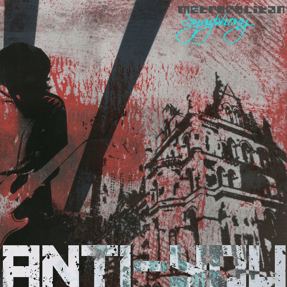
'CD Cover 1 - Front'

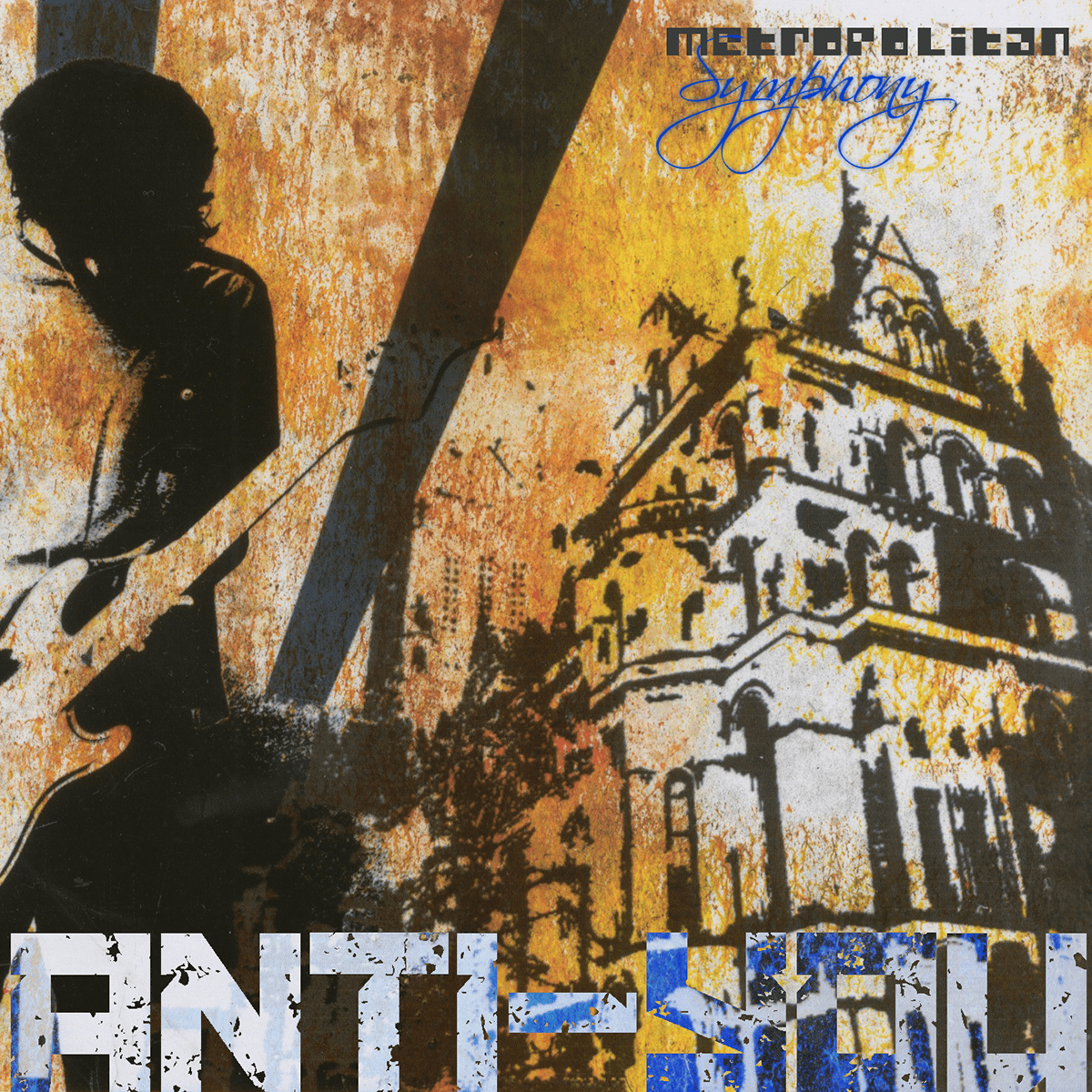
'CD Cover 2 - Front'

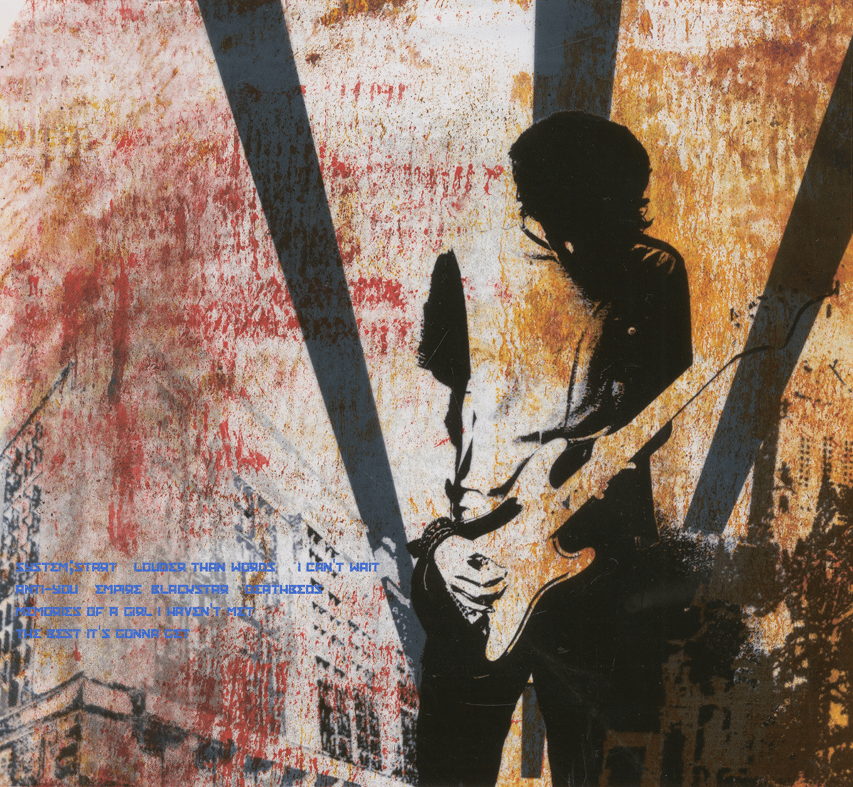
'CD Cover 2 - Back'
'CD Cover 3 - Front'
'CD Cover 3 - Back'
'CD Cover 4 - Front'

'CD Cover 4 - Back'
'CD Cover 5 - Front'
'CD Cover 5 - Back'

'CD Cover 6 - Front'

Experiments by rolling paint and printing on acetate. This is the result I have scanned in when the acetate is placed over the experiment.

Same thing as above, except with a different color background.

Inspired by Russian Constructivism
The edges are far too edgy, but I decided not to develop this any further and just didn't use it.

