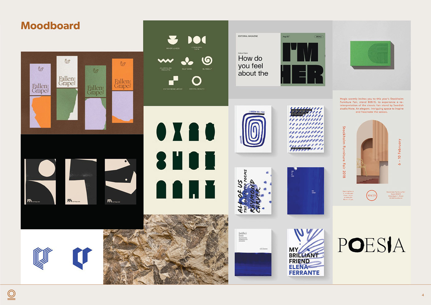
HODOS is a communication agency based in Paris. They contacted us to work on their branding ahead of their launch. 'Hodos' means the traveled way or path in Greek. We took inspiration from the look and feel of human walking tracks to create a unique brand identity. We replaced some characters of the logo with bespoke symbolic shapes that represent the values of the brand. These elements also work well on their own as brand marks. We designed a graphic fern that brings texture while giving a more natural feel to the background. The earthy colours paired with a sans serif font reflect the professionalism of the overall brand.


