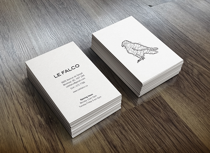
LE FALCO
A rebranding school project of a coffee shop in Mile End Montreal. The logo illustrates the interior of the place which has an industrial and craftsy design. The place combines the industrial feel of the area with japanese cuisine and culture, which determines the look of the logo.
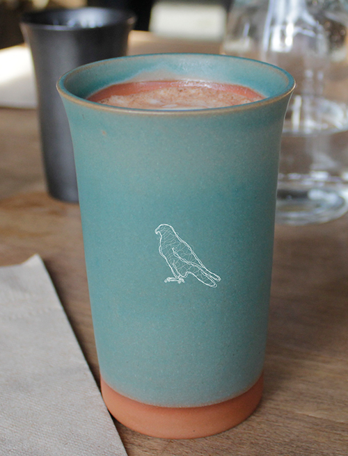
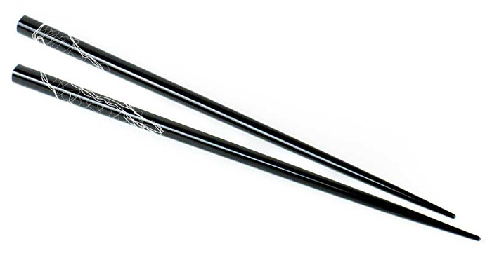
The logo takes a pictographic approach of the name Le Falco. The wire look of the logo reflects the interior and decor of the coffee shop.
The logo could be accompanied by the name Le Falco underneath or separated from it. In certain instances it is better to use the falcon all by itself. As shown in the stationery the bird standing by itself gives a more refined and thought out look rather than being always accompanied by the name.
On the other hand just using the name alone works fine for the letterhead and envelope which also gives it a clean design. Throughout the applications the falcon alone is the most often used for it creates good balance in its simplicity.