Interact with the prototype: https://projects.invisionapp.com/share/63XRWM9S#/screens/18418379?maintainScrollPosition=false

Sample prototype screens. Despite my initial first sketches of the checkout flow, I decided it was a better experience for the user if the checkout information was all on one page (last screen.)
My general approach was to make the user journeys as short as possible. In most cases, the user should be able to reach their goal in three clicks or less. Any information that wasn't readily available due to space constraints could be easily accessed via rollover callouts and right clicks. User journeys were further streamlined by the use of autofill and smart search suggestions.
My general approach was to make the user journeys as short as possible. In most cases, the user should be able to reach their goal in three clicks or less. Any information that wasn't readily available due to space constraints could be easily accessed via rollover callouts and right clicks. User journeys were further streamlined by the use of autofill and smart search suggestions.

Final version of the site map, in both tree and text format.

Final versions of the user flows for the three main user groups.

Introduction to the brand.

Summary of the business model of the brand.

Defining characteristics of the brand.
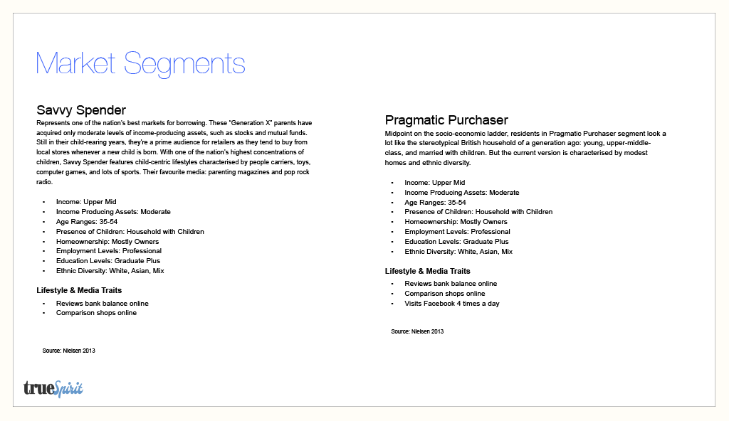
Primary market segments to design for. These help define the motivations of the user personas.

User personas.

Concept model containing all the main use cases to design for.

After reading the brief, I performed an analysis of competing and complimentary services to get a sense of the market space, common web retail conventions, and identify areas in which users were being underserved. As an emerging brand, taking advantage of competitors' weaknesses would help distinguish trueSpirit and give them edge in the market.

As part of the competitive analysis, I took screenshots of different things I liked and didn't like, and kept them organized to use as reference.

After I finished the competitive analysis, I took the provided personas and broke out their individual attributes to find what they all had in common. I used these commonalities to build the foundation of the information architecture.

I then began working on sketches of the user flows, site map, and checkout flow. I was mostly concerned at this point with getting the main concepts on paper, so they are extremely rough.

First iterations of the prototype screens. I felt that the "liney" style in these wireframes was a bit confusing to read, so in the second iteration I decided to go with gray boxes.

I decided to get some critical feedback from professionals as well as peers before testing the prototype.

User testing and feedback. Users had a strong positive response to the smart search suggestion function, and stated that the visual hierarchy was familiar and easy to understand. However,
credit card, address, and contact info forms in the checkout flow need to have clearer signposts for editing, and the order confirmation should include “Continue Shopping” link that takes you back to the home page. This feedback was included in the recommendations for the future iterations.
credit card, address, and contact info forms in the checkout flow need to have clearer signposts for editing, and the order confirmation should include “Continue Shopping” link that takes you back to the home page. This feedback was included in the recommendations for the future iterations.

