Student exercise:
Exploration of the communicative aspects and possibilities of typography / How to communicate visual values on a subject with only typography.
Brief:
Create an editorial product, where the content of the articles have to be communicated with typography only (+ 1 color as extra option if needed). The editorial must focus on artists and creatives, and the articles must be about art, architecture or design.
Pitch: Inspiration from the subject
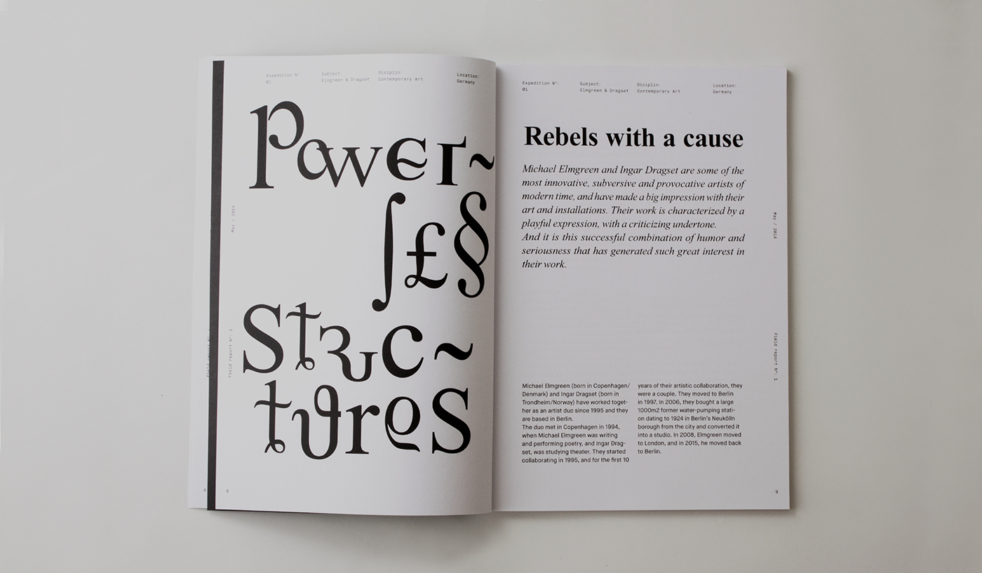
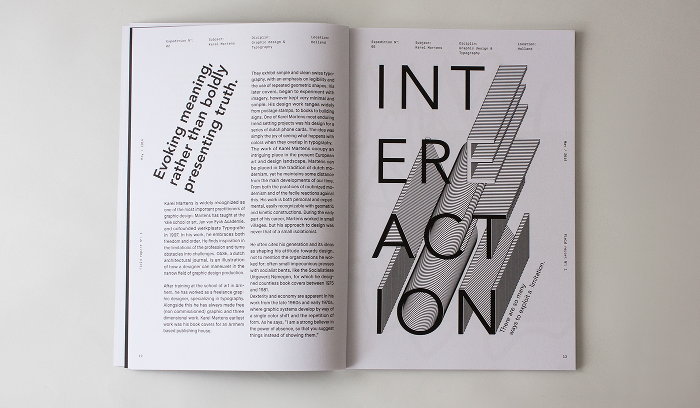
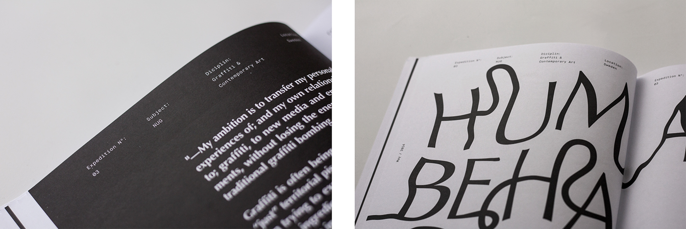
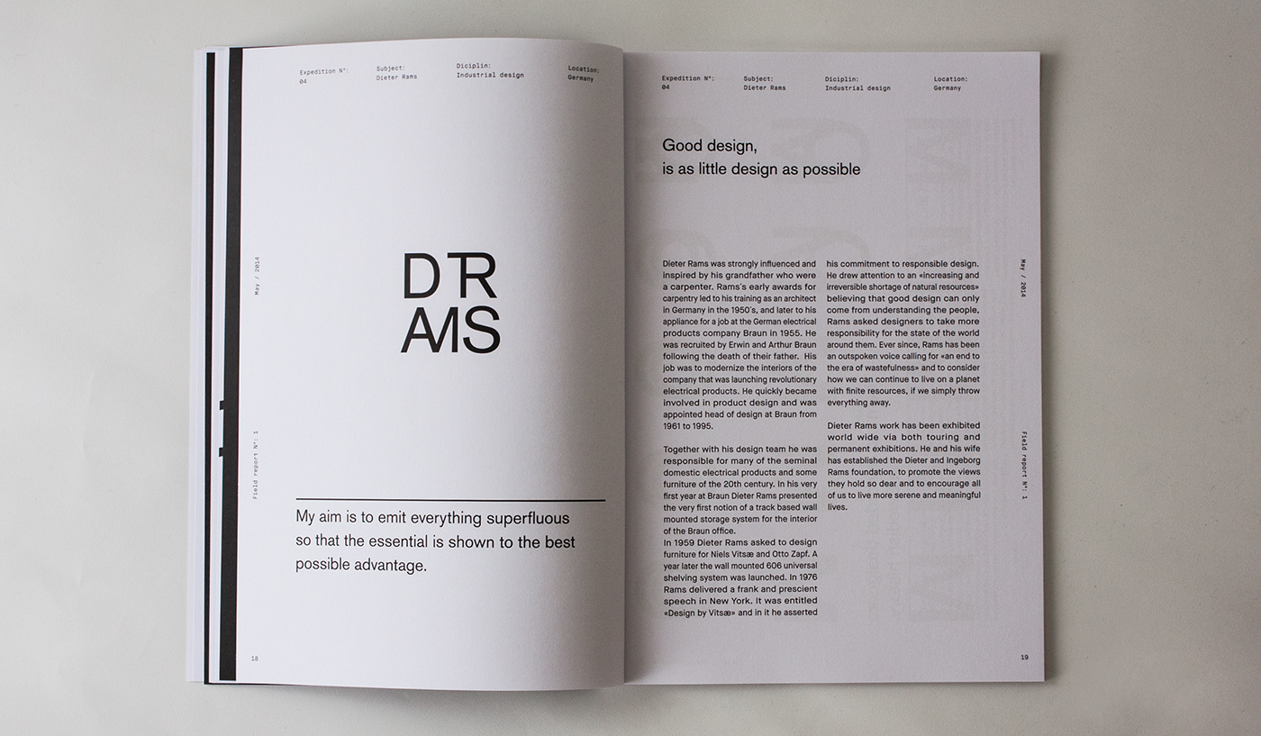
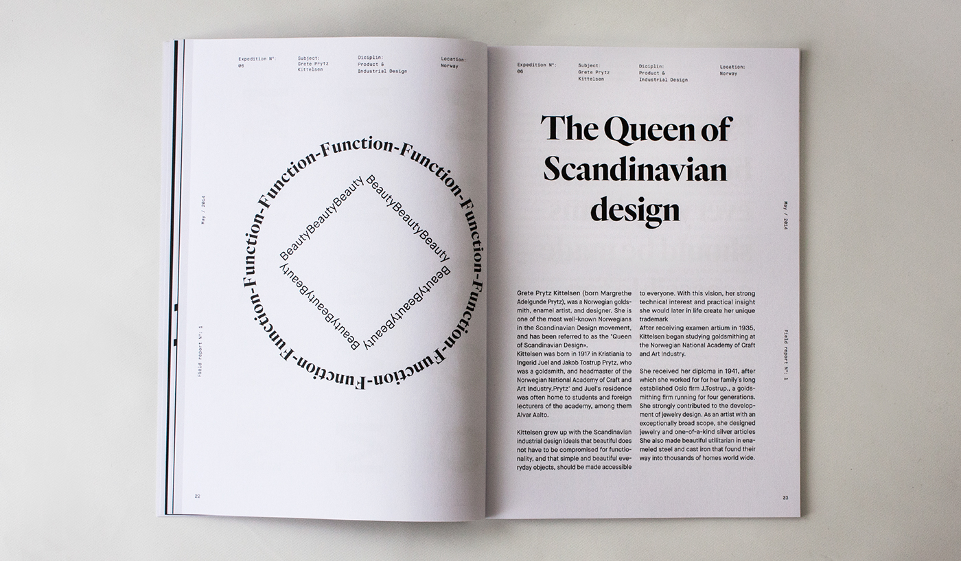
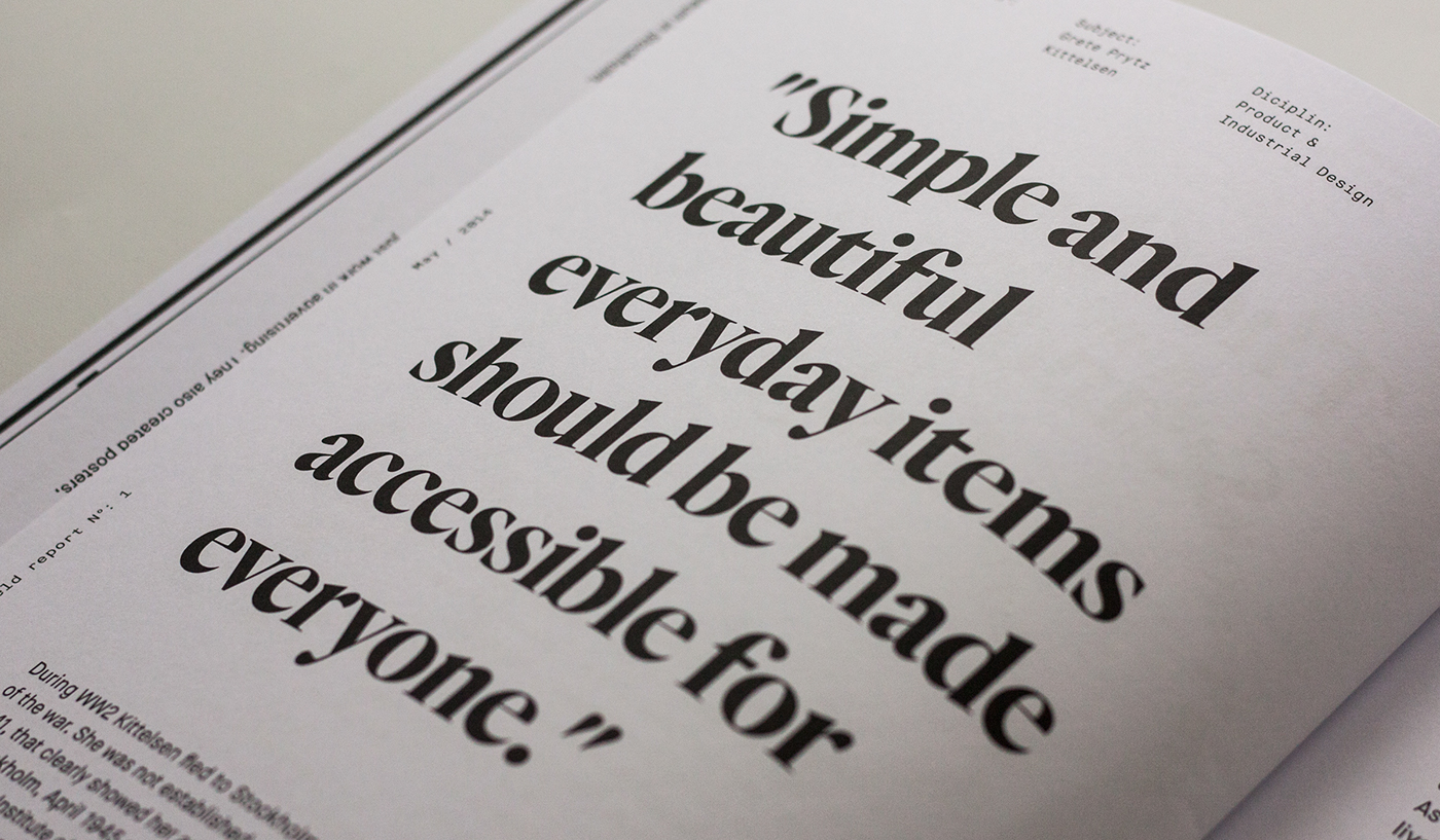
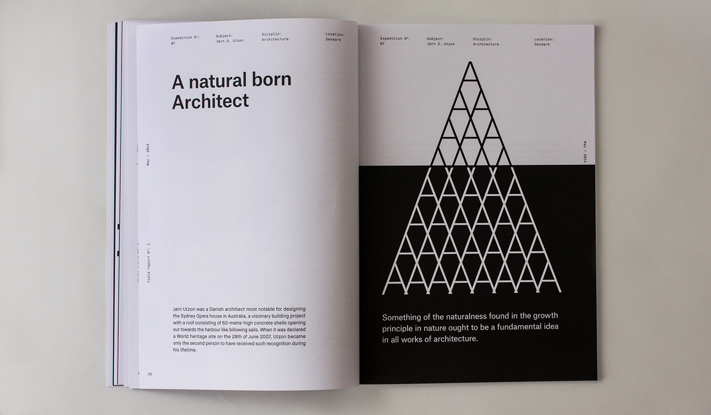
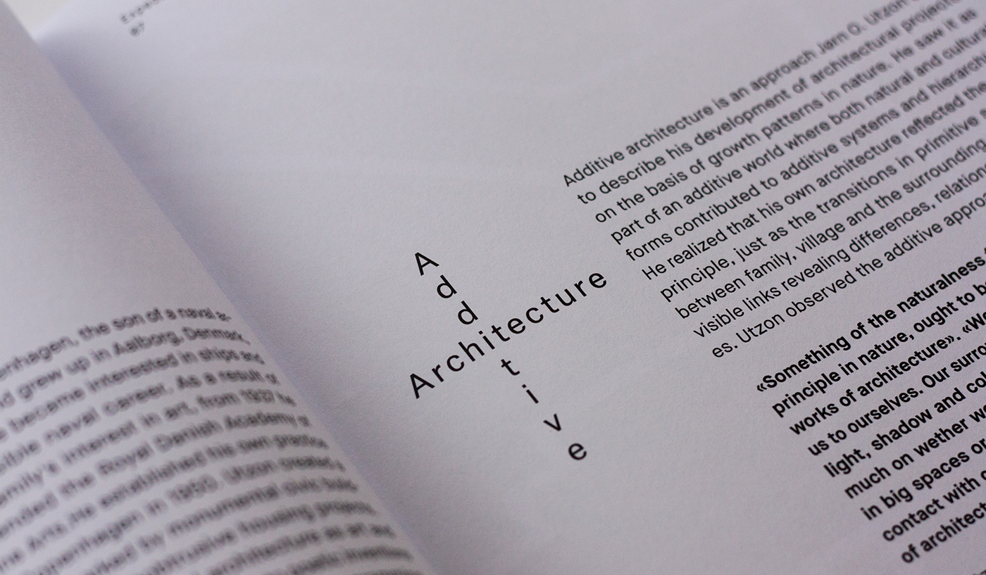
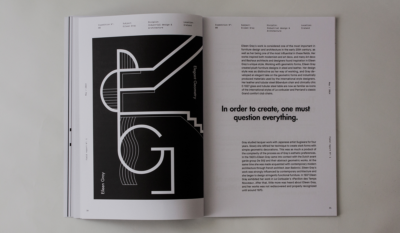
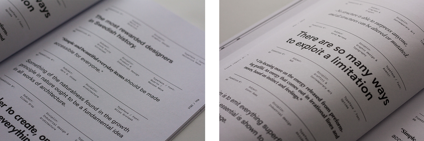
Take a word or sentence from each article that communicates the essence of the artists work. Use that word or sentence and visually enhance or describe the essence and unique values of the artist.
My solution:
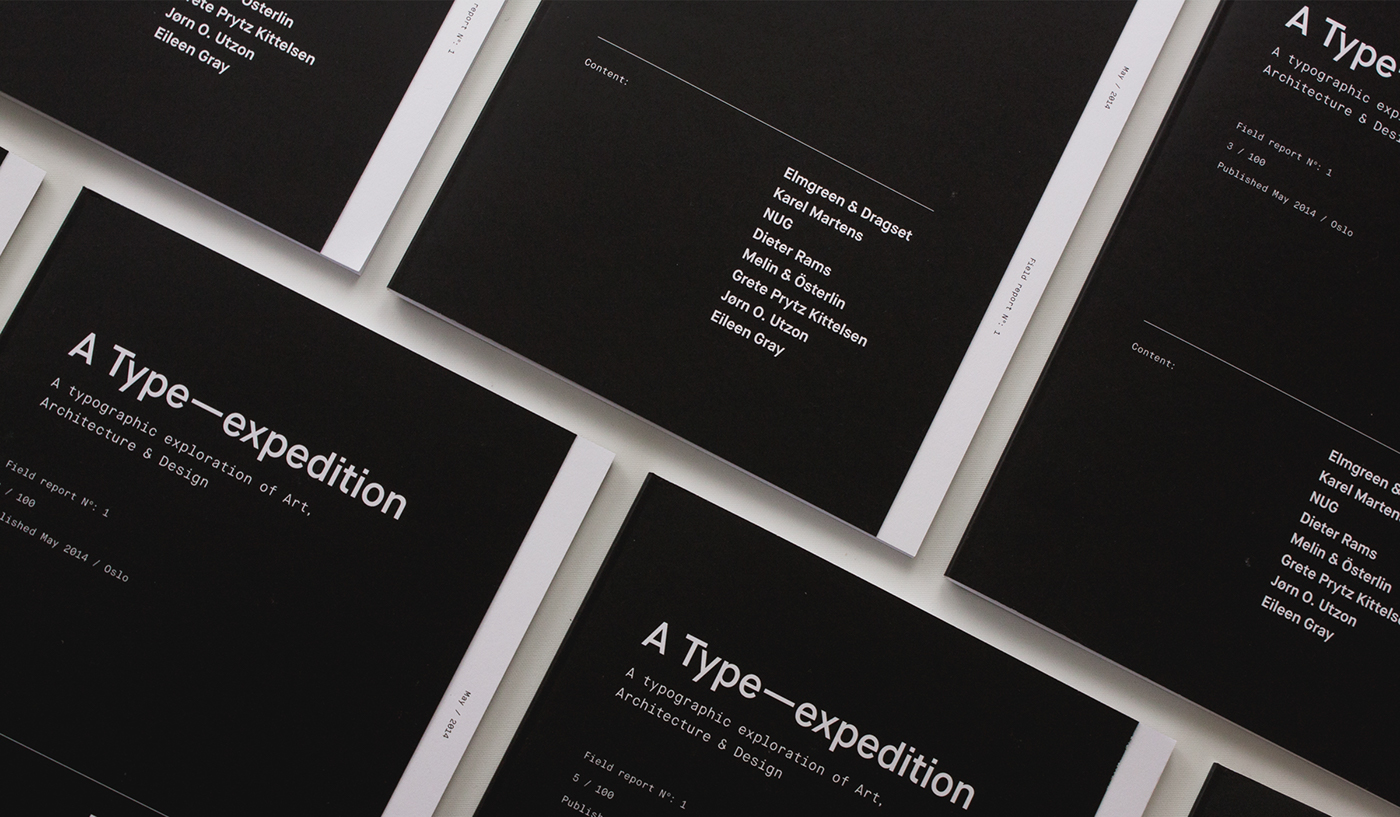
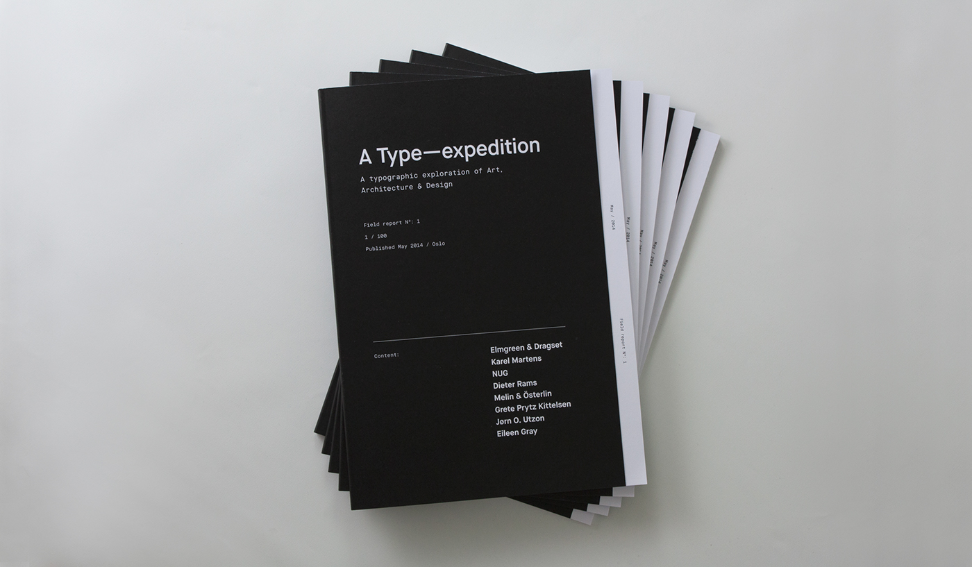
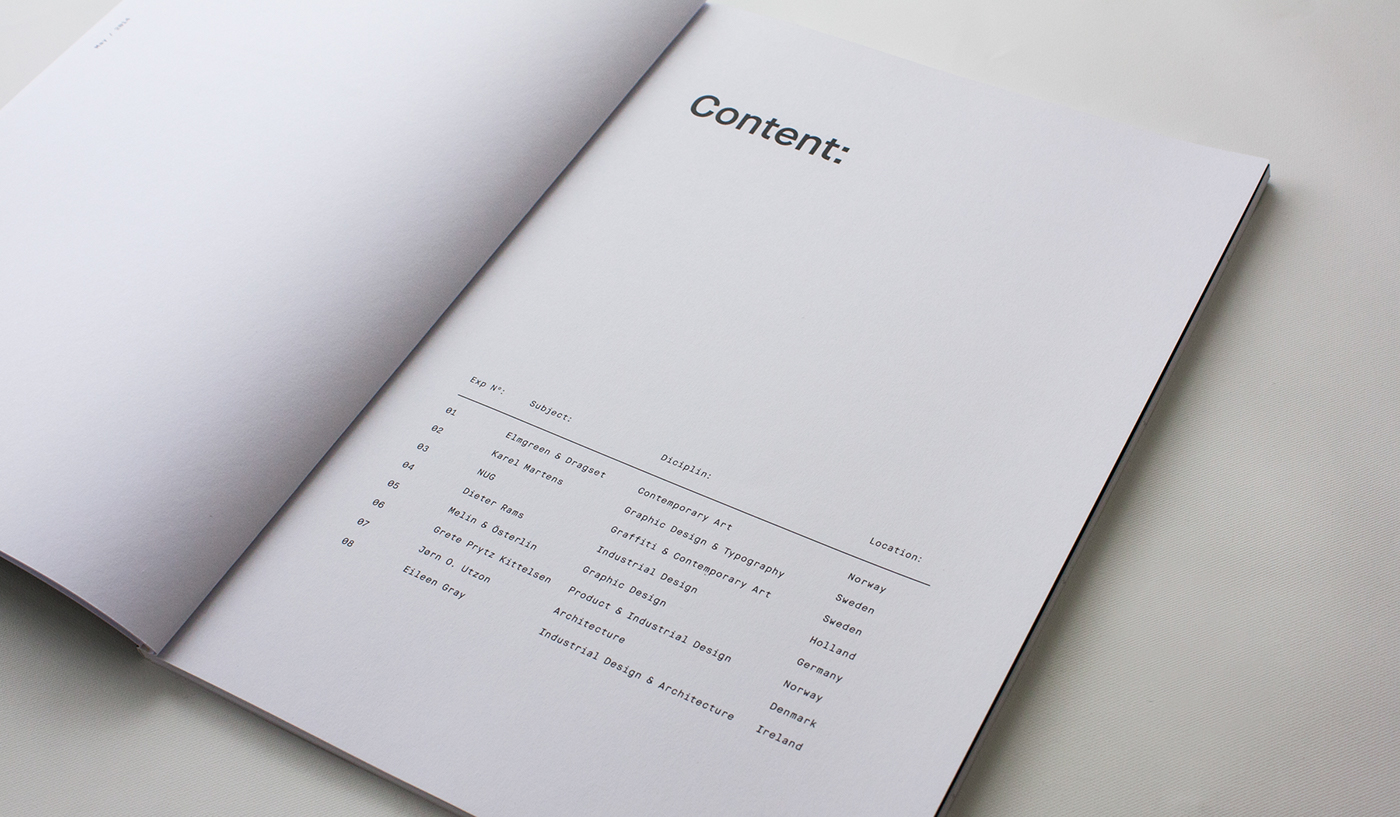
A type focused magazine - exploring the visual posibilities and challenging the standard communicative values of typography, as well as displaying great artists and designers for potential new fans by portraying different artists and creatives in each edition.
A type focused magazine - exploring the visual posibilities and challenging the standard communicative values of typography, as well as displaying great artists and designers for potential new fans by portraying different artists and creatives in each edition.
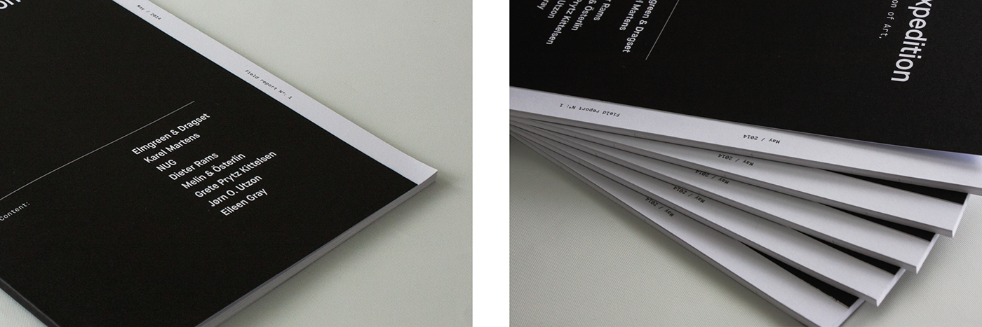
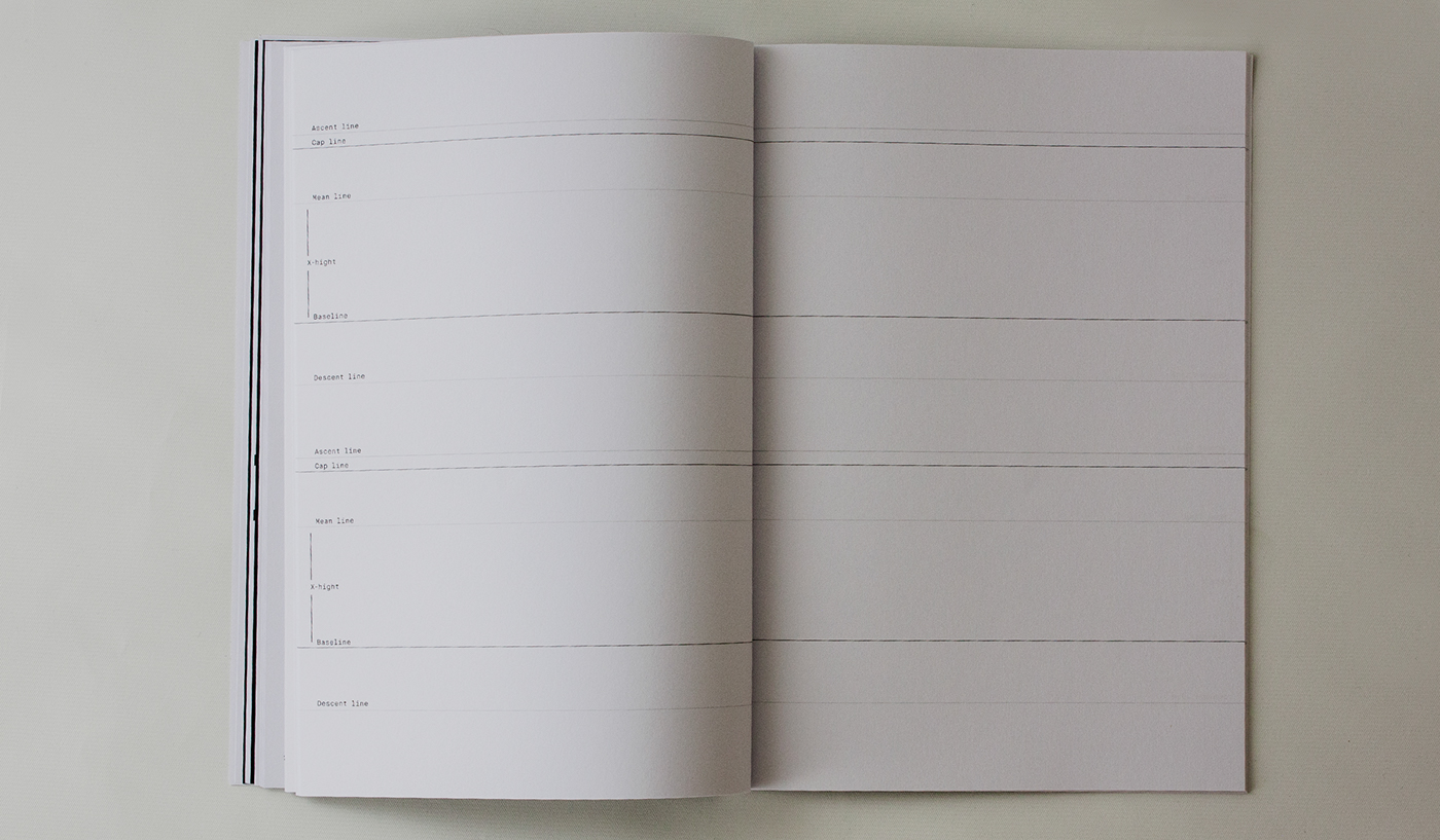
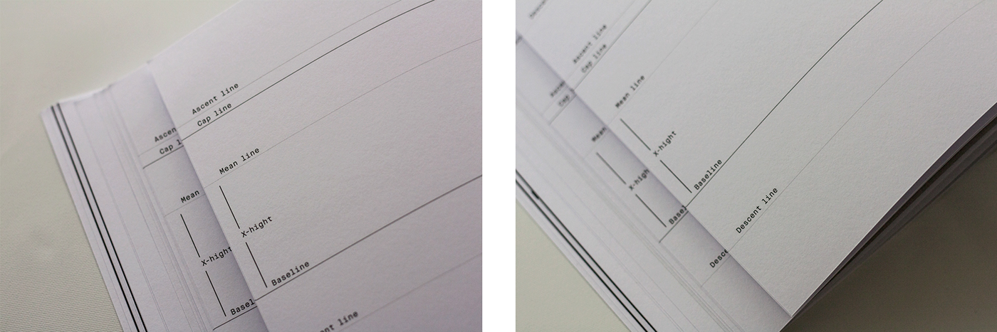
Inspired by the brief, I wanted to communicate exploring and discovering possibilities of typography. And to look at it as something more than just a «one function tool». The layout has subtle reference to research folders, and expedition forms, to bring weight to the concept.