


(ENG) About the project
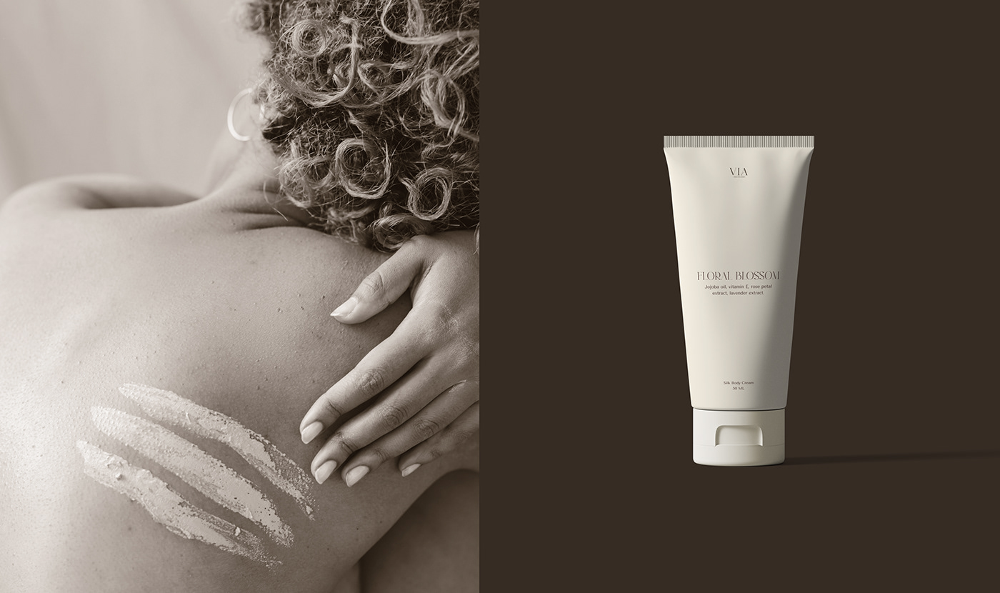
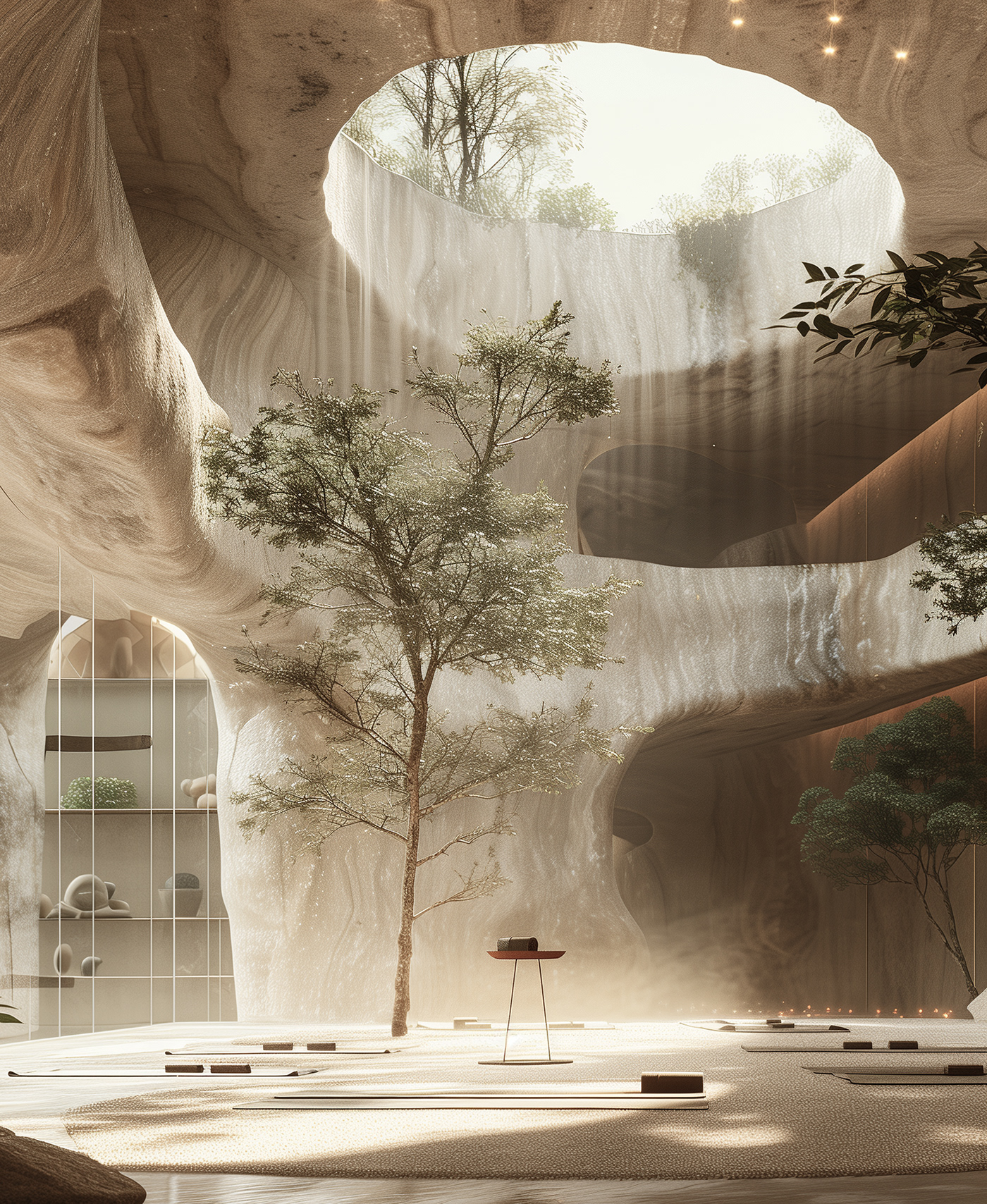
VIA (from Latin "Path") is a space for women where each one explores her inner world through spiritual, bodily practices and psychotherapy, gaining new insights about herself and her life path. Here they evolve alongside like-minded individuals and professionals - psychotherapists, yoga instructors, osteopaths and other practitioners.The brand's main mission is to create a comfortable, caring, and safe place for women, where each one can relax, embark on a journey to discover her true self, and reconnect with her nature and authenticity. The brand's target audience is women aged 25 and above, who are active and self-aware, seeking personal growth and self-discovery. They are willing to invest time and resources in their development and are looking for support, balance and emotional well-being in unity with themselves and in interaction with like-minded women.
Solution
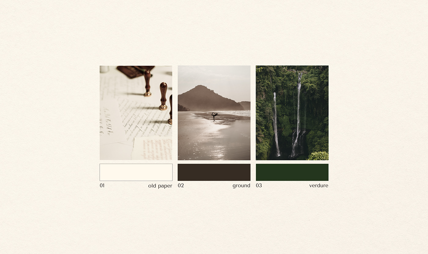
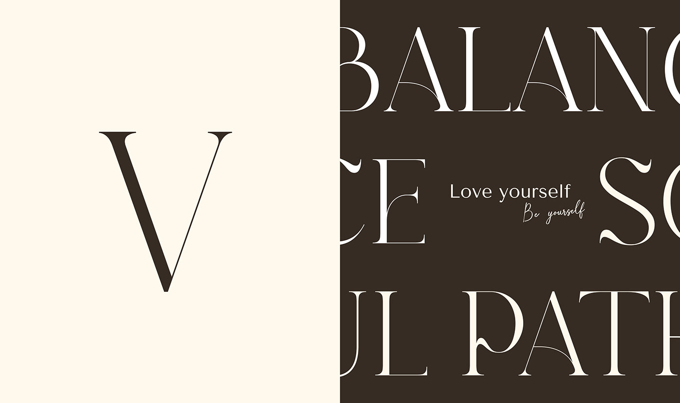
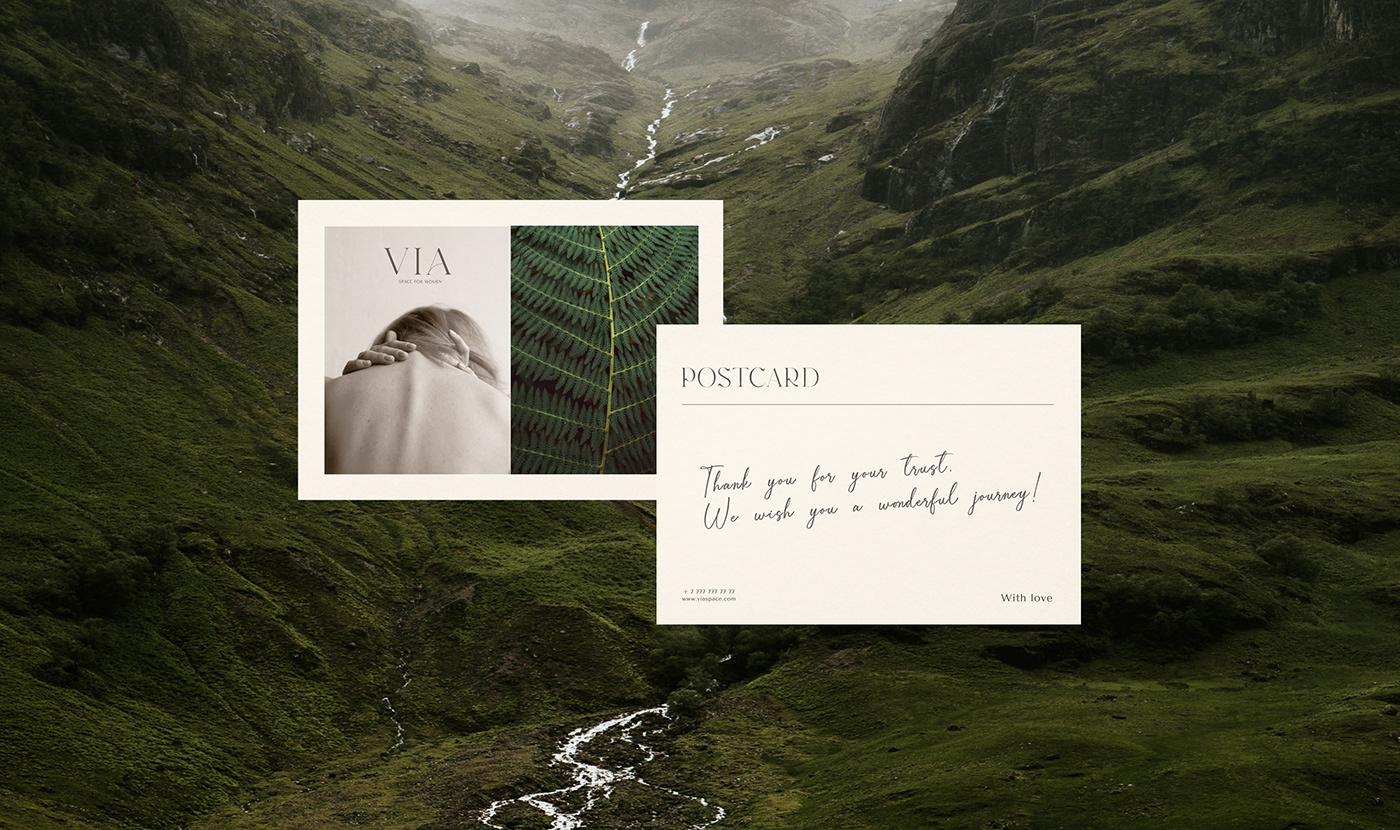
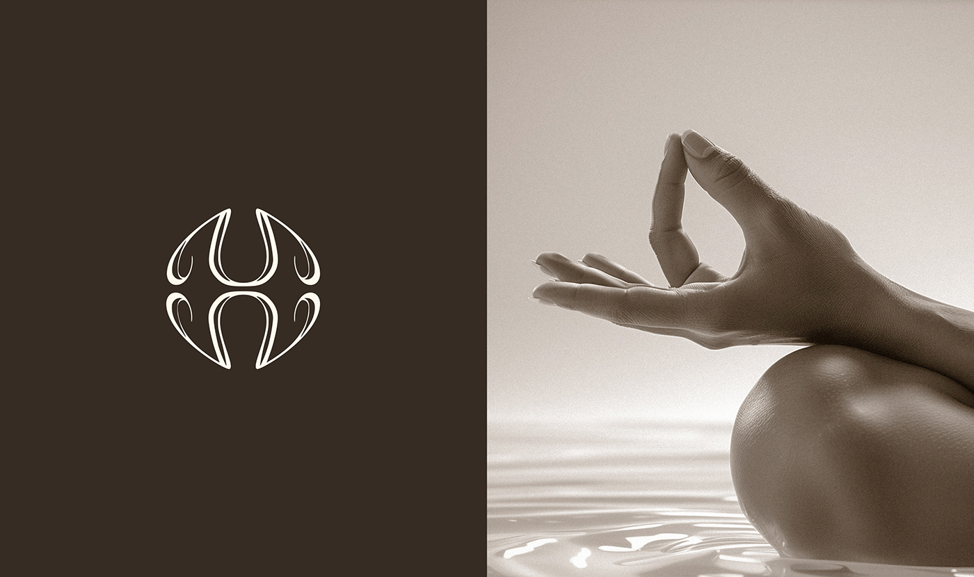
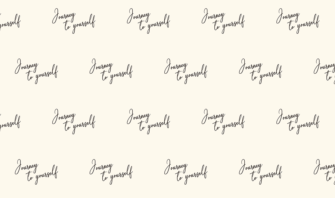
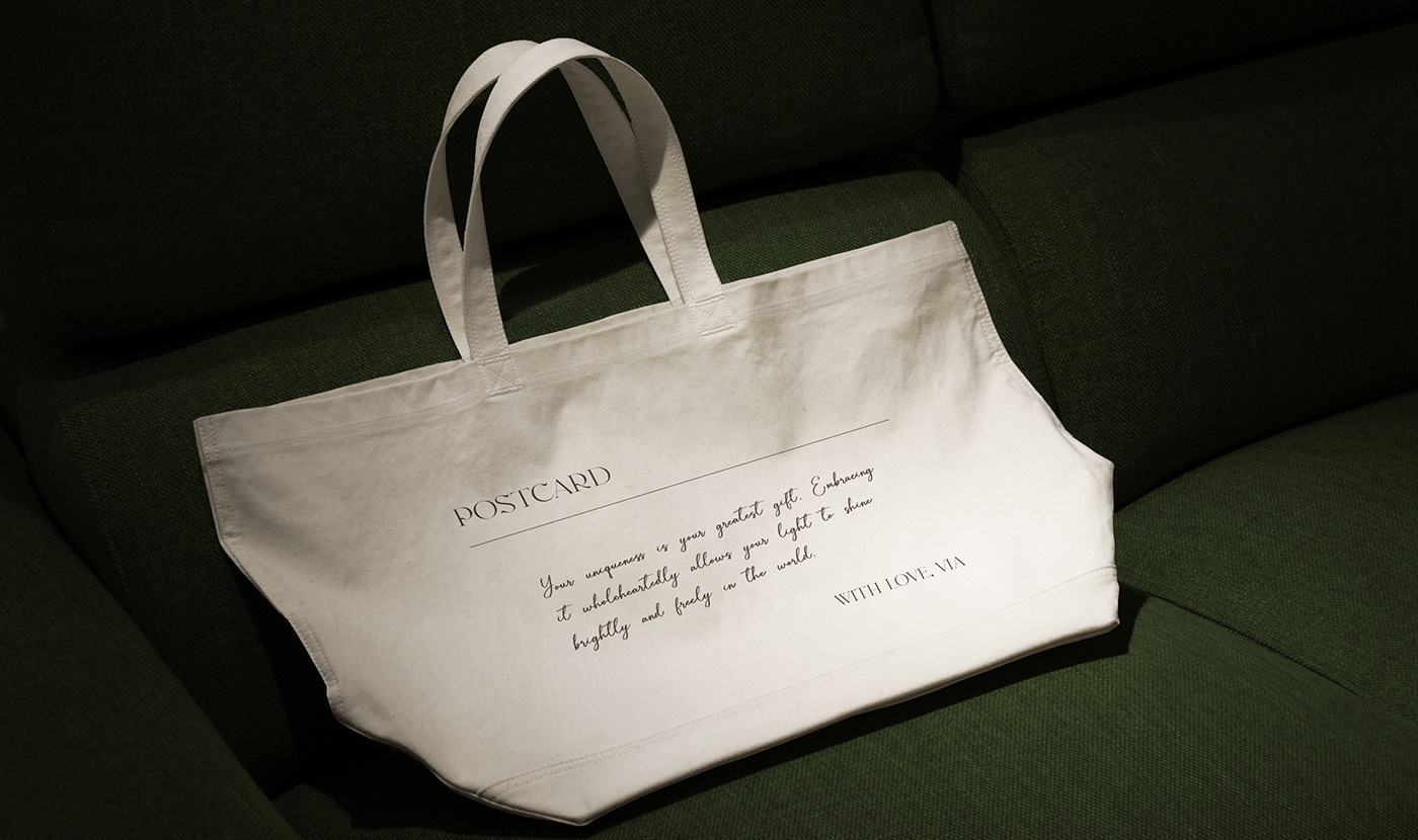
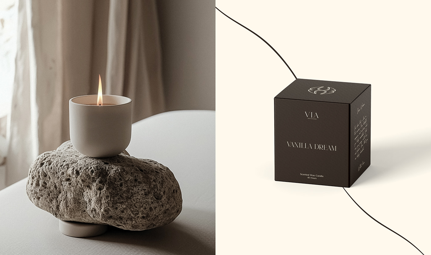
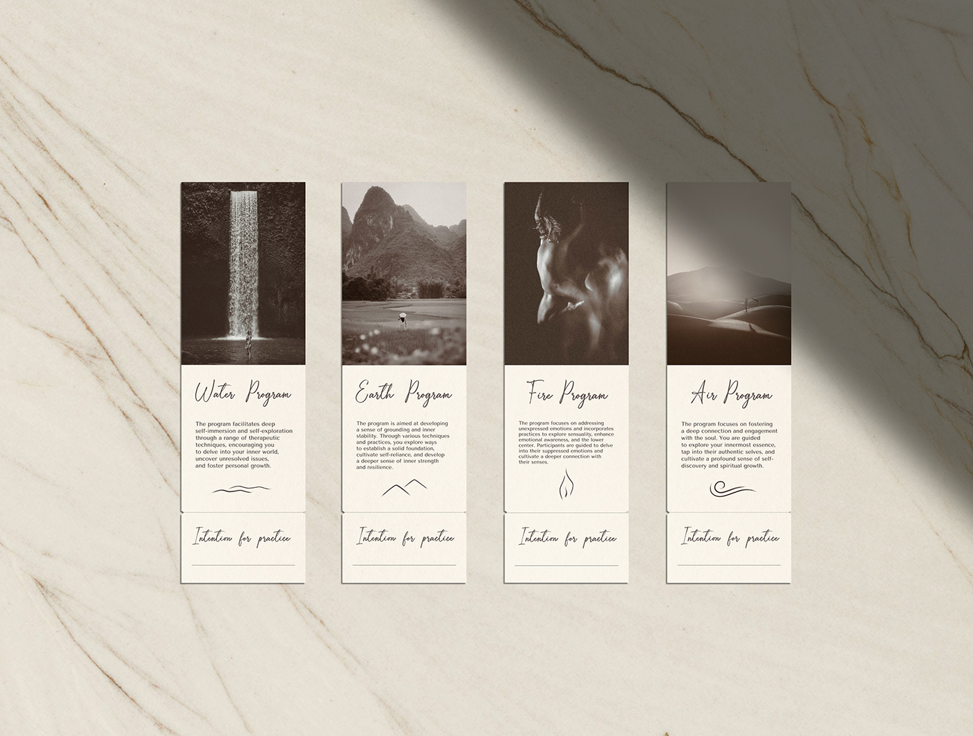
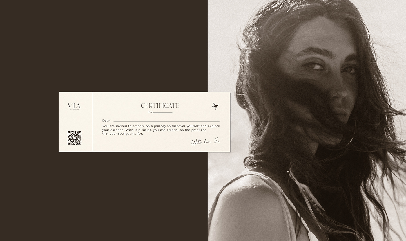
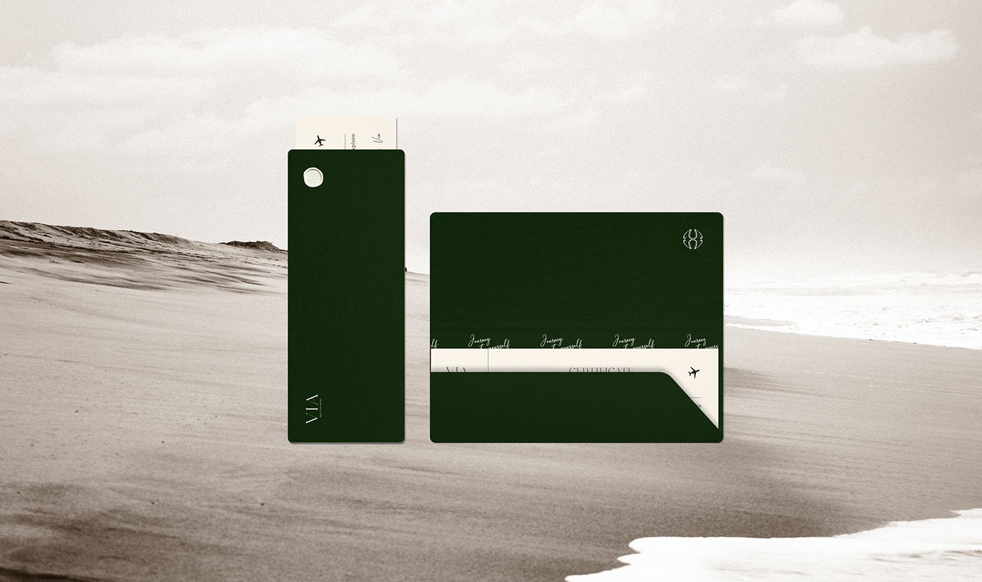
To reflect the brand's values, philosophy of the path, and transformations that occur within the VIA space, a concept of travel was chosen. As a woman enters the space, she embarks on a journey to her nature. And after it, she is already different. This metaphor formed the basis of the brand identity. Natural calm colors were chosen.The color of aged paper, reminiscent of past travels. As well as green and brown colors, which give a sense of support and new beginnings. Fonts, like those on antique maps. Contrasting elements in them, including in the logo, hint at the combination of different elements here, like support and flow, and softness. The handwritten font resembles signatures on postcards bought during trips. Brand carriers directly refer to the theme of travel: tickets, ticket folders, brochures, postcards. They are made in a way that makes you want to take them with you and leave them as a memory of an important moment in life.
(RUS) О проекте
VIA (с лат. «Дорога») - это пространство для женщин, где каждая исследует свой внутренний мир через духовные, телесные практики и психотерапию, обретая новые знания о себе и своем жизненном пути. Здесь они развиваются вместе с единомышленницами и проводниками - психотерапевтами, йогами, остеопатами и другими практиками. Основной миссией бренда является создание комфортного, заботливого и безопасного места для женщин, где каждая сможет расслабиться, отправиться на поиски своего истинного Я и соединиться со своей природой и аутентичностью. Целевой аудиторией бренда являются женщины от 26 лет, активные и осознанные, которые стремятся к личностному росту и самопознанию. Они готовы вложить время и ресурсы в свое развитие и ищут поддержку, баланс и эмоциональное благополучие в единении с собой и во взаимодействии с единомышленницами.
Решение
Для того, чтобы отразить в дизайне ценности бренда, философию пути и трансформаций, которые происходят в пространстве VIA, был выбран концепт путешествия. Так как приходя в пространство, женщина отправляется в путешествие к своей природе. И после него она уже другая. Эта метафора легла в основу фирменного стиля. Были выбраны натуральные спокойные цвета. Цвет состаренной бумаги, отсылающий к путешествиям прошлого. А также зеленый и коричневый цвета, которые дают ощущение опоры и нового начала. Шрифты, как на старинных картах. Контрастные элементы в них, в том числе в логотипе, дают намек на то, что здесь сочетается разное, как опора, так и мягкость. Рукописный же шрифт напоминает подписи на открытках, купленных в поездках. Носители бренда напрямую отсылают к теме путешествий: билеты, папки для билетов, брошюры, открытки. Они сделаны так, что их хочется взять с собой и оставить на память, как о важном моменте жизни.

(ENG) Social Media
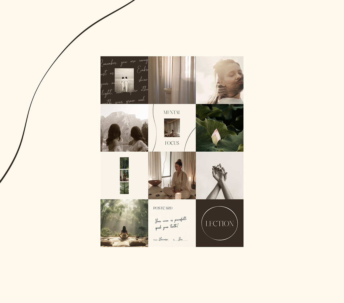
For the digital space, a proprietary typography has been developed for stories, posts, and highlights in the brand's main colors. Graphic techniques have been developed, such as lines and circles with varying thicknesses, similar to the logo. Also a sepia treatment with a reference to inner journeys and personal experiences has been chosen for the visual profile. Natural color correction with minimal warm undertones is used for balance. All techniques in the digital space together evoke feelings
of trust, openness and light.
(RUS) Социальные сети
Для digital пространства была разработана фирменная типографика для сторис, постов, хайлайтс в основных цветах бренда. Разработаны графические приемы, такие как линия и круг с разными толщинами, как в логотипе. Также для визуала в профиле была выбрана обработка сепия с отсылкой к путешествиям внутрь себя и свой опыт. Для баланса используется натуральная обработка с минимальным тёплым подтоном. Все приемы в digital пространстве в совокупности вызывают ощущения доверия, открытости и света.


Thank you for interest in my work!
I am open for cooperation and new projects.
I am open for cooperation and new projects.
Благодарю за интерес к моей работе!
Я открыта для сотрудничества и новых проектов.
Я открыта для сотрудничества и новых проектов.
Lesya Maslovskaya
Сonceptual brand-designer & art director


