
Ident for ETV1, now named ERR1 to bring it in line with the wider ERR TV/radio network, but I've kept the pink from the current logo.
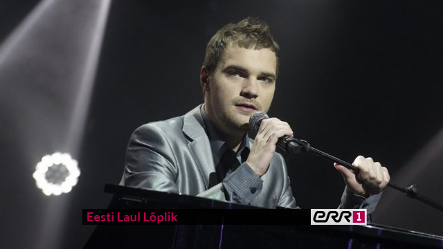
Advert for a programme.
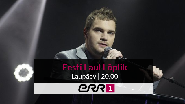
Endcap for the advert. I tried to keep it simple in terms of graphic elements, but stylish.

DOG for ERR1, designed to be noticeable but not too intrusive.
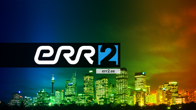
ERR2's ident, which reflects the more youth-oriented aim of the channel, and the identity serves as a contrast to ERR1 (pink/blue, black/white) to differentiate it from the first channel, whilst still having elements in common.


Endcap for a programme on ERR2 - the colours have been switched to keep the opposites theme of this channel.

DOG for ERR2.
