


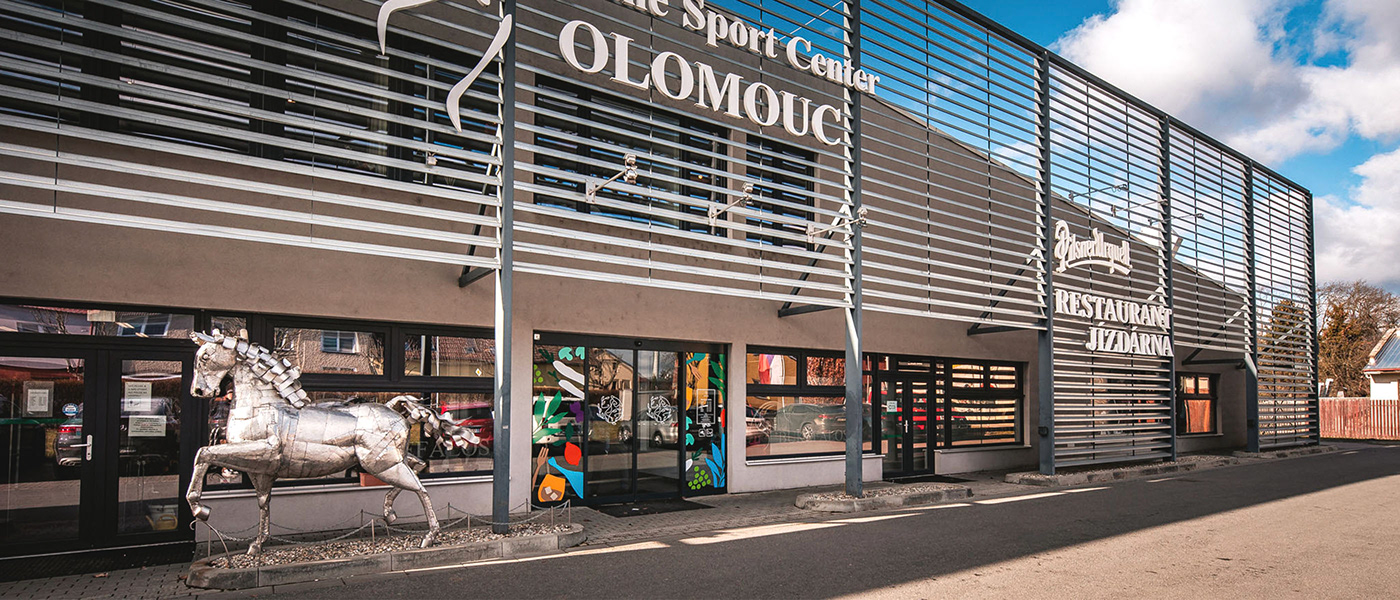
Jizdarna restaurant
When the new owner bought the premises of the existing restaurant and came up with an offer to completely redesign it, it was clear that it had to be something bold and unusual that would stand out among the ordinary restaurants in the area. Although the logotype itself is decent and combines the horse and laurel theme with a reference to the place, the visual style of the place is very colorful, cheerful, with unique illustrations that blend into the entire space. The brand also included labels and brand of the local beer. The theme of horses associated with the riding school, which is located in the same area, is reflected in the entire brand.
Logo / Rebranding / Identity / Social / Rebranding


Developed by Lucie Hajková
for client Rency s.r.o.
for client Rency s.r.o.
Photos: Jan Andrash
WANT TO SEE MORE OF MY WORK?
CHECK OUT WEBSITE
CHECK OUT WEBSITE


