

● Refill coffee
Refill coffee 是一家位于广州花都的独栋咖啡店。在项目初期的沟通阶段中,年轻的主理人们提出了自己关于这个品牌的一些设想,他们希望代表 Refill 品牌的形象是简约、高级并且能传递出一种轻松、好玩的氛围。
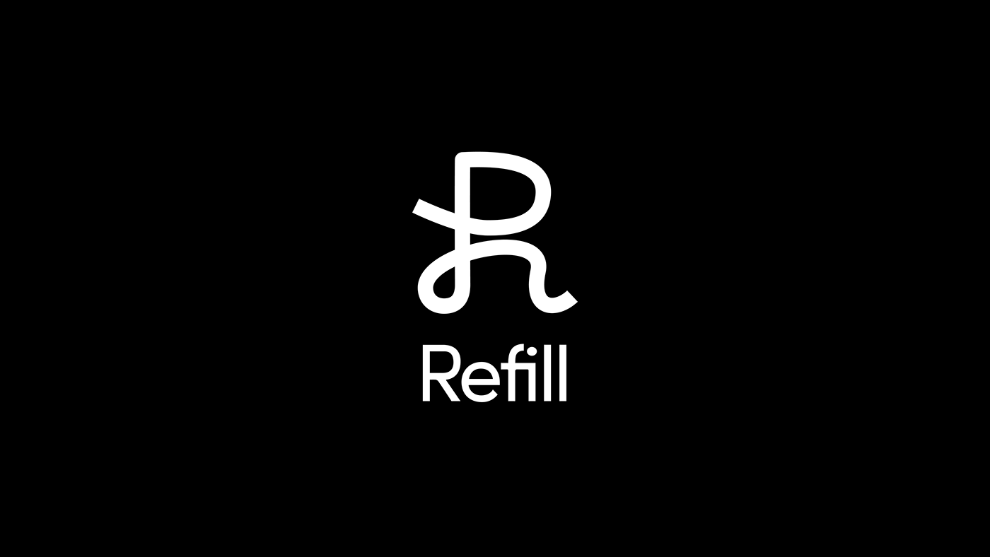
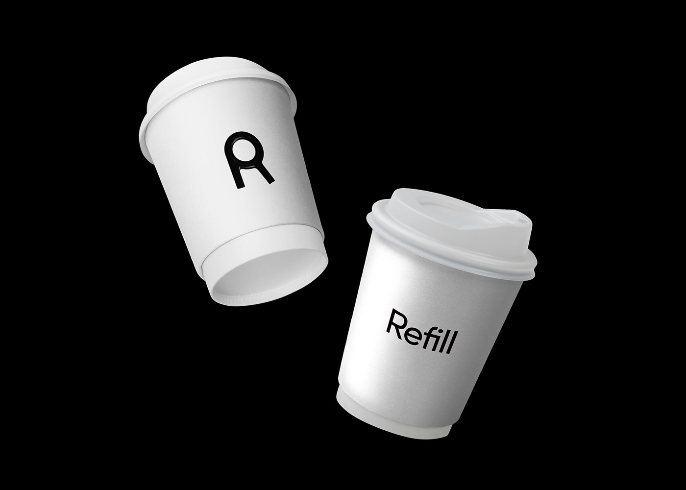
「Refill」的词意是「续满」,而「续满」的对象是多样的,它可以是杯子,可以是碗,也可以是盆、是瓶等等,只要是容器就行。那么「容器」这个概念,作为承载「Refill」的形象和精神的载体就再合适不过了。
在设计中,我们提取品牌名称的首字母「R」作为 Refill 品牌的核心识别符号,再围绕着「容器」这个概念来推进图形的演化。于是我们得到了一系列形态多样的容器「R」,并以此建立起品牌的视觉档案库,最终由这些形态各异的「R容器」串联起 Refill 的品牌识别体系。
Refill coffee is a standalone coffee shop located in Huadu Guangzhou. During the initial communication phase of the project, the young owners of the shop proposed some ideas about the brand, hoping that the image represented by the Refill brand would be simple, high-end, and convey a relaxed and fun atmosphere.
The word "Refill" means "to fill again," and the objects that "fill" can be diverse. It can be a cup, a bowl, a pot, or any container. Therefore, the concept of "container" was an excellent choice as a carrier of the image and spirit of "Refill."
In the design, we extracted the first letter "R" of the brand name as the core recognition symbol of the Refill brand, and then evolved the graphic evolution around the concept of "container." We thus obtained a series of diverse containers "R," which served as the visual archive of the brand, and ultimately connected the brand recognition system of Refill through these diverse "R containers."


Client:Refill coffee
DESIGN:谢奕烽 / 郭伟杰 / 颜林雄


