
DITO COFFEE
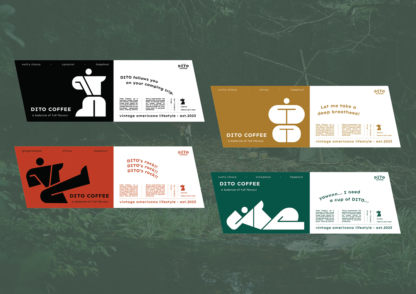
DITO isn't just a cup of coffee, it is a friend, a partner, follows you on your camping trip.
When it comes to coffee, we tend to think of a place, where we sit down and have a sip. But what about a sip of coffee during your camping trip? Especially for the people of the Americana lifestyle community. That's the reason DITO COFFEE was made. A coffee brand which is exclusively for those who love to travel.

DITO COFFEE aims to bring the coffeeholic different drinking experiences. We try to visualize the experiences through our design. The story is a all about people of the Americana community that loves camping. DITO as a person, he loves simple things, he is quiet but wild at the same time. And here comes our mood board for our branding.
These references belong to MR. NHAT DANG - the owner of RED ONION.

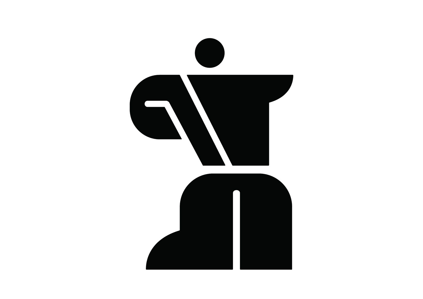

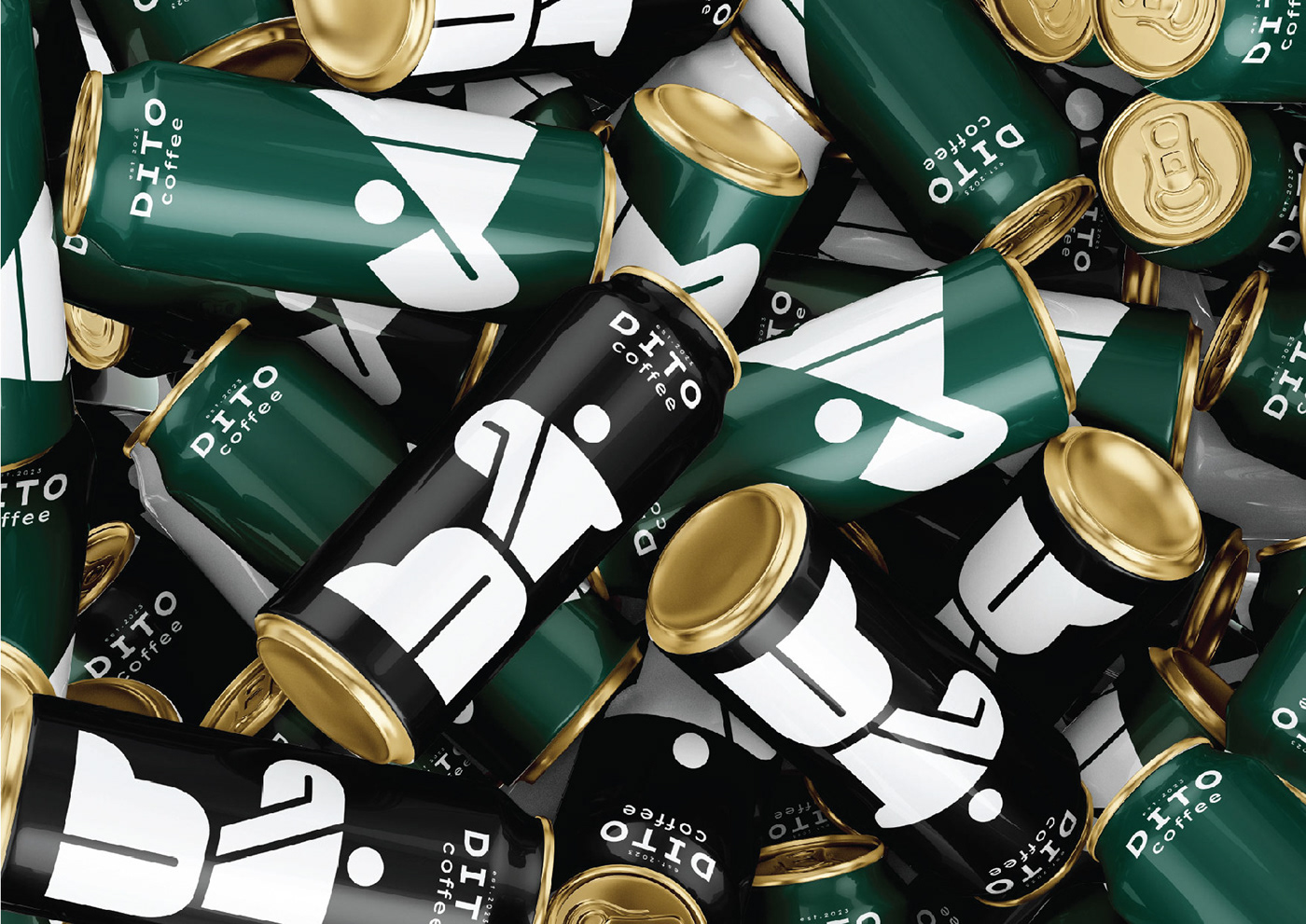
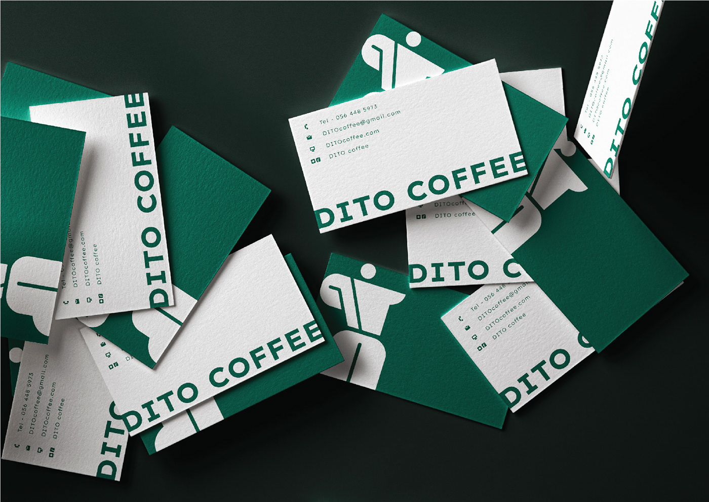
The story of DITO's logo describes a man who is sliding forward, with a bold and strong feelings, inspired by the shape of a MOKA POT, all together, become a unique mark of our brand. Three different versions down here are the combinations between typo and logo mark or typography only.
Here are three more states of DITO, DITO - the original, the fighter, the relax one and the meditator. in terms of colors, we chose different colors based on the characteristic of each state, black and white for the original DITO, red for the fighter, brings the feeling of eager to fight, green for the relax one and mustard for the meditator.


The font we used was Lexend Exa as its simplicity and it has different flexible weights.


Would you like a cup of DITO? Thanks for watching!
Designer: Ha Chan
