

IGNIS CUP NETSHOES MINERS
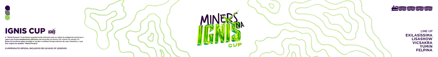
Após conquistar três títulos consecutivos no qualificatório da GODNESS CUP, surgiu a necessidade de aprimorar a comunicação da marca nessa modalidade. A ideia principal era desenvolver uma estética moderna e descontraída para a competição IGNIS CUP, utilizando o pattern já presente na identidade principal da Netshoes Miners. Essa pattern representa o mapa topográfico de Minas Gerais, combinado com elementos tridimensionais e um efeito de reflexo, transmitindo a ideia de inovação e modernidade.
After winning three consecutive titles in the GODNESS CUP qualifier, the need arose to enhance the brand communication in this modality. The main idea was to create a modern and laid-back aesthetic for the IGNIS CUP competition, using the pattern already featured in the main identity of Netshoes Miners. This pattern represents the topographic map of Minas Gerais, combined with three-dimensional elements and a reflective effect, conveying the concept of innovation and modernity.


PROCESSO CRIATIVO:


