"Legko" skimmed dairy products
Eng/
Millions of people use milk in their diet every day. But there are people who are intolerant to milk fat and can only consume skim milk. Or people lead a healthy lifestyle and deliberately refuse to consume milk with regular fat content. Therefore, skimmed milk products are produced for such people. But visually, the packaging of such products practically does not differ from the packaging of dairy products with standard milk fat content. Therefore, our task was to develop a naming, positioning and package design for skimmed milk products, which will visually reflect the properties and value of the product, and at the same time stand out among the competitors.
Rus/
Ежедневно миллионы людей в своём рационе используют молоко. Но при этом есть люди, у которых непереносимость молочного жира, и они могут употреблять только обезжиренное молоко. Или же люди ведут здоровый образ жизни и сознательно отказываются от употребления молока с обычной жирностью. Поэтому для таких людей выпускается обезжиренная молочная продукция. Но визуально упаковка такой продукции практически не отличается от упаковки молочной продукции с обычным содержанием молочного жира. Поэтому перед нами стояла задача разработать нейминг, позиционирование и дизайн упаковки для обезжиренной молочной продукции, которая визуально будет отображать свойства и ценность продукта, и при этом выделяться среди конкурентов.
CREDITS/ Art director & Design/ Igor Vetoshkin
Illustration/ Kristina Vetoshkina
CLIENT/ If you like it you can buy it

Eng/
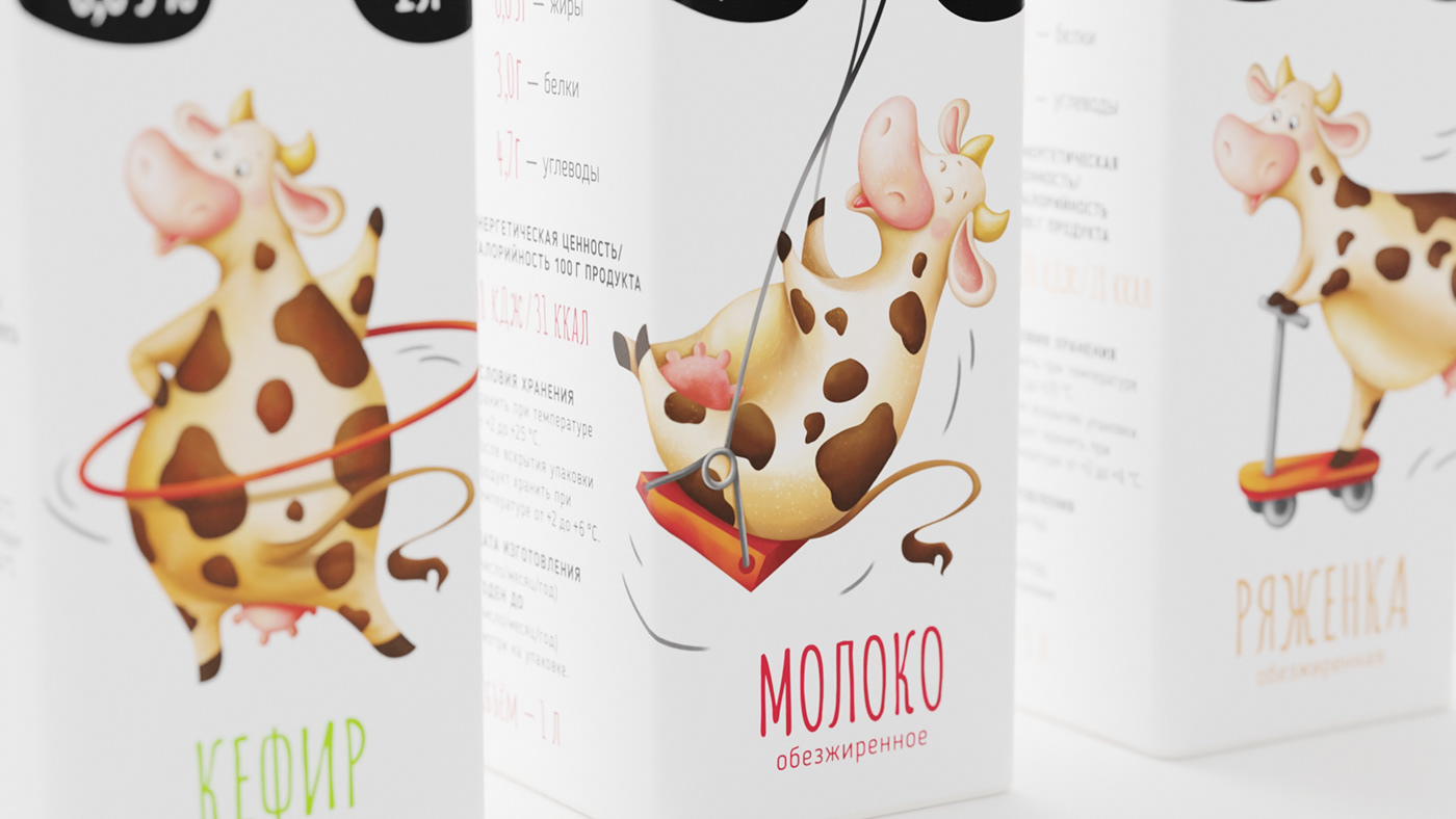
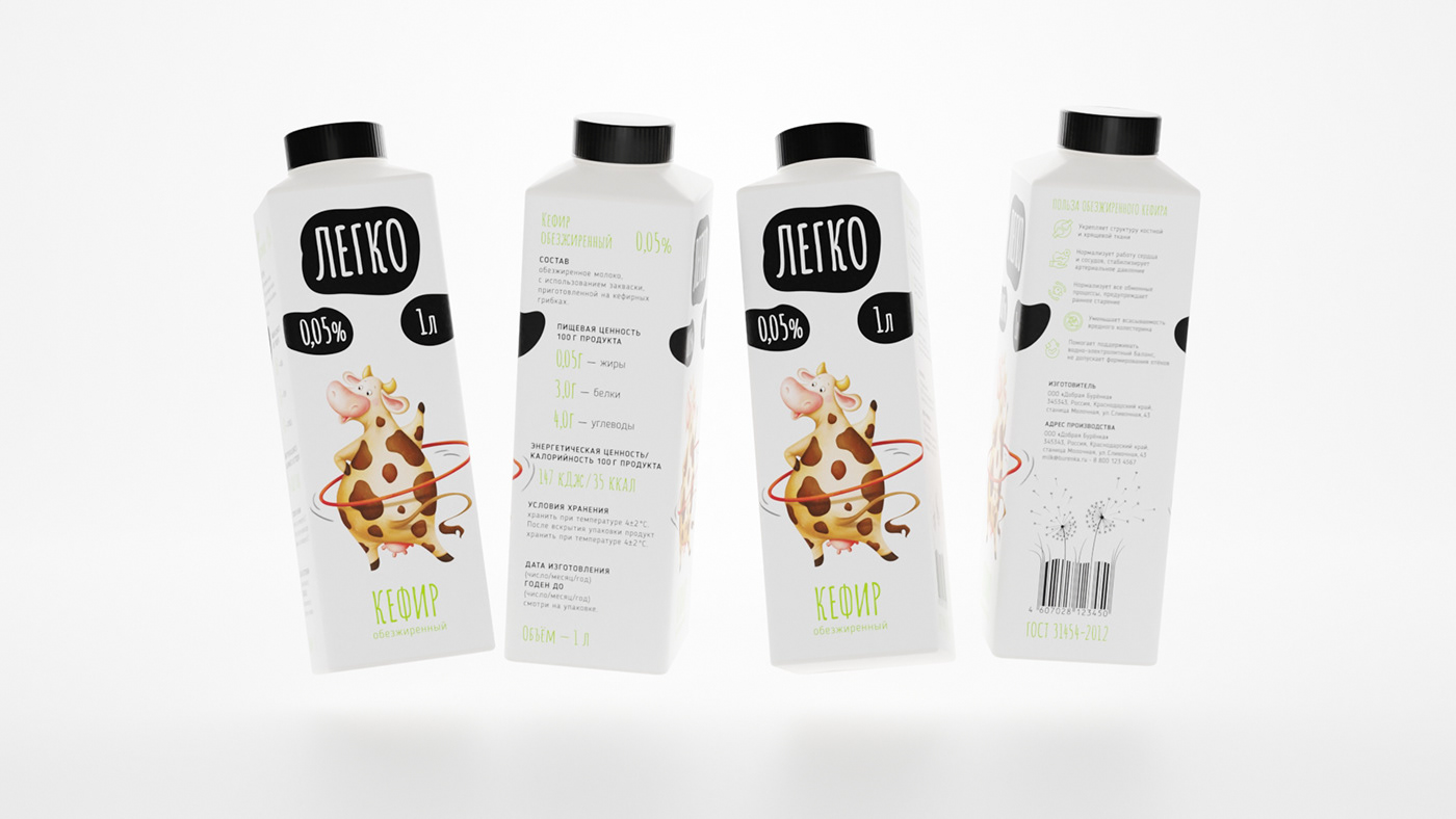
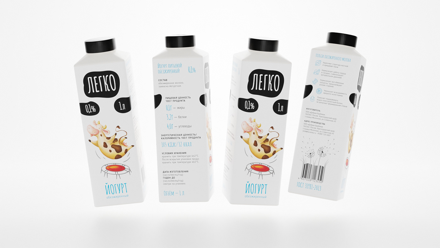
Considering that most people with a milk fat intolerance feel heavy after drinking regular milk, we proposed a solution to convey through the design the feeling of lightness when drinking skim milk. So we got the image of a cow that easily rides a swing, easily performs acrobatic tricks, and easily rides a scooter.
Rus/
Учитывая, что большинство людей с непереносимостью молочного жира испытывают тяжесть после употребления обычного молока, то нами было предложено решение передать через дизайн чувство лёгкости при употреблении обезжиренного молока. Так у нас получился образ коровы, которая с лёгкостью катается на качелях, легко выполняет акробатические трюки, с лёгкостью катается на самокате.


Eng/
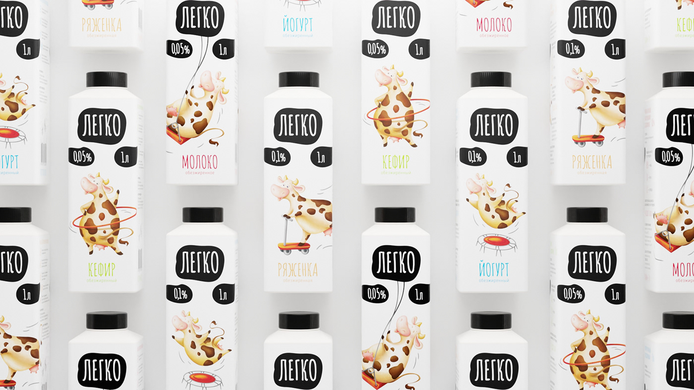
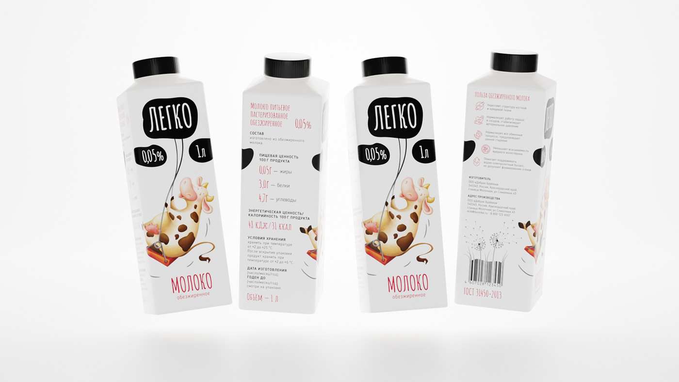
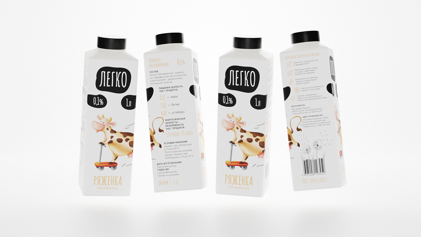
Since it was decided to translate the properties and benefits of the product through the image of a cow, it was decided to focus on the character in the package design. That's why the main background of the package is white, to highlight the main character. The image of a funny and carefree cow would allow the product to stand out among the competitors.
The design of the packaging is quite minimalistic. The upper part of the package is reserved for the logo and the metrics of the volume and fat content of the product. The logo itself is made in the form of a spot on a cow, thereby indicating that the customer is facing a dairy product. The lower part of the package is reserved for the illustration and the name of the product. The differentiation of the product within the line is built by the actions of the cow, as well as by the color in the product name. The sides of the package are reserved for technical information. All the information is divided into blocks, where the accents are made on the properties and advantages of the product. An additional accent was made on the barcode with an illustration, where the lightness of the product was additionally emphasized.
Rus/
Так как свойства и преимущества продукта решено было транслировать через образ коровы, то было принято решение в дизайне упаковки акцент делать на персонаже. Поэтому основной фон упаковки сделан белым, чтобы выделить главного героя. Образ забавной и беззаботной коровы позволит выделить продукт на полке среди конкурентов.
Дизайн упаковки выполнен достаточно минималистично. Верхняя часть упаковки отведена под логотип и метрики объёма и жирности продукта. Сам логотип выполнен в виде пятна на корове, тем самым указывая, что перед покупателем молочная продукция. Нижняя часть упаковки отведена под иллюстрацию и наименование продукта. Дифференциация продукта внутри линейки строится за счёт действий коровы, а также цвета в наименовании продукта. Боковые стороны упаковки отведены под техническую информацию. Вся информация разделена на блоки, где акценты сделаны на свойствах и преимуществах продукта. Дополнительным акцентом сделали штрих-код с иллюстрацией, где дополнительно подчеркнули лёгкость продукта.