
RiPrism, 2014
A luxury Korean and Japanese nail art and accessory brand specialising in producing glitter in a vast range of tints, hues and textures within individually curated themes.
'Iridescence of the cosmos at the tips of your fingers.'
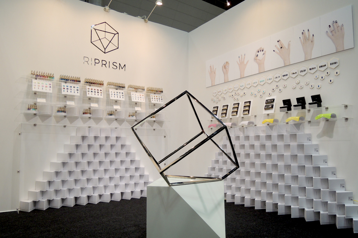
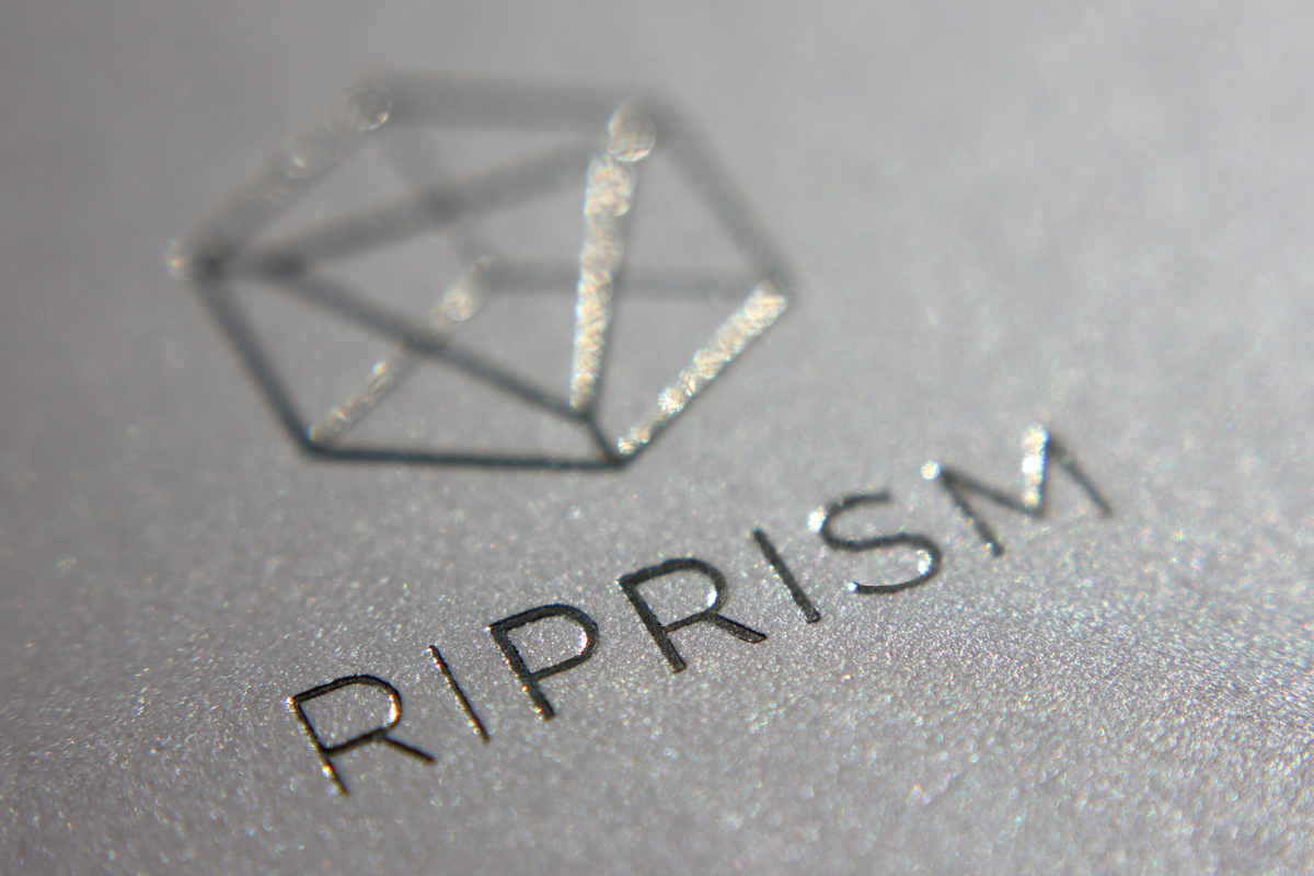
The brand uses the shape of a prism sculpture deconstructed into outlines. The shape plays with both the positive and negative shapes of a cube and pyramid. This creates a framed space which allows the identity of the brand to infinitely change through colours and shapes of the glitters held within. The hot stamp gold foil on pearl paper used throughout the branding acts as contemporary reference to the glitter product range. The packaging reflects the high-end brand positioning and uses angular shapes with clean lines to showcase the products. The RiPrism trade fair booth centres around the brand sculpture which gives the customers a physical and real exploration of the identity which is surrounded by the brand story and it's products.

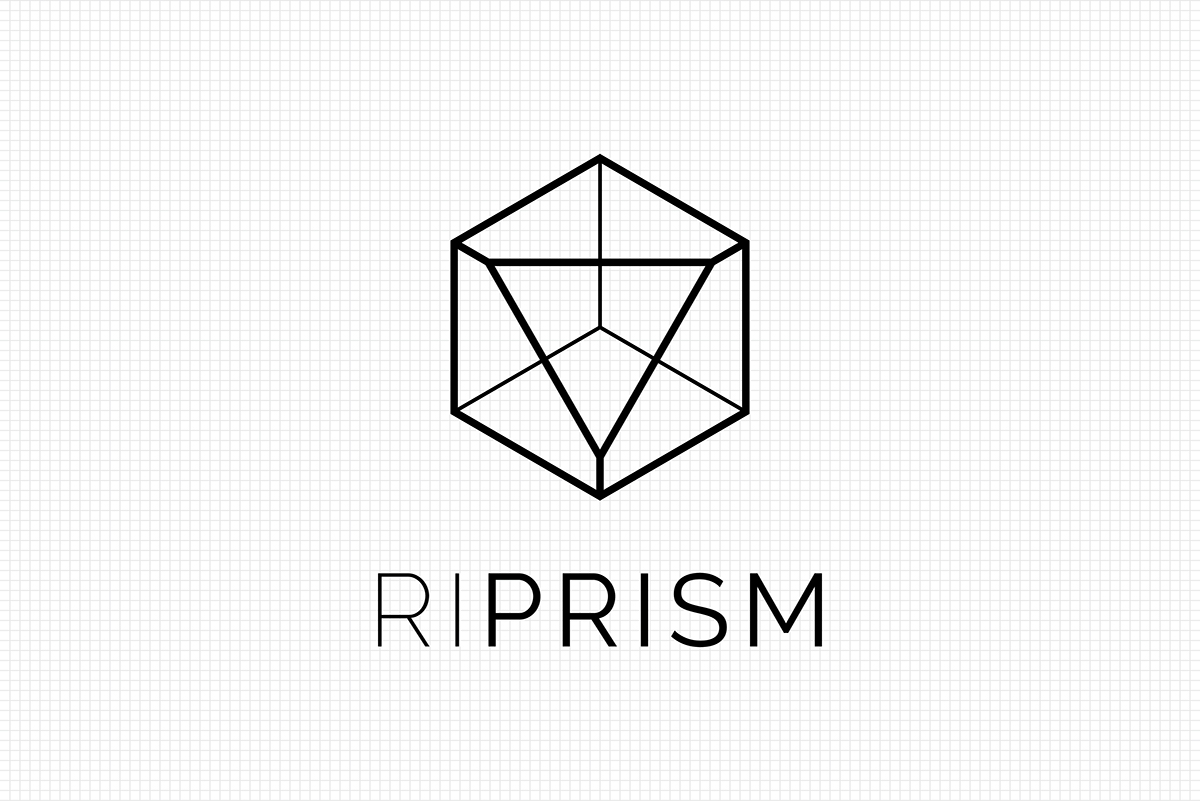
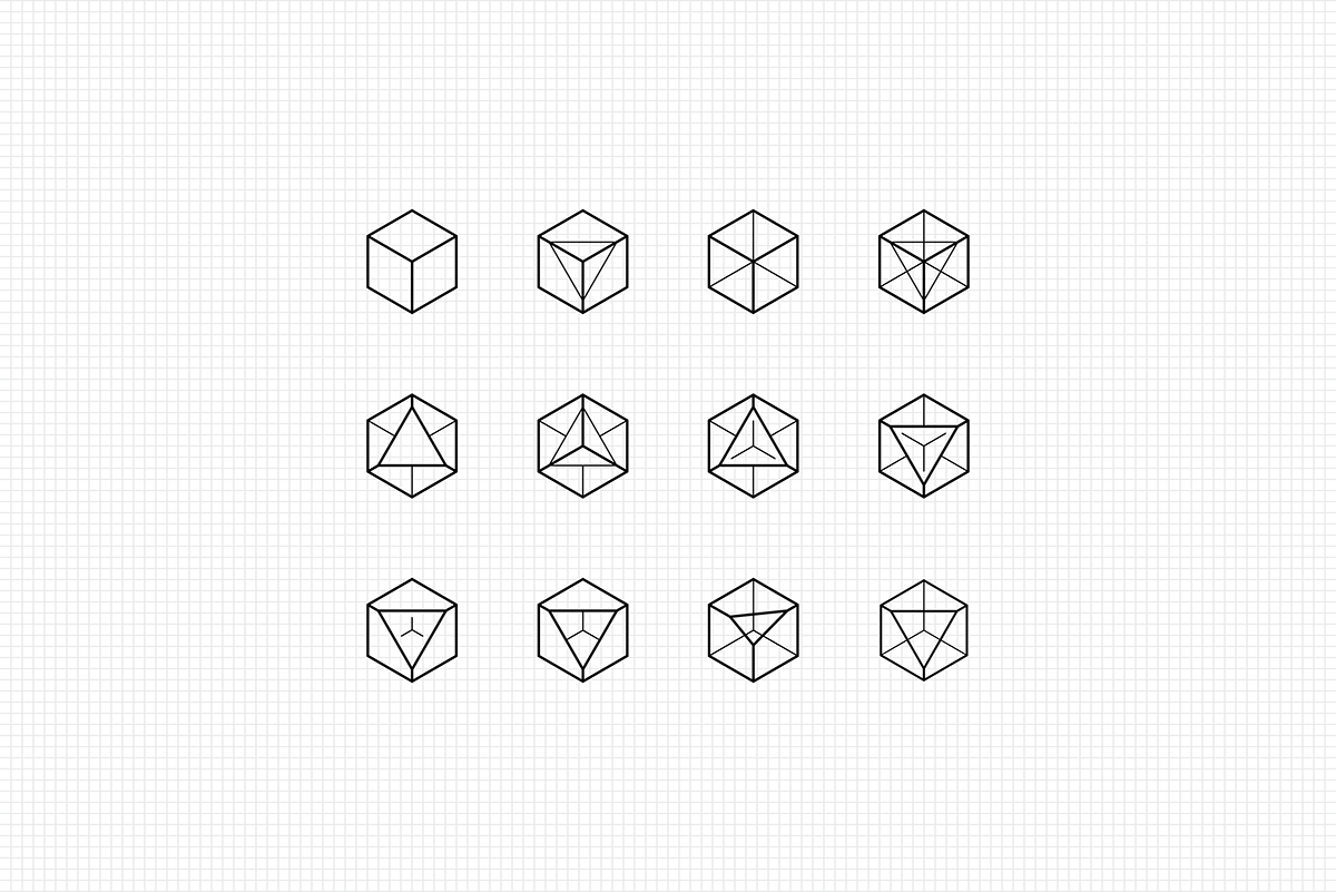

Logo development

Tokyo trade fair booth

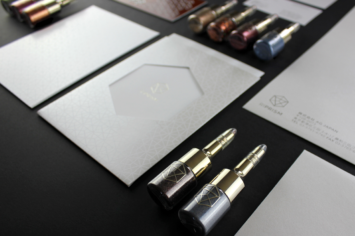

Branded collateral

Tokyo trade fair booth
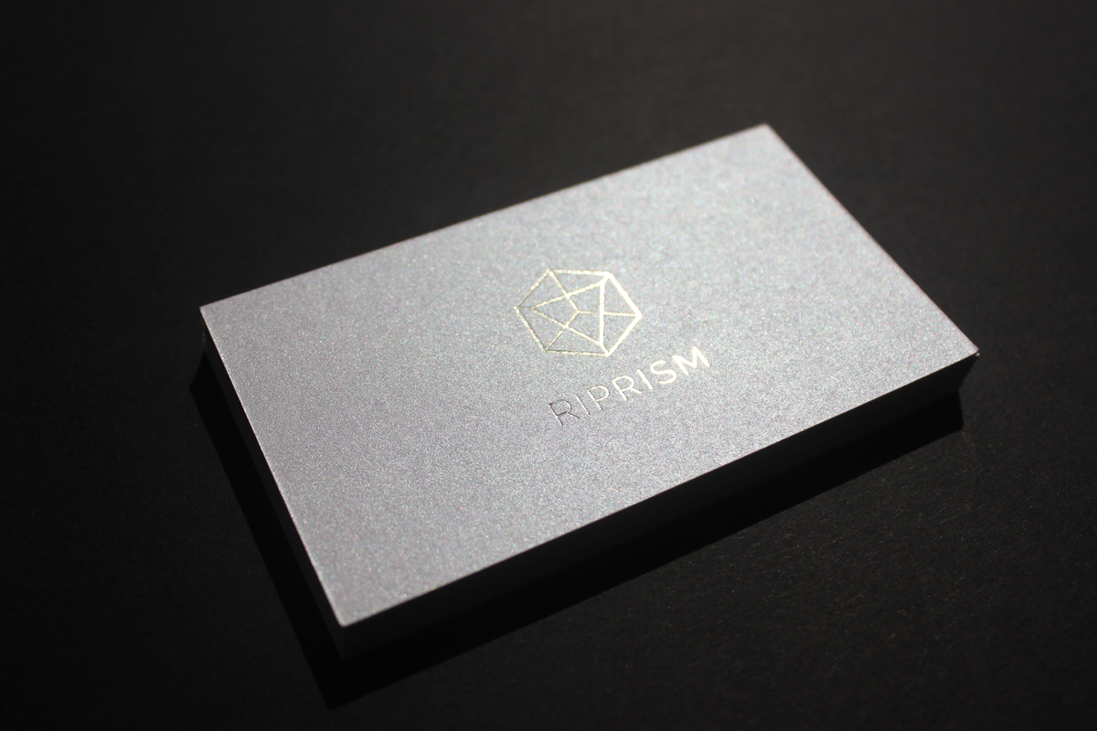
Business cards

Envelope pearl detail

Theme brochure in sleeve

White foil pattern detail

Product theme

Brochure detail

Tokyo trade fair booth


Product packaging