
These are my interpretations of the Adobe logo.

This video shows the process...
The first design contains all the necessary information to recreate the logo at any size. It is a direct representation of the construction maps I make for myself when doing largescale geometric artworks.The second design was done on a seperate day and is a layer added after constructing the logo according to the first day's plan.

When I was approached to participate in the Remix project, the first step was to deconstruct the Adobe logo in order to determine how to recreate it. In that process I was reminded of how important Illustrator had been (and continues to be) for me in designing and constructing all of my exactly rendered geometric artworks. With this template for building the logo, the next line of development was what else I might want to add to the design. These two lines of development becamse the ones I followed.
Background
The first several years of the earthscape art on the beach, the only access I had to making something truly large was to use geometry as a construction aid.

Illustrator was my main off-beach tool, used either to create a design from the ground up of arrangements and intersections of circles, discerning and highlighting the patterns to be found, or to deconstruct and reverse engineer a design, as I did with the Adobe logo. Both processes have their own explorations and lessons.
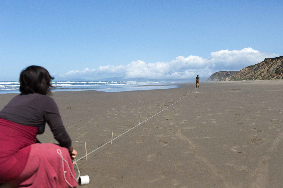
The next crucial step was to determine which bech to use and when it would be available to me in order to meet my desire to maximize the size of the design. I consulted the tide charts and found a couple of days that met my criteria of a high high tide followed by a low low tide, with the low tide occurring during day light hours [my life now appears to be dictated by the tides, which in turn follow the lunar progression]. I had been doing recent work on several San Francisco beaches and knew a good location. With date and location set, I called upon my crew to join me...
Outing: Day 1

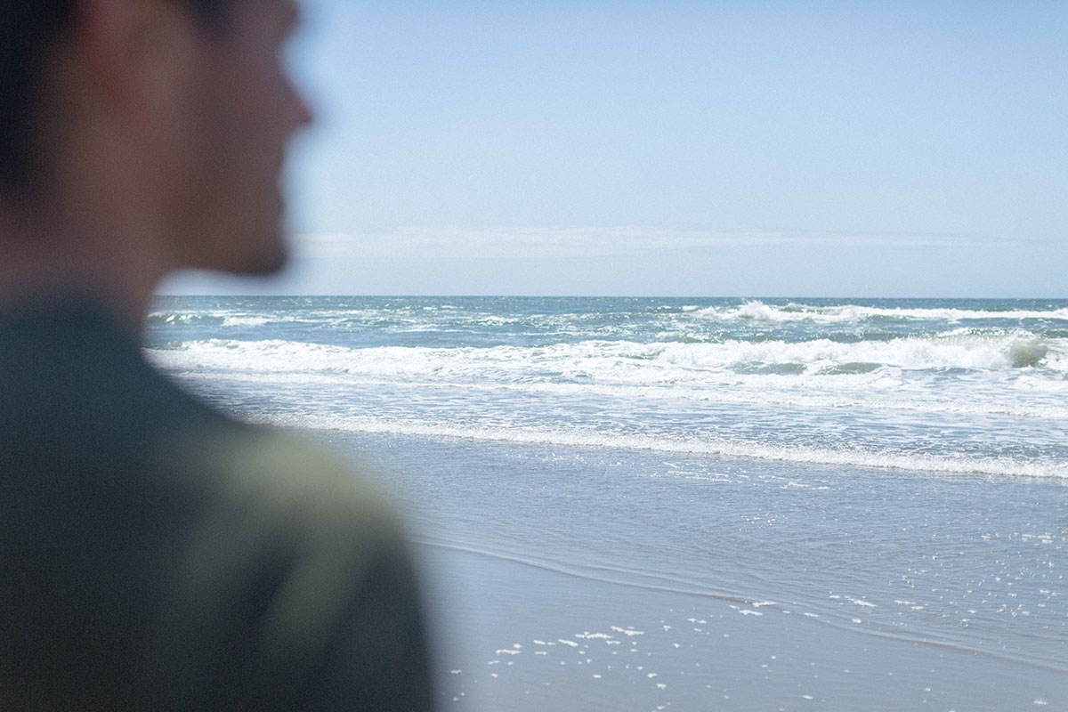
On the first viable day for work (or so I projected), I was pelased to see that the sun would be past directly overhead when we would be finished and opposite the vantage point, the perspective for which the logo was oriented. This matters, as can be seen when comparing the first day's work with the second- the clarity of the artwork in enhanced when the sun is opposite the viewer, contrast is naturally higher.

Begining the work and already getting a bit confused. It never fails that something I haven't considered comes in to throw a bit of a wrench in the process. It makes each outing unique and exciting (which, in the moment, can feel like anxiety when I am counting on a specific outcome and the tide is showing its return).
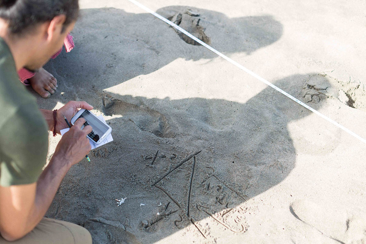
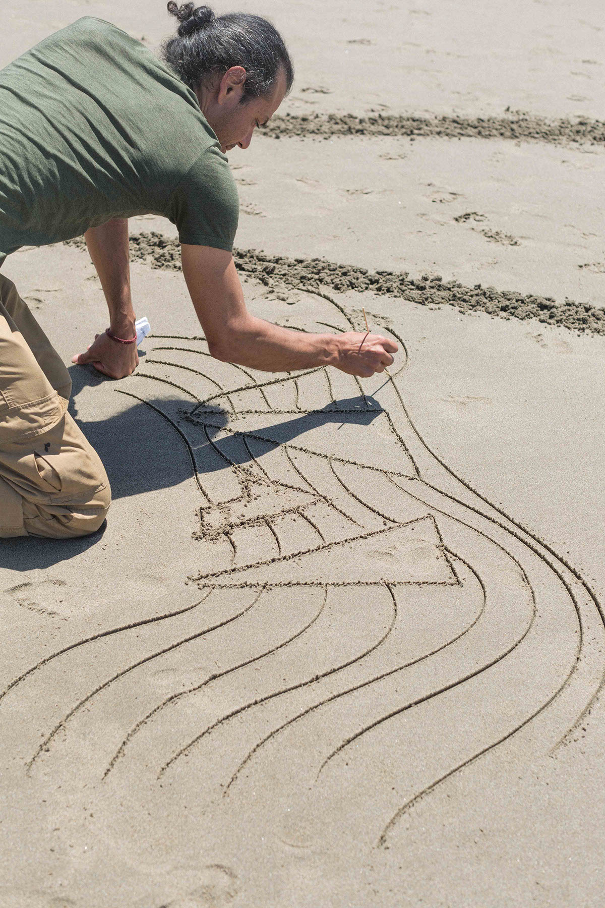
In order to center the design for the timelapse camera on the hill, I made a perpendicular centerline as my starting line. However, my design guide was based on starting with the cliff-side parallel guideline. I already had my methods for laying out everything else based upon first estableshing this line. I had gotten swept up in the moment, accomodating the camera, which hadn't been considered in my construction planing, and I now would have to halt the action to figure out the top and bottom line based upon the vertical line. It can seem like a trivial concern. However, this kind of design highlights the precion (and imprecision) of achieving a design of this scale. At the large scale, small initial discrepencies can snowball easily. In order to check that my bottom line was perpendicular to the centerline, I had to dig up Pythagorean's theorum, as this image shows. My efforts were for naught as I ended up scrapping this initial shift in approach in order to stick with the plan I had already laid out and knew would work. I began from the start, having lost precious time pursuing this direction. It's another reminder to me to not get so caught up in the moment that I disregard the planning I've done.
The translation from design on computer to the actual world always reveals the messiness of actualizing anything. In this photo I am calculating the sizes of the various components of the design based upon the amount of space the beach was offering me this day. Since I can't know in advance what exact amount of space I will have to work with, I construct using units of mesaurement that can get larger or smaller (shown in the first day's image as the circles- the smallest circle being the smallest unit). The amount of space I have determines how large the units are. When I redid the design the following week I was armed with with a confideent sense of what would be possible on the beach and what the various measurements would be and was able to do this part more efficiently. However, on this first day, calculating this part took more precious time.

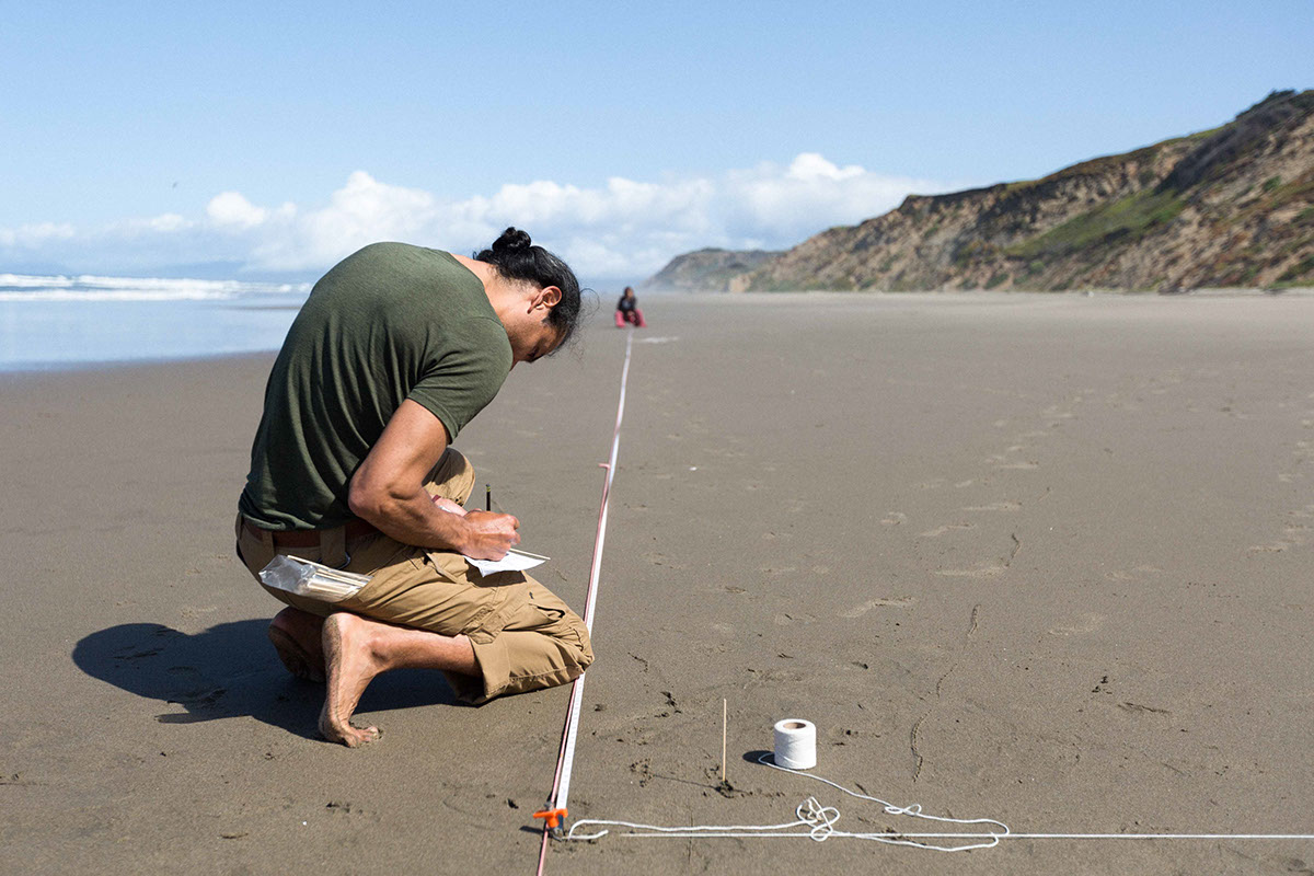
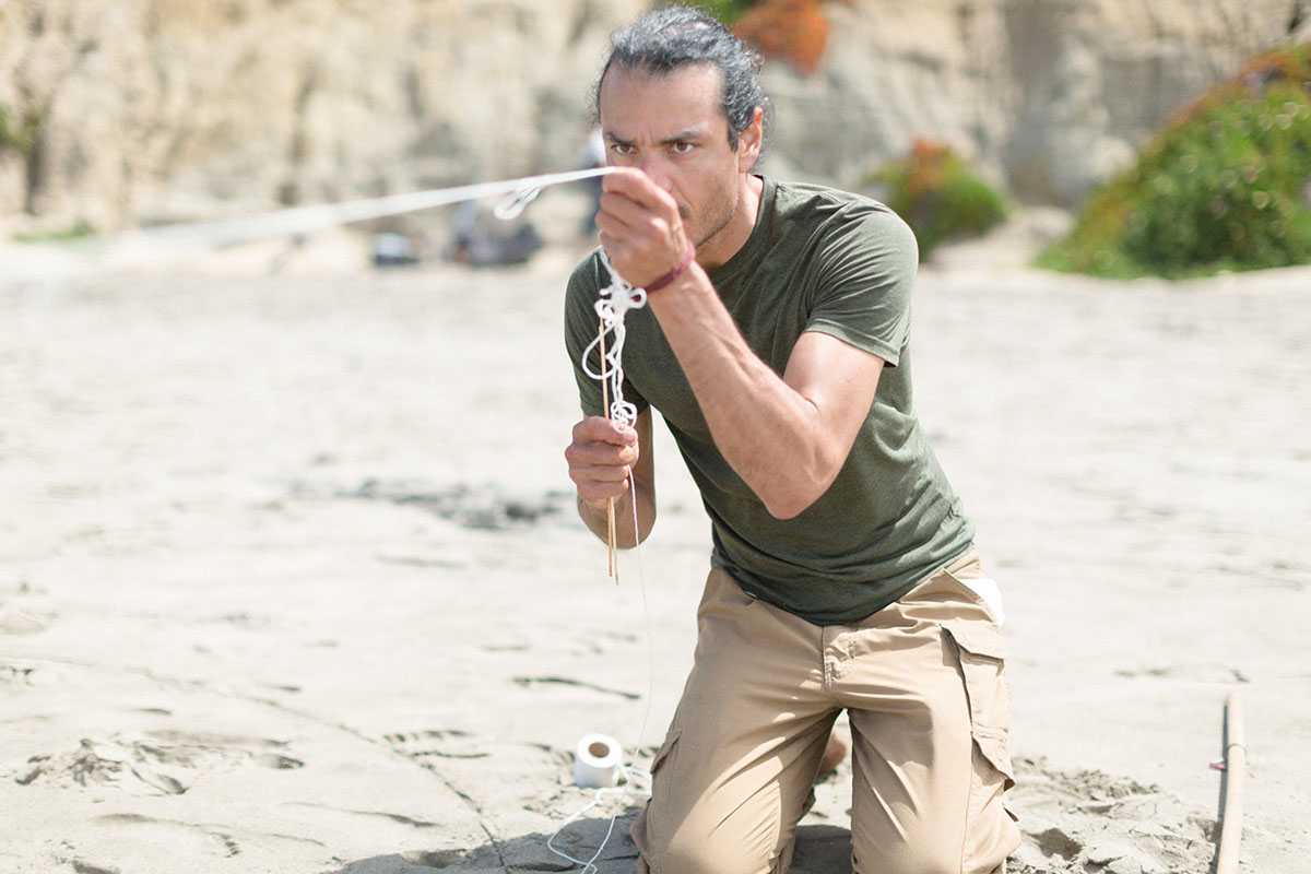
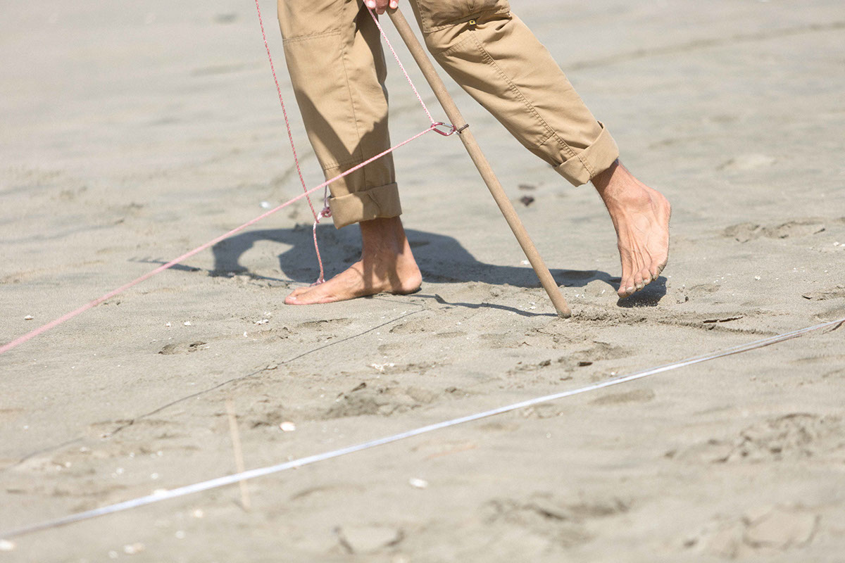
These were my tools, along with the rake: tape measure, twine for guideline, cord to use as a compass, stakes as compass centerpoints, and skewers to mark measurements within the design.
I didn't fully scrap the initial layout work. Since the centerline was oriented to the timelapse camera, I still needed to base everything else from it. In this image I am eyeballing the cliff-side guideline, attempting to gauge its perpendicular-ness to the centerline. The length of the design is 190 feet.
The skewers indicate where major design elements are placed such as a circle or a guideline.
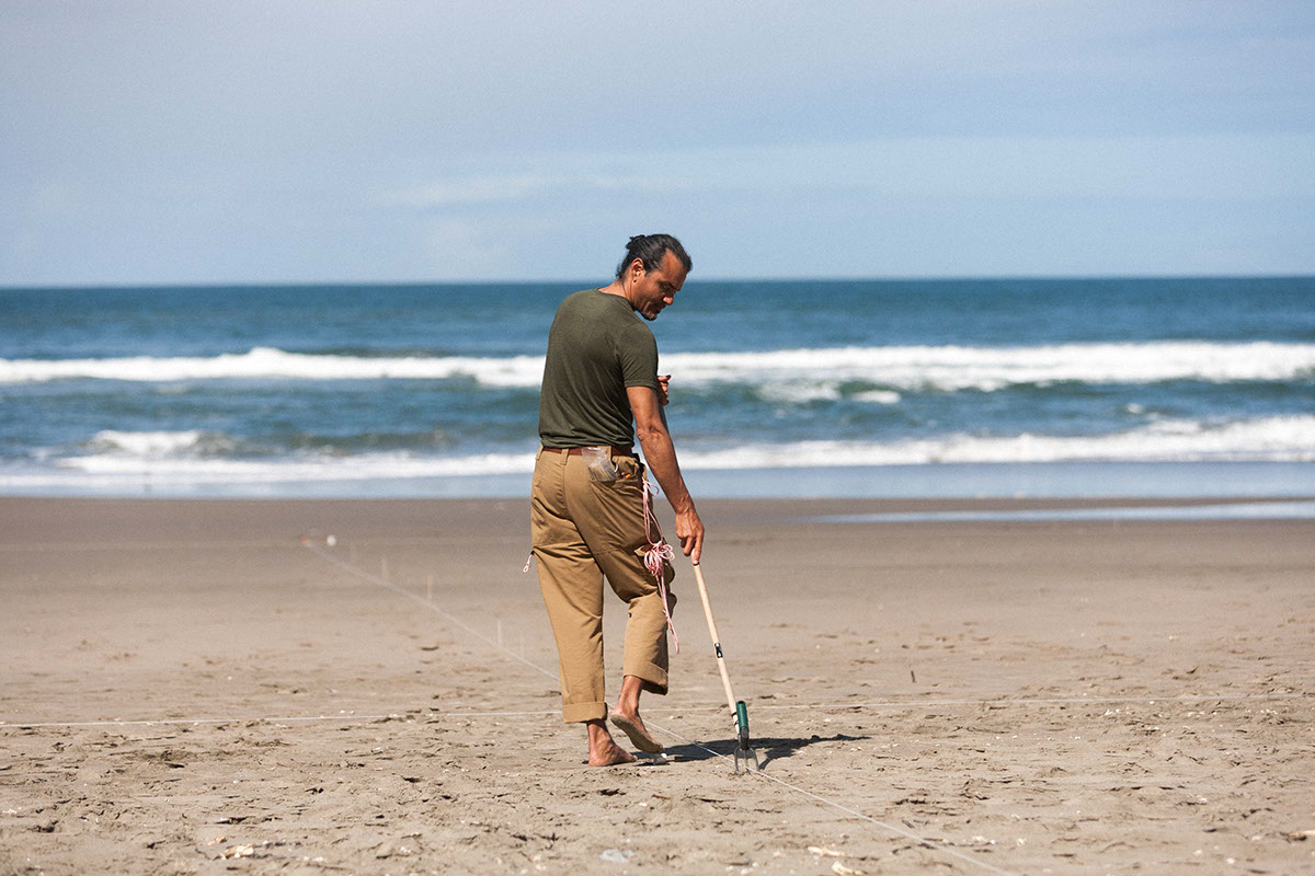
With the cliff-side and ocean-side lines laid out with my fine marking tool and the major elements placed, I begin raking.
Now raking the line that defines the guideline on the cliff side of the logo.
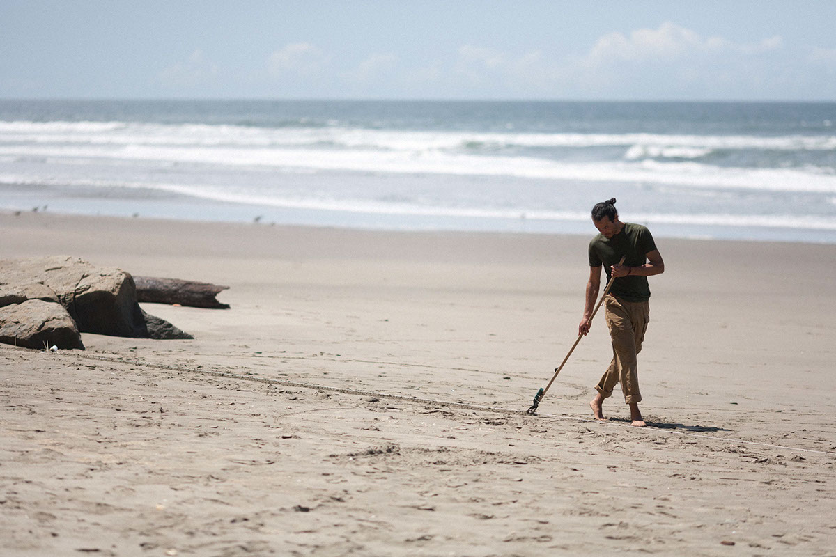
Having drawn in the main guidelines, now I start work on the circles using a cord as a compass which is connected to my marking stick and can be quickly readjusted. If I were not being so ambitious and going so large, or if I had more time before the tide were to return, I could have laid out the entire design using only circles to mark out the units of measurement that the entire work was based on. However, since time was tight, I did shorthand using a measuring tape. Efficiencies such as this would enable me to more quickly lay out the logo design the next visit to the beach, which would offer me more time to do a further design layered on this one.
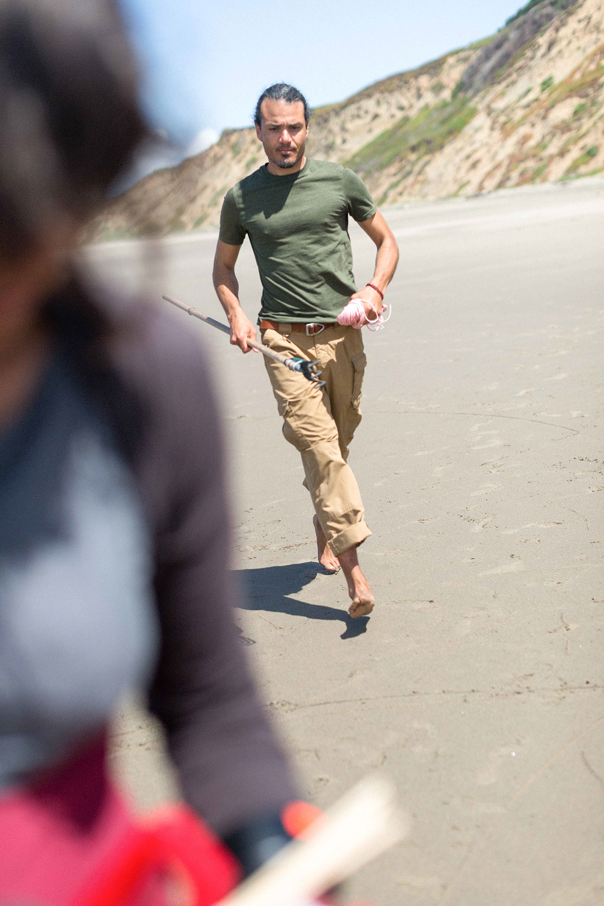
Work was taking longer than anicipated, which can offen be the case the first time through a design. Its why I gave myself 2 opportunities to do this for Adobe. This first day was intended as a 'dress rehearsal'. It turned out good enough to warrant trying a different design the following time. Part way through, though, it was looking like there would not be enough time to finish (I thank a very slowly returning tide with giving me more time that I had any reason to expect). Towards the last third of the construction, I was frantically running back and forth across the canvas.

The guide circles are in position. They define where the main guidelines will be placed- from a certain circle at the top line to a circle at the bottom line. I am raking a guideline in this photo.
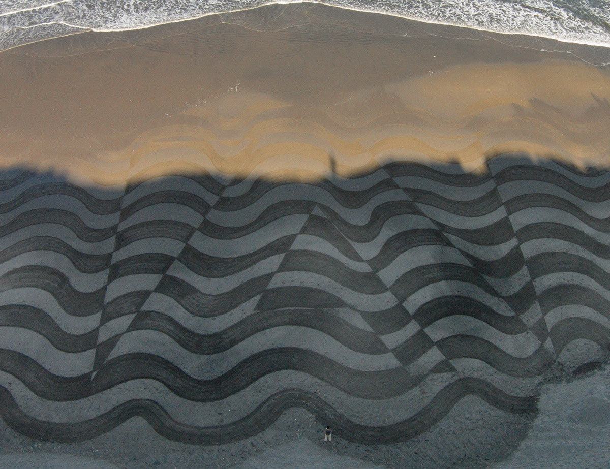
Final- Day 1

The guidelines define the major elements of the logo. Following them, I create the positive space portion of the Adobe logo, defined as a heavy stroke.This image is taken after 4 passes with a wider rake within the positive space. By this point, my cliffside circles were drying out and required multiple retracings in order to have them stand out as much as possible for the final photos. By the time we wrapped, I was exhausted!
Reflection Day 1
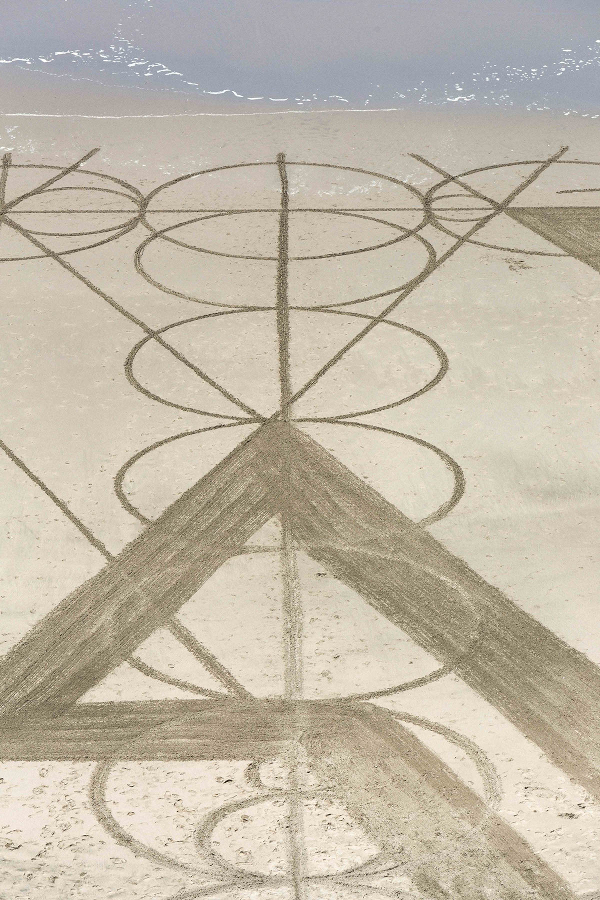
Guidelines are not intersecting as perfectly as planned. There are several places where this is present in the finished piece. At the scale of this design (130' tall x 190' wide) there are many ways in which the translation from conceptual perfection to actuality can be messy. Over such a distance, the cord I am using when making the arcs defining the top and bottom guidelines can stretch and create inconsistencies. Also, my eyeballing the cliffside line towards the start could easily have introduced misalignment of a couple of degrees. It is partly due to the prominence of imperfection in the geometrically oriented art that I appreciate organic designs that do not rely on perfect alignments(!)

The 4 arrow lines that create the arcs that determine exact positioning of the seaside and center guideline were difficult to visualize when I was on the ground placing them. As a result one on either side gets lost within the filled portion of the logo.
While I was initially disappointed by the section drying out at the bottom right, it definitely makes it clear that the artwork is real and not Photoshopped, a charge which I recieve every now and then.
Assessment: Overall, I am pleased with the effort.
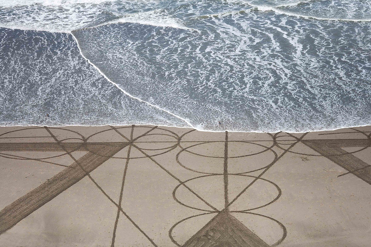
Almost immediately thetide began eating major portions of the design.
There is no escaping the returning tide. My art is defined in large part by what is realistic to complete within the time between tides when there is sufficient wet beach to do my work. I generally give myself about 2 hours to complete an artwork. Time spent working on logistics is time taken from completing the design. Especially for geometric designs, I hope to minimize thinking and have all my steps clearly laid out. But as mentioned previously, not all factors can be anticipated. Every outing is a technical learning experience. The first time through a desgn always reveals the missed factors.
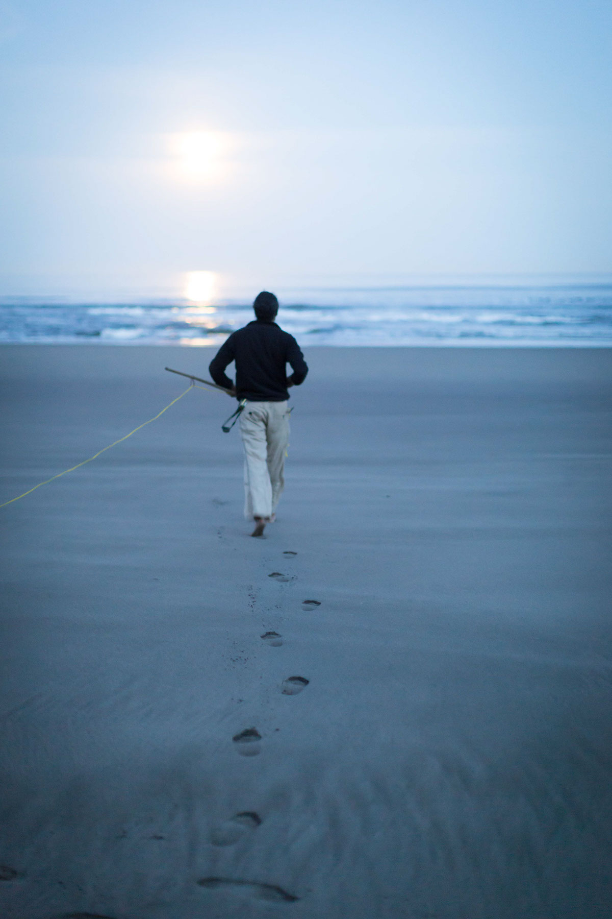
Here I am doodling with the design I may do on my return visit the following week. For the one I do next time which will incorporate an organic element, I must still lay out the logo precisely. This day gave me the understanding of what I would need to do the next visit in order to be more efficient time-wise, as that would be just the first of a 2-phase construction process.
Day 2
On the visit the following week low tide was at 5am. The full moon was a few hours from setting. It was a rare calm, even warm, morning.The beach had no other footprints- the canvas was ideal. However, I did find that despite the fact that the previous tides were both higher and lower than my first visit the week prior, there was not more beach available between the cliff and the water. In the short span of the week between visits, sand was noticeably piling up at the cliff-side of the beach, which is the normal seasonal occurence (conversely, winter storms remove beach sand and flatten out the beach). The upshot- the design would not be able to be larger than the previous visit. This allowed me to use the same measurements as the visit before. Had I more space to work with I might have gone for a larger design (a downside of my ambitious nature, which in this case would have bitten me come phase 2).

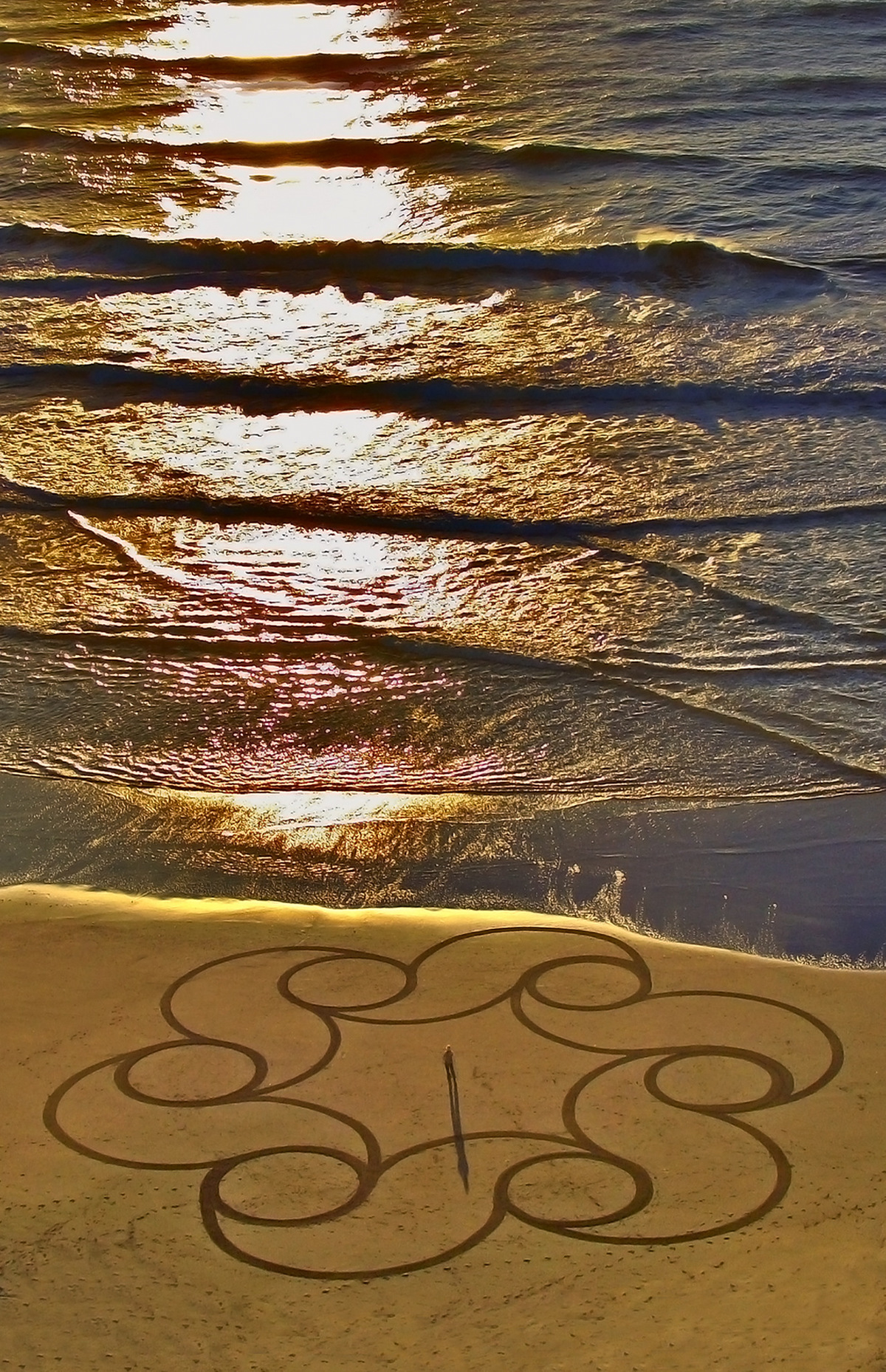
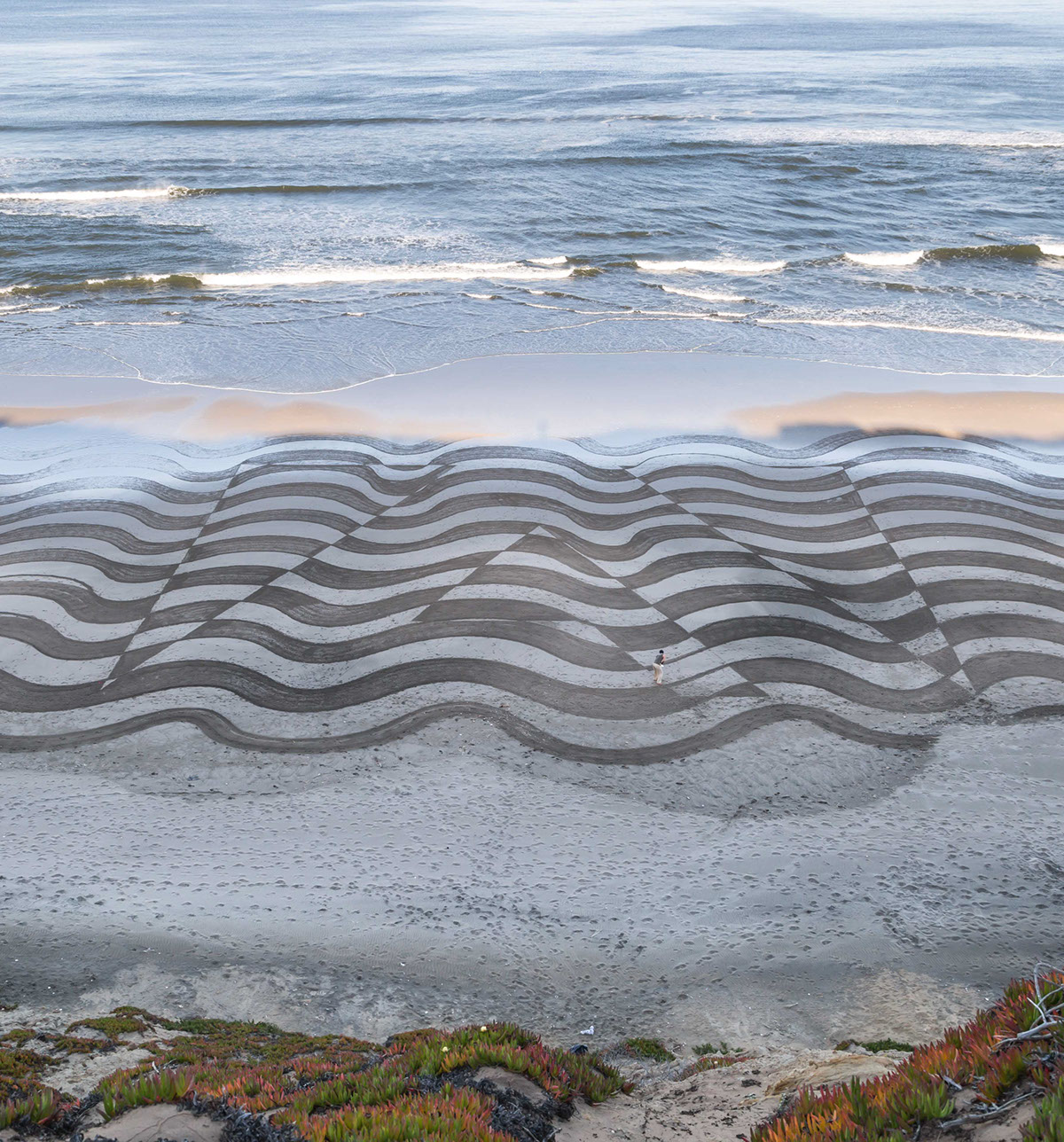
After going through the process of laying out the logo, as per Day 1, the second phase of the design-making was to layer the organic component.

Final- Day 2
Reflection
There is always a moment when finishing and looking upon the creation from above that I get to see what has resulted in actuality versus what I had sketched previously. Upon higher level reflection there always becomes apparent the changes I would want to make. For this particular design I would have made the waves much more organically wavy- it seemed taht I was doing that on the beach, but from above it wasm uch more regular than I had intended. Also, I would have framed the wavy lines a bit better on either side of the logo and added more of the waves on the cliff-side (which would mean lots more work and we were already racing towards the end to finish before the sun got higher (if I'm racing it is generally a good sign that I've been optimistic in my plans). The cliff-side dry sand acted as a hard boundary so nothing could have been done about that except to have done the design closer to the water, or to have made it smaller. I like what resulted though I didn't quite finish in time to beat the rising sun which is removing contrast from the top of the design.

All of this highlights the in-the-moment nature of the artwork. There are logistical constraints to a design of this scale- time and labor being the two biggest. These determine how ambitious I can allow myself to get, which in turn determines the design that gets done. And then there are constraints of nature- sunlight (or lack of it), tide and wave movements, shifting beach, even the sunniness of the day which causes more or less drying of the sand. When I plan towards making an artwork, I try to factor in as many variables as I can to offer me the likeliest chance for optimal conditions, for coming away from the outing with a good photo. And then I must arrive at the beach prepared to work with the conditions that are present. The conditions dramatically shift what is possible or what I choose to do and so flexibility of design is important. This has favored more organic designs that can shift according to the variations that the beach may present. The day 2 design was a blending of the precise with the organic.

Reflection on my part in the Adobe Remix Project
The images I submitted are ones I feel good about. I can have niggles of various manner about what I am seeing when I look at the images and can have the desire to redo, readjust, or reapproach some aspect or other. I can't not self-critique this way. I wish I had had the opportunity to try many different deisgns before turning in a final selection for this project simply for the capacity for the development process to occur more fully. However, the ultimate voice of the beach medium is the tide- having the right one and being at the right time at the right location. It shifts seasonally and the project needed to be completed before there were many beach opportunities. Thus the opportunities that were available would be practice run/development/final product days wrapped together.
Day 2 lit a path of exploration that I have found intriguing- bringing together the geometric and the organic in a cohesive way. I am sure to look back upon my efforts in this project as first forays exploring new braches of possibility.
Overall I am happy wth this project. It was great fun to take on and I appreciate having had the opportunity.


