


Student Project
GLYPH is a quarterly magazine focuses on showing excellent typography design and introducing skills and knowledge. The feature article of the first issue is to introduce combining different typefaces in a project. It came with a question when I was working on the cover design: Why should people need to know and learn combining different typefaces? The answer is: Because it works and could also help the design project become more interesting! With this answer, my solution was showing the beautiful, powerful typeface combination on an image. I directly combined several typefaces, tried to give a strong and straightforward impression through the typographic design.
GLYPH is a quarterly magazine focuses on showing excellent typography design and introducing skills and knowledge. The feature article of the first issue is to introduce combining different typefaces in a project. It came with a question when I was working on the cover design: Why should people need to know and learn combining different typefaces? The answer is: Because it works and could also help the design project become more interesting! With this answer, my solution was showing the beautiful, powerful typeface combination on an image. I directly combined several typefaces, tried to give a strong and straightforward impression through the typographic design.


I add a pin board (or say dots board) on the background, which makes the layout looks like a working space of the typefaces.
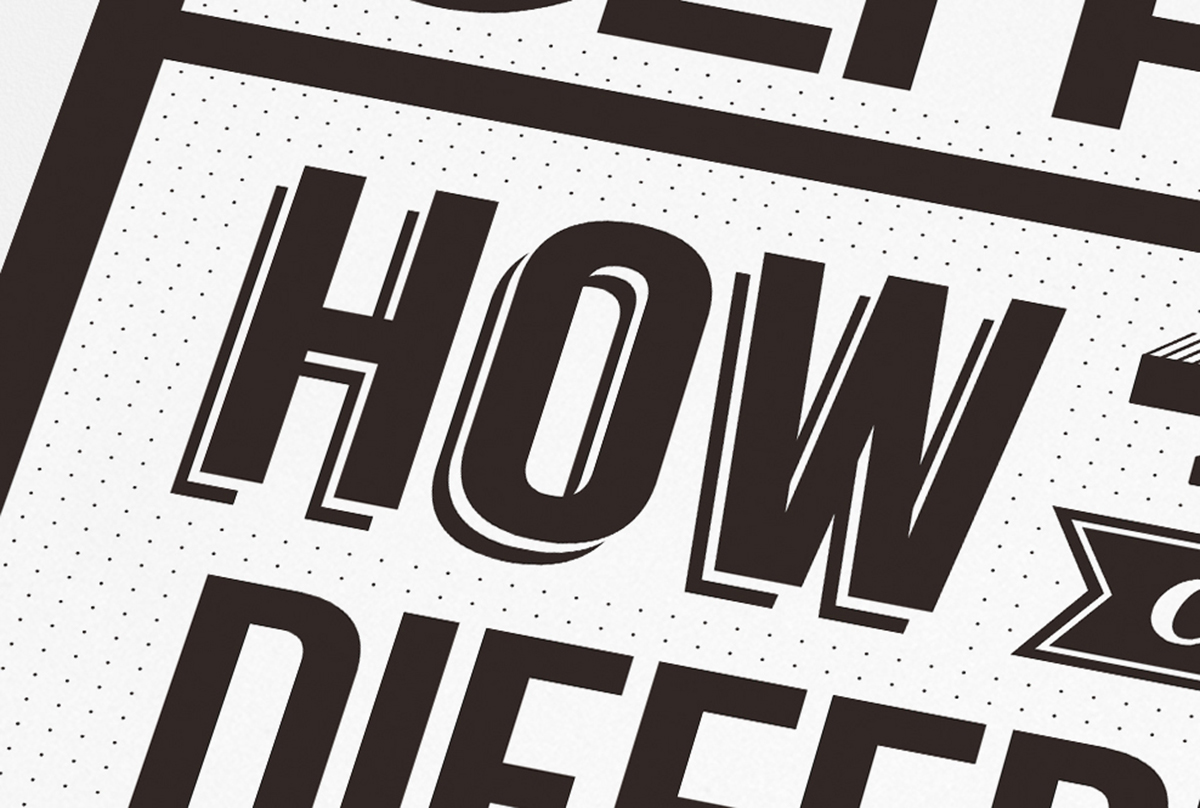
The tricky thing is with the dots on the back, the space need to be adjusted carefully so the dots won't interfere with the typefaces.

The pin board is applied in the spreads as well, so it needs some devices(the lines) for helping the layout stay clear and readable.
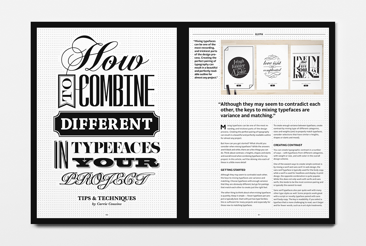
I also tried another typographic combination, which includes some more soft typefaces(the scripts), for the first page of feature article.


In the end, I want to say Thank You So Much to many professionals who provide me permissions of using their beautiful contents(images, texts) for this magazine project. I really really appreciate that! Thanks to these people, and below are the credits of those contents:
Contents credits, from left to right, top to bottom
Spread: Review Left Page
First Column: Typographica www.typographica.org/
Second Column Top: Uni Editions www.uniteditions.com/
Second Column Top: Uni Editions www.uniteditions.com/
Second Column Bottom Left: Ricardo Cordoba http://typographica.org/typography-books/book-review-recent-hyphen-reprints/
Second Column Bottom Right:
Image: Gerhard Kassner http://kassnerfoto.de/
Image: Gerhard Kassner http://kassnerfoto.de/
Text: TYPO Talks www.typotalks.com
Spread: Review Right Page
First Column: Milkxhake www.facebook.com/milkxhake
Second Column:
Second Column:
Image: Shaun Bloodworth http://www.shaunbloodworth.com
Text: AGDA http://www.agda.com.au/
Third Column Top: Old School New School http://www.newschoolfordesignandtypography.com/
Third Column Bottom:
Image: Jasso Lamberg
Spread: Feature Article 01
Article: Carrie Cousins http://designshack.net/articles/typography/mixing-typefaces-tips-and-techniques/
Image on right page: Franse Saritika https://www.behance.net/gallery/5037679/LiveLoveLaugh
Spread: Feature Article 02
Image on left page: Antwerp Typefaces designed by A2-TYPE http://www.a2swhk.co.uk/
Image on right page: Savvy Studio http://savvy-studio.net/
Georgia Hill https://www.behance.net/georgiahill
Georgia Hill https://www.behance.net/georgiahill


