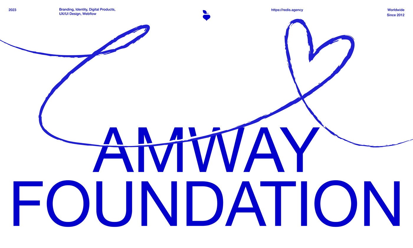
The corporate underscore from the original Amway logo is referenced by the handwritten line in the new one. The line both forges a deep connection with it and communicates
the authenticity and humanity of the corporation's charity objective.
The handwritten line in the corporate style illustrates, writes, circles, or highlights
the key points in the foundation's messages and requests that good deeds be done.

The foundation carries out its plans through various humanitarian endeavors and programs. In the visual system we created, the foundation's abstract underlying
finds its concrete outlines in the logos of its programs.
Designing new programs and emphasizing the proper focuses for each of them
becomes simple as a result.