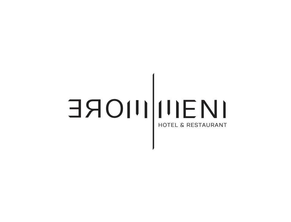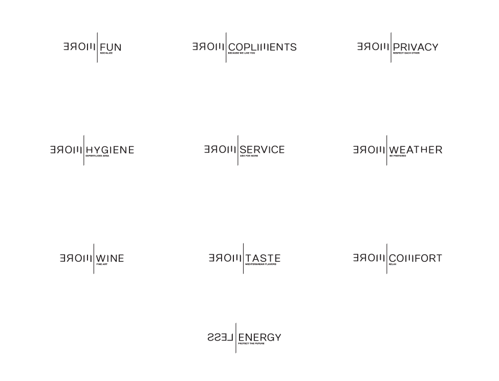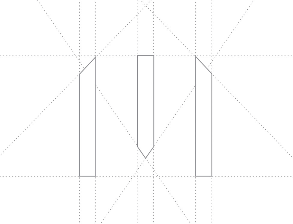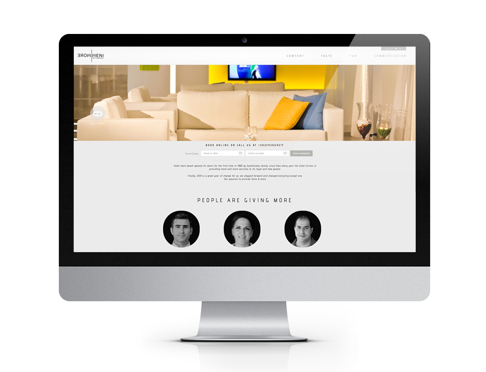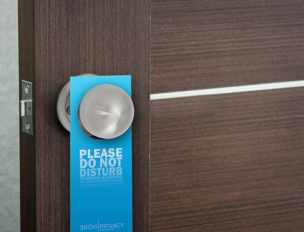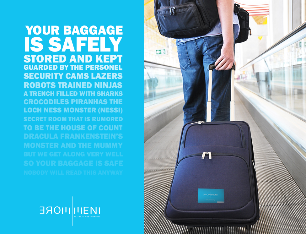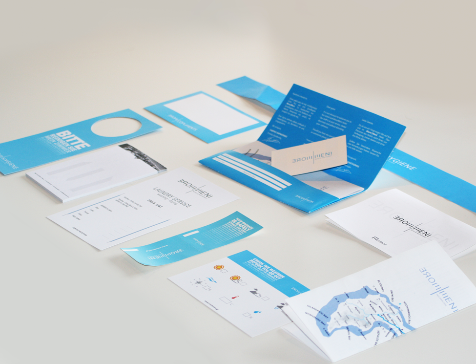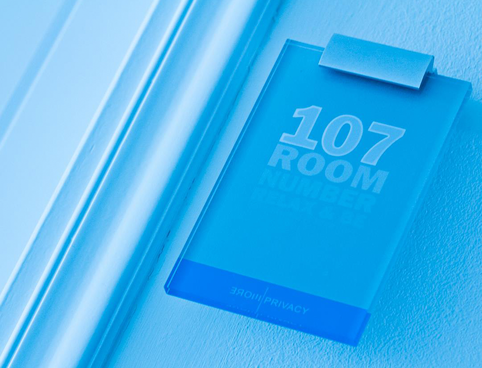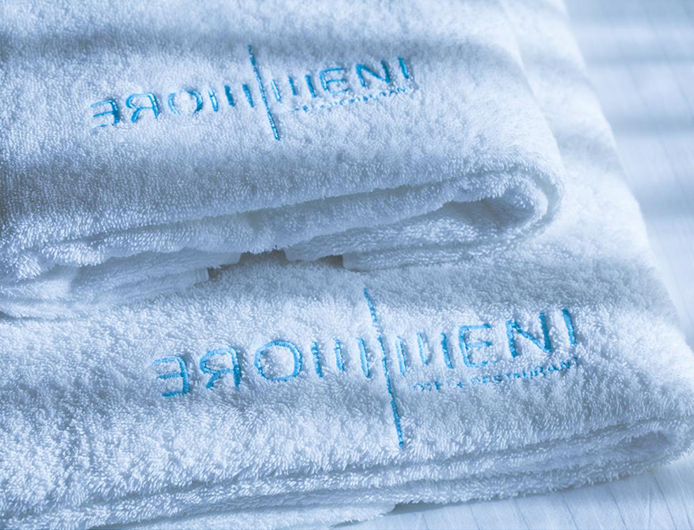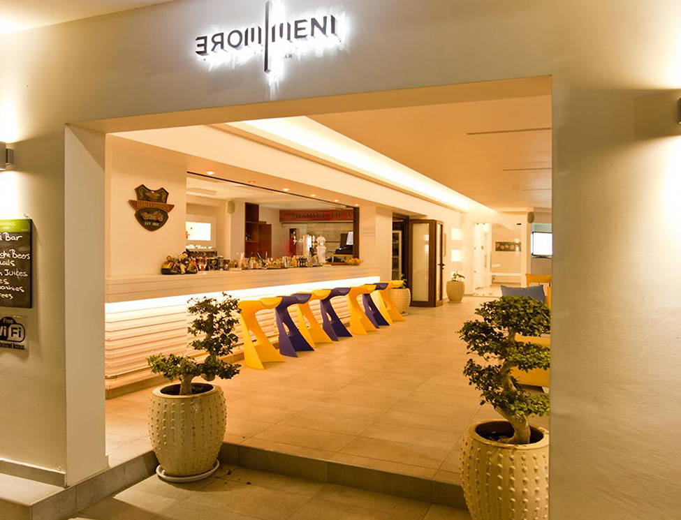

Re-branding of a boutique hotel. The new logo uses the old name with the word "more" in front and is based on strict, minimal lines. On the other hand, the corporate identity is based on the word "more", humor and the three colors blue,green & yellow. There are different logos for each department of the hotel as is shown below. The website is designed for tablets, and uses vertical and horizontal scrolling.