


MAGIS Full Brand Identity
(Student Project)
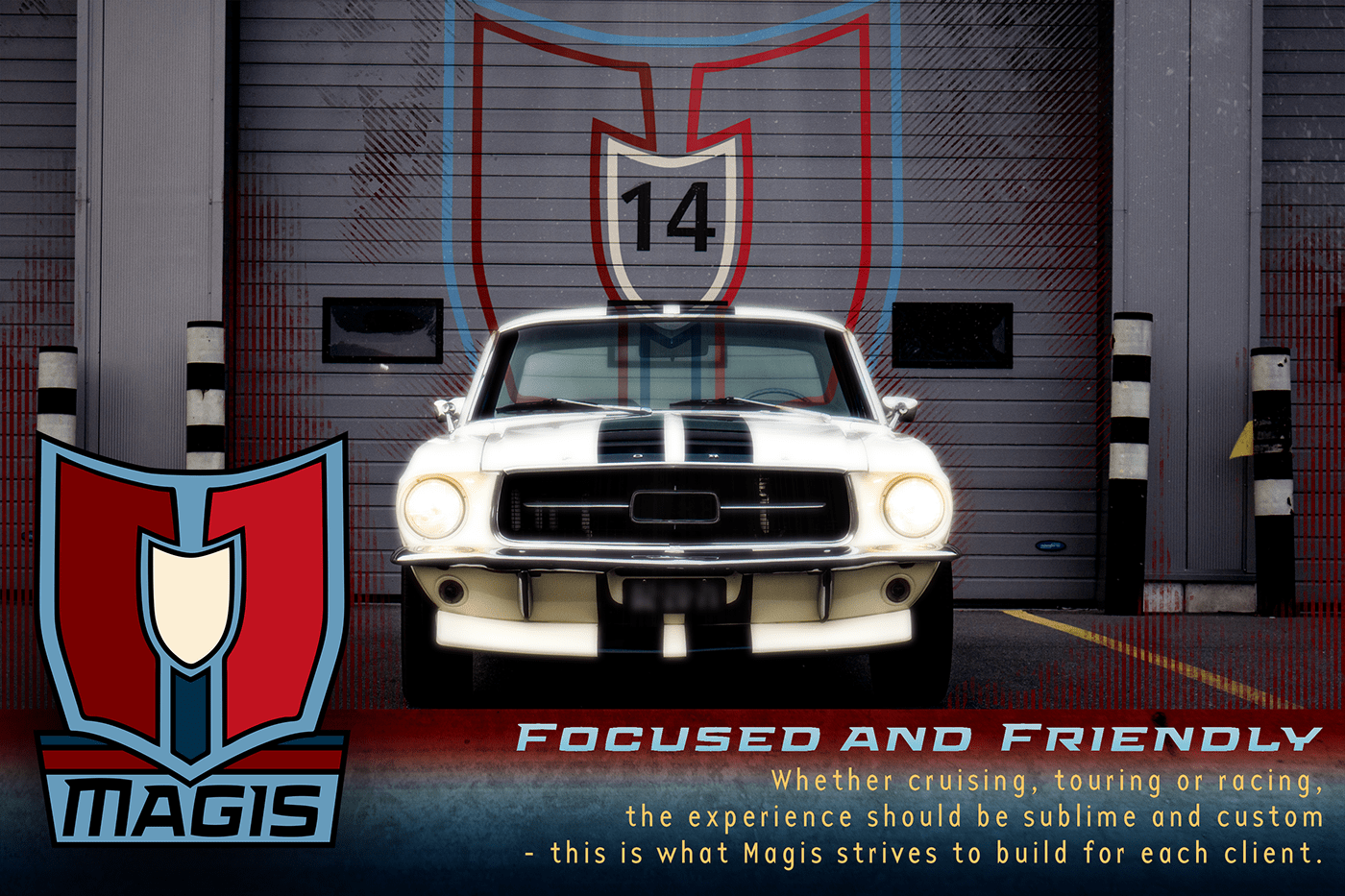
Magis Promo Image #1

Magis Promo Image #2
- Promotional images will include corporate colors as seen in the logo. Backgrounds may have colors adjusted with more of a blue or red tinge, depending on what the mood calls for.
- Some graphical elements may have a grunge/metallic texture to provide a firm, industrialized edge.
- Distressed halftone effects in the form of vertical and diagonal lines will also contribute to the brand’s firm, industrialized personality.
- Some graphical elements may have a grunge/metallic texture to provide a firm, industrialized edge.
- Distressed halftone effects in the form of vertical and diagonal lines will also contribute to the brand’s firm, industrialized personality.


The shapes of the logo “mark” are reminiscent of that of a top view of a muscle car hood. It has been intertwined with 2 red shapes resembling 2 halves of an M, and one long blue shape with a light yellow shape on top, shaped like an I. The use of these lengthwise shapes give the brand a bold, polished modern edge combined with the vintage, classsic font for the typeface.


