


Kathê Paulino
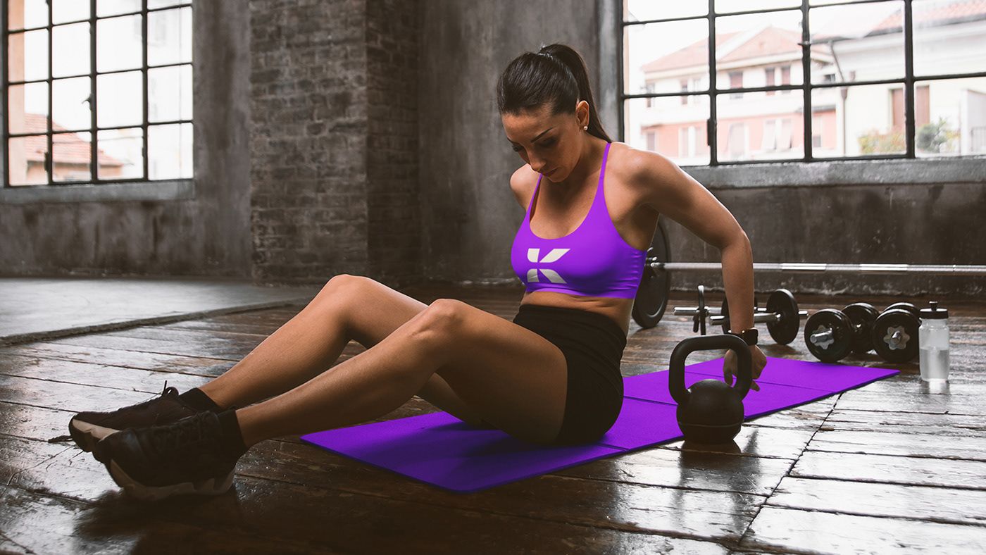
Kathê é uma profissional de educação física, com especializações no segmento de assessoria esportiva, e nos passou através do Briefing, a ideia de um símbolo que demonstrasse algo que a representasse, de preferência, com as iniciais de seu nome, seguindo uma linha clean, moderna e enérgica.
O objetivo desse projeto é criar uma marca que seja simples e moderna, ousada e criativa, mantendo uma linguagem visual única e que se destaque no mercado, fugindo do tradicionalismo e ganhando destaque entre os parceiros e clientes.
-
Kathê is a physical education professional, with specializations in the sports advisory segment, and through the Briefing, she gave us the idea of a symbol that would demonstrate something that represented her, preferably with the initials of her name, following a clean line, modern and energetic.
The objective of this project is to create a brand that is simple and modern, bold and creative, maintaining a unique visual language that stands out in the market, escaping traditionalism and gaining prominence among partners and customers.

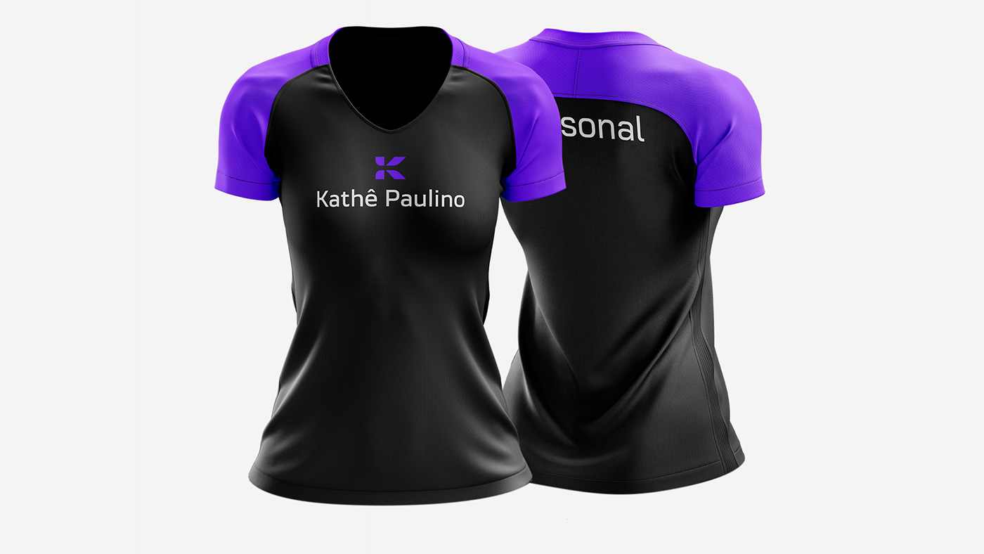
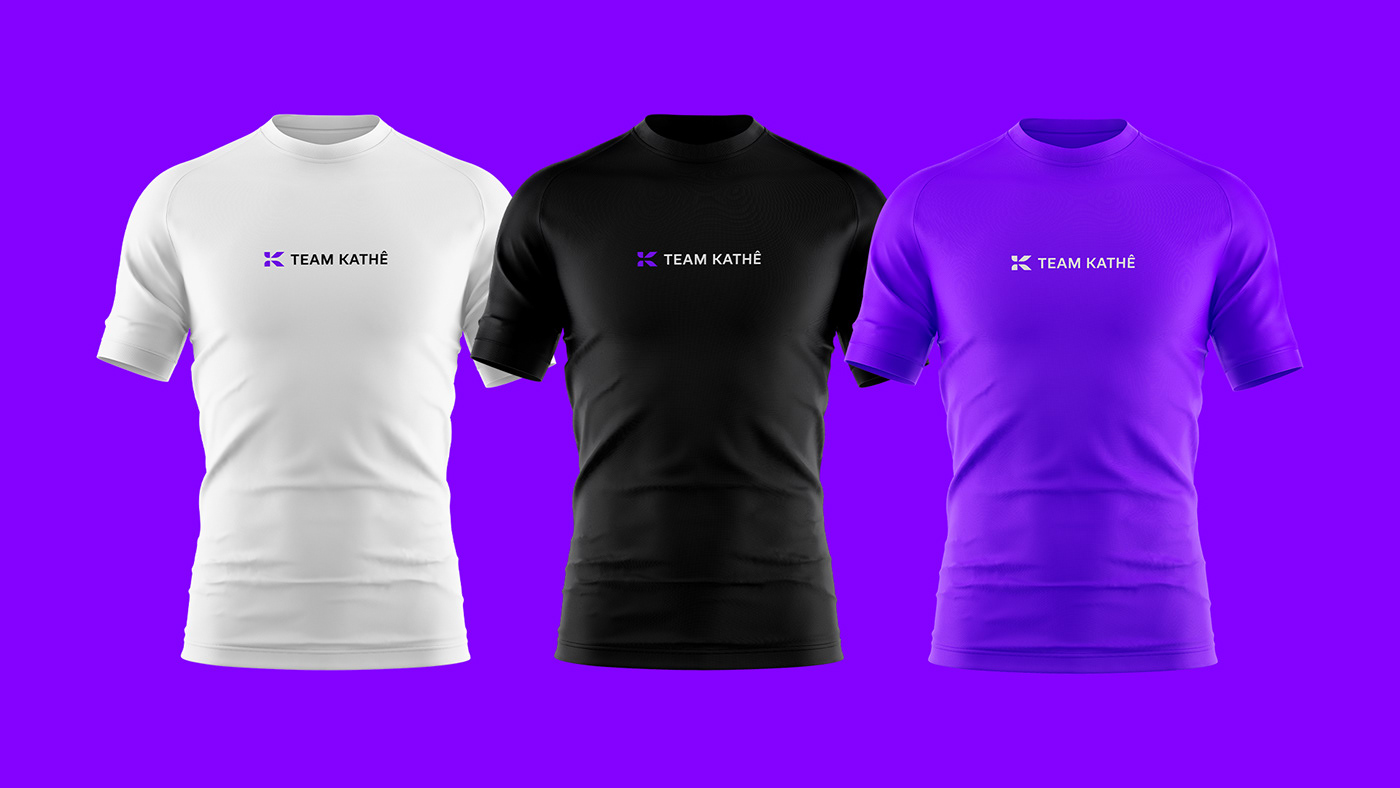
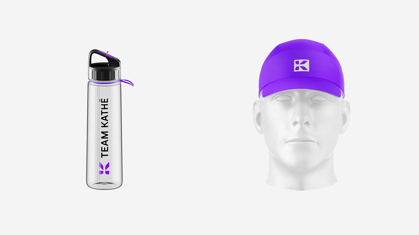
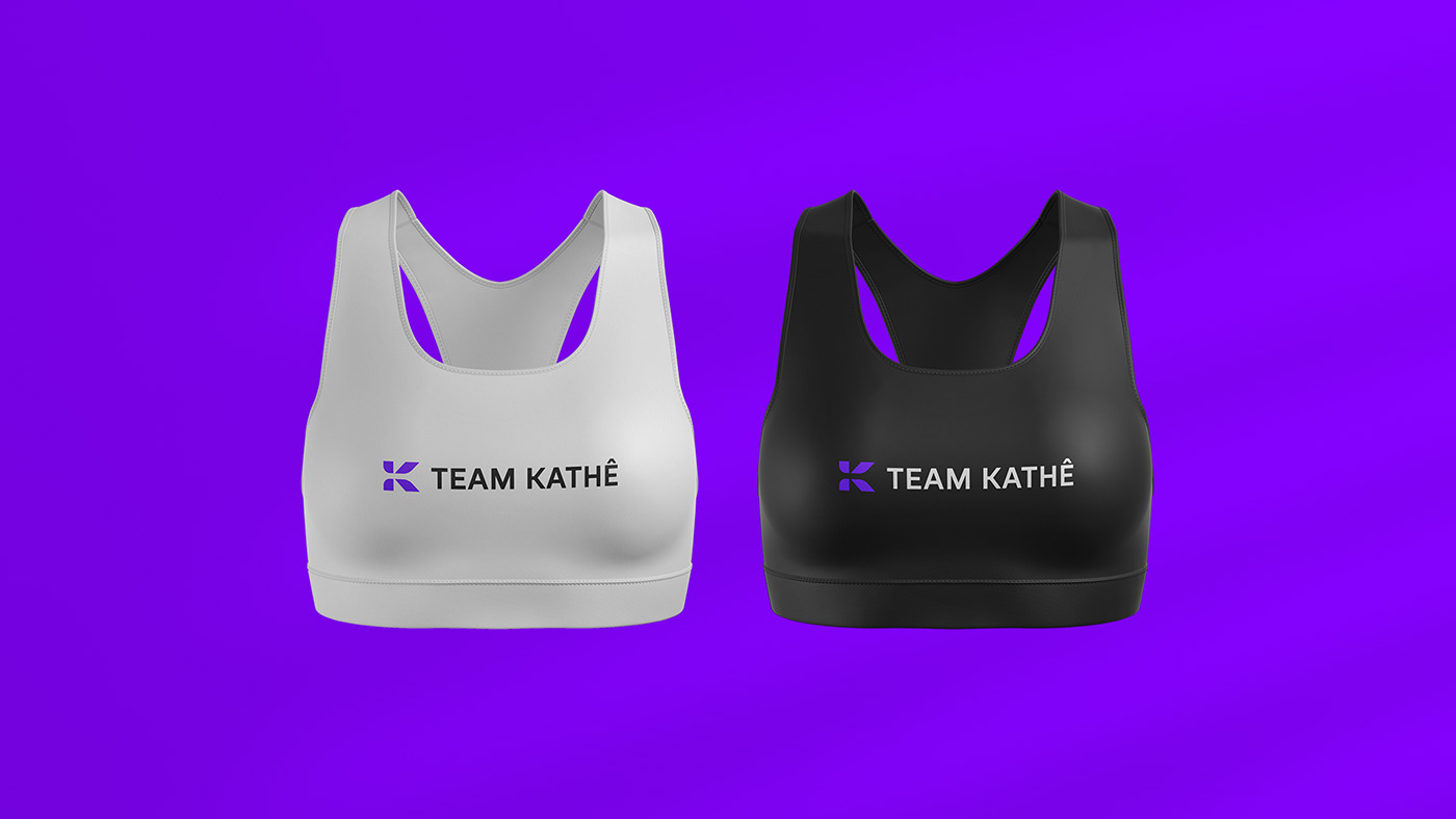
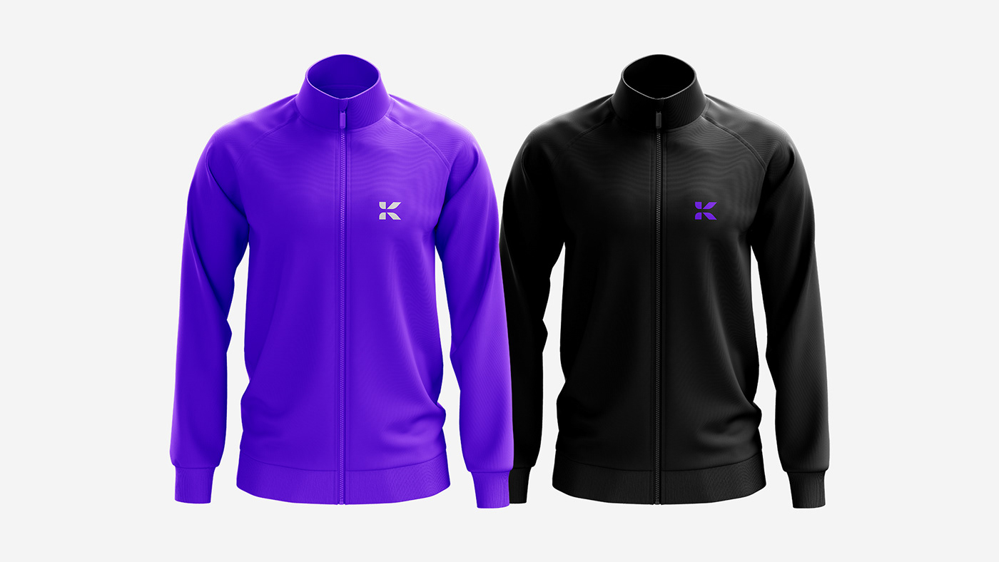
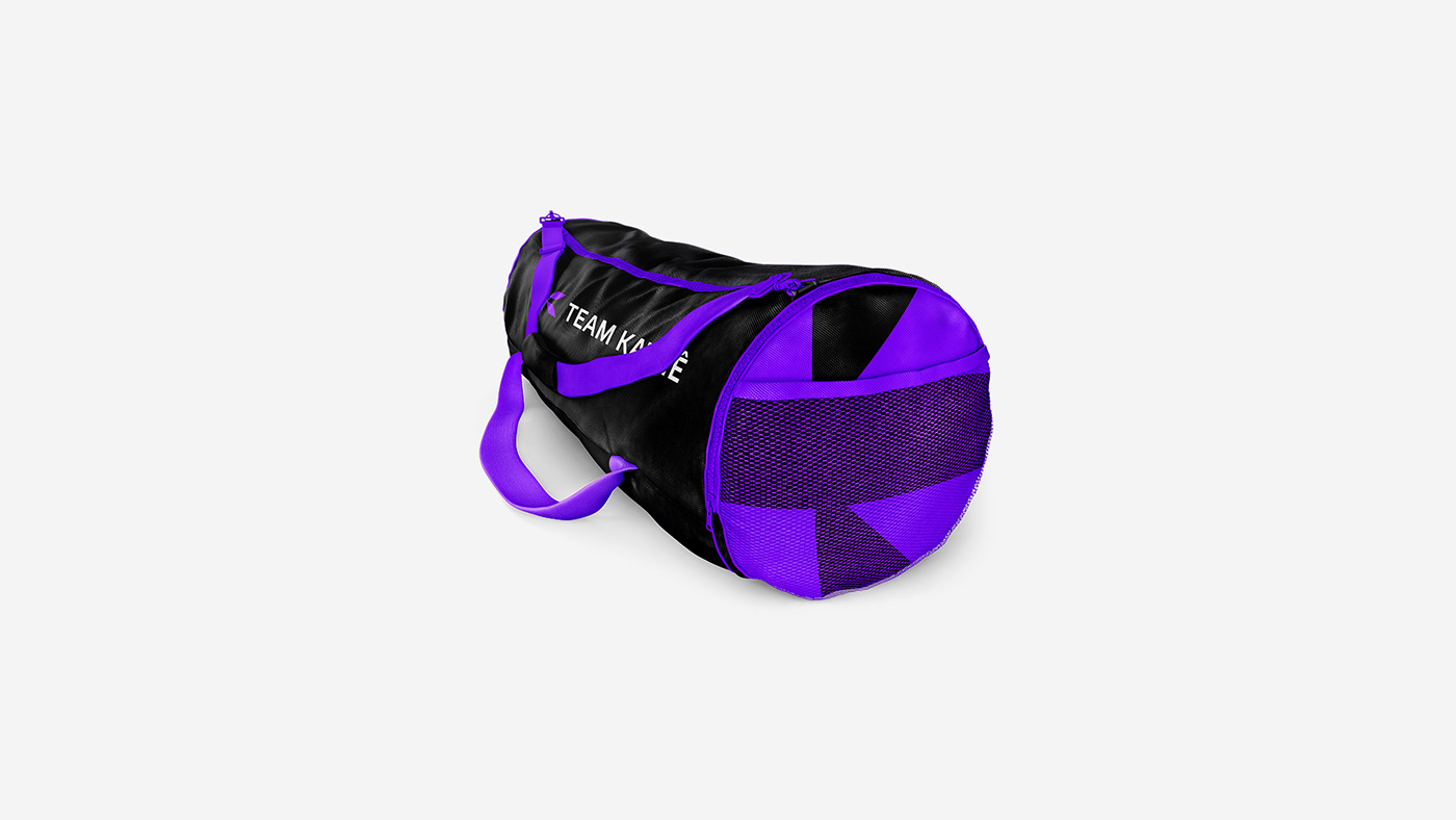
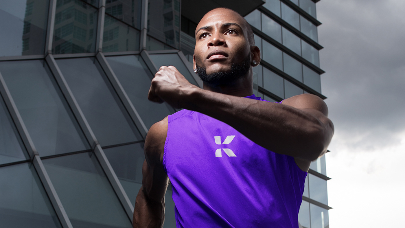
Cores | Colors
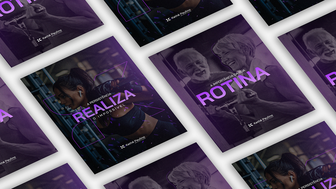
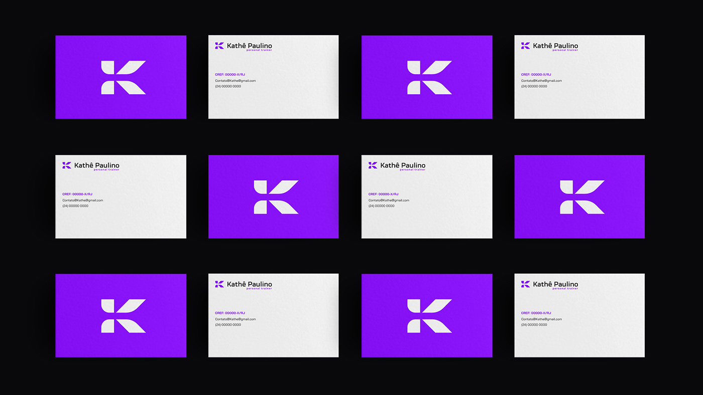
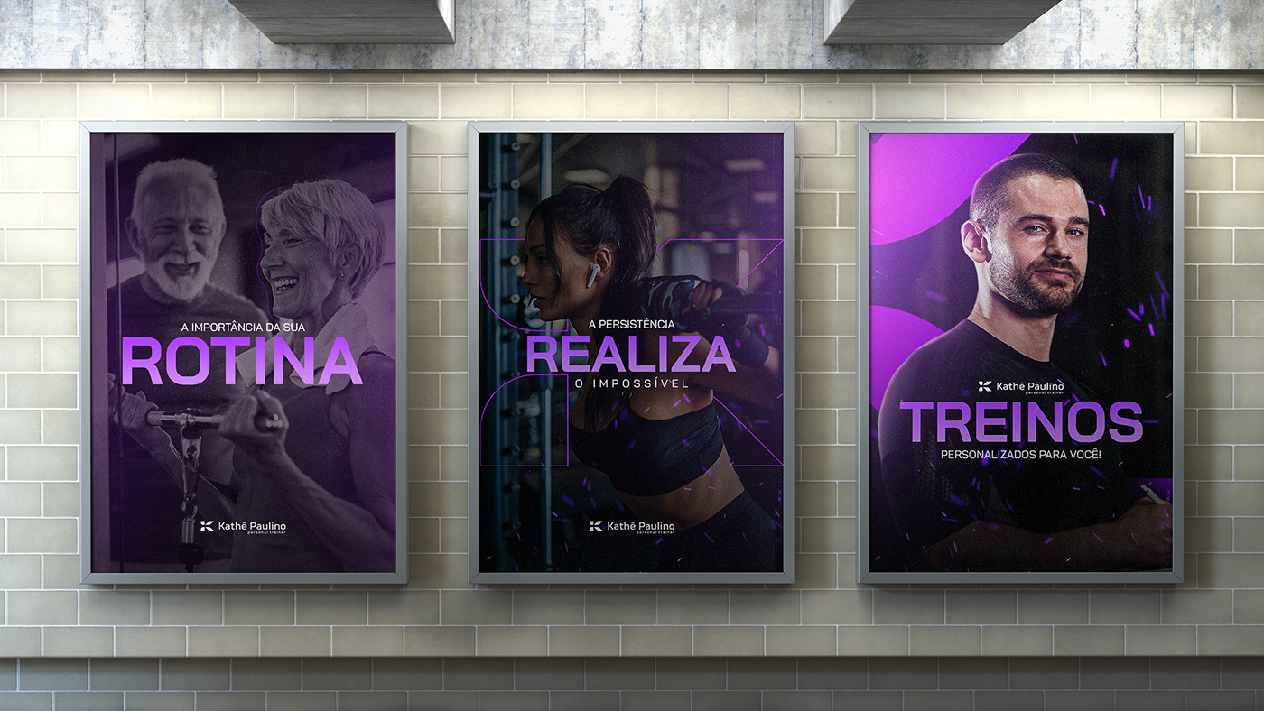
The choice of colors was a very specific request from the professional, opting for the color Purple in her brand, being a hue that conveys her energy and values very well, added to the classic White and Black.


Cliente: Kathê Paulino
Direção Criativa / Marca: Gustavo Costa
Apresentação: João Pedro Viana
Social Media: Ian Almeida
Siga-nos no Instagram: @agencia.floud


