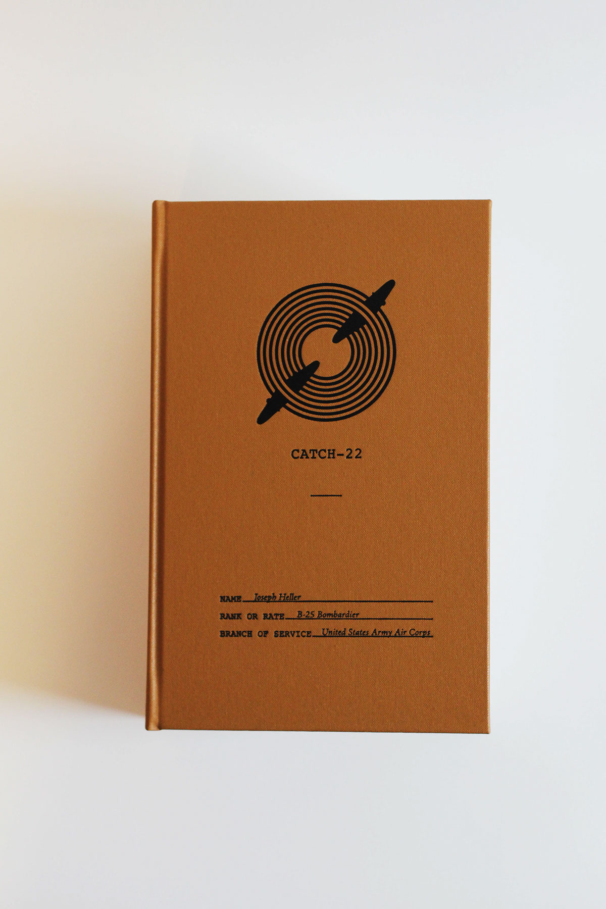
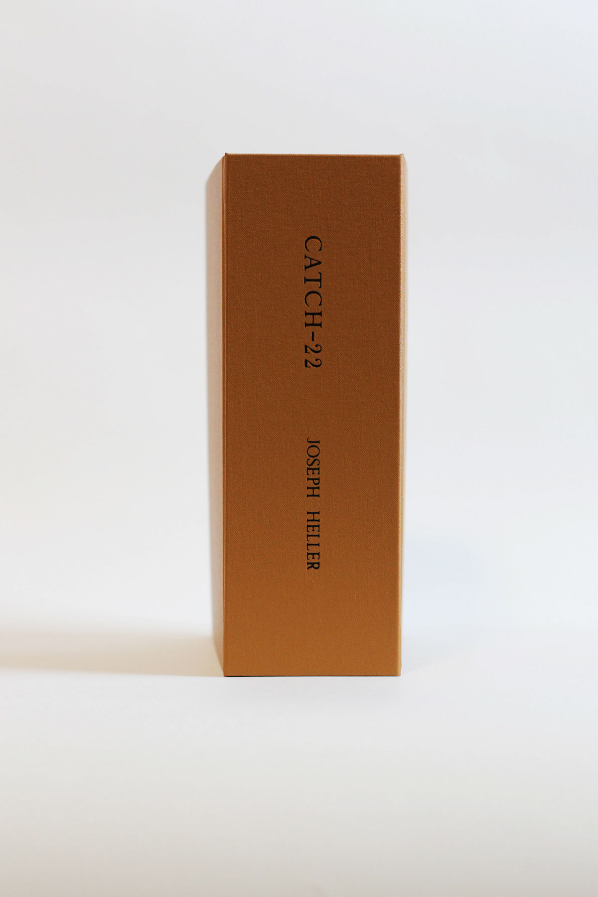
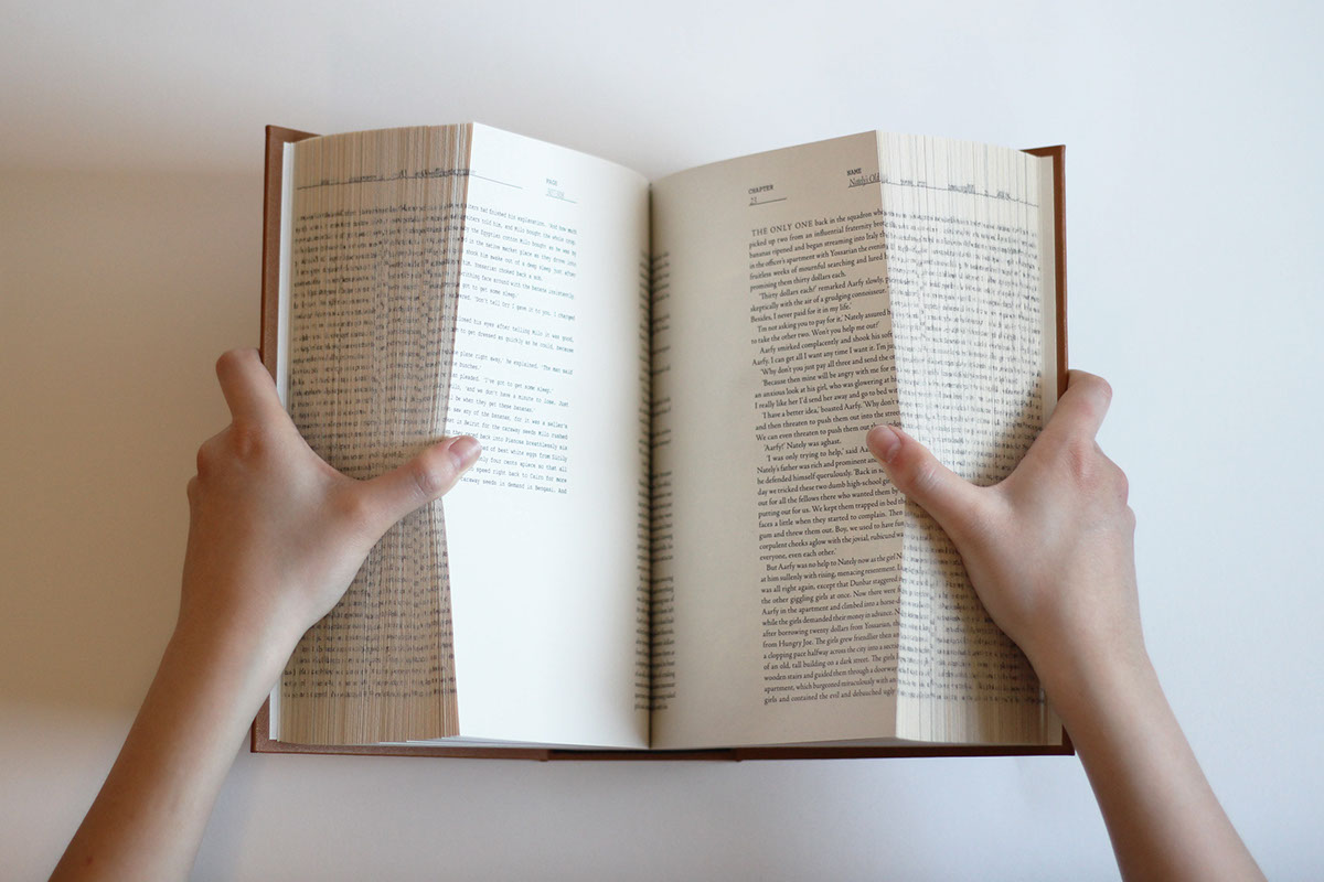
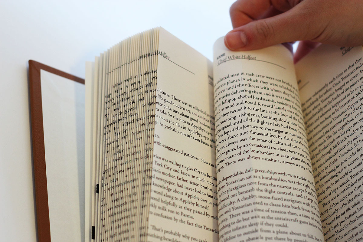
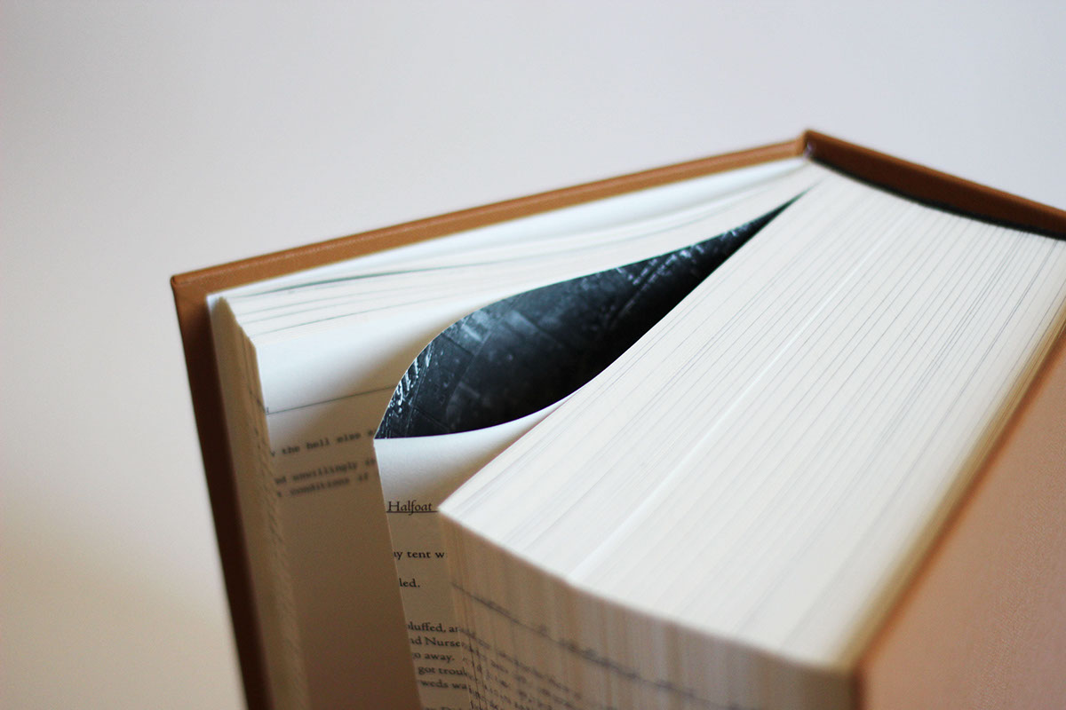
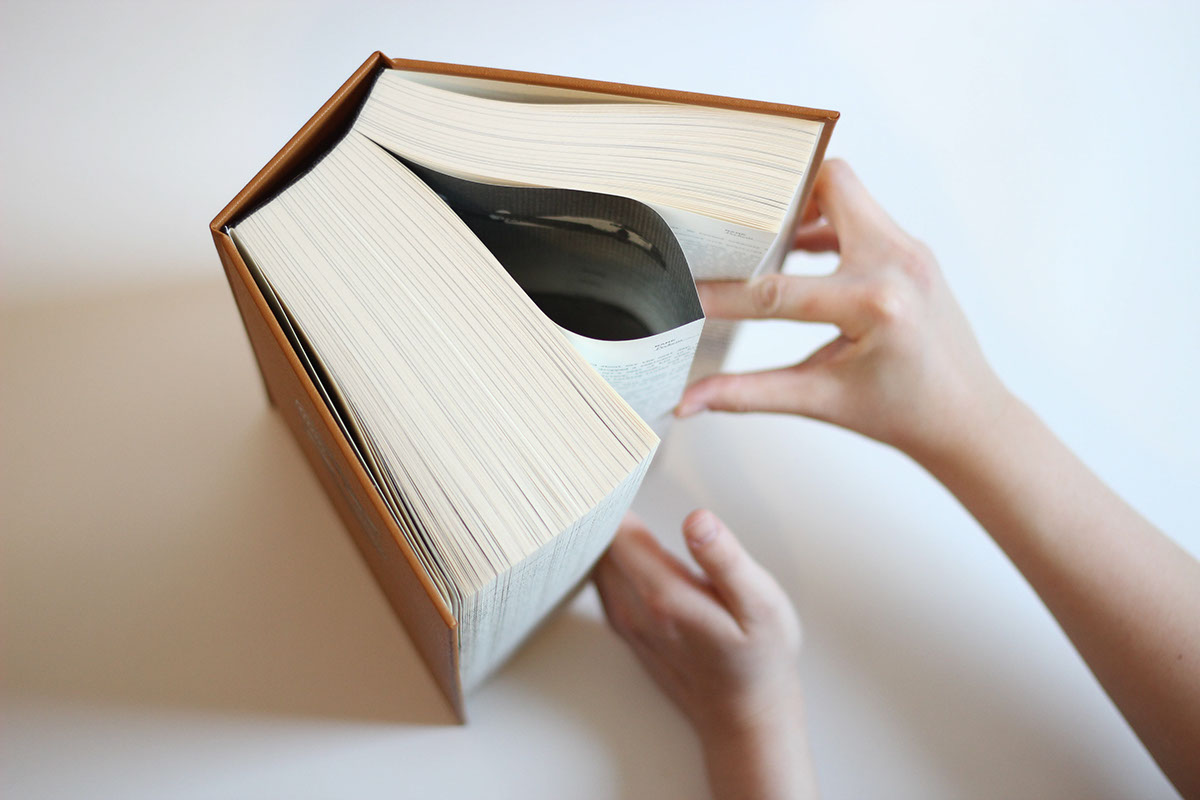
Catch-22 is a novel driven by paradoxical ideas created by the Bureaucrats. This book design is based on the aviator’s flight log in WWII. The body text itself is a paradox, it has no ending, just like the flight missions in Catch-22, the Bureaucrats just kept adding more and more flight missions for the bombardiers and they couldn’t get out from the situation because of Catch-22. There is a good reason for using the flight log is because it is a recording of all of their flying mission time, in this case, their never ending flight mission. The book is French folded because it could keep the text flow continuously and eventually formed a loop between all the chapters.
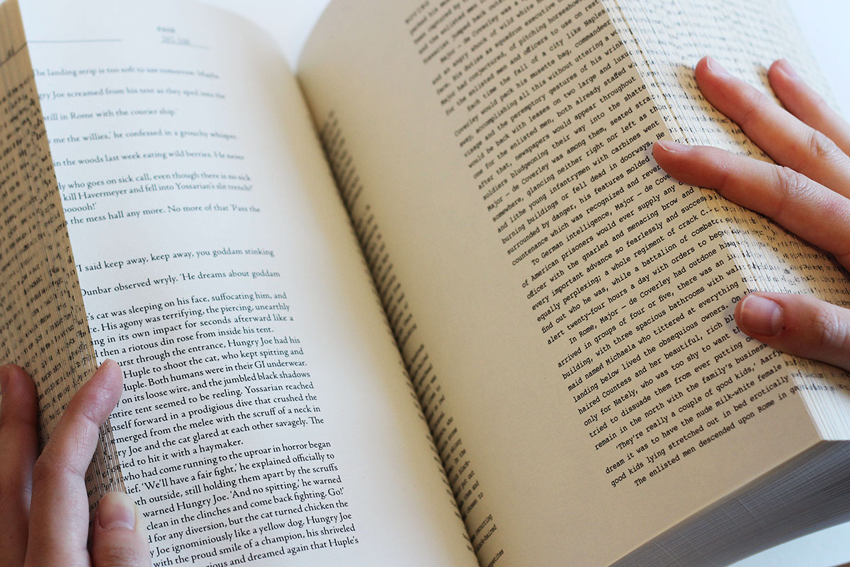
Moreover, each of the chapters’ first page contain photographs of WWII bombardier planes and aerial photographs because in Catch-22, the Bureaucrats are more concerned on the aerial bombing photographs than actually hitting the enemy’s base. The header for each of the chapters also mimic how the flight log book actually looks like from the inside. Each of the chapters in Catch-22 is actually names of different people and a few places so it makes sense to have their name filled in the blanks. The body text contained 2 typefaces, Courier and Adobe Jenson Pro which represents the Bureaucrats and the Air Force Corps. Courier is a typeface that is widely used in the military reports while Adobe Jenson Pro gave it a more humanistic approach to portray the innocent Air Force Bombardiers like Yossarian and his fellow men.