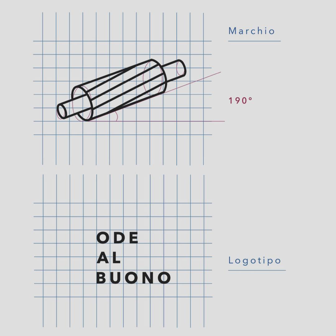
Ode al Buono
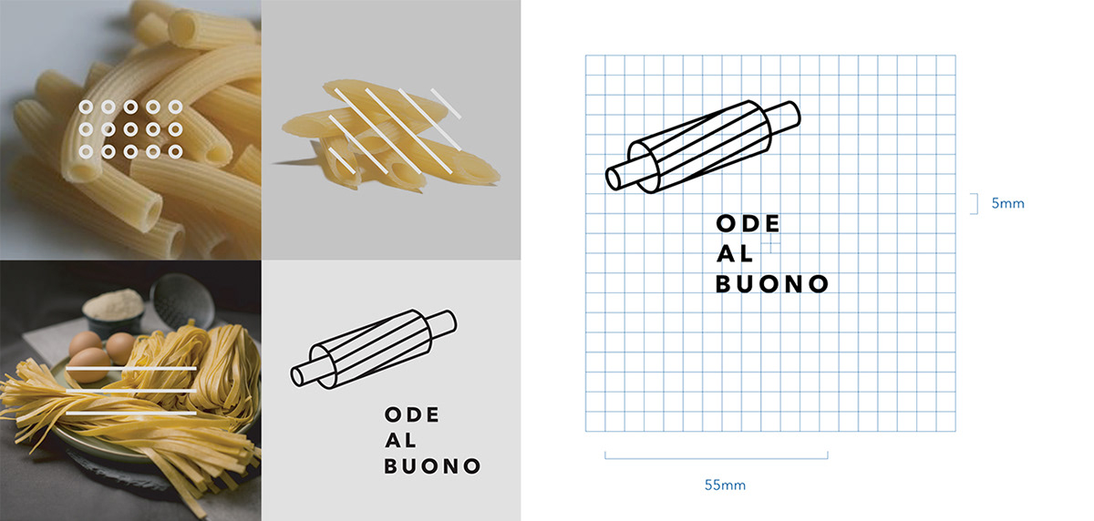
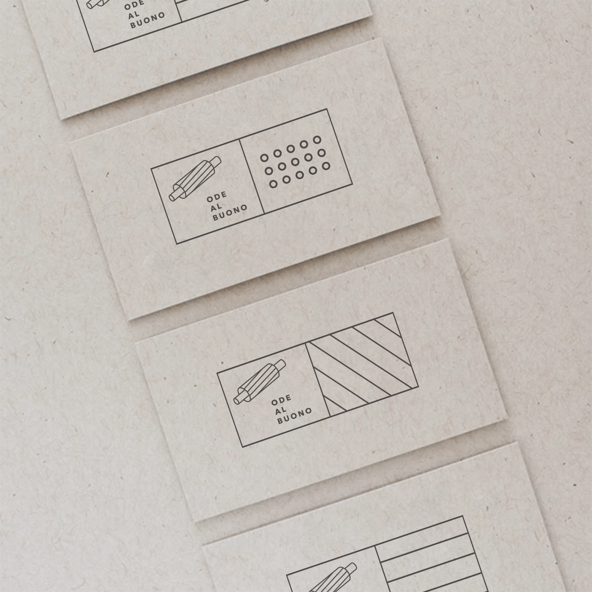
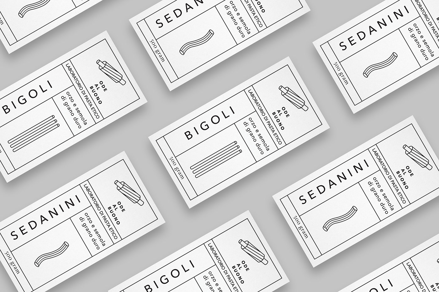
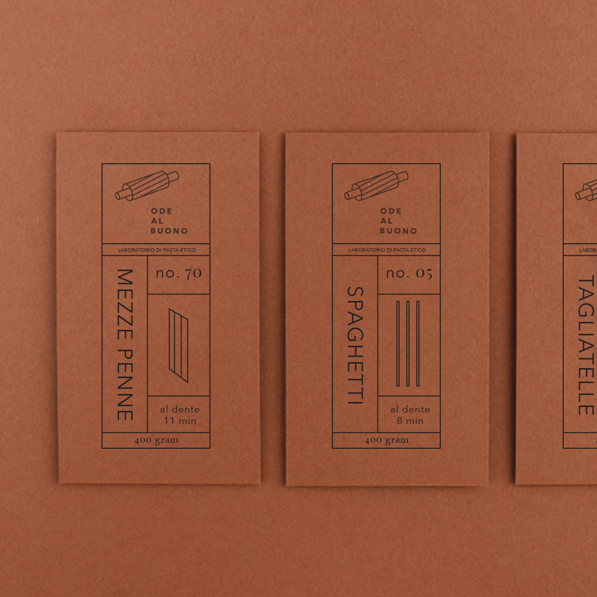
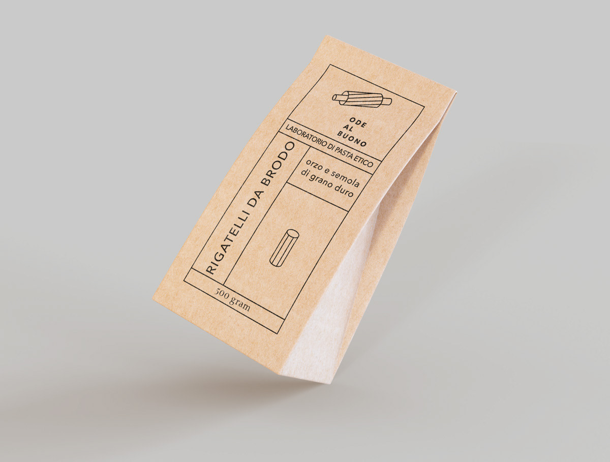
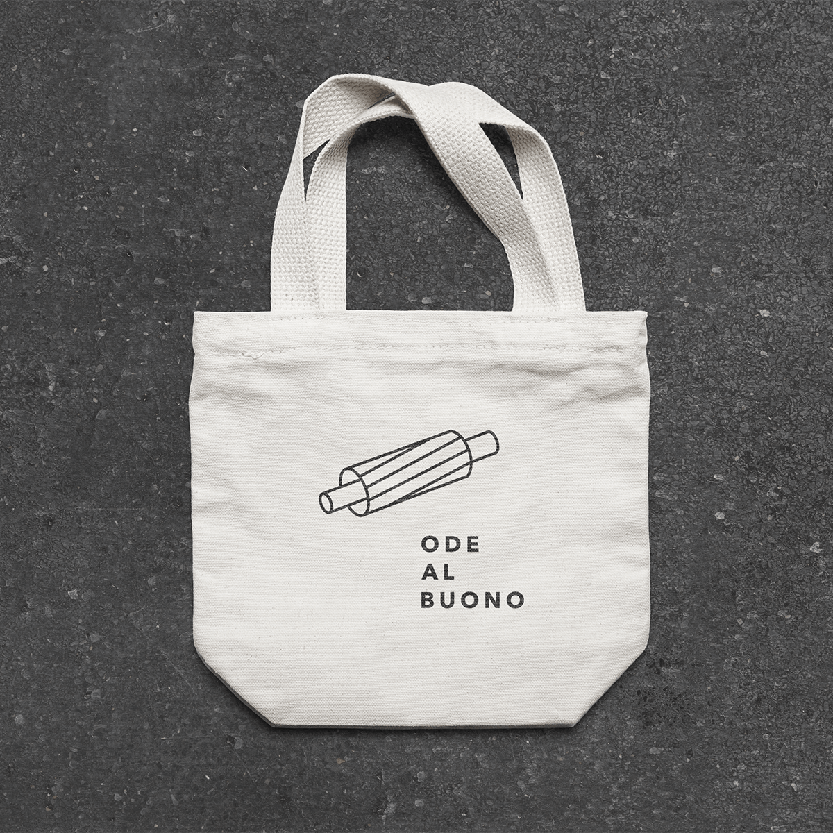
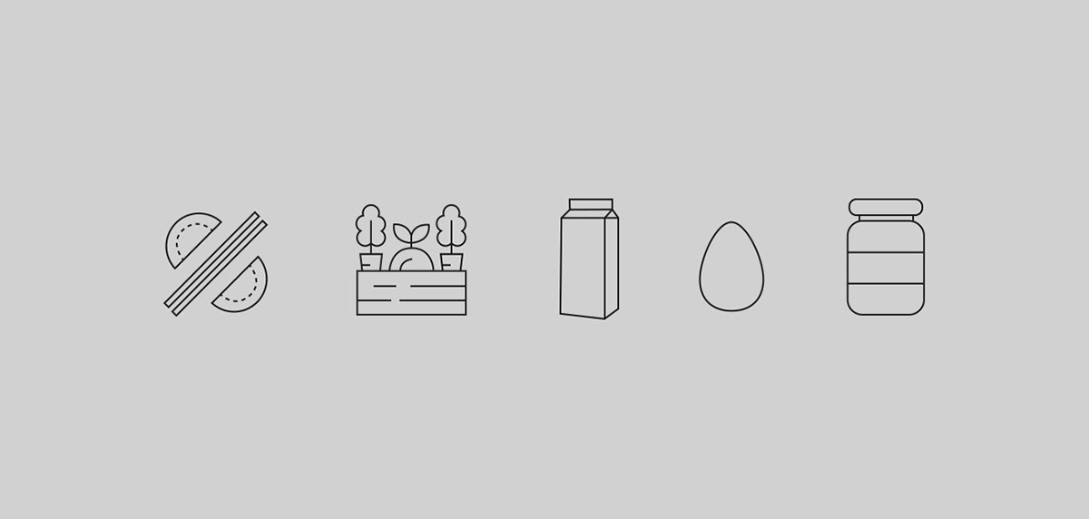
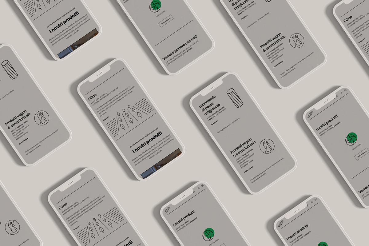
The idea behind the development of the logo and the entire branding draws inspiration from pasta (shapes and textures) and artisanal tradition: handcrafted or rolled with a rolling pin, just like our grandmothers used to do! Stylized as icons or transformed into textures, pasta takes center stage in the entire identity.
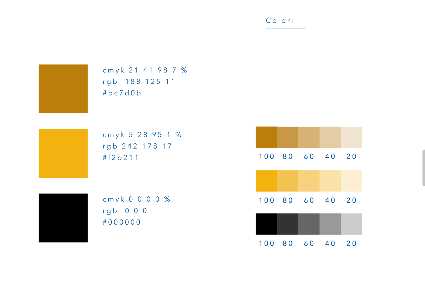
The primary and secondary colors evoke wheat and flours. The graphic style we have chosen combines both vintage and modern elements. Bold fonts are used to attract attention and adapt to the new realities that have taken shape in the Centocelle neighborhood in Rome.
The Ode al Buono project has recently been selected by Design Rush as the Best Design Awards.
Thank you for watching!
Check out my IG @ro_fotographicart
