This project (a mock-brief) is part of the Internmurals, a friendly competition between the interns of Vgrafiks Design and Branding and Plus63 Design Co.
110 Percent, by Lala, is a new chocolate bar that combines Lala’s signature formula, with oatmeal and electrolytes. This fusion of ingredients will keep you energy boosted.


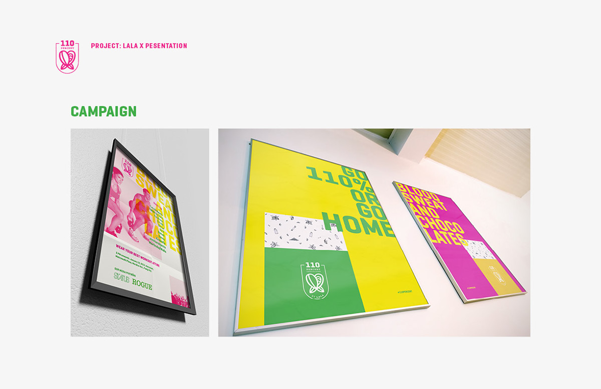
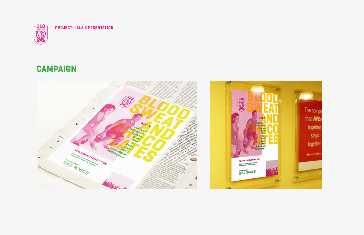
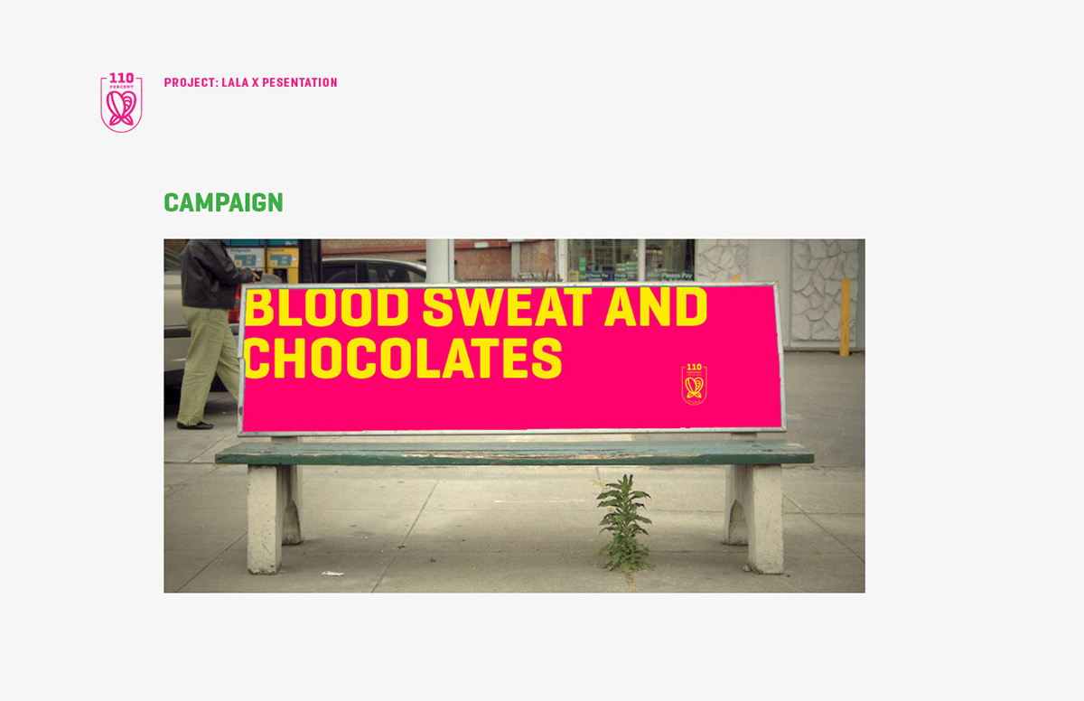
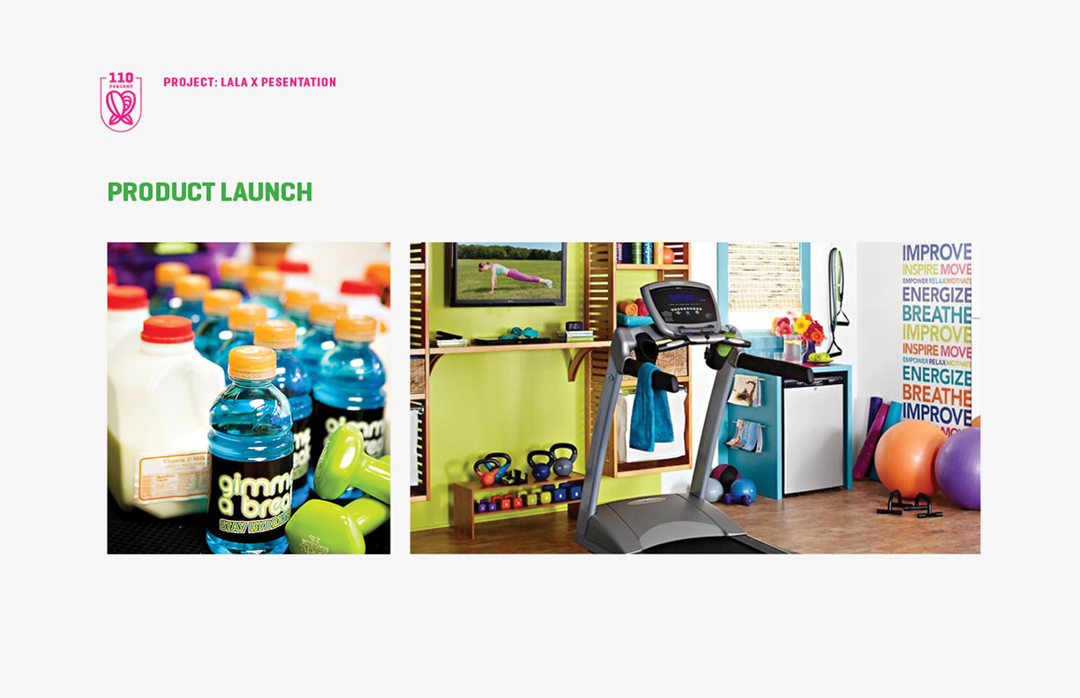
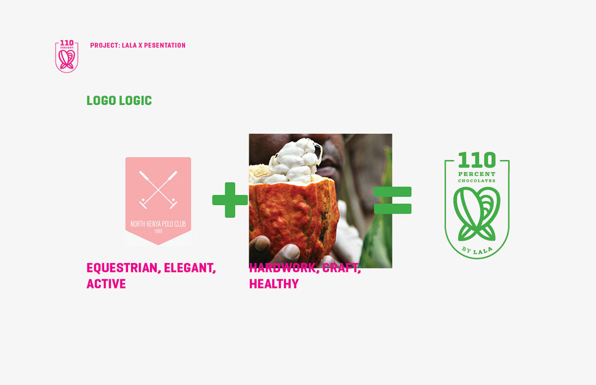
We want to energize the people through the product with respect to the hard work involved in crafting the chocolate and the commitment of the consumer towards fitness and/or work.

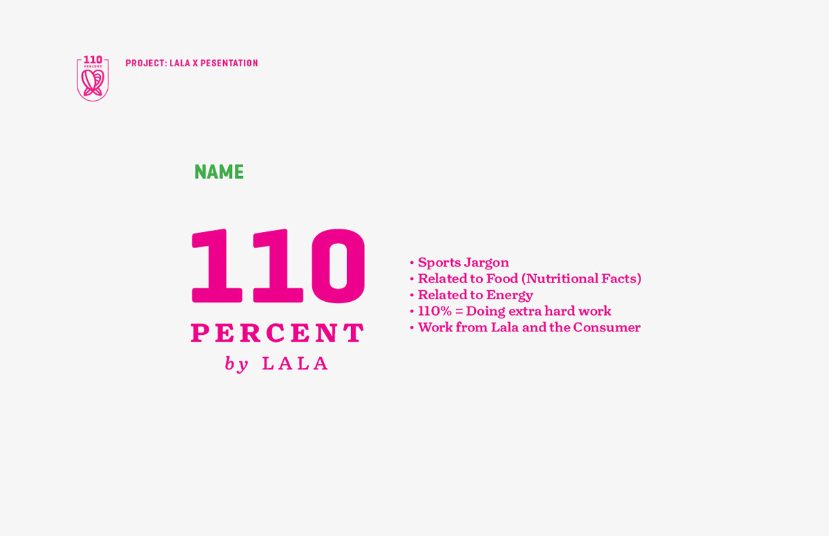
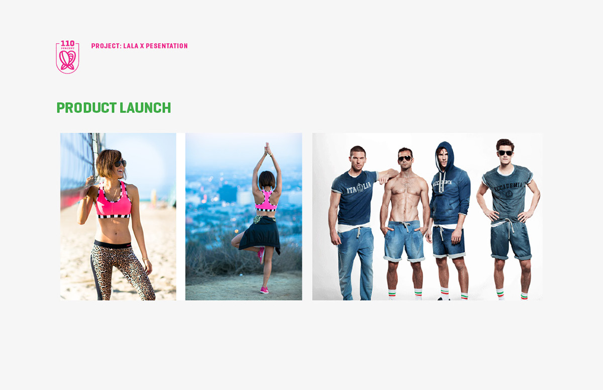
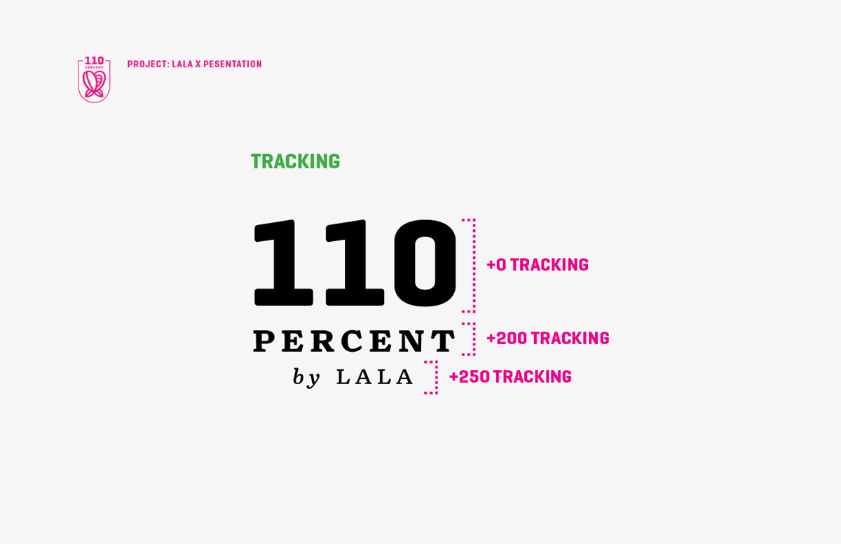
The challenge for this project is to create a design for a new line of LALA products that will cater to an entirely different target market. This new product line is given the name ‘110% by Lala’. The ‘110%’ taken from sports lingo, stands for the required effort to push one’s limits and to exceed expectations. The virtue of hard work is perfect for the new product line because (1) it is something that is inherent in the brand since its creator is a diligent family man, and (2) it is something that the target market can relate to with their active lifestyle.
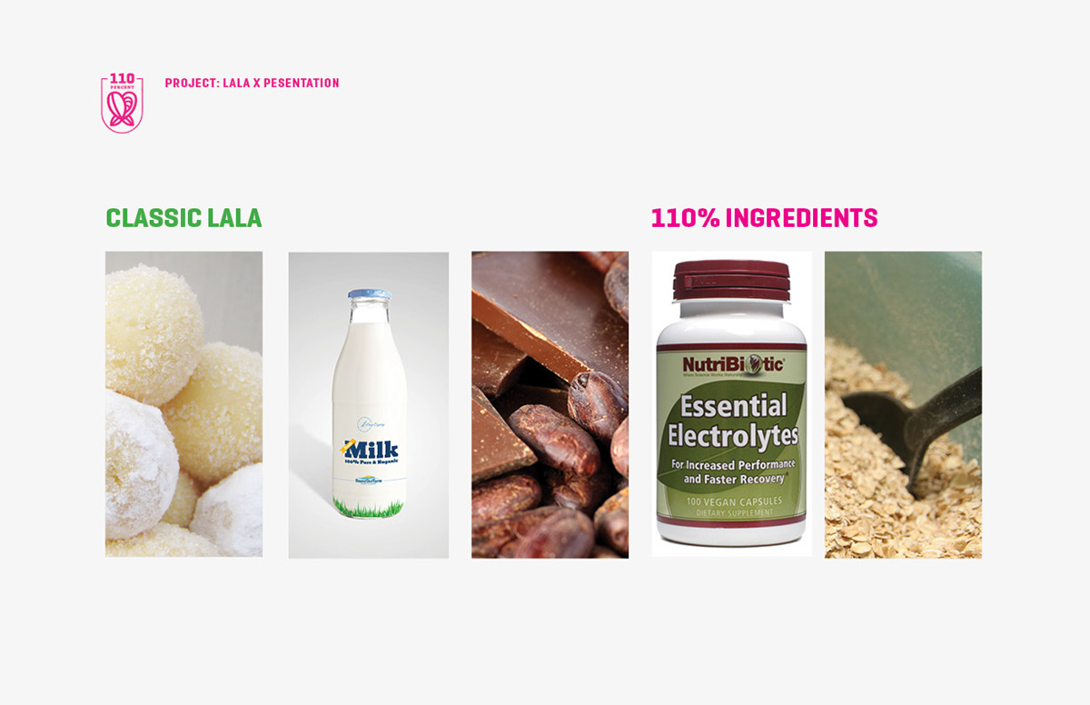
The new chocolate contains the classic ingredients of LALA which are milk, chocolate, and pastillas mixture and the 110 Percent ingredients which are electrolytes and oatmeal.

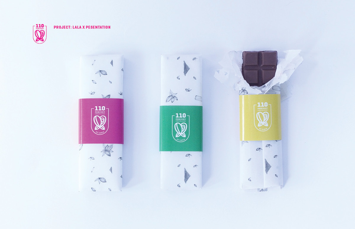
The main theme of the design is the contrast of energetic graphics (foreground) to a subdued crafting aesthetic of the background. The energetic graphics symbolize the active lifestyle of the brand, and in contrast, the background communicates the idea of hard work both in general work of the consumer and behind the crafting of chocolates.

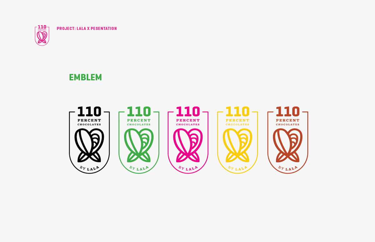


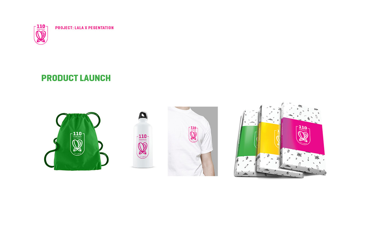
There are two sets of colors: the earth tones and the bright colors. The earth tones are inspired by the raw ingredients of the chocolate which implies the meticulous process in creating 110% by Lala. The idea is to make the consumers feel that every chocolate bar is carefully crafted by real people (again, the term: hard work) and not just mass produced by machines.
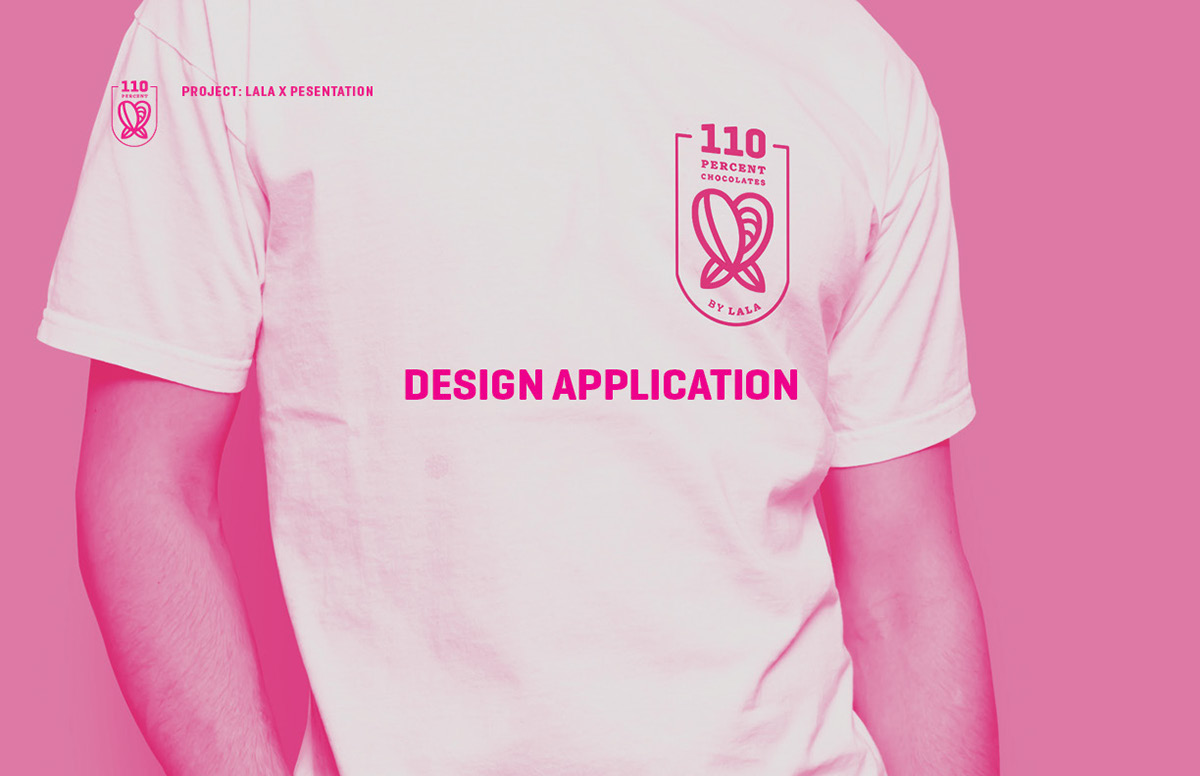
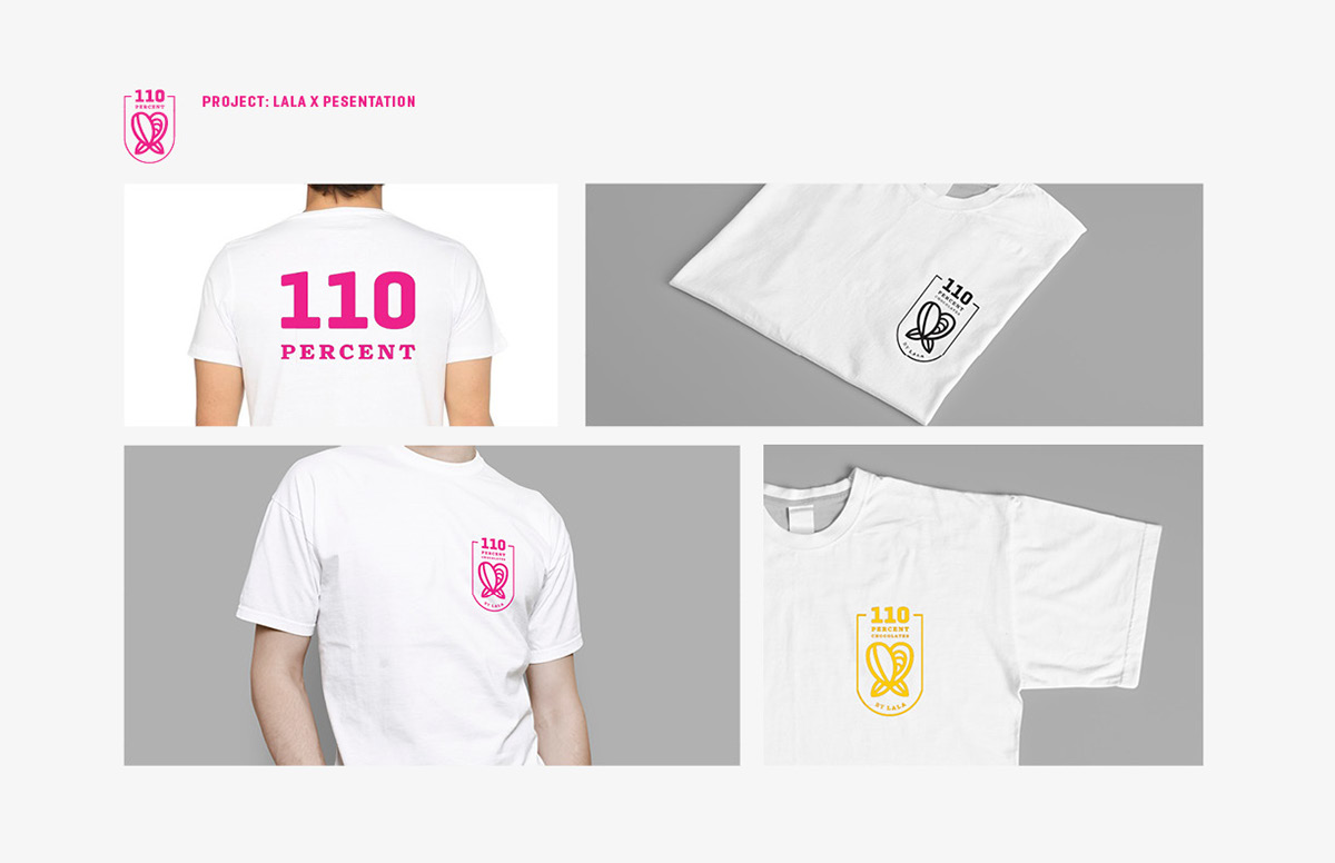
On the other hand, the bright colors (pink and yellow) are taken from the sporty and classy chic lifestyle that would appeal to the persona of the brand. In the Philippine culture, pink is usually associated with femininity, love, and warmth. By contrast, yellow is a gender-neutral color. In color psychology, yellow is believed to communicate energy and optimism.


The illustrations will consist mainly of chocolate ingredients to tell the story of how 110% by Lala is made from organic and natural products. These will appeal to the health-conscious demographic. The illustrations will appear as rough sketches without rendering. Sketching is the preliminary step in the process of building and crafting so adapting this kind of style would imply a planning, crafting, and process-oriented look. The illustrations will be overlapped with energetic graphic elements to further reinforce the industrious and hardworking feel of the brand.