
Typography Poster:
We were tasked to design an expressive typography poster that promotes our chosen state by incorporating its iconic features and intriguing facts into captivating visuals.
Itaewon (Korean: 이태원) is a vibrant and multicultural commercial area situated in Seoul, South Korea. Renowned as one of Seoul's most popular neighborhoods, it has gained fame for its lively nightlife scene and a variety of trendy and exotic restaurants lining its streets. Being the international district of Seoul, Itaewon is distinguished for offering cuisines that are not widely available in Korea. The district has transformed with the emergence of coffee shops, trendy bars, and fusion and international restaurants, making it a favored destination for young cosmopolitan Koreans and foreign residents alike. Two noteworthy festivals, the Global Village Festival and Halloween Festival, hold special significance in Itaewon's event calendar.

Mood Board:

Started off by sketching the layout of the poster, using a short tagline and the name of the city.

After experimenting with two different approaches, one using only outline neon lines and the other with flat color shapes, I ultimately decided to combine both concepts. The final design incorporates glowing shapes to create a more visually impactful poster.

During the experimentation phase on Photoshop, I explored the neon effect and carefully selected a color scheme that perfectly complements the vibrant nightlife neon signs.
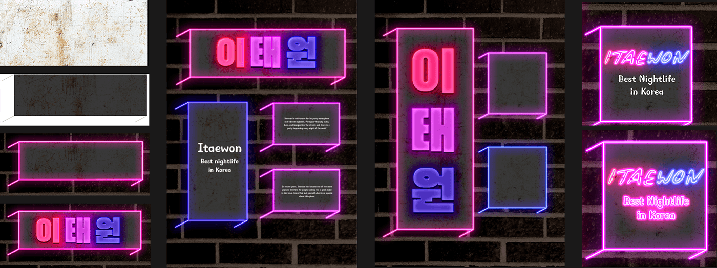
I used brick walls as a background for the poster, as the combination of neon shapes with the brick wall background creates a visually captivating poster, symbolizing Itaewon's urban and multicultural essence. Moreover, the brick wall backdrop resonates with the neighborhood's lively nightlife scene, as it is a common interior design element in many bars and clubs. This strengthens the overall theme of Itaewon's exciting and vibrant nightlife experience.


Following the feedback from user testing, my friends mentioned difficulty in reading the Korean word "Itaewon," which occupies 70% of the poster. They only recognized it after reading the English tagline. To address this, I introduced subtitles. However, the current layout feels fragmented, rigid, and restricted, resulting in a boring appearance. To better align with Itaewon's style, I have to make the design messier and wilder, to capture the lively and chaotic atmosphere of the neighborhood.

I considered incorporating the words into signboards, similar to street signboards that protrude out. This would improve readability but also add depth and visual interest to the poster. This approach allows the design to occupy more space on the poster, making it less plain and more engaging. The signboard concept aligns perfectly with Itaewon's urban and bustling ambiance.
To bridge the gap between the tagline and the Korean "Itaewon," I decided to use the neon effect on both elements to create a cohesive look. Additionally, to strengthen the connection between the English and Korean versions of "Itaewon," I color-coded it in three parts, representing how it is pronounced in Korean.

이태원
Itaewon, best nightlife in Korea
Itaewon is well-known for its party atmosphere and vibrant nightlife. It is a culturally diverse district in Seoul where you can find a variety of foreign shops and restaurants. The area developed as such because of the presence of American soldiers here during the Korean War. Today, Itaewon has become one of the most popular districts for people looking for a good night in the town. You can find delicious international foods, a tidy sprawl of shops, foreigner-friendly clubs, bars, and lounges lining the streets. There is also a party happening every night of the week!. Come find out yourself what is so special about this place.


