
Original photo

For this assigment we needed to extract the model and create a multi-layered, textured, background as explained in the book.
I layered three images for the background. Two were blended together for the texture effect. I added a blue color overlay to the B&W textures to give it a little pop. I also applied brightness/contracts, modified levels and hue/saturation to these layers.
I stacked the graffiti backround on the texture layers and set it to multiply. I really felt like you could still tell that the model wasn't actually in front of the wall because of the lighting differences. I found, and played around with, the rednering lighting effects; ultimately I added two spotlighs - one in the top right and one bottom left corner to lighten those areas and darken the opposite corners.
I still felt the lighting was off, so I lightly burned some of the shine off the models arms, back and face.
Finally I adjusted the levels, birghtness and contrast on the model layer.
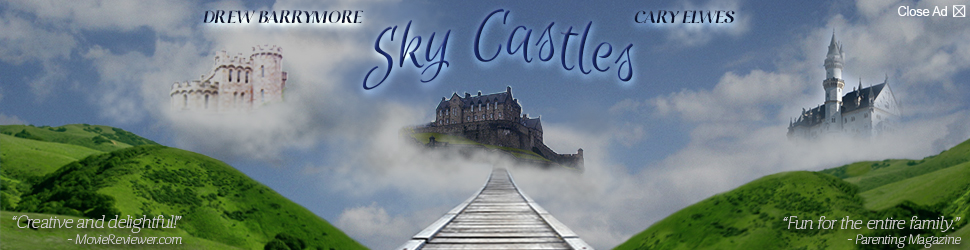
Fictional movie, website banner advertisement.
I used 6images for this composition ( 3 castles, bridge, cloud background and landscape)
All castles were extracted using the selection tool and refine edges.
The bridge was adjusted with perspective warp.
The bridge was adjusted with perspective warp.
Clouds under the castles were added by several cloud brushes I created and obtained through creative commons license. I layed the clouds and vaired the opacity as welll as blend modes to give them depth.
The landscaping was 1 image with background removed with the selection, refine edge and then deleted. It was duplicated and then warped in different ways for each side. I used the patch and clone tools to create variations on each side.
The background clouds were a single image with some cloud brushes used at various blend modes.
Tirciary ad: I used another 3 images (castle, stairs and cloud backround)

Source files for the web ad assignments: Banner & Portrait

Perforation:
Once effects layer is created, duplicate layers and applied as clipping mask allowing granular flexibility with each effect
Danger sign:
White rectangle (base):
Bevel & Emboss
Inner Shadow
Gradient Overlay
Pattern Overlay
Drop Shadow
Stroke only rectangle
A black rectangle with red ellipse and white stroke
Shadow on a separate layer for warping
Rust layer - two custom brushes, created from photographs of rust; applied bevel, emboss and color overlay
Type:
Keep Out - no effects applied
Authorized - beveled/embossed; inner shadow, color overlay, gradient overlay and pattern overlay
Danger - pattern overlay
Fasteners - separated drop shadow for warping, burned and dodged edges
Keep Out - no effects applied
Authorized - beveled/embossed; inner shadow, color overlay, gradient overlay and pattern overlay
Danger - pattern overlay
Fasteners - separated drop shadow for warping, burned and dodged edges
Radioactive sign:
Custom shape filled with yellow, drop shadow applied and put on a separate lay for warping
Layer mask from bevel highlight and bevel shadows
Radioactive symbol and rust are on their own layers masked on the caution sign layer
Custom shape filled with yellow, drop shadow applied and put on a separate lay for warping
Layer mask from bevel highlight and bevel shadows
Radioactive symbol and rust are on their own layers masked on the caution sign layer
Fasteners:
Pulled segments from a chain link fence image, applied drop shadows and separated the shadow layer for warping
Pulled segments from a chain link fence image, applied drop shadows and separated the shadow layer for warping
Background:
Two lens flares on a black background
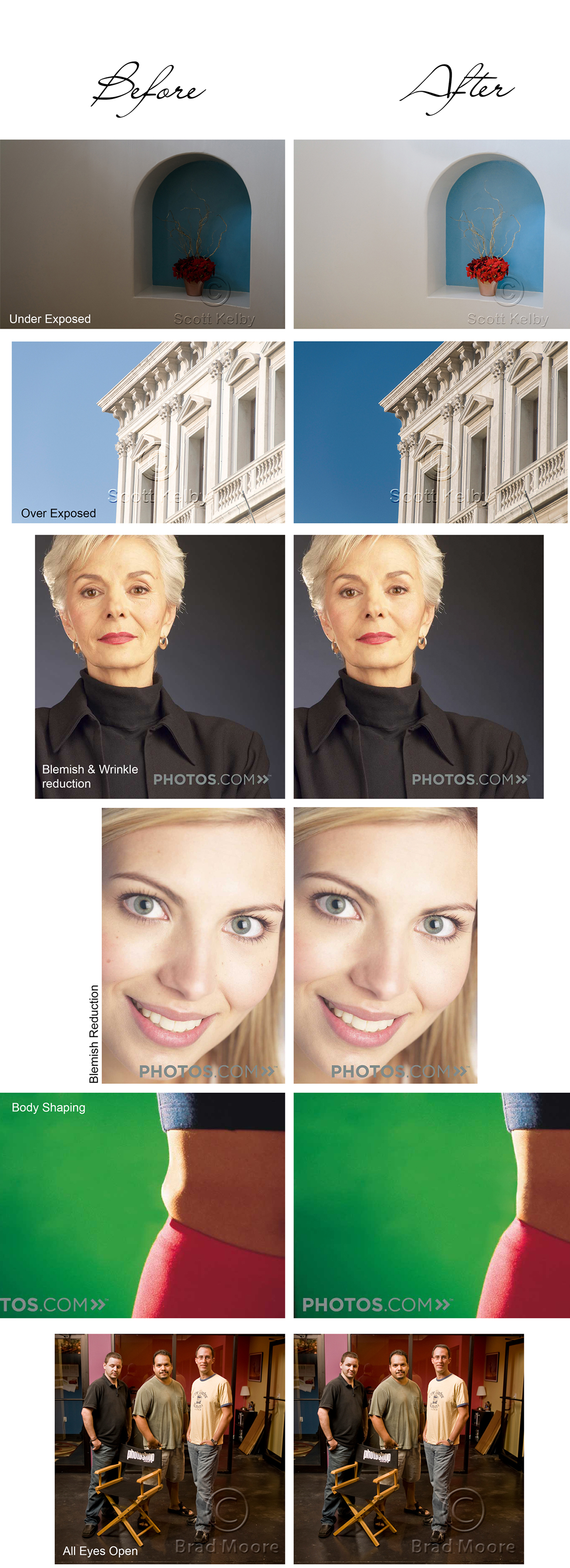
Here are 6 of the 7 images for another assignment this week. Before image on the left, after on the right. I love doing this kind of stuff. The body shaping was the most challenging and rewarding, but it crosses an ethical line for me.

Lesson 2: Seagull assignment. I alterend the original photo (top image) using Camera Raw only. First, I applied edits to the entire image. WB: Daylight; Exp: +.15; Contrast: +28; HL: -8; Shadow: +23; Whites: -7; Blacks: -28; Clarity +17; Vibrance: +9 and Saturation: +7. I made a few custom Point - Tone Curve tweaks. Finally I changed Details - Sharpening - Sharp: 16; Rad: 1.3; Det: 25. Mask 7. Noise Reduction - Lum: 16; Lum Detail: 36; lum Contrast: 19; Color: 25, Color Detail: 50; Color Smoothness: 72.
Then I began working with the Adjustment Brush to make the eye and beak really pop. I carefully masked the yellow areas to increase exposure, lighten shadows, then add clarity and saturation. Sharpness, Noise and Defringe were all increased while Moire was decreased. I also added a pale yellow tint to further saturate the yellow.
The breast and neck were modified to increase highlights, decrease shadow, add clarity and saturation among other tweaks.
The last modification to the bird was to the foward foot. Deacreased showas, added clarity, saturation, sharpness and applied a pale pink color.
The last phase was to decrease exposure thoughout the image and then erase around the font half of the bird for vingetting.
Finally I cropped the image to reduce the space to narrow the focus on the single subject while ensuring vingetting was appropriately included.
