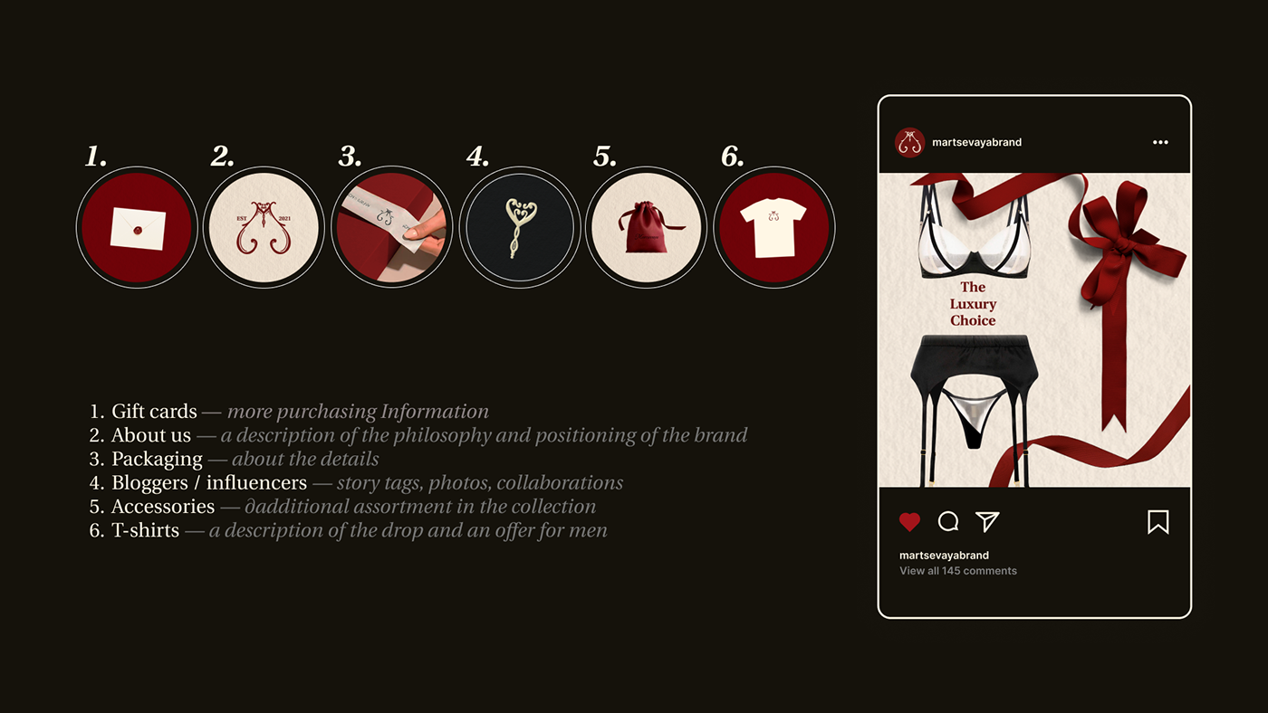
Martsevaya is a family lingerie brand that combines minimalism and luxury.
The brand is aimed at women who want to look sexy and attractive, but at the same time remain discreet and mysterious. The mission of the brand is to show the peculiarity of every woman through contact with designer underwear and boudoir.
The brand is aimed at women who want to look sexy and attractive, but at the same time remain discreet and mysterious. The mission of the brand is to show the peculiarity of every woman through contact with designer underwear and boudoir.
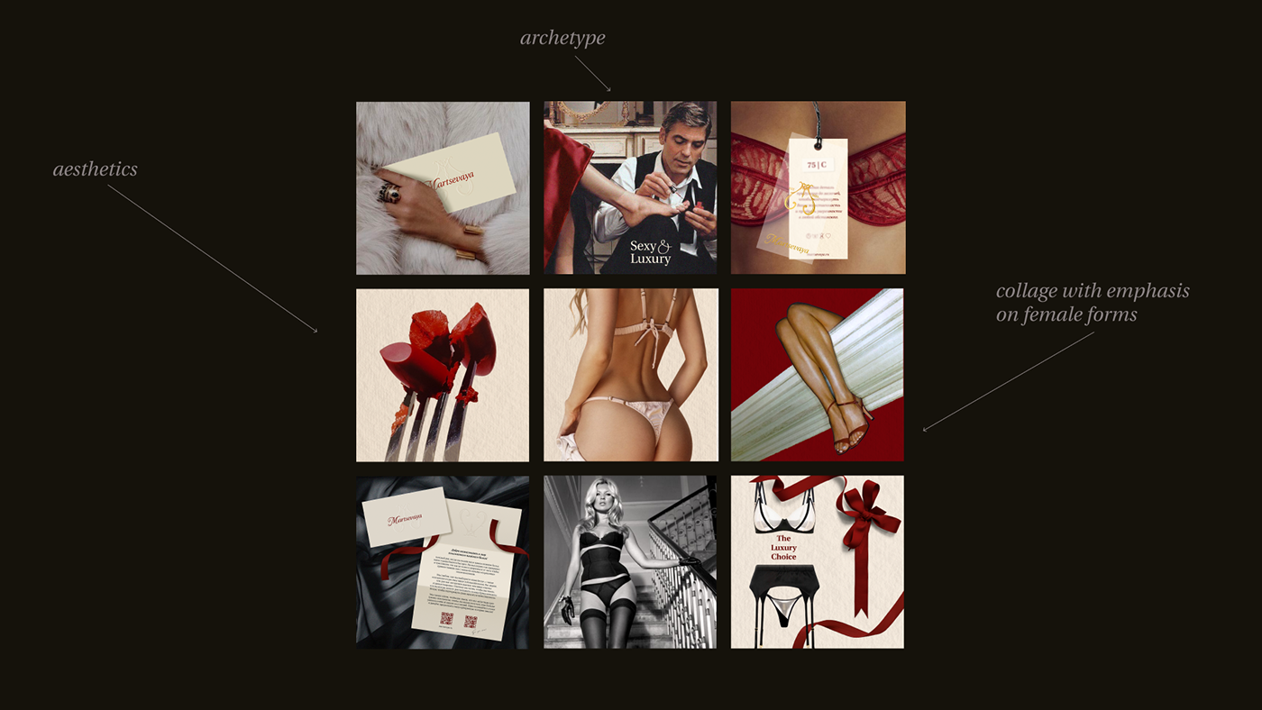
The task was to create a corporate identity, logo and sign. With the help of design, we conveyed the message of the brand: we made it elegant, but at the same time provocative due to the choice of colors.

We used italic serif font for the logo — balancing, not intrusive and mysterious. This font perfectly conveys the author's style and a sense of unity in the Martsevaya family home.

The brand sign combines several form factors.
The upper part resembles a bra, and the lower outline of the buttocks. Thin and graceful lines create a sense of mystery. The monograms represent boudoir and luxury. The key gives a sense of exclusivity and belonging to a community of like-minded people. The letter M — what the story of the brand begins from.