In 2022, the owners of the «Veresk» flower workshop have a desire to make a parallel business related to the main one: a project for growing microgreens. We came up with a brand name, conducted a survey and launched a website, laying the foundation of the business.
Having established the cultivation and supply of microgreens, the client thought about creating his own brand identity. One of the main requirements was recognition among other market players. And also the ease of using the identity.
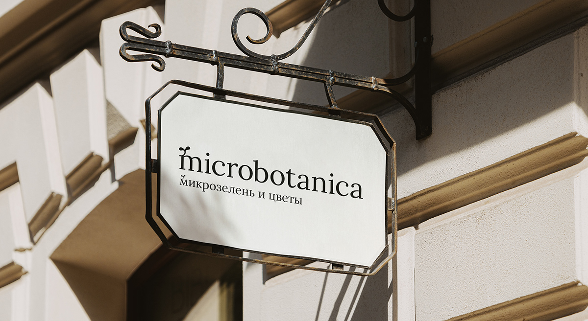
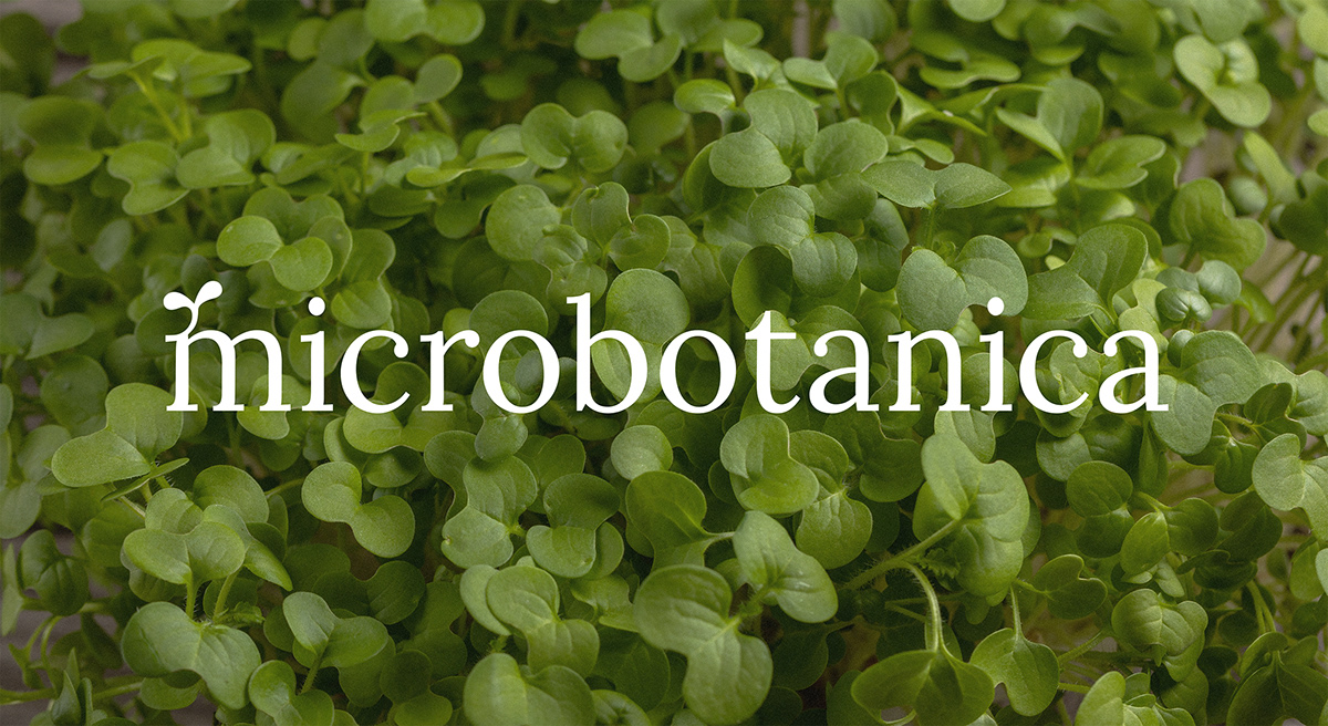
Microgreens are seedlings, not adult plants, so in the process of creating an identity, we came to an unexpected style-forming decision: to delete uppercase letters, replacing them with lowercase ones with a brand sprout. So the agency faced with a challenge: modify the font.

First, it was necessary to find the form of the brand name. It should be organic, similar to microgreens, at the same time not be too decorative, so as not to attract too many attentions. We took the «Lora» font as a base. After that, we organically fit the brand sign into each letter, accounting the specificity of each symbol, the balance of black and white inside the letter.
In order for the letters not to «fall in» and be well-read, we adjusted the size, position, slope, and flexure of the branded sprout. This is how the «microlora» font was made, laying the foundation for a design system.


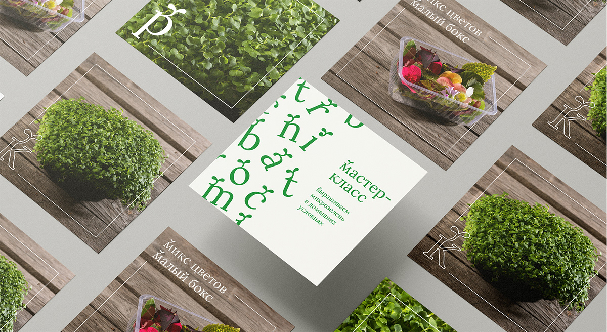
To show the specificity of each type of microgreens, we have introduced engraving illustrations for the design of branded labels. Small sprouts in illustrations get a unique structure and relief. The illustration is intertwined with the symbol in the same way as the branded sprout is intertwined with lowercase letters in the «microlora» font.


Microgreens not only support the body, but also give it energy, energizes it. This idea is displayed in a playful green pattern. It crumbles on branded merchandise and gets stuck in social networks, diluting the seriousness of the design system.

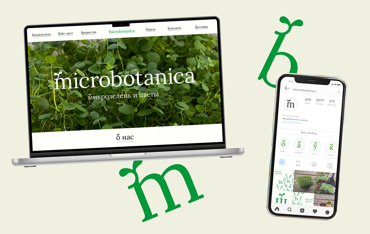
Social networks are one of the main communication channels of the brand, in which it is difficult to integrate a corporate font. Therefore, we have developed templates for the design of covers and product cards. We simplified the corporate table to a rectangular outline and left room for a header or symbol. We can also use a pattern for the design of posts.
Agency: be art
Project manager: Julia Lebedeva
Client side project manager: Julia Lukina
Project manager: Julia Lebedeva
Client side project manager: Julia Lukina
Art director: Danil Sneg
Lead designer: Mariya Cherkasskaya
Lead designer: Mariya Cherkasskaya
Type designer: Mariya Cherkasskaya


