


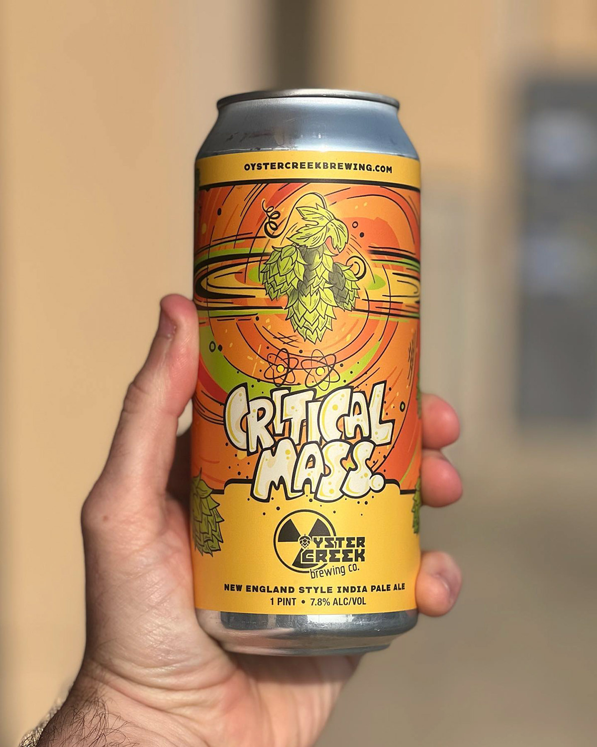
Critical Mass. New England Style India Pale Ale
This label was designed for Oyster Creek Brewing Co. and their new NEIPA beer release. The illustration was inspired by a supernova and the citrus flavors of the hops. Oyster Creek's branding is focused on nuclear power-centric themes, so the label needed artwork with energy!
Our original design featured an orange in the center, acting as an exploding sun. The massive eruption sends flying hops out into the universe swirling out of control. This label was so juicy that TTB declined the orange illustration, stating that it was misleading to the liquid inside (even though the beer notes clearly state the heaping amounts of citra and mandarina bavaria hops that went into this cloudy Nor'easter. Back to the drawing board we went. I illustrated a cluster of hops to represent the supernova instead and bingo, the label was approved.


Concepts & Sketches
Take a look through the below concepts and sketches of the illustration, custom lettering and color palettes explored while designing this craft beer label. The illustration was designed to have a sketchy hand drawn look with bright nuclear colors. Flavors so out of this world, you'll think you're on another planet!


Branding & Graphic Design of the Label
Once rough thumbnail sketches are explored for quick composition, the label comes together in Adobe Illustrator working out the layout and branding. This design process carefully considers where the logo will live on the label as well as the UPC, government warning, ABV and name of beer. A well designed branded template provides unity throughout additional beer releases. Giving the illustration and logo designated space on the label ensures consistency in the packaging.


Custom Lettering
Hand-drawn custom type in collaboration with Jeremy Friend. The lettering adds additional personality to the label and is front and center when looking at the packaging on the shelf. Drawing the name of the beer as opposed to just using a font not only increases visibility to your customer but also pulls the entire theme of the label together.


Hoot Design Studio
Craft Beer Label Design • Brewery Branding • Packaging Design • Pen & Ink Illustration
www.hootdesignstudio.com | Follow along on Instagram


