Yalodomi
Glass experts
Background
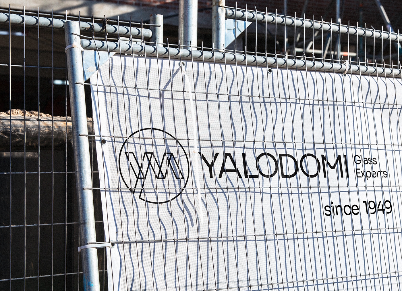
Yalodomi is the leading glass processing company in Greece specialising in the design and manufacture of all types of flat glass products. It has been dedicated to offering a wide range of quality products and all-around service, since its founding in 1949, continuously investing in new technologies and quality control systems. Last but not least, the company has its own testing laboratory and quality control unit.

rebranding
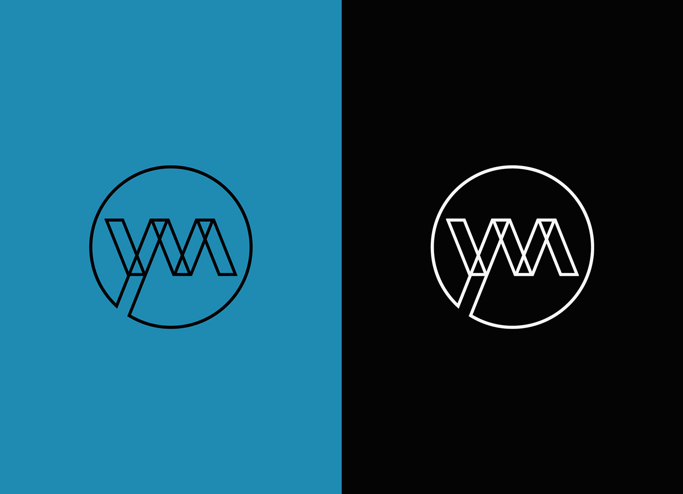
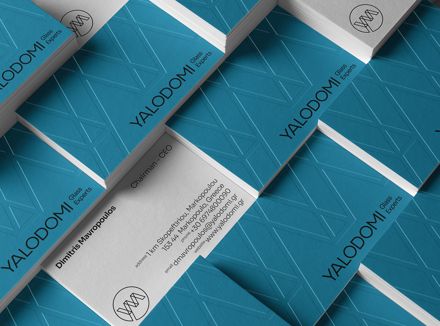
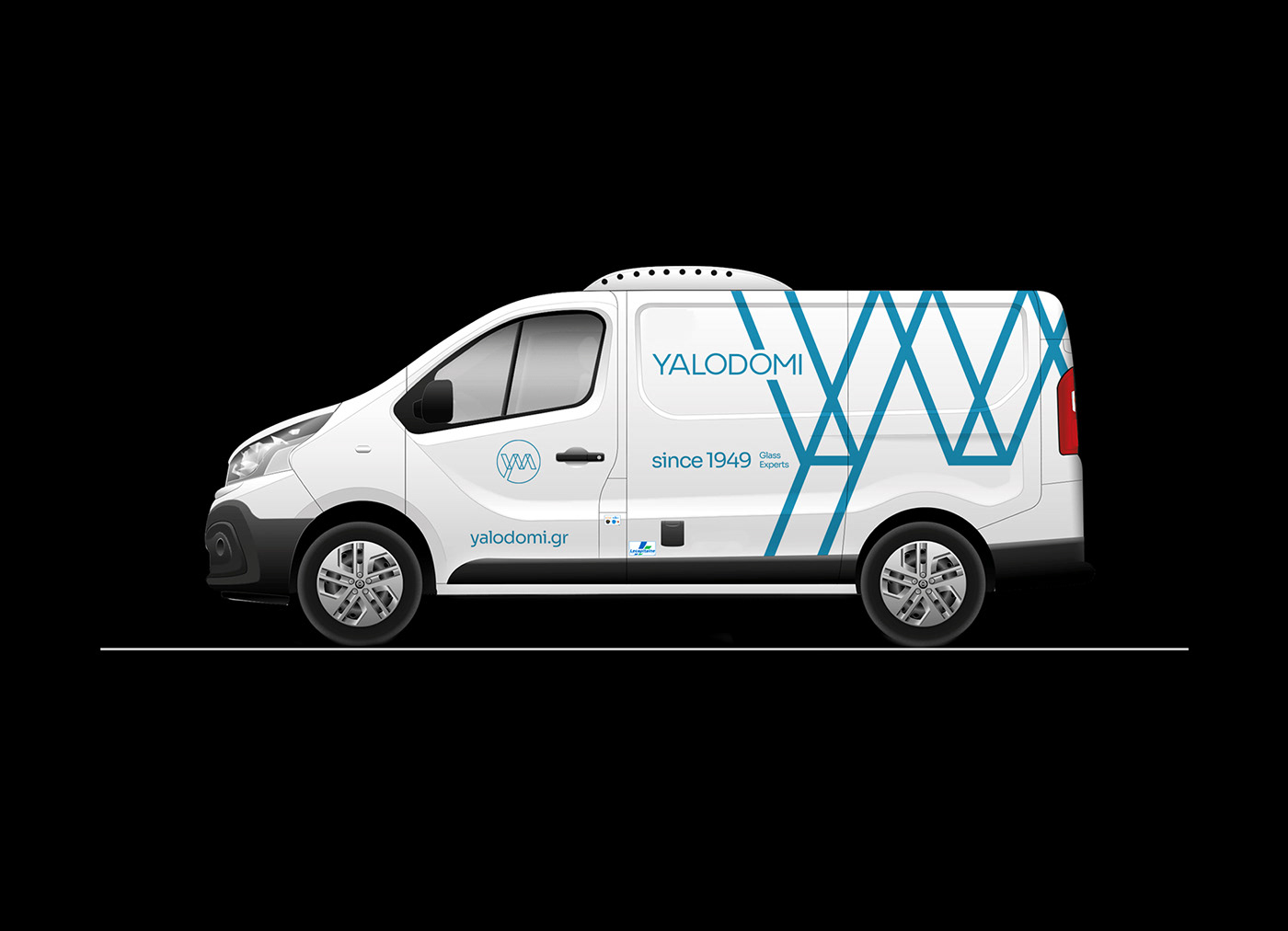
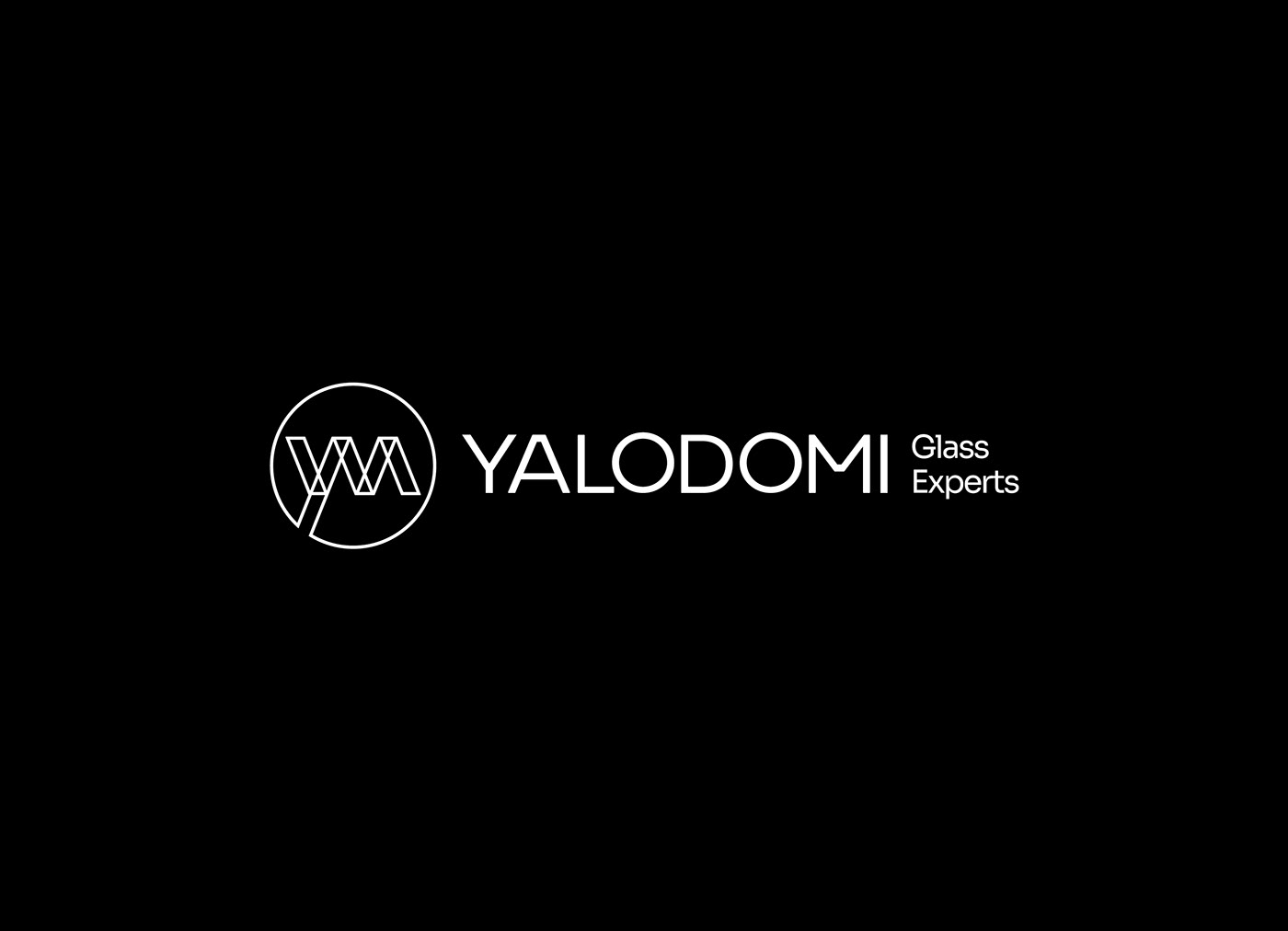
The name is a greek compound word made of the words, glass ''γυαλί'' (yali) and the word structure ''δομή'' (domi). The concept of the logo is based on notions such as transparency, customization and practicality. Simple and thin lines form a mechanical and structural system, to emphasize the aspects of the company's major projects and its constructive nature.
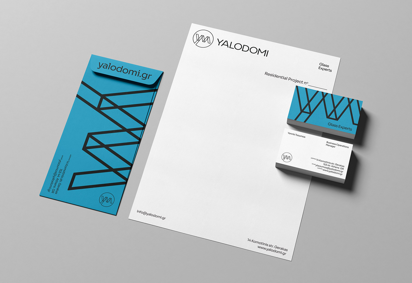
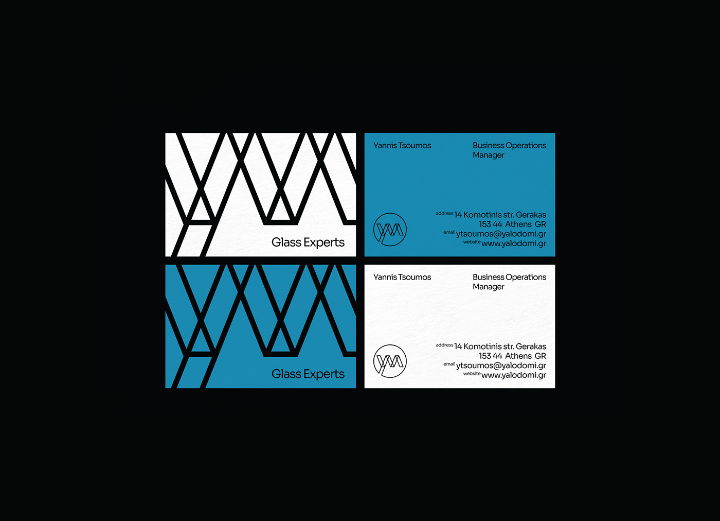
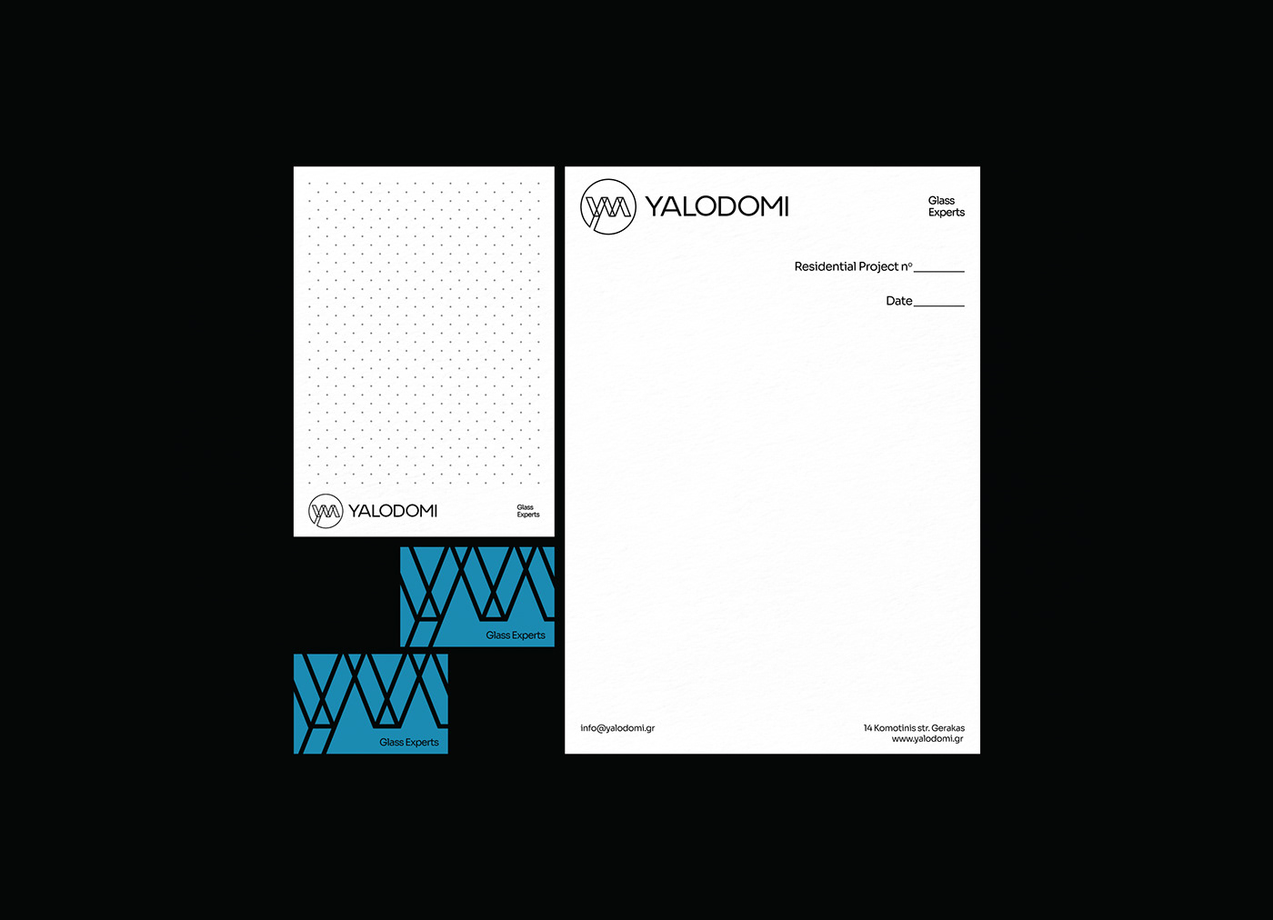
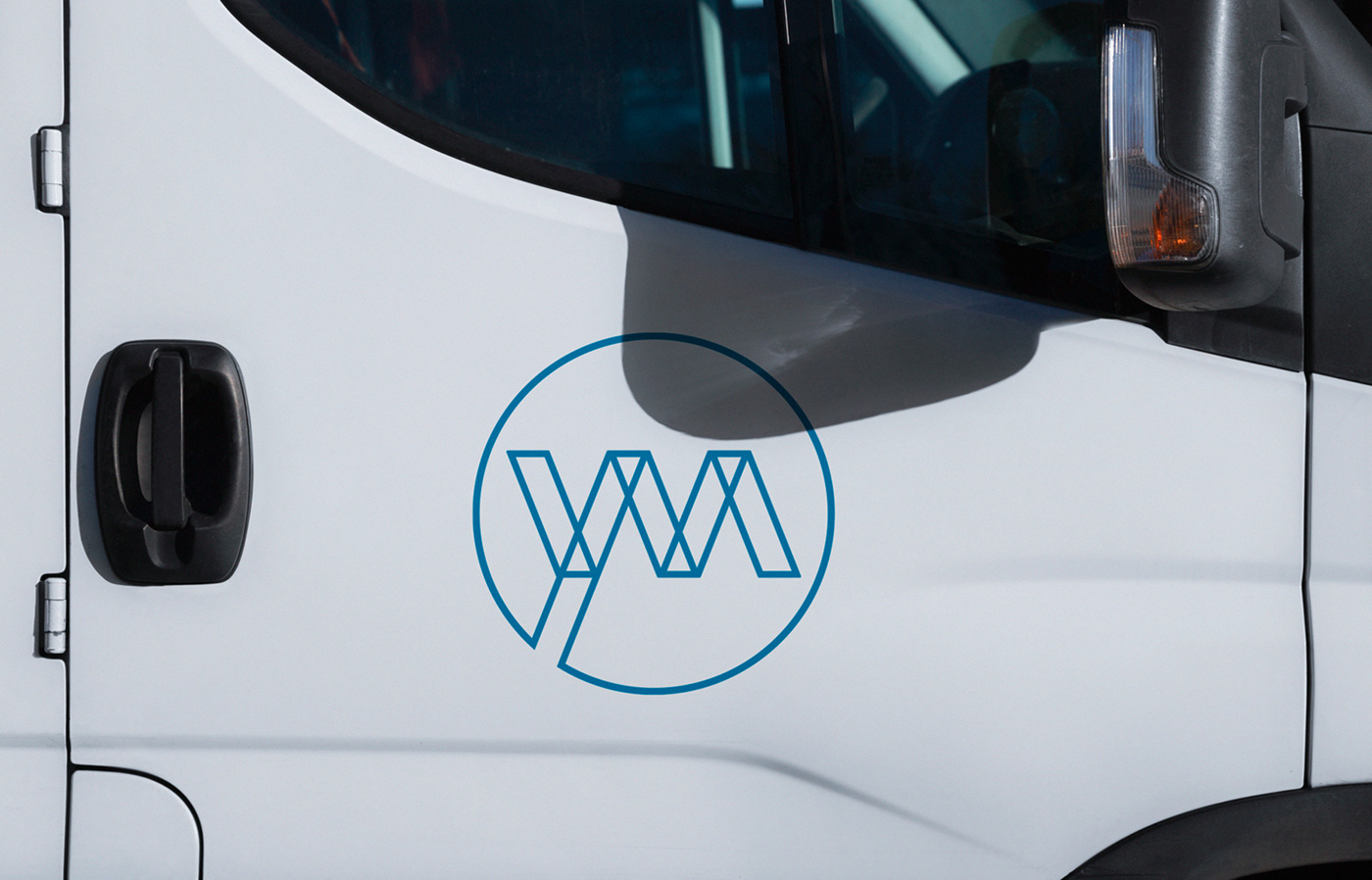
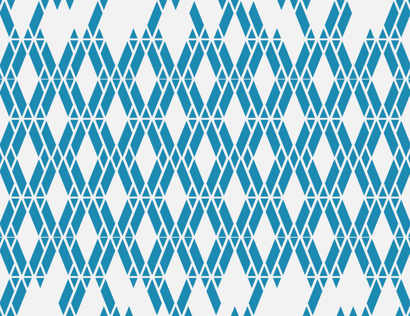
The logotype combines the letters Y + M ( M stands for the Founder's family name), we kept the idea of a circular monogram like the old mark, and also the composition of the elements, but we switched the monogram into an "outline" type symbol, to make the structure of the logo visible. This refers to the transparency of the company's basic construction material but also to some building's and structural element layouts. Also, some patterns and abstract vector ensembles were created, derived from the logo and the negative space of the monogram. Those visual compositions were used for the identity elements and overall communication, as patterns, or as individual shapes.
Pure glass material is usually colorless, but the glass material in the building application and the urban area, captures and reflects the color of the landscape. So we kept the blue color who was also present in the old mark, as the main color of the identity with a slight tonal variation.